 Zoom Logo PNG
The Zoom logo looks like a camera lens focused on the client. The image accurately conveys the services provided. Represents communication and video communication. The color scheme suggests cloud technology and connecting across distances.
Zoom’s history traces back to Eric Yuan. In 1997, after several visa attempts, he moved from China to Silicon Valley and joined WebEx. When Cisco acquired WebEx in 2007 for $3.2 billion, Yuan became VP of engineering but viewed the product as too complex for everyday users.
In 2011, after Cisco rejected his proposal for a mobile-first system, Yuan left and founded Saasbee in San Jose on April 21, 2011, with about 40 engineers. The startup raised $3 million in June. In May 2012, it was renamed Zoom Video Communications. A beta launched in September 2012, followed by Zoom 1.0 in January 2013. That year, the company secured $6 million in Series A funding led by Qualcomm Ventures and reached 1 million users.
By 2014, usage grew to 10 million participants. Competing with Skype and Cisco products, Zoom focused on access through a simple link without registration. This approach helped adoption among small and mid-sized businesses.
In 2016, subscription revenue passed $100 million, and Zoom entered Gartner’s leaders list. In 2017, valuation exceeded $1 billion. On April 18, 2019, the company went public on NASDAQ at $36 per share, raising about $357 million. Rivals included Microsoft Teams, launched in 2017.
In 2020, daily meeting participants exceeded 300 million, driving rapid growth and heightened security scrutiny. The company paused feature development for 90 days to address encryption and data concerns. That year, Zoom launched Zoom Phone. In 2022, shareholders rejected a planned $14.7 billion acquisition of Five9, while Zoom retained a leading share of the video conferencing market.
Meaning and History
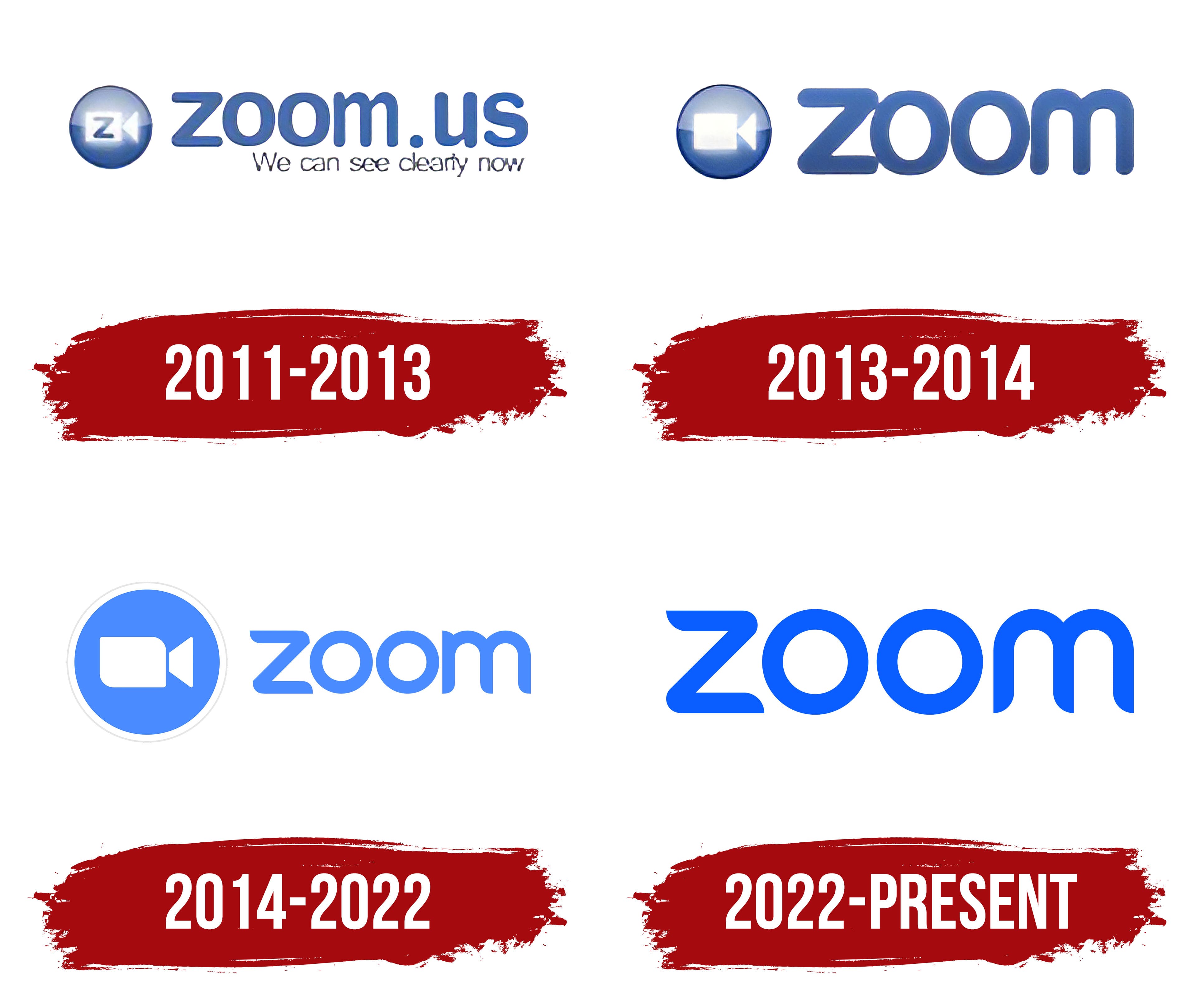
Since Zoom’s main goal is to provide a stable video connection between users, the platform has long used a video camera icon. But in 2022, she removed that badge because everyone already knew what Zoom was for. In addition, the designers have retained the iconic blue color and the inscription’s distinctive font, which keeps the logo recognizable.
What is Zoom?
Zoom is a video conferencing platform created by the US company Zoom Video Communications, Inc. It released its beta version in 2012. The program allows meetings with up to 100 participants (in the free mode). With the most expensive plan, you can increase the number of connected participants to 1000.
2011 – 2013

At the very beginning, the Zoom platform used a logo with its domain (“zoom.us”) in large dark blue letters and the motto (“We can see clearly now”) in small black letters at the bottom. On the left was a dark blue gradient circle containing an image of a white video camera with a blue “Z.”
2013 – 2014

In 2013, the wordmark was shortened to a brand name. It featured very narrow letter spacing, a bubble type, and a dark blue color. The circle with the camera remained, but without the letter “Z.”
2014 – 2022

The developers took a simple approach, displaying the platform name in lowercase without any additional elements. This simple, catchy design has become a distinctive feature of the program. It is also a recognizable wordmark of Zoom Video Communications Corporation, which owns the innovative product and all rights to the brand identity.
The Zoom logo appears as light blue lettering with rounded corners. It reflects the brand’s basic principles: minimalism, simplicity, and boldness. The marketing team developed the design, including the overall concept and typography. She also approved the only permitted version of the logo: the blue word “zoom” on a white background. Other versions with additional elements, modifications, or color changes violate the branding rules.
The color scheme is based on the original shade, Zoom Blue (#2D8CFF), one of the azure color options. It is used for the lettering, depicted on a blank white background (#FFFFFF). This combination emphasizes the wordmark’s minimalism and aligns with Zoom’s main principle: bold simplicity. The same cool blue tint is found throughout video telephony services. He is an asset in designing the company’s website, software, and advertising materials.
2022 – today

The Zoom platform has taken a step toward simplification by removing the camera symbol from its logo. Now it’s a wordmark made of individual glyphs. It looks as harmonious as possible because the “m” no longer has the triangular protrusion at the top.
Font and Colors

The corporation’s name and its main product are written in an original typeface created specifically for Zoom. Several corners of the z” and “m” are rounded, and the rest are elongated and slightly curved to resemble short serifs. But this is only the author’s stylization. The letters have no serifs because the general outline was borrowed from the Kaleko 205 typeface.
The developers used the modern grotesque as a base and modified it, creating their own version for the video communication platform’s logo. They chose this font as the base for its excellent readability, versatility, and balance. Rounded edges give the lettering a friendly look.
The customized lettering complements Zoom Video Communications’ base Lato typeface. The developers chose it to create a coherent brand identity. As a result, the logo is inextricably linked to other elements of the platform’s visual identity, including the corporate font and palette.