![]() Discord Logo PNG
Discord Logo PNG
The fun, playful Discord logo symbolizes the messaging system’s friendly atmosphere. The gaming style aligns with the messenger created for esports athletes and gamers.
In 2012, after selling OpenFeint to GREE for $104 million, Jason Citron founded Hammer & Chisel and began developing the mobile MOBA Fates Forever. The game launched in 2014, received positive reviews, but failed commercially.
During development, Citron and his team struggled with communication tools while playing League of Legends and Final Fantasy XIV. Skype lagged, while TeamSpeak and Mumble required a complex setup. This gap led to the idea of a simpler voice platform built for games.
Citron partnered with Stanislav Vishnevskiy, and in March 2015, Discord entered beta. On May 13, 2015, it launched publicly at discordapp.com. Early adoption came from communities around Diablo, World of Warcraft, and Twitch, helped by browser access and invite links.
By 2016, Discord had reached 25 million users and raised $20 million in funding, including from WarnerMedia. In 2017, Discord Nitro introduced an ad-free subscription model. The user base grew to 87 million.
In 2018, Discord launched a game store but shut it down in 2019 after failing to compete with Steam. That same period included a $150 million funding round and Microsoft’s integration with Xbox Live.
In 2020, the slogan changed to “Your Place to Talk” as usage expanded beyond gaming. Monthly users exceeded 140 million, with revenue reaching $130 million.
In 2021, Microsoft discussed acquiring Discord for about $10 billion, but talks ended. Sony Interactive Entertainment later invested. By September, the valuation reached $15 billion.
In 2023, leaked Pentagon documents were shared on a Minecraft server, prompting concerns about moderation. In 2024, Discord cut about 17% of staff. In April 2025, Citron stepped down as CEO while remaining on the board.
Meaning and History
![]()
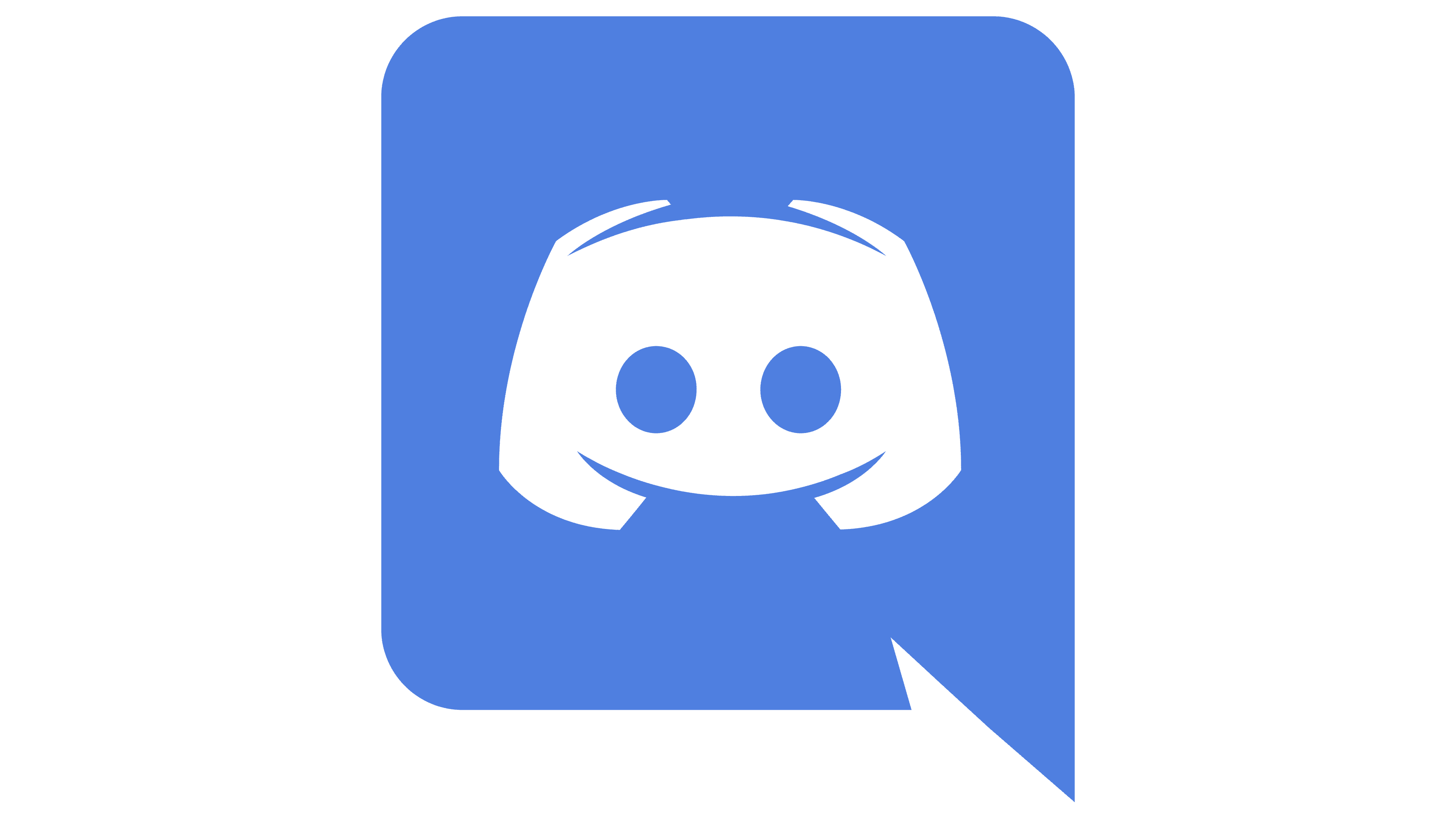
The app has an easily recognizable icon. It consists of two parts: on the left, a blue dialogue cloud with a graphic symbol; on the right, a stylized inscription “DISCORD.” The hand-drawn element appears abstract, resembling a game console controller with short handles. This explanation sounds plausible, as the service was created for gamers. However, Discord’s official version is completely different: the logo depicts a robot named Clyde, a friendly character who helps Messenger users.
What is Discord?
It’s a free messenger owned by the eponymous company. It is suitable for various operating systems (iOS, Android, Windows, macOS, Linux) and supports many languages. The application’s first release dates back to 2015.
2014 – 2015
![]()
2015 – 2021
![]()
The logo features the application’s main mascot, so the designers paid attention to details. The robot’s head is inside a dialogue cloud, which is symbolic given Discord’s focus. The style is modern yet friendly: the lower semicircular protrusion resembles a smile, and many angles are smoothed. This was done to attract new users and encourage them to communicate.
Although the logo designers used the Uni Sans Heavy font, they significantly modified it. The original, created in 2008 by Svet Simov, looks more formal. Discord has a stylized font, especially the letter “D,” with partially erased vertical strokes.
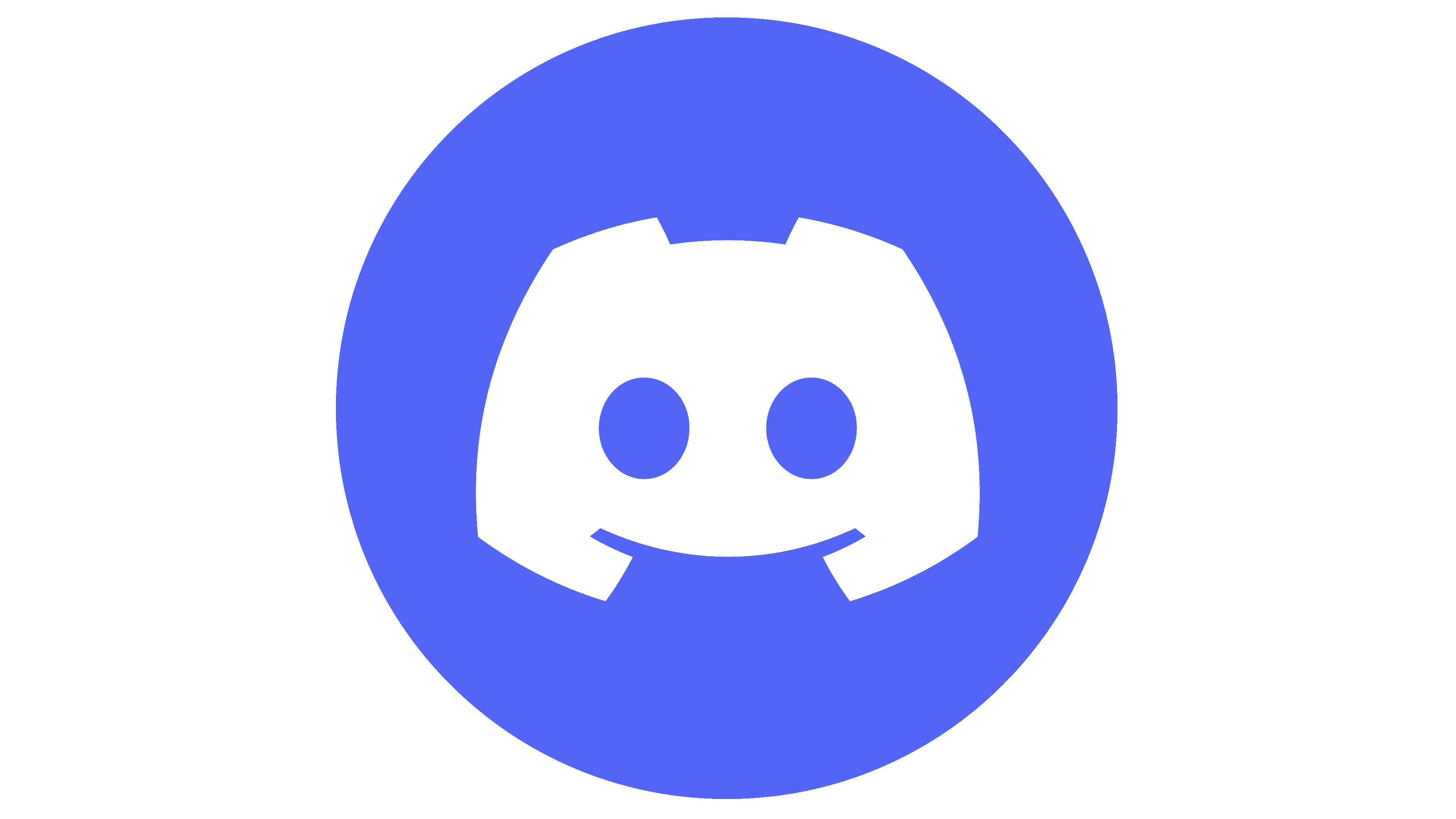
2021 – today
![]()
After the redesign for the messenger’s 6th anniversary and social network Discord, Clyde’s robot shape remained the same. Only minor details changed. For example, the upper spikes (antennas) merged with the head’s main body, forming trapezoidal protrusions that resembled ears. The lower stroke was slightly shortened, making the smile appear more restrained.
Significant changes affected the inscriptions: a practical, rounded font replaced a “robotic” font with a truncated “D” letter. All letters (except the first) were converted to lowercase. In addition, the designers removed the dialogue window and applied the blue-violet color to the robot, which had previously been white.
Font and Colors
For the first version of the logo, the developers created an original font based on Uni Sans Heavy and Compose Black. The left part of the letter “D” was cut at a sharp angle. They chose a softer font with round, bold, lowercase letters for the second version. The letters are light and streamlined, demonstrating the application’s friendliness and openness.
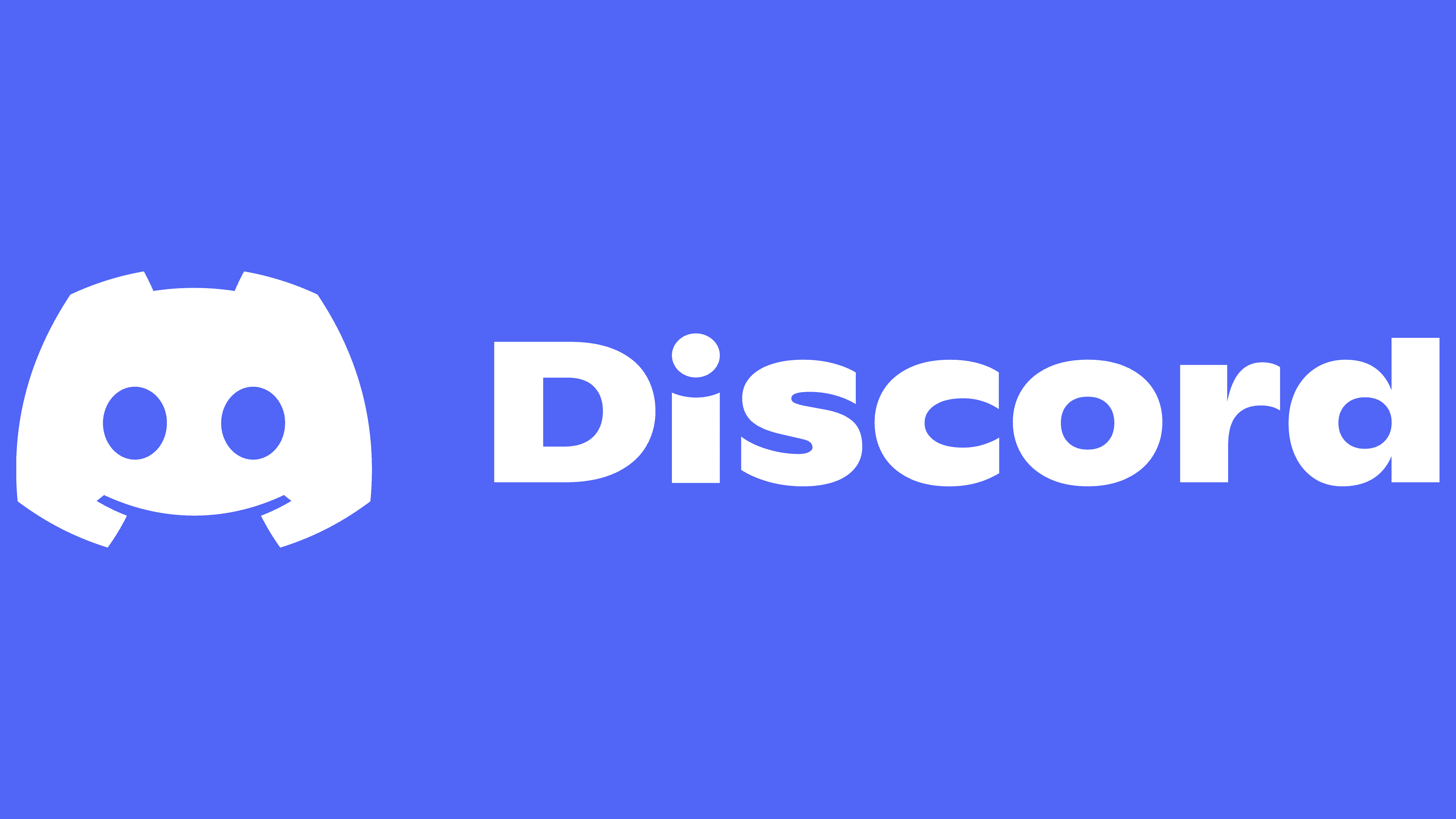
The color palette was completely preserved. The company representatives call it turquoise, though it is a shade of blue-violet (#7298DA). It contrasts pleasantly with white, lending the logo a friendly aura. According to the creators, such colors emphasize the atmosphere of unhindered communication and freedom of expression.