The AutoCAD application for design automation has received a modern visualization, symbolizing its continuous development and improvement. The new AutoCAD logo reflects the accessibility of the latest additions and the clarity and simplicity of the recent releases.
Autocad: Brand overview
| Founded: | December 1982 |
| Founder: | Autodesk |
| Website: | autodesk.com |
Meaning and History
It all started with its homegrown development, an architectural design program bought in 1977 by programmer Mike Riddle for a whopping $15,000 at the time. Its first name was INTERACT; MicroCAD changed it, and in 1982, it was renamed AutoCAD version 1. Initially, it could only develop 12 primitives, and the command menu included just 41 items. Today, the AutoCAD 2018 version counts 14 million lines of code, is released in 18 languages, hundreds of thousands of licenses sold, and the number of pirated copies reaches a million.
Autodesk employee Chuck Weickshn created the first logo for the AutoCAD version. The logo was a word made of letters of the same size; the part AUTO was blue, and the letters CAD were white in a black frame. The background consisted of seven blue stripes resembling a staff. In the top right corner was a subscript TM mark.
Subsequently, the emblem changed the size and color of the letters several times.
What is Autocad?
Autocad is an abbreviation formed from the phrase “Automatic Computer Aided Design.” It refers to software that allows the creation of three-dimensional and two-dimensional drawings, modeling objects with high precision, and performing project analysis. The American company Autodesk created the commercial application for use in various fields, including electrical engineering, mechanical engineering, engineering design, and architecture.
the 1990s
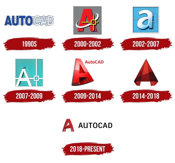
The debut emblem looked like a single inscription against a background of thin blue and wide white stripes. And it was blue and white. The first word – “Auto” – was done in bold letters in a blue palette. The second – “CAD” – is written in white letters, outlined with a thin contour. The name consists of two parts and is used as is, without breaking into separate fragments. Thanks to such contrast, the inscription is well-readable, as each part is visible. At the same time, such a connection demonstrates the common goal of the program.
2000 – 2002
Developers decided to replace the program’s full name with a single letter A. It was executed in red, around a white orbit in a slanted ellipse to the right – a yellow star stylized as a drawing. Such an emblem turned out to be recognizable and attracted additional attention to the product.
2002 – 2007
The logo design changed radically: the letter “a” was made lowercase, voluminous, and light blue with a gray contour. The square background was also blue, and the frame was light gray. A stylized white cursor completed the design.
2007 – 2009
And again, there was a change of image: the square became blue-green with a tilt towards green, the letter “A” again uppercase, in thin white lines, the inner perimeter of the frame outlined with a white stripe.
2009 – 2014
A new logo returning to red color: a 3D image of the letter “A,” tilted to the left. Thanks to the dark background, it appears three-dimensional.
2014 – 2018
The letter “A” was widened and stylized as a voluminous pyramid. It successfully reflected the functionality of the design program.
2018 – today
The final version, still relevant today, was adopted in 2018. The voluminous letter “A” is executed in an original design, with a color stretch from dark brown through red to pink. The program’s official name is the word AutoCAD (in this case, uppercase), which is written in bright red letters on a white background.
Autocad: Interesting Facts
AutoCAD is a computer program by Autodesk that helps people draw and design things on their computers. It’s been around since 1982 and is important for making buildings, machines, and many other things.
- Early Days on Computers: AutoCAD was one of the first drawing programs that worked on regular computers, so more people could use it, not just big companies with expensive equipment.
- Always Getting Better: AutoCAD is updated yearly to add new features that make it easier and better for all projects.
- Works with Many File Types: AutoCAD can use many different files, making it easy for people to work together, even using different programs.
- 3D Drawing: It started with simple 2D drawings, but now you can make 3D models to see what something will look like from all sides.
- You Can Make It Your Own: People can customize AutoCAD by writing little programs to do what they need. This means they can speed up their work and fit their needs.
- Learning Tool: Schools worldwide teach students how to use AutoCAD because it’s so important for jobs in designing and making things.
- Used Everywhere: Not just architects and engineers but people designing cars, ships, and even spaceships use AutoCAD to help plan and design.
- Use It Anywhere: AutoCAD is now available on phones and online, so people can work on their designs from anywhere.
- Helping Save History: People use AutoCAD to help fix and keep old buildings and important places safe for the future.
- Good for the Planet: It also helps people design better things for the environment using less energy and better materials.
AutoCAD is important for making all sorts of things, from our houses to our daily gadgets. It’s a big deal in the world of drawing and design.
Font and Colors
The changes in the logo of this brand are related to the additions made to the software. In addition, the authors have always strived for visual clarity and simplicity, which they achieved in the latest version. The current emblem is a 3D object with wide lines, well-distributed shadows, and clear edges. Therefore, the letter “A” looks perfectly balanced despite the uneven stripes. The legs are slightly twisted at the bottom, so the inner part is somewhat turned outward. The crossbar is wide on the right and narrows to the left, which also emphasizes the volume well.
Although there is a letter in the modern emblem, there is no text to speak of – it’s absent. The designers made a bet on a symbiosis of verbal and graphic symbols. At the same time, the inscription is used separately from the icon or on the label. Usually, it’s the TrueType format with a TTF or SHX extension from Windows. The rest are special AutoCAD fonts. But the very first logo had a text. It was a chopped font – smooth and without serifs. The brand palette evolved from a combination of blue and white to red and burgundy, occasionally interspersed with pink.
Autocad color codes
| Fire Engine Red | Hex color: | #c42328 |
|---|---|---|
| RGB: | 196 35 40 | |
| CMYK: | 0 82 80 23 | |
| Pantone: | PMS 711 C |
| Contessa | Hex color: | #cc6d67 |
|---|---|---|
| RGB: | 204 109 103 | |
| CMYK: | 0 47 50 20 | |
| Pantone: | PMS 7607 C |
| Black | Hex color: | #000000 |
|---|---|---|
| RGB: | 0 0 0 | |
| CMYK: | 0 0 0 100 | |
| Pantone: | PMS Process Black C |
