The iPad logo is simple and austere, emphasizing the power and performance of the gadgets. The emblem signifies the best mobile device for remote work, reading, and leisure. The logo reflects customer orientation.
iPad: Brand overview
| Founded: | April 3, 2010 |
| Founder: | Apple Inc. |
| Headquarters: | California, U.S. |
| Website: | apple.com |
Before the world got its hands on the iPhone in 2007, Apple had already been looking at another game-changing device: the iPad. However, it wasn’t until January 27, 2010, that this innovative tablet made its public debut. Sporting a 9.7-inch touchscreen powered by Apple’s iOS, the iPad was strategically placed in the market as something more than a smartphone but less than a laptop. Designed to handle various tasks—from web surfing and emailing to media consumption—the iPad carved out its niche.
The immediate public response was astounding. On its first day on the shelves, the iPad reached over 300,000 homes, soaring past a million within the initial 30 days. This kind of market reception was more than just profitable; it helped redefine what a tablet computer could and should be.
Apple didn’t rest on its laurels but committed to yearly updates, continually enhancing the iPad’s hardware. Various iterations have hit the market since its inception, each addressing consumer needs. The iPad 2, launched in 2011, was sleeker, quicker, and lighter. A year later, the iPad Mini appeared, catering to those who preferred a more compact 7.9-inch screen. 2013 saw the introduction of the iPad Air, which took thinness and speed to a new level. Then came the iPad Pro in 2015, replete with a hefty 12.9-inch screen and support for specialized accessories like a keyboard and pencil.
As of 2018, the iPad’s sales figures had surpassed 360 million units, maintaining its stronghold in the tablet marketplace. The iPad’s saga, therefore, isn’t just a tale of technological advancement but also a testament to Apple’s knack for identifying and filling gaps in the consumer electronics landscape.
Meaning and History
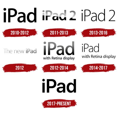
The logo of the tablet computer has remained fairly constant and consists of the brand name in black proprietary font. Minor rebranding has occurred with the release of new generations, happening quite frequently. Each version adds defining accents, highlighting the uniqueness and differences of the new device from the previous version. The emblems’ characteristic directly indicates the main change, making the identity simple and clear to users.
What is an iPad?
A tablet computer made by Apple. It combines the capabilities of a touchscreen with the power of a laptop. The product has enjoyed immense success. Over 13 years, 500 million devices have been sold. Since 2020, 53% of customers have purchased their first Apple tablet, highlighting market expansion and increased demand.
2010 – 2012
In late January 2010, Apple announced the launch of a new device—an original iPad with a touchscreen display running on the SoC Apple A4 chip. The gadget was later identified as the first generation.
A logo consisting of the brand name was developed for the device. The name derives from one pronunciation variant of the word “notepad”—Pad. Some believe the name was borrowed from the fictional device PADD in the American series Star Trek. Given the device’s easy web access, the letter “i” was added as a reference to the Internet.
Interestingly, the idea for the product predates the iPhone, but the first tablet appeared on the market six years after its development. Initially, the device was supposed to be named iTablet.
2011 – 2013
The second-generation iPad tablet, featuring a dual-core processor and FaceTime video-calling mode, was announced in 2011. The logo, in the form of the brand’s name, was overlaid with a slanted semi-transparent white veil. As a result, half of the inscription is partially blurred, while the other half retains a rich black color.
- The feature indicated the presence of Airplay mirror imaging in iOS 4.3, allowing for screen duplication of the tablet on Apple TV.
- The veil, symbolic of a white cloud, hints at the existence of iCloud, which enables tablet synchronization with other devices and backup creation.
- The gradient speaks to transparent design elements in the Notification Center and Control Center.
The small letter size indicated the product’s compactness.
2013 – 2016
2013, iOS 7 was released, allowing the iPad2 to upgrade to this operating system version. This feature made the product unique, as it could run on versions 4, 5, 6, and 7 of the system.
The logo of this period transformed, adopting thin, tall letters. This choice emphasized expanded functionalities—the lightness of the inscription aligned with the new operating system font.
The emblem design closely resembled the iPad Air, also released in 2013. Support for the iPad 2 ceased in 2016.
2012
In 2012, a new third-generation iPad was introduced, featuring a quad-core graphics processor, a new Apple A5X chip, 4G support, voice dictation capability, and 1080p HD video recording.
A distinct logo was created for the product introduction on March 7 at a special presentation at the Yerba Buena Center for the Arts.
The sign simply read, “The new iPad.” The direct message immediately conveyed the necessary information, announcing the next generation of Apple’s iconic products.
The black font was slightly veiled by a white semi-transparent layer, akin to a cover over a piece of art before its grand unveiling. This tactic created an analogy to something grand and valuable.
The name “iPad” is highlighted in a bolder font. The thin letters of “The new” clarify that it’s not the product name but a temporary message on the logo.
A gradual increase in the thickness of the glyphs in the inscription serves as a timeline leading up to the product launch. Sales of the new iPad3 started on March 16, 2012, in the first ten countries. Yet, by the end of 2012, the third-generation release was discontinued due to the introduction of the fourth generation.
2012 – 2014
To distinguish the fourth-generation tablets on shelves, the main feature of the product – a Retina display – was indicated in the logo. The use of this emblem began at the end of October after the official introduction of the iPad 4 and the completion of the patent registration for the Retina name in the U.S.
The inscription allowed for dual advertising – for the tablets and the components, linking the brand with advanced, cutting-edge technologies.
The emblem consists of two levels. At the top, the brand name is written in large letters with a gradient, using the signature iPad font. Below the length of the brand name, “with Retina display” is added. The phrase highlighted Apple’s new development – a display with increased pixel density (more than 320 dots per inch).
2014 – 2017
2014, following the discontinuation of the iPad 2, Apple relaunched the production of the iPad 4, whose sales had dwindled after the release of the iPad Air in 2013.
The updated logo emphasized the new role of the device as a less expensive competitor to the Air. Extremely thin, lightweight, and noticeably smaller letters indicated a 20% reduction in tablet prices.
The emblem highlighted the phrase “with Retina display,” so buyers knew that this was a modern, advanced tablet with an excellent screen despite its low cost.
2017 – today
In March 2017, the next fifth generation of the gadget was released with an Apple M9 processor. Confident, clear, large letters in the emblem represent a popular, in-demand device. The deep black color emphasizes the increased brightness of the display, which rose by 25% due to the absence of lamination and anti-glare coating.
In 2018, the iPad 6 was announced, and the fifth generation was discontinued, yet the logos for subsequent devices remain the same.
Font and Colors
The emblem in black monochrome aligns with the tablet designs. It looks formal and serious, underlining the device’s capabilities for work-related projects. The device enables music creation, photo editing, text writing, calculations, hand-drawing, document signing, and marking up any files.
The Apple Myriad Pro SemiBold emblem font was designed for iPad logos. The neatly printed letters without serifs and with smooth rounded lines were conceived in 1992 by Adobe. Apple started using the font in 2002.
iPad color codes
| Black | Hex color: | #000000 |
|---|---|---|
| RGB: | 0 0 0 | |
| CMYK: | 0 0 0 100 | |
| Pantone: | PMS Process Black C |


