 University of Texas at Austin Logo PNG
A deep respect for knowledge is demonstrated by the logo of The University of Texas at Austin. The university is actively working on the prosperity of the state. The main task of graduates is to take their place in the community and make a difference using their education.
University of Texas at Austin: Brand overview
| Founded: | September 15, 1883 |
| Headquarters: | Austin, Texas, United States |
| Website: | utexas.edu |
Meaning and History
UT Austin has a very difficult development path because it was first mentioned in 1827 as part of Coahuila y Tejas. However, the government of Mexico, to which these territories belonged, did not take any action to open it. The surrounding lands were given to him, then taken away for a long period, even after the adoption of the Constitution of the Republic. The areas intended for building buildings appeared in scanty quantities. There were not enough funds.
The fate of the university remained uncertain until the spring of 1881 when the authorities decided to open it. Then the legislature announced the structure of the university the type of its organization and called elections to determine the location. In the fall of that year, it became known that the institution would be located in Austin. The city of Galveston took second place in the list of contenders. It was decided to establish a medical department there. Official celebrations on the occasion of the laying of the first stone in the main knowledge took place in the autumn of 1882. And in September 1883, The University of Texas officially opened its doors.
Currently, the university provides higher education and conducts serious scientific research. Research is concentrated in such areas as engineering and physical sciences, programming, computer science. Among the priority areas of its activity are biofuels, solar panels, carbon dioxide, water purification devices. The Energy Institute was opened in 2009. The University of Texas also deals with medicine, covering neuroscience, bioengineering, pharmacy, and some other areas of healthcare. Especially for this, he created the Dell Pediatric Research Institute in 2010. He also has the McDonald Observatory, which is connected to Hobby-Eberly, the third-largest telescope in the world.
The University of Texas has a visual identity mark used in the curriculum, brochures, advertising media, signage, and more. At the moment, two variants are known, which differ only in grouping elements.
1967 – 2015
The former emblem consists of the expanded name of the university, divided into three lines: the top – “The University of,” the middle – “Texas,” the bottom – “at Austin.” The text emphasis is on the word “Texas.” It is highlighted in large type with capital letters, while the rest of the inscriptions are small. At the bottom, two thin stripes are added – to the right and left of “at Austin.”
2015 – today
The modern version of the logo uses a graphic icon – a shield with a wreath, a star, and a book. It takes place before the phrase “The University of Texas at Austin” and the free-standing word “Texas.” All the inscriptions are decorated with narrow serifs but no longer pointed at the ends, as in the old emblem, but rounded. The corporate color is preserved, although it is shifted to a dark palette.
Seal
All the achievements and concepts of UT Austin are reflected in its symbolism, which consists of several university logos and a seal. The sports department also has its emblems. They are associated with historical landmarks and key aspects of the Texas lands.
The seal was designed in 1903 by William Battle and approved by the 1905 Board of Regents. It has a classic round shape with several thick stripes and a center. The base element is the shield, which is placed in the middle and divided into two zones. An open book is depicted in the wide part – a symbol of knowledge and education. The narrow one contains a five-pointed star and a wreath of oak and laurel leaves. The branches are connected by a long ribbon tied in a bow. Around the shield is a motto consisting of three separate words: “Disciplina. Praesidium. Civitatis.”
This is followed by a wide white stripe, separated by two rings. It contains the full name of the institution of higher education: “The University of Texas” at the top and “at Austin” at the bottom. Between them are drawn two miniature stars. The printing edge is double, white-gold, like all other elements.
Texas Longhorns Logo
UT Austin has its own sports department, including men’s and women’s teams in basketball, baseball, football, tennis, volleyball, and other disciplines. It is often referred to simply as Horns because the logo contains the head of a local buffalo breed, the Longhorns. Cows were brought to the New World by the famous explorer Christopher Columbus. Since then, they have taken root, bred, and have become a symbol of the state of Texas.
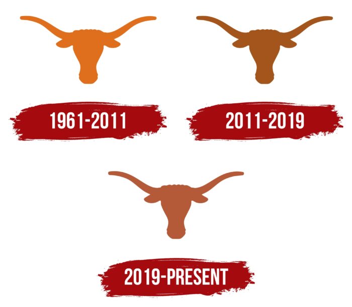
1961 – 2011
The logo of the University of Texas at Austin athletes is minimalistic but has a powerful energy. It depicts the silhouette of the head of a long-horned bull – the state’s main attraction. Despite the lack of many details, its appearance is valued for its timeless character – strong and unshakable. The horns of the animal are incredibly massive since, in reality, they are able to reach more than 3 meters (in aggregate). The icon also clearly shows the contours of lowered ears and flared nostrils, which indicates that the bulls are tense and ready to enter the fray.
2011 – 2019
After the redesign carried out in 2011, the emblem has completely retained its original appearance – the same contours with an emphasis on long and powerful horns. The nostrils of the animal are still dilated, and the ears are lowered forward. The only change was in color: the orange-gold bull was repainted in the color of dark gold.
2019 – today
Since the Texas Longhorns sports logo remains the most successful in the opinion of many experts, it was not changed again. The designers have only converted the colors. So now the bull is brown-red.
Font and Colors
The identity of one of the most successful universities in the United States has one thing in common – color. Both in print and the academic logo and the sport’s emblem, there is golden. Moreover, it prevails in all three variants. But the constituent elements, the concept, the form they have are different. Each of these signs is based on its principles.
The Dyal and Partners studio developed the modern corporate identity for UT. She used GT Sectra as the main typeface and Benton Sans as the secondary one. These are thin serif fonts. The main colors of the university are golden and white.
University of Texas at Austins color codes
| Tawny | Hex color: | #bf5700 |
|---|---|---|
| RGB: | 191 87 0 | |
| CMYK: | 0 55 100 25 | |
| Pantone: | PMS 166 C |


