 Louisiana State University (LSU) Logo PNG
The university cares about students. The LSU logo conveys that the institution is a source of light in a sea of knowledge. Within its walls, it is easy to learn new things. It is always happy to explain and answer questions. The symbols of the logo convey wisdom.
LSU: Brand overview
Louisiana State University has gone through many trials that hindered its development. Several closings, fires, destruction of books and equipment, frequent relocations, post-war economic crises, staff turnover due to lack of salaries, student deaths during World Wars I and II, allegations of corruption and bribery – all these events hindered the normal development of LSU. But the educational institution coped with the challenges of fate. It continued to develop and eventually became a research institute with a huge number of educational programs. Currently, it owns a campus of 250 buildings and 21 sports teams.
Meaning and History
There was a period in the history of Louisiana State University when it had the status of a military institution, and its students were considered cadets. This began in 1860 with the founding of the Louisiana State Training Seminary and Military Academy. The university received its current name in 1870 after moving to a boarding school for the disabled when a fire destroyed much of its property. The modern campus was opened in 1926.
To differentiate itself from other institutions in the state and nation, LSU has adopted a unique visual identity system. The logo reflects the university’s outreach, research, and teaching activities. Its distribution is regulated by the Office of Trademark Licensing and the Division of Strategic Communications. There is also a seal that is used on documents, including various contracts, certificates, and diplomas. Its use is monitored by the Office of the Registrar. Both elements of identity reflect the long history and roots of the university.
What is LSU?
LSU is an acronym for Louisiana State University. It was first mentioned in 1853 as a military academy. A little later (in 1860), the institution became a university. Its location is the city of Baton Rouge, Louisiana. The main campus was built in 1926 and today includes more than 250 Renaissance-style buildings. The university is designated the highest level of research activity.
This symbol was inspired by the official government seal that first appeared in 1812 when Louisiana became a state. According to archival records, then-Governor William C. Claiborne changed the image of an eagle to a pelican feeding its chicks with its blood. Perhaps in this way, the new official decided to show respect for the Catholic heritage because the pelican personified the atonement, the sacrifice of Christ. Incidentally, in one of the prayer books, the painted bird looked the same as on the state’s debut seal. The design of the national seal changed frequently: there were variations with and without blood and with different numbers of chicks.
LSU’s university-wide seal depicts a white pelican with its head bowed over a nest of three chicks and wings spread wide as if trying to protect them from danger. The artists decided not to depict blood on the bird’s chest, but it is implied there because that is the whole meaning of the symbol. The developers tried to give the graphic elements the shape of a circle due to the sloping wings and semicircular nests.
The drawing is placed in a ring of text. Above is a bold inscription, “LOUISIANA STATE UNIVERSITY,” which has an arc-shaped form. Dots separate the name of the institution on both sides. Below is the phrase “AND AGRICULTURAL AND MECHANICAL COLLEGE,” which is curved in the form of a reverse arc. A smaller font has been chosen for it. Directly below the socket is the year of LSU’s founding: “1860”. The main color of the seal is black. It is combined with a white background.
The branding is based on a logo with an abbreviation. It is used to signify the campus communications environment and everything associated with Louisiana State University. Its history begins with the LSU Tigers logo. It speaks to the inextricable link between the academic institution and its sports teams.
LSU’s stylized letters are printed in magenta. The combination of rounded and right angles makes the “S” look unusual, while the “U” has an asymmetrical shape. The high contrast of lines explains the unusual character of the letter “L”: the horizontal stroke is almost twice as thin as the vertical one.
LSU Tigers Logos
All sports teams at Louisiana State University are called the Tigers. They compete in 21 sports and represent LSU in the Southeastern Conference, competing at the NCAA Division I level. Only three women’s teams (track and field, cross-country, and basketball) are called the Lady Tigers.
LSU’s athletic department has been around for a very long time. The Tigers were the first American soccer team to travel to another country to compete. The game took place in 1907 in Cuba. Despite the large height difference, the American soccer players defeated their rivals from the University of Havana. Another important event was the opening of Tiger Stadium, the eighth-largest stadium in the world, in 1924.
In addition to soccer, Louisiana State University sponsors other NCAA-sanctioned sports. These include volleyball, track and field, tennis, diving, softball, golf, cross country, beach volleyball, basketball, and baseball. They all have one nickname in common: the Tigers (or Lady Tigers).
They were not named after felines but after military units formed in Louisiana during the American Civil War and unofficially nicknamed “The Tigers.” The coat of arms of the 141st Field Artillery Regiment still bears the head of a grinning predator.
Now, however, LSU teams have begun to abandon their historical legacy. University officials claim that the institution’s name, mascot, and emblem symbolize the tigers that have lived on campus since 1924. The statement was made after an anonymous author asked LSU to rebrand the athletic department because the Louisiana Tigers’ lineage included drunks who abused slaves.
Louisiana State University has used the tiger mascot since the 1890s and has no plans to change it. The management made concessions only once, removing the image of the predator’s head from the team’s logo. That happened in 2014.
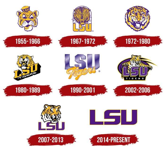
1955 – 1966
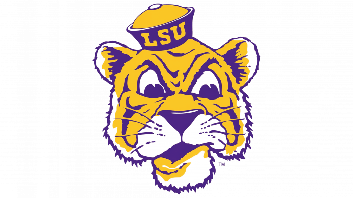
In 1955, the sports department got an emblem that looks like a portrait of a cartoon character. The tiger expressively frowns, wrinkles his nose, and raises his upper lip. The artists drew details using contrasting colors:
- They made all the contours and stripes purple.
- The center part was painted orange.
- The edges, eyes, and the area around the nose remained white.
On the head of the anthropomorphic predator was worn a uniform sailor’s cap without a visor. On the side of the cap was the orange lettering “LSU.” It indicated the team’s affiliation.
1967 – 1972
After the 1967 redesign, the animal became more realistic. Artists detailed the fur, whiskers, and nose wrinkles. At the same time, they depicted sharp fangs and ears pressed against the head to make it clear that the tiger was growling menacingly. The drawing was placed in a thin arch of purple lines. Below it was the abbreviation “LSU” written in a stylized font. The orange letters were outlined with a dark outline around the edges. The most unusual was the letter “S,” consisting of two corners.
1972 – 1980
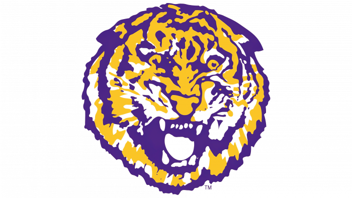
In 1972, the designers removed the inscription and the arch, leaving only the tiger’s head. It was depicted at a slight angle, with the predator roaring with a wide-open mouth. The style of the drawing changed: the animal became motley and not as realistic as in the previous logo.
1980 – 1989
The color scheme changed for the first time in 1980. The designers of the emblem used black instead of purple, repainting in this color all the contours, tiger stripes, and the sides of the letters. The animal’s head peeked out from behind the inscription “LSU,” located diagonally. The abbreviated name of the university became the team’s nickname. It was in a white slanted sans serif font.
1990 – 2001
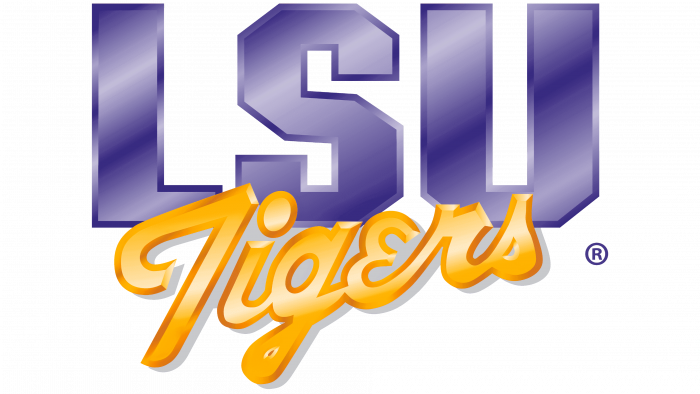
At the turn of the century, the Louisiana State University Athletic Department again updated its logo. The head of a snarling predator disappeared from the logo. The abbreviation “LSU” became purple and moved to the background. The designers chose a polygonal geometric font for it. The word “Tigers” was enlarged and repainted in gold. A handwritten semi-contact font was used for it. Contours, linear gradients, and shadows appeared on the decals, creating a three-dimensional effect.
2002 – 2006
The year 2002 saw the triumphant return of the tiger. The designers made it so that the predator jumped out from behind the letters “LSU” as if defending the honor of the university. In this version, not only sharp fangs were visible, but also powerful paws with long claws. The gradient disappeared, but the school’s initials had a double black-and-white outline and an orange border. The word “TIGERS” was at the bottom of the black trapezoid. It was written in white capital letters. The common background for all the elements was a purple spiral shape. It resembled a portal from which a predator jumps out.
2007 – 2013
The designers of the emblem removed the paws and torso of the tiger, leaving only the head, which was encircled with a wide black line. The athletic department’s nickname also disappeared, as did the dark background behind it. The “LSU” lettering remained largely unchanged; only the letters were stretched out slightly horizontally, and the white outline became orange.
2014 – today
In 2014, the tiger head disappeared from the logo. All attention turned to the abbreviated name of the university, the design of which has not changed. The abbreviation, as before, is colored purple and has a thin, light orange outline.
Previously, Louisiana State University teams used the symbolism of the head of a tiger. The dangerous beast roared, personifying the athletes’ warrior spirit and intimidating opponents. Recently, the tiger appears at competitions only as a mascot, and the logo is limited to a short inscription “LSU” without additional elements.
The designers chose Geaux Extended, a font owned by the university, for the logo. It was developed in 2002 and has gradually evolved. Teams use it for sports names as well as for lettering on uniforms. All Geaux letters are uppercase, angular, with irregular line widths.
The LSU Athletics branding guide states that depending on the background color, the wordmark can be magenta (# 461D7C), gold (# FDD023), white (#FFFFFFFF), or black (# 000000). The most popular is the magenta version with a gold outline.
LSU: Interesting Facts
Louisiana State University (LSU), located in Baton Rouge, Louisiana, is a public research university dating back to 1853. Initially started as the Louisiana State Seminary of Learning & Military Academy, it’s now known for its diverse academic and athletic accomplishments.
- Origins: In 1853, LSU opened near Pineville before moving to Baton Rouge in 1869.
- Unique Designations: LSU holds land-grant, sea-grant, and space-grant status, which shows its commitment to a wide range of educational and research activities.
- Mike the Tiger: Since 1936, the live mascot Mike the Tiger has symbolized LSU’s spirit. Mike enjoys a spacious campus habitat, emphasizing the university’s focus on animal care and conservation education.
- Tiger Stadium: Known as “Death Valley,” it’s famous for its vibrant atmosphere, making it a challenging venue for opposing football teams. It seats over 102,000 fans.
- Distinguished Alumni: Alumni include NBA star Shaquille O’Neal, political commentator James Carville, and Nobel Prize-winning physicist Douglas D. Osheroff.
- Academic Diversity: LSU offers a variety of programs and is noted for research in coastal restoration, biomedical research, and veterinary medicine.
- Campus Beauty: The campus features live oak trees, Italian Renaissance buildings, and the picturesque LSU Lakes.
- Mardi Gras Break: LSU celebrates its Louisiana heritage by observing Mardi Gras as an official holiday.
- Military Tradition: Reflecting its origins as a military academy, LSU honors this history through the Cadets of the Ole War Skule and a Corps of Cadets program.
- “Golden Band from Tigerland”: LSU’s marching band is central to its cultural and athletic events and is known for its performances at football games.
- Research Leadership: Home to the Pennington Biomedical Research Center and the Louisiana Space Consortium, LSU is a leader in health, nutrition, and space research.
- Cultural and Economic Influence: LSU significantly impacts Louisiana’s culture and economy, serving as a major employer and contributing through its initiatives.
LSU stands out for blending its rich history with forward-looking research, innovation, and community service, making it an important cultural and educational institution in the U.S.
Font and Colors
LSU’s branding guidelines include recommendations for typography. For headlines and text, Proxima Nova and ITC Caslon 224 sans serif fonts are welcome. However, none of the suggested fonts are used in the university’s graphic symbols. Unless the design of the lettering on the seal very remotely resembles fonts from the Proxima Nova family. The letters in the acronym logo were designed from scratch.
The word “LSU” can be colored in one of four official colors: LSU Purple (# 461D7C), white, black, 50% Gray (# 999999), or LSU Gold (# FDD023). In this case, magenta is the primary color. Printing is predominantly black and white.
LSU color codes
| Purple | Hex color: | #461d7c |
|---|---|---|
| RGB: | 70 29 124 | |
| CMYK: | 44 77 0 51 | |
| Pantone: | PMS 2607 C |
| Gold | Hex color: | #fdd023 |
|---|---|---|
| RGB: | 253 208 35 | |
| CMYK: | 0 18 86 1 | |
| Pantone: | PMS 116 C |
FAQ
What is the LSU logo?
The LSU logo is an acronym. In the original form, the abbreviated name is made in capital letters, which resemble graphic signs. This impression is created by the rounded bevels of the letters S and U, and the letter L has the appearance of a clear rectangle. The seal of the university shows a pelican leaning over a nest with three chicks. It is surrounded by a ring of the university’s name.
What font is used in the LSU logo?
The LSU logo uses a university font designed in 2002. It is called Geaux Extended and is the basis of the university’s modern identity. The letters included in it are characterized by angular cuts with roundings and irregular thickness.


