


![]() UANL Logo PNG
UANL Logo PNG
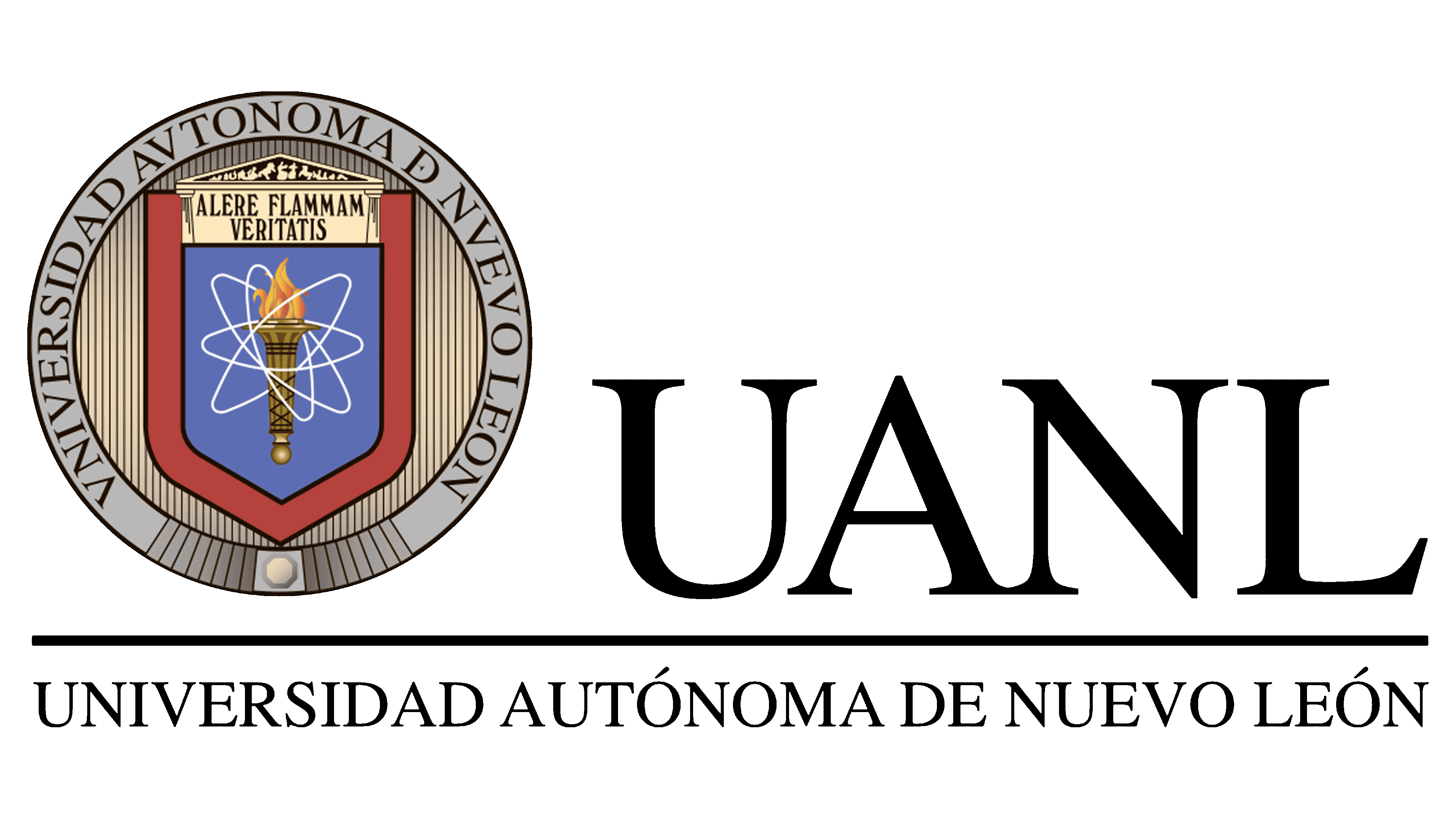
The UANL logo is rich in important elements. In the center are white rings resembling the planetary model of the atom. This is a hint that the university is engaged in scientific research. A burning torch is depicted in place of the core. It is often used emblematically as a symbol of progress, education, enlightenment, and knowledge.
The Autonomous University of Nuevo León traces its roots to 1824, when a law chair opened at the Seminary College of Monterrey. It became the first higher education institution in northeastern Mexico after a 1823 decree allowed the seminary to train specialists in civil and canon law.
The modern university project began on October 29, 1932, when representatives of law, medicine, pharmacy, civil studies, and teacher training asked the state congress to create a public university for Monterrey. The first Organic Law was approved on September 25, 1933, and the University of Nuevo León opened that day. Its first rector was Héctor González, chosen by the University Senate led by Pedro de Alba.
At launch, the university had 1,862 students and 218 teachers across law, medicine, engineering, chemistry, pharmacy, teacher training, technical schools, nursing, and midwifery. Political conflict soon interrupted its work. In 1934, the state dissolved the university and created a Socialist University committee. The institution reopened on September 13, 1943.
On November 26, 1952, Decree No. 146 granted self-government, allowing the Senate and Board of Trustees to elect rectors and deans. After student protests from 1967 to 1972, autonomy was formally secured in 1971 and was incorporated into the university’s name. UANL later kept ownership of Tigres, while Cemex took over team management in 1996. Its main academic rivals are UNAM and TEC de Monterrey. At the same time, UANL remains Mexico’s third-largest public university and the largest in the northeast.
Meaning and History
![]()
The Universidad Autónoma de Nuevo León has a long history, during which it has strengthened its position and expanded the number of destinations. Its roots can be traced to several institutions established in the 19th century. They include the Centers for Higher Education, the auditoriums of the Trident and Royal Collegiate Seminary, the School of Law, the Medical School, and the Citizens’ College.
Each of these institutions has contributed to the creation of the modern public university. UANL is proud of its origins and patrimony, which are reflected directly in its visual identity. The logo features a phrase that symbolizes the university’s motto: Alere Flammam Veritatis. Its essence is to encourage the flame of truth.
What is UANL?
UANL is the third largest public university in Mexico. It offers students a wide variety of fields of study and provides access to higher education degrees. The educational institution comprises the agricultural and medical campuses, the university campus, and the Mederos campus. Other municipalities have separate facilities (including Linares, Sabinas Hidalgo, and Marin).
This motto was established at the time of its foundation and remains relevant today. In addition, the logo includes other symbolic elements: a circular frame bearing the university’s name, a shield-like detail, an imitation of historical construction, and a torch set within a badge, resembling a scientific model of particle motion. Each piece symbolizes a connection to science and development.

The official founding date of the University of Mexico is 1933. In November of that year, the Honorable Congress of the state decided to create a new educational structure based on the Civic College, the School of Law, Medicine, and Pharmacy, and other educational structures. The new university took in more than 1,800 students and became one of the largest in its region.
A solid, bold logo with several defining details established the institution’s visual identity. In the center is an element resembling a shield. Inside it, there is a torch with a burning flame (the symbol of hope and development), a special sign in the form of a model of atomic motion (the symbol of science), as well as an image of an ancient construction with the university motto (the reference to the sources). All this is placed in a circle, on the edges of which is a strip with the institution’s name.
Two different font formats were chosen for the inscriptions. The name is written in strong, rigorous lines with serifs that show confidence. The motto is set in a font reminiscent of antiquity. This format was not chosen by chance, as this phrase conveys the core values that have remained unchanged since UANL’s creation. The coloring consists of different shades. The variety of colors favorably emphasizes many directions of the educational unit.
Font and Colors
The Universidad Autónoma de Nuevo León has an expressive logo that reflects its core values. It is written in straight lines with serifs but in different formats. The letters Alere Flammam Veritatis resemble ancient script, and the main inscription is set in the traditional serif style. Both variations harmonize with the overall concept and symbolize the unity of the past and the present.
The color palette consists of the following shades:
- golden (strength);
- blue (confidence);
- shades of grey and beige (tranquility);
- Burgundy (energy);
- black (status and elite).
Complementing the picture is the neutral white color in which the symbol of science is painted. This means that the institution is responsible for the learning process and demonstrates professionalism. Graduates are true experts in their field and proudly display their diplomas.