 MIT (Massachusetts Institute of Technology) Logo PNG
Microchips, chips, and modern developments in engineering and robotics are visible in the university’s visual mark. The MIT logo emphasizes research and publication, relegating student learning to a secondary role.
MIT: Brand overview
The Massachusetts Institute of Technology has several important missions. It educates students in 32 departments and also engages in cutting-edge research in science, economics, and engineering. Among its latest developments are four-legged robots that can do somersaults, airplanes with no moving parts, and a “smart” hydrogel pill that monitors stomach health for a month. In addition, MIT employees have developed a program that decodes human thoughts and created a system that helps artificial intelligence make plans. In 2016, they learned how to turn greenhouse gas into gasoline, restore the memory of patients with Alzheimer’s disease, and programmed E. coli to fight cancer. In 2017, university officials grew a light-emitting plant to replace desk lamps, and in 2021, they invented a mask to detect COVID-19 in the air.
Meaning and History
The Massachusetts Institute of Technology was founded in 1861. Financial difficulties did not prevent its development, so by the end of the XIX century, it acquired new buildings and educational programs. After moving to another campus, MIT began to reform its faculties. When World War II broke out, university officials developed several defense projects, including microwave radar. Faculty and students then embraced computer technology. They created one of the first video games and, at the same time, became the “progenitors” of hacker slang. Among the alumni of MIT are more than 90 Nobel laureates. Therefore, it is not surprising that it is recognized as the best educational institution in the world.
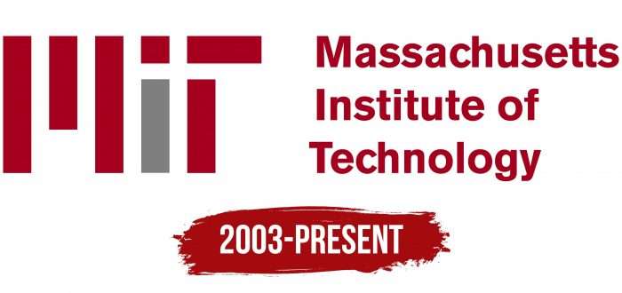
The graphic style of the institute is based on a system of historical symbols. It is based on the seal, which has been in use since 1864. It decorates certificates, diplomas, and other solemn documents. But it seemed to the representatives of the university that this was not enough, as all seals look the same. They decided to emphasize the visual identity of MIT with the help of a unique word mark, reflecting all spheres of the university’s activity. The design of the inscription was thought up by Matthew Carter in 2003. Now, the logo can be found on t-shirts, signs, social networks, and media.
What is MIT?
This is an abbreviation of the full name of the Massachusetts Institute of Technology (Massachusetts Institute of Technology). This educational institution was opened in 1861 in the city of Cambridge. Like many polytechnic universities in Europe, it is focused on engineering and applied sciences. This is hinted at by its motto, “Mind and Hand,” exalting the unity of mind and manual labor. MIT alumni include nearly a hundred Nobel laureates.
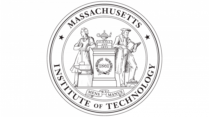
It is still unknown what guided the creators of the MIT seal. However, it is remarkably similar to a drawing from the cover of The Young Mechanic magazine in 1833. Perhaps it is a mere coincidence, as the designers tried to combine the symbols of industry and intelligence, which were embodied in the images of a blacksmith and a scientist. In this way, they immortalized the philosophy of William Barton Rogers, who believed that practice and knowledge are inseparable concepts and, therefore, cannot exist separately.
The design was recommended by the Committee on Printing, which was chaired by Rogers himself. This happened in 1863, and within a year, the seal became official. In 1965, it was engraved and began to be used to mark documents. This service cost the university $258 dollars. Since then, the graphic mark has never changed, except for unofficial versions. It looks the same as it did in the 18th century: it consists of several concentric circles with inscriptions and patterns.
In the center is a pedestal with a lamp – a symbol of knowledge. There is also a laurel wreath, symbolizing victory, and the number “1861” – the year of the founding of the Massachusetts Institute of Technology. The lamp stands on three volumes labeled “SCIENCE AND ARTS.” Below, beneath the pedestal, is another phrase: “MENS ET MANUS.” The Latin motto of the university is traditionally written on an unrolled scroll. Like most printed elements, it signifies the link between study and practice. The images of a scholar and a master carry the same meaning. One of them is reading a thick book, and the other is holding a large blacksmith’s hammer placed on an anvil.
The drawing frames a ring with the full name of the university. The first word is written at the top and is separated at the edges by two black five-pointed stars. Below it is the phrase “INSTITUTE OF TECHNOLOGIES”. Both parts are typed in a serif font – thin and long.
The MIT emblem did not begin to be used until 2003 – 142 years after the university was founded. However, the unique lettering badge has become more famous than the seal because of its customized design. It was created by typographer Matthew Carter, who was tasked with redesigning MIT’s visual identity.
The branding guidelines state that the stylized rectangular text is a graphic element and should blend in with the full name of the institution. The letters “MIT” are too abstract for people unfamiliar with the university to decipher. The dark red letter “M” has three vertical stripes: one short (in the middle) and two long (on the edges). The letter “I” has a burgundy rectangle (bottom) and a gray square (top) instead of a dot. Two perpendicular lines – both red – form the final “T”.
There are restrictions on the use of the MIT logo. First of all, it must remain visible. This applies to both scale and palette. In addition, the icon is always complemented by the inscription “Massachusetts Institute of Technology,” which is divided into three lines. Designer Matthew Carter chose a geometric sans-serif font for the text.
MIT Engineers Logo
The athletic department of the Massachusetts Institute of Technology is called the MIT Engineers. It is a member of the NCAA, where it competes in Division III. It has 22 wins in team championships and 42 in individual championships. The athletes are currently ranked second among all divisions and lead their division in academic graduation rates. They also compete in the NEWMAC, United Volleyball Conference, EAWRC, CWPA, and EARC. The university’s structure includes teams in hockey, water polo, volleyball, rowing, alpine skiing, gymnastics, golf, and other athletic disciplines.
The MIT engineers’ emblem features a beaver. It was approved as a mascot in 1914 because of its engineering and construction skills, perseverance, dedication, hard work, and technology. It was initiated by a group of alumni, and Richard McLaurin endorsed their proposal. “Patron” athletes were named TIM, an acronym for Massachusetts Institute of Technology (MIT) spelled backward.
The beaver is depicted floating in a hypothetical aquatic environment, as indicated by the waves emanating from it. They take the form of two semicircles joined at the center. In the center, between the thin lines, is a shapeless gray spot. Behind him – an animal with red eyes from anger. The beaver has a menacing look, staring at what lies ahead. The body is black with a reflection on the back, and the tail with a grid pattern. Below is the name of the athletic department. The first part (MIT) is typed in large crimson font and the second half (Engineers) – in small gray letters.
MIT: Interesting Facts
The Massachusetts Institute of Technology (MIT), located in Cambridge, Massachusetts, is a top university known for leading the way in science, technology, engineering, and math (STEM).
- Start and Goals: In 1861, MIT was set up to advance science and technology and prepare students to contribute significantly to industry and society during the Industrial Revolution in America.
- Hacker Culture: MIT is known for its unique “hacker” culture, where students solve problems creatively, devise smart engineering solutions, and pull off elaborate, funny pranks.
- Nobel Laureates: More than 90 Nobel Prizes have been awarded to MIT’s faculty, staff, and alumni, showing its role in groundbreaking research and innovation.
- MIT Media Lab: Since 1985, the MIT Media Lab has been at the forefront of technology, media, science, art, and design, leading to innovations like wearable computing and digital currencies.
- OpenCourseWare (OCW): In 2001, MIT made a wide range of course materials available online for free, a groundbreaking step in the open education movement.
- The Infinite Corridor: This 825-foot-long hallway aligns with the sun twice a year in an event called “MIThenge,” attracting many to see this solar phenomenon.
- Entrepreneurship: MIT encourages MIT alumni to start new businesses and startups, which generate massive revenues comparable to those of some of the world’s largest economies.
- Pop Culture: MIT often appears in films, TV shows, and books as a symbol of scientific excellence. For example, it’s mentioned in “Good Will Hunting” and “Iron Man.”
- Major Contributions: MIT has contributed to important discoveries and inventions, including radar technology during World War II, the concept of the expanding universe, and the invention of computer core memory.
- Sustainability Efforts: MIT works on sustainability and climate change challenges, with initiatives like the MIT Energy Initiative aiming to find new solutions to energy problems.
MIT’s impact is global. It influences technology, education, and society and attracts some of the world’s brightest minds to tackle big challenges.
Font and Colors
The symbolism of the university reflects its focus on both knowledge transfer and practical activity. This is evidenced by the inscriptions on the Seal and the contrasting images of a scientist and a blacksmith. The emblem with abstract letters represents the innovative side of MIT. The abbreviation looks obscure but technological: each quadrilateral resembles a chip element.
Since not everyone knows what the word “MIT” means, it has to be combined with the text “Massachusetts Institute of Technology.” Traditionally, simple typography is used for the inscription: a bold sans serif font with strokes of approximately equal thickness. Its exact name is unknown, but it is very similar to Gothic 725 Black by Tilde and Craft Gothic Bold and Foundation Sans Bold by FontSite Inc. This font was designed by Matthew Carter, who created the logo from scratch.
The lettering on the Seal, on the other hand, is in high-contrast Antiqua. The edges of the letters are decorated with long and thin serifs. This design was proposed back in the 1860s when the university emerged, and it needed its own symbol. So, it corresponds to the style of that time.
MIT has no official font, but there is an approved color scheme. The palette is based on burgundy (# 9D2235), dark gray (# 898D8D), and light gray (# C7C9C7) colors. White, black, or dark red printing is acceptable, depending on the background. The logo should be two-color to highlight the bottom of the letter “I.” Combinations of gray with black or red and black with red are acceptable.
MIT color codes
| Vivid Burgundy | Hex color: | #9d2235 |
|---|---|---|
| RGB: | 157 34 53 | |
| CMYK: | 0 78 66 36 | |
| Pantone: | PMS 187 C |
| Aluminium | Hex color: | #898d8d |
|---|---|---|
| RGB: | 137 141 141 | |
| CMYK: | 3 0 0 45 | |
| Pantone: | PMS 877 C |
| Neon Silver | Hex color: | #c7c9c7 |
|---|---|---|
| RGB: | 199 201 199 | |
| CMYK: | 1 0 1 21 | |
| Pantone: | PMS 420 C |
FAQ
What does the MIT logo stand for?
The stylized abbreviation MIT, consisting of seven quadrilaterals of different sizes, denotes the innovation and technological orientation of the educational institution. Each geometric figure resembles an element of a microchip. It is also a symbol of external simplicity, which hides a deep meaning.
What is the MIT logo?
The logo of the Massachusetts Institute of Technology contains a stylized inscription “MIT.” The first letter consists of three vertical rectangles. The letter “i” that follows it looks like a rectangle with a square at the top. The letter “t” consists of two perpendicular quadrangles. All figures are burgundy in color except for the bottom part of the letter “i.” The emblem should be completed with the full name of the university.
What font is the emblem of the Massachusetts Institute of Technology printed in?
The phrase “Massachusetts Institute of Technology,” which is part of the emblem, is written in bold sans-serif font. It has much in common with Foundation Sans Bold, Craft Gothic Bold, and Gothic 725 Black but is not identical to them. The letters are rounded and narrowly spaced.
