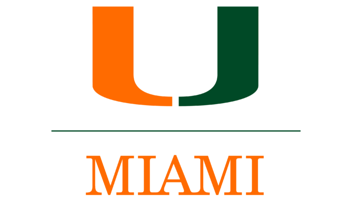
The University of Miami logo was inspired by the Miami Hurricanes sports symbol. The letter “U,” made up of two multicolored slices, represents the abbreviated name of the institution. This university-wide badge is incredibly popular in South Florida and beyond.
University of Miami: Brand overview
The University of Miami’s full name is often shortened to The U, as its split U logo is one of the most recognizable symbols in South Florida. The history of the mark is as storied as that of the institution, which originated in 1925 in Coral Gables. The logo and seal represent 12 separate schools and colleges. In addition, the letter “U” inspires the Miami Hurricanes intercollegiate sports teams to win. As of 2021, the university’s baseball players have won four national championships, and the soccer players have won five.
Meaning and History
When the University of Miami was founded, the “U” brand did not yet exist. At one time, real estate developer George Edgar Merrick donated money and land so that a group of enthusiasts could open an educational institution. That happened in 1925. A year later, Hurricane Great Miami ruined all plans. High water and high winds damaged the buildings and led to the beginning of the Great Depression. So, for the next 15 years, UM was forced to survive the recession. The campus remained unfinished, and classes were held in a nearby hotel. Students went door-to-door begging to raise money for the university.
Gradually, the university recovered and even went out on a high, becoming one of the top ten employers in Miami-Dade County. The university has special national status in areas such as music, communications, medicine, oceanology, law, engineering, and business. All units share a common visual identity represented by a seal and logo.
Until 2009, the modern logo of the University of Miami did not exist. It was adopted based on the results of a study that included alumni surveys and focus groups. University leaders wanted to know if the symbol of sports teams (green-orange letter “U”) could be used as a university-wide mark. The result was positive: it turned out that the letter “U” connects all units of the university and could become the basis of a unified graphic identity.
This mark has existed since 1973, but for a long time, it was used only for sports teams. It was created by artist Bill Bodenhamer and UM alumnus Julian Cole, who intended the “U” to stand for “University.” Now, the letter, divided into two parts, is the centerpiece of the entire university’s identity. Its green-colored right side resembles the capital letter “J,” while the left half is colored orange and looks like a mirror image of the “J.”
The “U” symbol is never used alone. It is necessarily combined with the inscription “UNIVERSITY OF MIAMI,” which occupies two lines. On the top is the green word “UNIVERSITY,” and on the bottom is the orange “OF MIAMI.” A long horizontal line is drawn below the phrase. This component is no less important than the name of the institution and the U-shaped sign. It separates the text part of the logo from the graphic part.
The Seal
The official UM stamp is placed on official documents such as diplomas and contracts. It appeared a long time ago and, at first, was black and white. Now, the colored version is better known. It represents a light blue circle with a white border outlined on both sides with black contours. On the ring, there are inscriptions “GREAT SEAL UNIVERSITY OF MIAMI,” “CORAL GABLES FLORIDA,” and “1925”.
Inside the circle are vertically arranged the following elements: a brown palm tree with green leaves against a yellow sun (above), a triangular shield of many colors (in the middle), and a yellow ribbon with the Latin motto “Magna Est Veritas” (below), affirming the greatness of truth.
The shield is divided into three diagonal fragments: white, green, and yellow. A black key is depicted in the lower left corner and a green bowl with red tongues of fire in the upper right corner. The central part shows an open book on which the phrase “INVESTIGATIO CONSERVATIO ET DISSEMINATIO SCIENTIAE” is written in black and white.
Font and Colors
The most important element of the University of Miami’s identity is the letter “U,” divided into two parts. This is a recognizable graphic sign that was previously used only by sports teams. It became so popular that it was adopted as the university-wide logo.
For the text “UNIVERSITY OF MIAMI,” Antiqua Century Schoolbook 8T (Bitstream), one of the main fonts of the institution, was chosen. The lettering on the seal is in a similar style. Miami orange (#F47321) and Miami green (#005030) dominate the color scheme of the visual symbols.
University of Miami color codes
| Orange | Hex color: | #f47321 |
|---|---|---|
| RGB: | 244 115 33 | |
| CMYK: | 0 53 87 4 | |
| Pantone: | PMS 1585 C |
| Green | Hex color: | #005030 |
|---|---|---|
| RGB: | 0 80 48 | |
| CMYK: | 100 0 40 69 | |
| Pantone: | PMS 7727 C |


