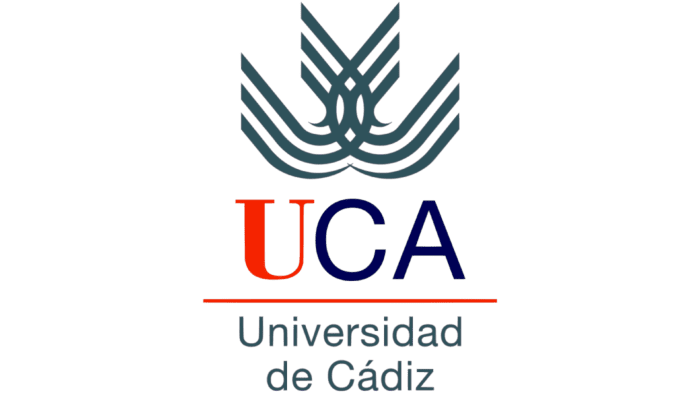
A distinctive feature of Universidad de Cadiz’s identity is the mandatory use of both the full and abbreviated visual versions. The primary focus of the UCA logo is on the university’s location, which the institution takes pride in, showcasing the convergence of the Atlantic and the Mediterranean and supporting unification and integration.
UCA: Brand overview
| Founded: | 1979 |
| Headquarters: | Cadiz, Spain |
| Website: | uca.es |
Meaning and History
The university’s logo follows the traditions of most universities; hence, it contains both abbreviated and full names. Of course, the most important part is the lower one. It consists of two lines: “Universidad” on the first and “de Cadiz” on the second. Above them is a thin line separating the abbreviation “UCA,” where the letters “C” and “A” are highlighted in color.
The abbreviated version is only used in conjunction with the full one, as confusion in its identification outside the university is not ruled out. The focus is on the location of the educational institution – the city of Cadiz, emphasizing the university’s pride in belonging to this region. The same applies to the brand name and other symbols.
What is UCA?
UCA is an acronym denoting the University of Cadiz. This educational institution first opened its doors to students in 1979. It comprises four campuses located in different cities of the Spanish province of Cadiz. The university’s rich history is reflected in various aspects of its scientific activity. UCA adheres to high educational standards, and its graduates occupy prominent positions in Spain and abroad.
Some versions have a slightly different grouping of elements. The expanded names “Universidad” and “de Cadiz” are located on the left, and in front of it is a graphic emblem with the abbreviation “UCA.”
In 2019, for its 40th anniversary, the university introduced an updated logo dedicated to the round date. To create something original and festive, the developers highlighted the number 40 in the brand palette. Next to it, they placed the phrase in Spanish, “Años 1979 – 2019”, and even lower – a slogan. This logo was used for a limited time and remained on the official web resource of the institution.
UCA: Interesting Facts
The University of Cádiz (UCA) is in Cádiz, a historic place in Andalusia, Spain. It’s a school with a lot of history and good courses.
- Love for the Ocean: UCA teaches about the ocean well. They have courses on ocean science, how to build ships, and studying the sea because they’re right by the water.
- Started in 1979: UCA officially started in 1979, but its roots go back much further. There was even a Royal Naval College in the 1700s.
- Lots of Courses: They teach all kinds of things here, from health to engineering, and you can study for a bachelor’s, master’s, or doctorate.
- Friends Around the World: UCA works with schools and research places worldwide, making many international friends.
- Campuses Everywhere: UCA campuses are in several cities around Cádiz. They’re part of city life and help out in the local areas.
- Green School: UCA cares about the planet. They’re working on being greener, like using less energy and teaching everyone about the environment.
- Rich Culture: Being in Cádiz means UCA is surrounded by much of Spain’s history and culture, which makes studying here extra special.
- Top-Notch Research: UCA is known for its excellent research, especially on the ocean, energy, history, and society. It has special research centers for these topics.
- Learn Languages: With students from all over Spain and Spain, UCA is a great place to learn Spanish and other languages.
- Fun Campus Life: Being a student here is fun. There are many activities, and because it’s near the beach, you can also do water sports and hang out on the sand.
UCA is not just a place to learn; it’s part of a big community. It’s known for its ocean studies, care for the environment, and making friends worldwide.
Font and Colors
The textual part is complemented by a graphic element consisting of several intertwined lines of curved shape. Each of them has three stripes. This sign implies the Atlantic and Mediterranean convergence, symbolizing the province of Cadiz. It also supports the idea of unifying and integrating people, the university, and the province it is located in.
The main palette of the higher education institution is built on a combination of three colors: orange-red (letter “U” and dash), blue (symbols “CA”), and gray (full name and graphic image). Sometimes, black is used instead of a white background, but the original composition is always maintained. The university’s emblem has two fonts: Bodoni Bold and Helvetica New Roman.
In conclusion, this university stands out with its individual symbolism, like many others. This helps it remain a well-recognized structure among other leaders in Spain’s education system.
UCA color codes
| Dark Slate Gray | Hex color: | #2f525b |
|---|---|---|
| RGB: | 47 82 91 | |
| CMYK: | 48 10 0 64 | |
| Pantone: | PMS 7476 C |
| Candy apple red | Hex color: | #f52300 |
|---|---|---|
| RGB: | 227 212 173 | |
| CMYK: | 0 4 20 7 | |
| Pantone: | PMS 172 C |
| Midnight blue | Hex color: | #000155 |
|---|---|---|
| RGB: | 63 194 204 | |
| CMYK: | 60 0 23 0 | |
| Pantone: | PMS 2755 C |


