Supermarkets captivate consumers with their rich assortment and pleasant prices. According to the emblem, promotions are constantly held here to attract new visitors. The Kroger logo symbolizes a business approach and customer care.
Kroger: Brand overview
Meaning and History
At the end of the 19th century, one in ten children of the Kroger family, 23-year-old Bernard, invested his accumulated $ 372 in opening a grocery store. He directed it himself, experimenting with marketing products produced by his own company. A year later (1884), a young entrepreneur founded a second retail outlet. In 1902, he registered a chain called the Kroger Grocery and Baking Company, which included 40 stores that brought in $ 1.75 million annually. Moreover, it was the first universal structure with a personal bakery.
In 1916, the company expanded with the first self-service stores. In the 30s of the 20th century, she began to test products and monitor their quality before sending them to the counter for the first time in the history of commerce. Another innovation this seller introduced was related to car parks: they were located right under the supermarket walls.
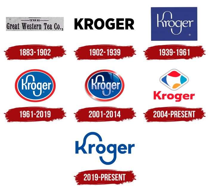
So, the Kroger company gradually began to win the attention of buyers, expand by acquiring competitors, and open new outlets. It also has many bakeries, dairy farms, factories, and enterprises that produce grocery goods. They all worked under the same logo and represented an individual trademark. In total, there are seven logos in its history.
What is Kroger?
This is a supermarket chain that appeared in the United States in 1883. It was founded in Cincinnati, Ohio State. Kroger is now the second-largest retailer in the country. He has over 2,500 stores.
1883 – 1902
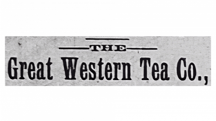
Initially, the individual symbolism consisted of black lettering “Great Western Tea Co” with miniature serifs positioned against a light background—a horizontal rectangle. Above the store’s name was a barely noticeable article, “the,” decorated with thin lines on both sides.
1902 – 1939
The boss chose a different logo to instill confidence in shoppers and highlight the seriousness of his chain. It was businesslike and simple, containing no unnecessary details—only a large, wide inscription. The word “Kroger” was in bold uppercase. The letters were chopped, strict, and even located at a minimum distance from each other.
1939 – 1961
Having gained enough fame and becoming recognizable, the supermarket chain carried out a redesign, after which it acquired a creative logo. It consisted of a single inscription – the names of the stores. To give it some originality, the developers extended the upper segment of the uppercase “K” and the lower part of the lowercase “g.” The result is two arches that almost reach the letter “o.” The “e” had a beveled right side (it was slightly cut off), and the “r” looked more like an uppercase “Y.” The background of the word “Kroger” was a dark purple rectangle of regular shape.
1961 – 2019
In the next version, the developers replaced purple with blue and removed the rectangle, using an oval with a red border instead. They also changed the font to a more austere style. Therefore, the letters in the logo of those years were even, except the “K” and “g,” which remained elongated.
2001 – 2014
During this period, the logo received a mirror effect that made it three-dimensional. This impression was due to the glare and the “metalized” texture, which seemed to play in the sun, reflecting part of the window.
2004 – today
In parallel with the base logo, an adjacent one appeared. It is still used in branded gas stations and looks like a diamond-shaped icon with abstraction. Inside the geometric figure, red, blue, yellow, and light blue spots of indeterminate configuration. A light gray line runs along the edge of the icon. The name of the trade and commercial network is located under the diamond. It has a completely different font – no elongated letters. Both “r” have exactly cut heads, while “g” has the original top protrusion, which also has a straight cut.
2019 – today
In 2019, the retail chain returned to its previous emblem—with elongated elements at the “K” and “g.” To modernize the logo, the designers corrected it by lengthening the curves. To do this, they made the inter-letter space wider than before. Thanks to this technique, the curved elements received a clear arched shape.
Kroger: Interesting Facts
Kroger was founded in 1883 in Cincinnati, Ohio, and is now one of the biggest supermarket chains in the U.S.
- Early Start: Kroger was one of the first supermarkets. Unlike other stores at the time, Bernard Kroger used his savings to start a store that sold a wide range of items.
- Self-Service Shopping: It was one of the first stores where customers could pick their items, changing how people shopped.
- Tech-savvy: Kroger quickly adopted new technologies like electronic scanners and computer systems to improve shopping and inventory management.
- Making Its Products: Kroger makes many of the products it sells, from food to jewelry, making it one of the biggest food makers in the U.S.
- Kroger Marketplace: Kroger stores now sell groceries, furniture, electronics, toys, and more, making shopping more convenient.
- Going Green: Kroger is working on being more environmentally friendly by reducing waste, using energy wisely, and offering sustainable seafood.
- Helping the Community: Through its Zero Hunger | Zero Waste Foundation, Kroger aims to stop hunger and reduce waste by 2025.
- Innovative Services: To make shopping easier, Kroger has added online ordering, pickup, delivery, and smart shopping carts.
- Health Services: Kroger offers health services in many stores, such as pharmacies, clinics, vaccinations, and health advice.
- Growing Bigger: Kroger has bought many other stores, including Fred Meyer and Harris Teeter, which helped it grow across the U.S.
Kroger has come a long way from its first store to becoming a major name in the supermarket world, thanks to its innovation, focus on customers, and commitment to the community and the environment.
Font and Colors
The company has focused on the name, which is more important for trade signs than a separate graphic element. Experiments with writing led to the emergence of two curved letters, which serve as a graphic design.
The logo uses a typeface called ITC Avant Garde Gothic Std Bold with modified “K” and “g.” The corporate palette consists of white and blue # 084999. It is somewhere between cobalt and cornflower blue. It is allowed to place white letters on a blue background in the logo and blue letters on a white one.
FAQ
What is the Kroger slogan?
The slogan “Fresh for Everyone” shows what the brand strives to offer. It tells us that the brand provides fresh, high-quality products everyone can afford. It reflects a belief in the importance of everyone having access to fresh food. This demonstrates a desire to include everyone and care about the well-being of all customers.
What is the Kroger symbol?
In September 2019, the brand introduced a new “Fresh Food Basket” logo. This symbol features a shopping cart that looks like it is made from citrus slices. This design emphasizes that the brand offers fresh and quality products. The citrus motif strongly symbolizes the brand’s healthy choices in its stores.
What is the meaning of the Kroger logo?
The logo includes a smiling face made up of the letters “o” and “g” in the name, with the “g” curving to form a smile. This simple, thoughtful design will make customers feel welcome and valued. It reflects the brand’s goal to create a friendly and enjoyable shopping experience, demonstrating its desire to interact with customers positively.
What is the Kroger brand?
The brand is a supermarket chain in the USA that sells various products, including prepared foods, seafood, meat, beer, and baked goods. It is known for its quality and wide selection, satisfying the daily needs of millions of customers. The stores provide a convenient and affordable one-stop shopping experience, making them a favorite among shoppers who value quality and affordability in grocery shopping.
What is the Kroger logo supposed to be?
The logo is written in a simple and bold font with distinctive touches. It includes curved “K” and “g” extensions—the “K” extends upward, and the “g” curves outward. These design elements help the logo stand out and become memorable.
Did Kroger change their logo?
2019, the brand updated its logo, bringing back the emblem style that was first used in 1939. They introduced a new tagline that aligns better with the brand’s values and vision. This change aimed to modernize the brand’s appearance while maintaining its historical roots and traditions in a competitive grocery market.
