


![]() Sprouts Logo PNG
Sprouts Logo PNG
The Sprouts logo symbolizes closeness to nature because the chain primarily sells natural and organic products. Additionally, the stylish sign demonstrates the brand’s commitment to developing and adhering to modern design standards.
For the Sprouts brand, the logo uses the full name, Sprouts Farmers Market, rather than the abbreviated name. This well-known trading network in America operates across 23 states, providing its services to its customers. Its supermarkets employ over 35,000 people, and each store averages about 30,000 square pounds. That is, it is a large-scale system for trading natural and organic farm products. It also offers a variety of household items, body care products, baked goods, deli items, seafood, nutritional supplements, and vitamins. The time of its occurrence is 2002. The founder is the Boney family. The head office is located in Phoenix, Arizona.
The roots of this company date back to the first half of the 20th century, when merchant Henry Boney opened a small counter in the California city of La Mesa. There, he sold fresh fruit in the open air. This event took place in 1943. Then, in 1969, the merchant’s sons founded Boney’s Market, bringing together the family’s grocery stores. The result is a large covered area. The brothers named the building after their father, Henry. In 2002, representatives of the Boney dynasty created a large shopping center, Sprouts Farmers Market, in Chandler, Arizona.
In 2011, Apollo Global Management merged Sprouts, Henry’s, and Sun Harvest into a single entity. A year later, she added the Sunflower chain, also known as Sprouts. At the same time, the trading giant lost its status as a family firm and became a public corporation. Her work went very well, so in 2018 and 2019, Fortune magazine included her in its list of the World’s Most Admired Companies.
Meaning and History
![]()
The trade network logo changed at the most important moments of its history. The first stage, of course, is the foundation, and the second is consolidation. Although the difference between them is about 20 years, the designers have retained the basic visual identity style, adhering to the principle of naturalness. Nature is conveyed through the palette of emblems, lines, and characteristic elements.
What is Sprouts?
It is an American supermarket chain that offers a variety of products, including agricultural goods, nutritional supplements, personal care items, household essentials, and seafood. The main emphasis is on the naturalness of the products offered, so the company’s full name is Sprouts Farmers Market. It was formed in 2002 and currently operates in 23 states, providing its services. Its founders are representatives of the Boney family. The headquarters is located in Phoenix, Arizona.
2002 – 2020
![]()
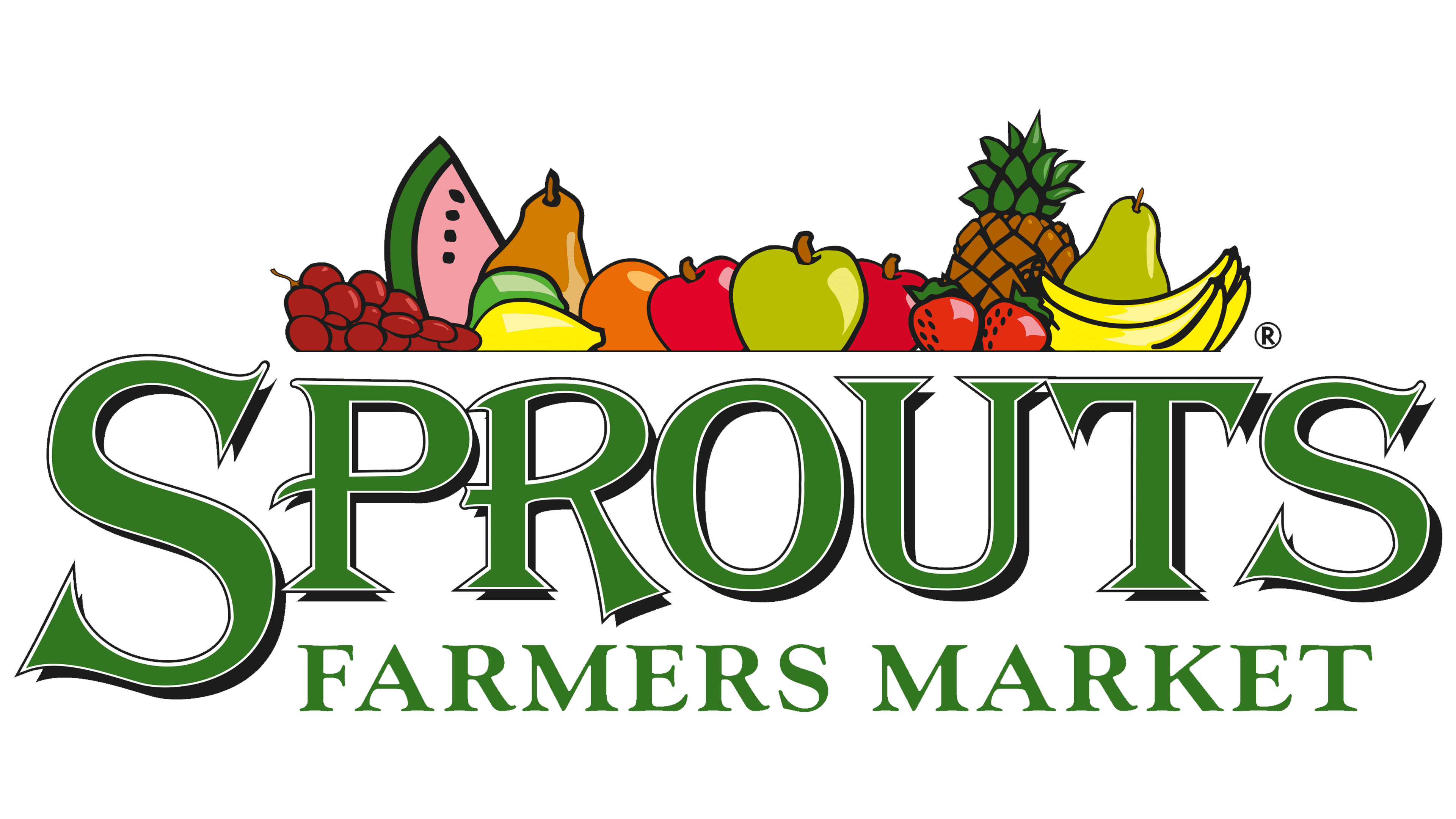
The debut emblem consisted of a counter with fresh fruit. They were bright and colorful, which suggested their juiciness and appetizing qualities. This is exactly what merchants were striving for when they placed such a sign in their supermarkets. Among the healthy goodies were watermelon, grapes, apples, pineapple, bananas, plums, lemons, pears, and other fruits.
Below, in large characters, was the word “Sprouts.” It was done in an uneven font with sharp serifs. The difference in the glyphs’ heights emphasized this unevenness. For example, the smallest sign was “O,” the largest was “S,” and “R” had its right leg longer than its left. The designers typed the second part of the name in small letters of a similar style. The stitches have been left justified, starting with “P.” All elements were in a horizontal ellipse of a light gray color.
2020 – today
![]()
Now the Sprouts retail chain has a minimalistic logo. This is part of the previous version, but without the fruit image. This redesign is associated with a significant expansion of the range of goods; now, you can find dairy and grain products, meat, fish, pastries, and much more. The designers transformed the graphic element into a miniature leaf within the letter “O,” resembling a curved stem. It has a sharp end and a lateral “process.” The rest of the symbols are classically printed, even antique. The inscription on the top line is large, while the one on the bottom is small.
Font and Colors
The identity of retail supermarkets is associated with plants and agriculture. This is evidenced by the color and shape of the letters, as well as additional details in the form of fruits, leaves, and stems. A similar concept can be traced in both versions. The palette is a calm, pastel spectrum. The primary difference between the two emblems lies in the shapes of the glyphs and the absence of an oval background.
The Sprouts logo consists of inscriptions made in Antiqua. In the first case, this is an individual set of glyphs; in the second case, the classic font Minion Pro Condensed Caption Bold, developed by Adobe. The phrase in the bottom row is typed in a typeface reminiscent of Capitolina Semi Bold by Typefolio Digital Foundry.
The colors in the emblem are restrained, powdery for the inscriptions, and bright and juicy for the fruits. Pastel green #2a7839 is predominant; light green #6cbd47 is additional. Additionally, the first logo features red, yellow, brown, orange, and purple.