


Tourisme Abitibi-Témiscamingue invited travelers to see the long drive as part of the experience when LG2 introduced a new identity in spring 2026. The Canadian agency built the region’s identity around a willingness to explore unfamiliar routes. In the logo, the first letters of Abitibi and Témiscamingue form an evergreen tree.
Established in 1978, the association represents a region in northwestern Quebec. It works with local organizations and businesses to welcome visitors and develop tourism. The update is intended to unify the region’s communications and present it as a place to visit, live, and do business. According to LG2, low awareness and established stereotypes had limited interest among tourists, prospective residents, and investors.
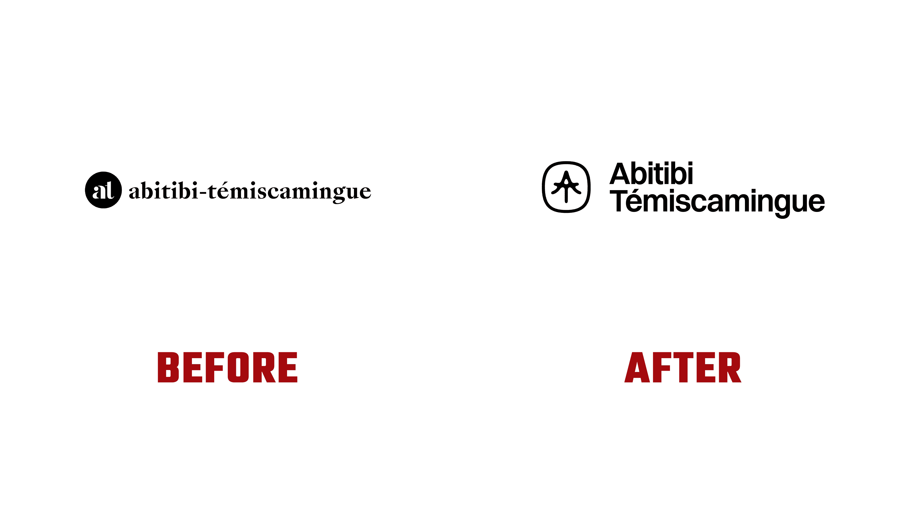
The agency felt the previous identity did little to reflect the region’s history and natural surroundings. The new idea was expressed in “Nos richesses se méritent,” meaning “Our treasures must be earned.” The phrase connects the rewards of a visit with a willingness to travel farther, explore, and leave familiar routes behind. The brand speaks to outdoor enthusiasts, cultural explorers, and people looking to settle or start a business. For residents, it aims to nurture a sense of belonging to the region.
The monogram joins the “A” from Abitibi and the “T” from Témiscamingue through shared strokes. The sloping sides of the “A” form the treetop, with branches spreading toward the base. The vertical stroke of the “T” extends downward into a trunk, while its crossbar runs through the middle of the design. A small opening near the top helps distinguish the “A.” The region’s initials and the forest imagery come together in a compact symbol.
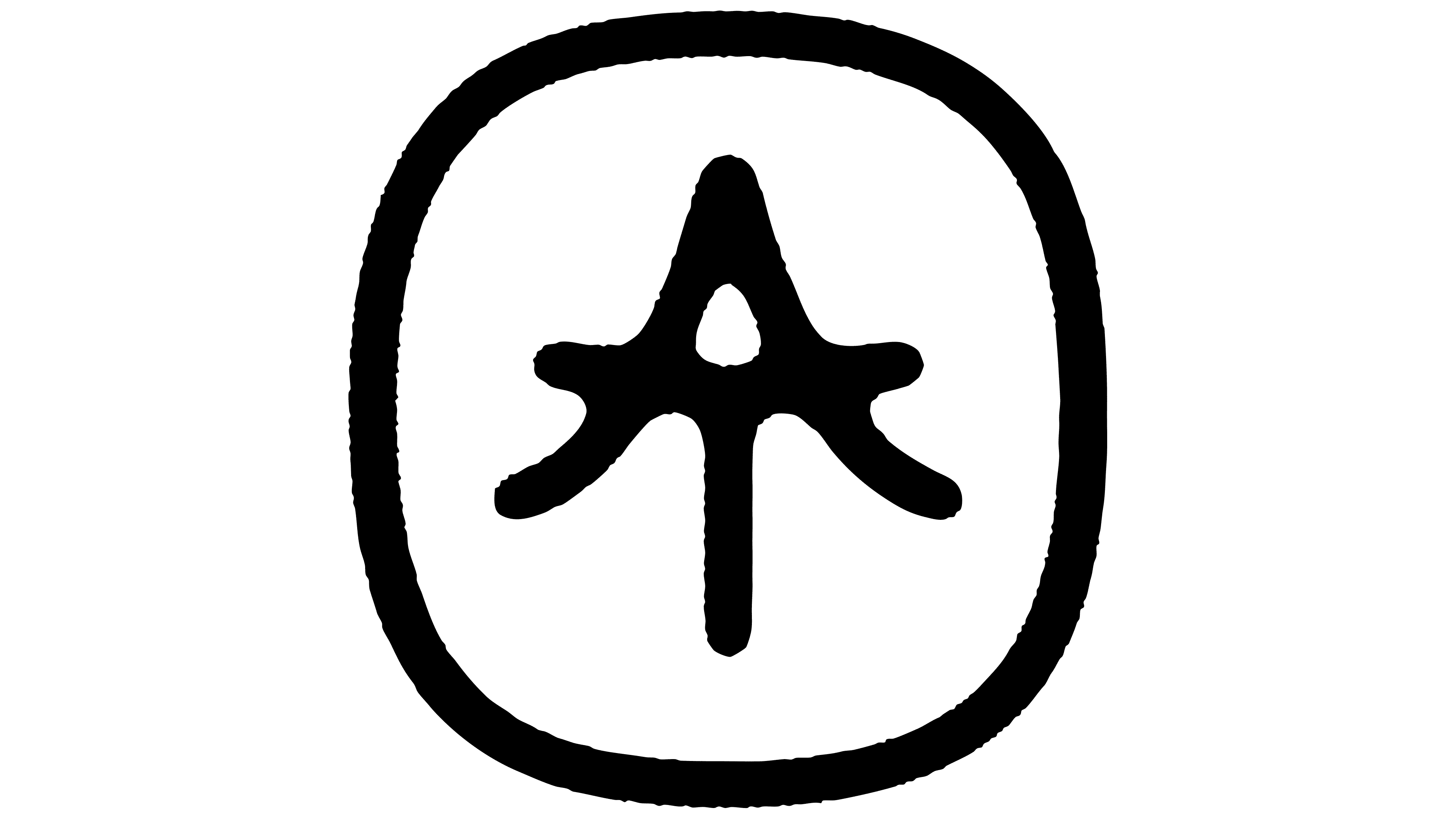
A thick frame with rounded corners surrounds the tree. The stroke endings are rounded, the branches curve slightly, and the uneven edges resemble a printed impression. The texture gives the emblem the appearance of an object worn by time. LG2 Creative Director Élise Cropsal connects it to a desire to convey the terrain’s ruggedness and portray the region beyond polished tourism imagery.
The wordmark uses the sans-serif typeface, Switzer. In the vertical version, Abitibi sits above Témiscamingue, with both lines centered beneath the monogram. Initial capitals are followed by lowercase letters, and the French accent remains above the “é.” The lettering’s even strokes contrast with the emblem’s textured edges. In an alternate version, a thick orange outline surrounds the name, following the overall shape of the two lines.
Orange is the identity’s primary color. LG2 connected it to sunsets and clothing worn for hunting, fishing, and mining work. Green, blue, and brown complement it with nature-inspired colors. The combination references both visitors’ experiences and residents’ everyday activities.
Montreal’s Society for Arts and Technology unveiled the identity. Supporting patterns were developed from the contours of the region’s land, lakes, and waterways. They appear on flags, patches, and printed materials, with versions created for wayfinding, souvenirs, and animation. The association has introduced the new identity across its main materials and website.