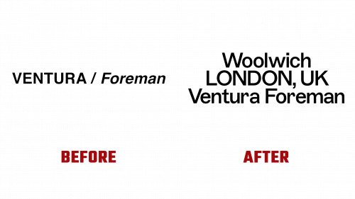
Ventura Foreman, a husband and wife team specializing in workwear, has launched a new brand identity designed by Studio Blackburn. Based in Woolwich, South London, Robert Ventura and Sophie Foreman create workwear in-house for clients like Paul Smith, Matches Fashion, Norman’s Café, Nana O’s, and Michelin-starred restaurant Trinity in Clapham.
The rebranding aimed to capture the essence of Ventura Foreman’s brand. The new identity is clean, simple, and familiar but with a hint of something unique. This is reflected in the choice of typography and the way labels are attached.
The selected typeface, ABC Marfa Medium by Dinamo®, is a sturdy, utilitarian font with subtle quirks. Unique characteristics, like the slightly off-kilter letters “t” and “r,” add personality without losing the utilitarian feel.
The previous logo suggested a divided partnership, with each partner working independently. The new logo balances the partners and prominently features their South London location, emphasizing it as a key part of the brand’s identity. The logo’s pyramid-like structure adds visual appeal and balance.
A notable feature of the new identity is the absence of a fixed color palette. Instead, it uses paper stocks and colors to complement the clothing range and available fabrics. This approach ensures the brand remains flexible and adaptive. Hits of color are added for print collateral, postage labels, and other branded assets when needed.
The logo itself is a sans-serif design applied consistently across all brand materials. The repetition of the logo in the same composition, with supporting typography always typeset in the same size, leading, and centered alignment, creates a cohesive visual identity. This disciplined approach ensures a strong, utilitarian feel without unnecessary decoration.
The brand identity includes an unexpected elegance reminiscent of blue-collar workwear but with an upscale twist. This is evident in the quality of the workwear uniforms, appealing to design-conscious individuals. The photography used in the branding showcases the rich fabrics and craftsmanship, adding a touch of humor and personality.
Overall, Ventura Foreman’s new identity is a well-crafted example of modern branding. It communicates the brand’s core values while introducing unique elements. Combining a quirky typeface, flexible color application, and consistent logo usage creates a standout brand in the workwear market.
The rebranding strengthens Ventura Foreman’s visual identity and reinforces its position as a leading workwear provider with a distinct brand presence.


