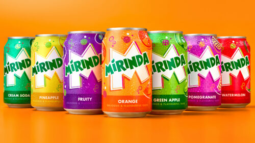
PepsiCo’s Mirinda has joined the bandwagon of beverage brands undergoing a visual transformation. However, despite its vibrant colors and revamped logo, the rebrand leaves something to be desired, proving that not every makeover results in an improved final product.
Accompanying the revamped logo Mirinda is an array of vibrant color palettes that represent Mirinda’s impressive range of over 50 flavors. Twirling spheres, fizzing bubbles, and zesty fruit illustrations attempt to create a playful, energetic atmosphere that mirrors the variety of the product. The colors and illustrations are indeed eye-catching, but they raise the question—do they successfully represent the brand and its offerings?
Mauro Porcini, SVP and Chief Design Officer of PepsiCo, expressed his intention behind the redesign. He explained, “We wanted to create a vibrant, energetic look and feel that could capture the spirit of Mirinda. So, PepsiCo Design and Innovation crafted an identity full of contrasting colors and bespoke illustrations that embody the brand’s playful nature.”
Porcini also emphasized the importance of maintaining brand consistency across all platforms, both digital and physical. The intention was to ensure that Mirinda’s wide variety of flavors was celebrated visually, offering fans the same level of excitement and distinction across all brand touchpoints.
However, while the rebrand is visually engaging, it doesn’t quite deliver the punch you’d expect. The abundance of contrasting colors and visuals could potentially overwhelm rather than intrigue the audience. Additionally, the decision to place so much emphasis on the ‘M’ in the logo might not resonate as intended with the audience, as it seems somewhat disconnected from the brand’s overall message.
In summary, while PepsiCo’s attempt to revamp Mirinda’s brand identity through a vibrant and playful design is commendable, the outcome seems to lack a certain depth and cohesion. It’s a rebrand that stands out because of its loud colors and sheer variety but perhaps fails to effectively communicate the brand’s unique personality and offerings. Ultimately, the success of this rebrand will be measured by how well it resonates with consumers and reflects their perception of the Mirinda brand.


