


![]() Mirinda Logo PNG
Mirinda Logo PNG
The Mirinda logo symbolizes the natural composition of the drinks produced by this Spanish company. The connection to nature can be traced at every level, from refreshing color to metaphorical images. The emblem is associated with juicy fruits, exotic tropics, and fun holidays. Pleasure abounds!
Mirinda was launched in Spain in 1959 by the company Pascual. The drink appeared in a country with a strong citrus culture, so orange and lemon flavors were natural starting points. Its name came from Esperanto and translates as “admirable” or “wonderful.” Early bottles were large one-liter formats, aimed at family consumption.
The European soft drink market grew after the war, as consumers sought fruit-flavored alternatives to colas. In that segment, Mirinda competed with Fanta. The Coca-Cola brand appeared in Germany in the early 1940s and spread across Europe in the 1950s. Mirinda built its place through Spanish origin, accessible pricing, and fruit-based positioning.
In 1970, PepsiCo acquired the brand and gained global distribution rights. The purchase gave Pepsi a fruit soda line for competition with Fanta in international markets. After the deal, Mirinda expanded through Europe, Asia, the Middle East, and Latin America, with recipes and flavors adapted to local tastes. Licensed partners often produced the drink through regional bottling plants.
Before the acquisition, Mirinda had already re-entered the Philippine market in the mid-1960s, competing with Royal Tru-Orange. It’s 1978 “Sunshine Drink” campaign tied the brand to the image of a real orange. In the 1990s, orange became the main global flavor. South Korea began licensed production in 1972 through Hanmi Foods, later under Lotte Chilsung Beverage, until 2022. In late 2003, Mirinda entered US stores in bilingual packaging. Still, since 2005, many US flavors have been moved under the Tropicana Twister Soda brand. In Brazil, the 1996 launch ended in 1998, with priority shifting to Sukita.
Meaning and History
![]()
Mirinda is a very active, upbeat brand. Over its 50-year history, many visual signs have changed. However, once formed, successful associations, for example, a circle, were transferred from logo to logo.
What is Mirinda?
This soft drink brand is known for its bold fruit flavors and vibrant, humorous character. The beverages offer a variety of flavors adapted to regional preferences around the world: classic orange, exotic tropical fruits, strawberry, and grape. The drink’s uniqueness lies in its intense flavor, bright color, and high level of carbonation, creating an explosive effect when opening the bottle. In Asia and the Middle East, this drink has become part of youth culture and a symbol of fun, gaining special popularity.
1959 – 1970
![]()
The sign under which soda is known in Spain is a large, light-green letter M with the brand name inscribed on it.
The artificial international language Esperanto, which the creator of the drink was fond of, was used for the name. Mirinda translates as “wonderful!”. The word was to convey to everyone who sees the lemonade that it has a delicious, delightful taste.
The abundance of green color spoke of naturalness and freshness. However, in general, the icon did not indicate the bottle’s contents.
1970 – 1986
![]()
In 1970, PepsiCo bought the rights to Mirinda. The company sees the brand’s development in its own way and changes the visual identity to start distributing lemonade in other countries.
The new logo is clearer: an orange image with the name overlaid. Even to an inexperienced person, it is clear what the drink is made of.
Overlaying the inscription on the picture made the logo more compact. When drawing the central vertical line, the two halves were symmetrical, which created a sense of harmony and completeness.
The name’s placement at the top of the fruit emphasized the brand.
The entire logo had a double border: white and green. This united the parts of the composition into one whole. White color spoke of naturalness and freshness. The final green stroke indicated the use of botanicals and health benefits.
1986 – 1992
![]()
The drink is presented on the world market. To show openness and a willingness to appear in new countries, the logo has been slightly changed and the dense double edging removed. This “bare” the orange and the inscription, making them accessible, friendly, and their own.
The fruit is depicted more schematically. The yellow circle resembles the sun and shows a juicy, summery, sweet taste. It represents the brand’s popularity, which rises like the sun in new markets.
Three green leaves are complemented by the idea of the worldwide procession of Mirinda, the tips of which look in different directions.
A circle of leaves is like a bomb that explodes with taste. The white background of the inscription conveys cleanliness and safety.
1992 – 1995
![]()
The theme of the orange continues in the emblem of this time. Both an orange background and an orange fruit are used for the presentation. The overflow of colors and the addition of warm shades of yellow and orange highlight the drink’s rich flavor.
A series of lines appears in the background, running obliquely across the background. They resemble a musical row flying up. Mirinda likes music that invigorates and improves their mood.
The brand name is aligned with the lines and tends to rise. It demonstrates the brand’s active development and its achievement of new heights. The word “orange” was added to the title. In some countries, the drink is presented only as an orange.
At the top, the leaves are depicted as three halves of a lime. The taste of Mirinda has notes of this fruit that complement and set off the sweet orange.
1995 – 2001
![]()
All borders of the logo disappear again. The new visual sign appears to come from the user’s picture. Splashes of juice fly from a round slice of orange to the sides, filling the air with a fresh, sweet aroma. The picture indicated the use of natural juice in the preparation of Mirinda.
The inscription is also placed obliquely, and above the letter “I” instead of a dot, two green leaves with drops of cold water flaunt. They exude coolness and freshness.
2001 – 2004
![]()
The orange background of the logo is back. And on it is a fruit close to the natural image. The diffuse yellow color around the orange creates a frosty feeling on the glass bottle when taken out of the refrigerator. It conveys the idea of being cool on a hot day. It makes you want to buy a drink right away.
Warm orange colors attract attention and create a feeling of sweetness and richness.
2004
![]()
The orange image was removed from the logo, with a focus on adding natural juices to drinks. In the visual sign, drops of juice scatter from the name in different directions. However, the logo did not catch on, as it evoked associations more with a dirty blot than with a carbonated drink.
2004 – 2012
![]()
The emblem of 2004 was another attempt to move away from the orange theme. In this sign, the circle represents the globe, with the sun rising against a background of green leaves. The image showed the ubiquity of Mirinda.
Green three-dimensional letters with white borders evoked associations with ice cubes.
2012 – 2017
![]()
The logo returned to the citrus theme, but without a direct hint of orange. Its layout is original and different from everyone else’s. Behind the name, a semicircle of fruit, with visible slices, peeps out from below. It is grapefruit, tangerine, orange, or lemon. The lobules lack a clear border, and there is a white space between them. And from above, above the name, squeezed juice splashes.
Neatly rounded drops and rounded letter corners hint at the fruit’s shape, embodying Mirinda’s pleasant taste.
2017 – today
![]()
The last logo is verbal. It is made in pure green color with letters of different sizes. They bounce like gas bubbles in a bottle of Mirinda. The inscription is placed obliquely from bottom to top, which supports the soda theme and the rise of gas from the bottom of the can.
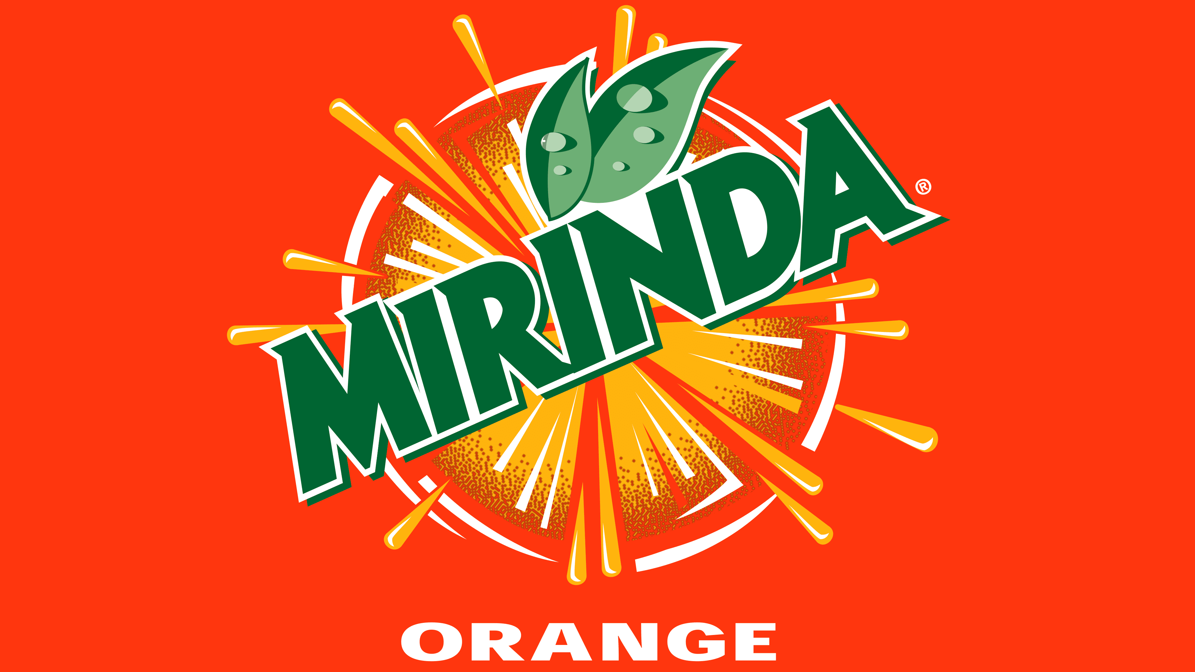
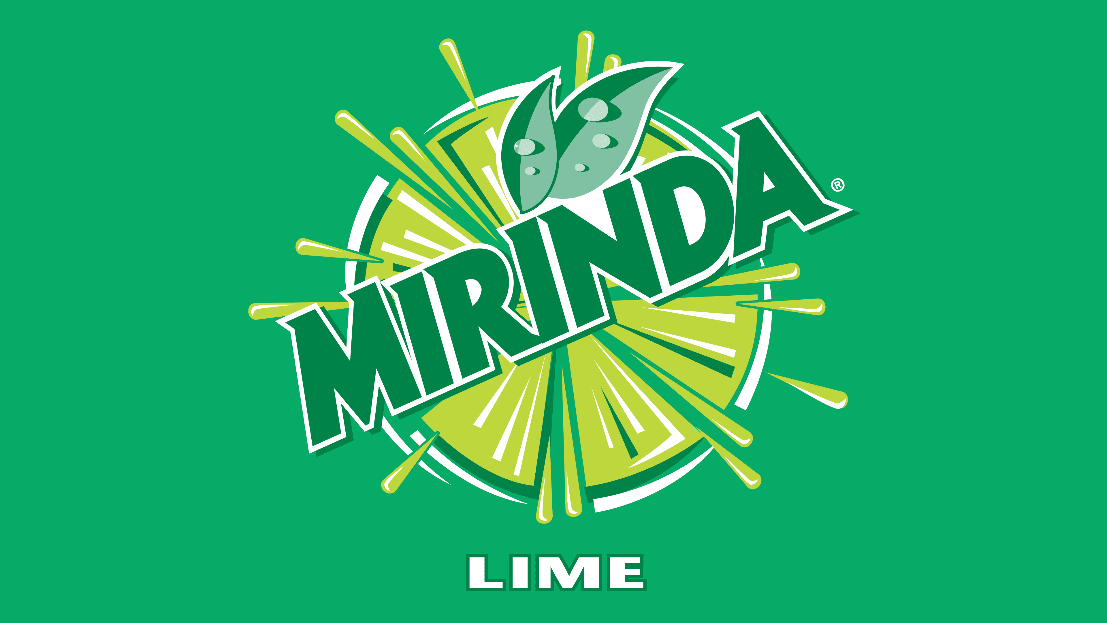
The logo still conveys a sense of good mood and a striving for leadership. But moves away from the orange theme. The brand offers 12 flavors, and orange is just one of them.
2023 – today
![]()
Mirinda is revolutionizing the world with its innovative rebranding and global slogan, saluting and welcoming the upcoming wave of creative trailblazers. These audacious individuals dare to present their distinct thoughts and manifest their authentic selves, offline and online.
Simultaneously with the launch of the #NoFlavourLikeYourFlavour campaign, Mirinda has unveiled a vibrant new look called “Making an M-pact”. The revamped Mirinda emblem, the result of a creative process by PepsiCo Design and Innovation, now shines with a more vivid green, sharper corners, and sleeker lines for added prominence. The recognizable ‘M’ of Mirinda serves as a stage for creativity, featuring playful color schemes, spinning orbs, effervescing bubbles, and vivid fruit drawings that bring the brand to life and evoke a sense of refreshment and vitality.
The logo, now presented in a brighter green with sharper corners and cleaner lines, prominently showcases the letter ‘M’. It’s part of the brand’s new slogan, ‘Making an M-pact,’ intended to ignite creativity. Interestingly, the dot on the “i” has been shifted to the first letter instead of the second, a subtle alteration intended to draw attention to the ‘M’ within the logo. It’s a clever design twist, though it’s unclear how effective it would be in fulfilling Mirinda’s hope of inspiring creativity and ‘make an M-pact.’
Font and Colors
The main shades of the logos are orange and green. These are the colors of life, taste, warm sun, bright tropical fruits, freshness, and fun.
The font of the modern logo resembles a processed Comixed RP Bold Regular. Sharp angular letters in it, like pricks of gas bubbles.