The logo of the popular non-alcoholic drink Fanta reflects the deep meaning of its name and the essence of the product. Bright, cheerful, inspiring, and full of energy, the logo attracts the target consumer segment.
Fanta: Brand overview
Fanta is a popular non-alcoholic beverage of German origin, now produced by the American corporation Coca-Cola (which acquired the rights to it in the 1960s). The product itself appeared in Germany in the 1940s. Its current name came about accidentally when the head of the company asked employees to use their imagination to find a suitable name. Since “Fanta” means “fantasy” in German, manager Joe Knipp exclaimed: “Fanta!”.
Meaning and History
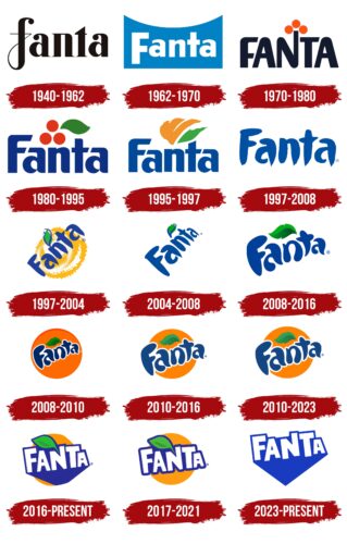
The brand’s emblem is bright, cheerful, and energizing. However, it wasn’t always like this; previously, it looked gray and dull. Over time, it has undergone many stages of evolution.
What is Fanta?
Fanta is a non-alcoholic drink made from water, sugar, and natural flavorings. It was created in Germany as an alternative to Coca-Cola. The original flavor is orange, but now there are variants with different fruits: peach, strawberry, grape, apple, lemon, etc.
1940 – 1962
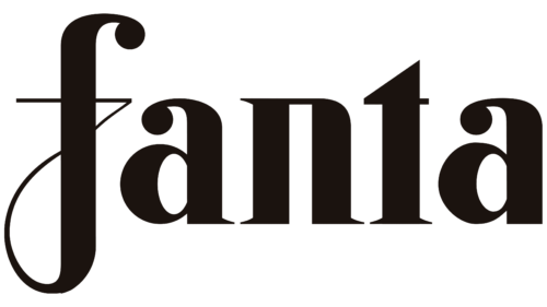
The debut version is a strict inscription in black lowercase font. Due to the curved crossbar of the letter “f,” the first letter looks handwritten. The logo’s background is white.
1962 – 1970
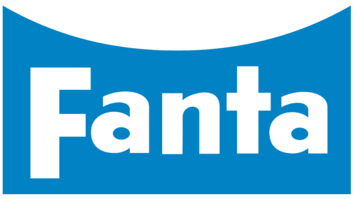
This period features a colorful emblem with the drink’s name in white characters against a blue background. Their shape is geometrically precise, with straight angles, except for the letter “a,” which is rounded. The substrate is rectangular, with a concave bend at the top.
1970 – 1980
This legendary time in the brand’s history saw designers adding elements of fun and playfulness to the logo in 1970. As a result, three large orange dots appeared near the extended leg of the letter “N” (all letters are now capitalized), symbolizing the oranges that became the main ingredient in the drink’s production.
1980 – 1995
The emblem became colorful: in this version, the letters are blue, and the oranges, stacked on a hill, are bright orange (they were slightly shifted to the left). A juicy green leaf was added to the fruits.
1995 – 1997
The light blue word “Fanta” is written in bold font with a balanced number of angles, cuts, and rounded shapes. Above the letter “n” is an orange spot drawn with sweeping diagonal lines. This abstract orange is the drink’s main ingredient. To its right is a stylized green leaf.
1997 – 2008
In 1997, the manufacturer changed the style of the Fanta logo. Instead of a strictly geometric font, an artistic font with small dots at the ends was now used.
1997 – 2004
This period includes versions with an orange spiral background, representing orange juice being poured into a glass. The drink’s name is placed diagonally. This version has the most dynamic image, conveying energy.
2004 – 2008
The background of the inscription disappeared, and it acquired a three-dimensional effect.
2008 – 2016
In 2008, designers improved the word “Fanta.” They made the blue letters lower and thicker to associate them with water droplets. A shadow was added to the leaf.
2008 – 2010
Developers depicted a large orange on the logo, making it resemble the sun.
2010 – 2016, 2010 – 2023
The brand name is placed diagonally and consists of light blue bubble letters surrounded by wide white contours. The inscription extends beyond a large orange circle, depicting a sunny orange. Above the word is a small leaf with a green gradient.
2016 – today (international)
This logo is characterized by geometrically strict white letters with a blue shadow, conceived by designers from the Koto Agency (UK). They first cut out the letters and all elements from paper, then manually assembled them and created a vector logo.
2017–2021 (Japan)
In the current version, developers retained the letters with dark blue outlines but removed the shadows to reveal the orange color. Additionally, they preserved the logo’s colorfulness, which is vital as a marketing tool since the target consumer segment is young people who are goal-oriented, energetic, and enthusiastic.
2023 – today
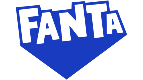
The beverage manufacturer moved away from the old logo with smooth forms. The new angular design demonstrates the brand’s youthful and bold character and its readiness to go against traditions. The bubble font was replaced with a clear sans-serif font. Asymmetrical rectangular letters were custom-made for Fanta. The word is drawn in white and arranged like a staircase on the left. The background for the inscription is a dark blue geometric figure with a triangular bottom.
Fanta: Interesting Facts
Fanta is a famous soda that’s known all around the world, and it has an interesting story that goes way back.
- How Fanta Started: In 1940, during World War II, it was too hard to get Coca-Cola syrup to Germany because of the war. So, the Coca-Cola team in Germany made a new drink with what they had, and that’s how Fanta was born.
- The Name “Fanta”: A man named Joe Knipp thought of the name during a meeting. He was told to use his imagination, or “fantasie” in German, and he came up with “Fanta.”
- Coming Back and Spreading Out: After World War II, they stopped making Fanta. But in the 1950s, it came back and became popular worldwide. Now, you can find Fanta in more than 180 countries.
- Lots of Flavors: Fanta started with an orange flavor, but now there are over 100 flavors, depending on where you are. Some unique ones include the Elderberry flavor in Serbia, Bosnia & Herzegovina, and Green Soda in Thailand.
- An Old Coca-Cola Brand: Fanta is the second oldest brand made by The Coca-Cola Company, right after Coca-Cola. It’s been very successful.
- Fanta Girls and Ads: In the late 1990s and early 2000s, Fanta had ads for different flavors featuring the “Fanta Girls” characters. These ads were meant to make young people like Fanta even more.
- Fanta in Music and Movies: You might hear Fanta mentioned in songs or see it in movies and TV shows. Its fun look and flavors make it popular with young people.
- Always Trying New Things: Fanta is known for trying new things with flavors and their bottles. They were among the first to use PET plastic bottles, which are very common now.
- Sponsoring Fun Events: Fanta likes to sponsor music events and festivals that attract young people, helping the brand stay fun and lively.
So, Fanta’s not just a drink. It’s a story about making the best of what you have, being creative, and becoming a favorite soda for people worldwide.
Font and Colors
The graphic symbolism of the trademark is the color orange. It is present in almost all versions of the emblem, as it is the main ingredient of the “sunny” drink.
In the new emblem, instead of thick, squat letters, flat and angular ones are used. The unconventional font creates the impression of cut paper. It was proposed by the studio “Colophon.”
The color palette is diverse. This is due to the expansion of the drink’s flavor, which now includes rich orange and pale mandarin, yellow, green, and purple. Therefore, the palette is now differentiated by codes.
Fanta color codes
| Carrot Orange | Hex color: | #f7941e |
|---|---|---|
| RGB: | 247 148 30 | |
| CMYK: | 0 40 88 3 | |
| Pantone: | PMS 1495 C |
| Blue | Hex color: | #2d3092 |
|---|---|---|
| RGB: | 45 48 146 | |
| CMYK: | 69 67 0 43 | |
| Pantone: | PMS 2746 C |
| Kelly Green | Hex color: | #70bf44 |
|---|---|---|
| RGB: | 112 191 68 | |
| CMYK: | 41 0 64 25 | |
| Pantone: | PMS 361 C |
| Maximum Green | Hex color: | #609644 |
|---|---|---|
| RGB: | 96 150 68 | |
| CMYK: | 36 0 55 41 | |
| Pantone: | PMS 7739 C |
