Connoisseurs of good rum know that the distinctive bat image on the emblem has been used for three centuries. In Cuba, this bat once symbolized success and health. The Bacardi logo is a tribute to the rich history of the alcohol company, which in 1862 owned an old distillery with a whole brood of bats. At least, so the legends say.
Bacardi: Brand overview
| Founded: | 4 February 1862 |
| Founder: | Don Facundo Bacardí Massó |
| Headquarters: | Hamilton, Bermuda |
| Website: | bacardilimited.com |
Meaning and History
The recognizable logo of Bacardi Limited Group includes an image of a bat. For a century, designers have only changed the style of the graphic sign, leaving the brand’s identity untouched.
What is Bacardi?
Bacardi is one of the largest family-owned companies for producing strong spirits. The same name is carried by its primary product – Cuban rum. Special yeast obtained from sugarcane is used for its production. The first Bacardi distillery opened in 1862.
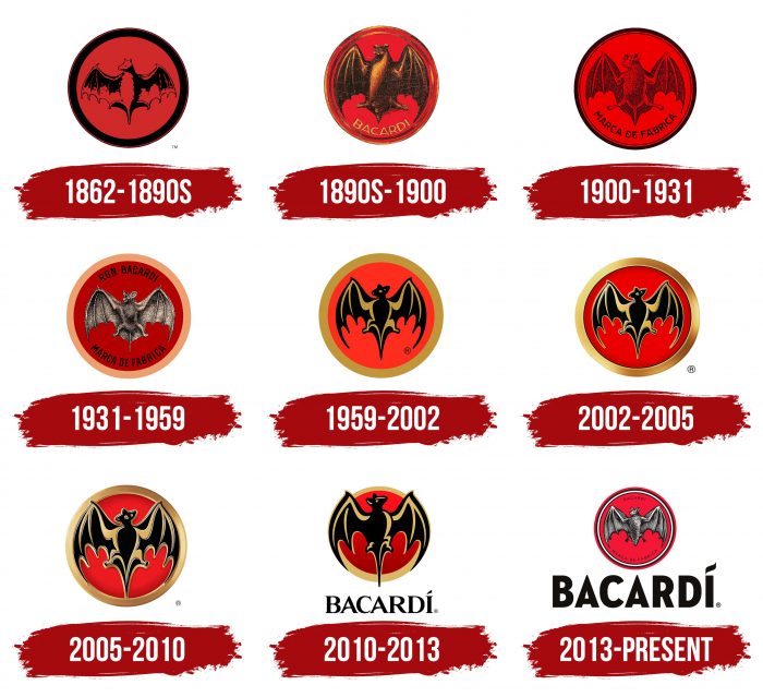
1862 – 1890
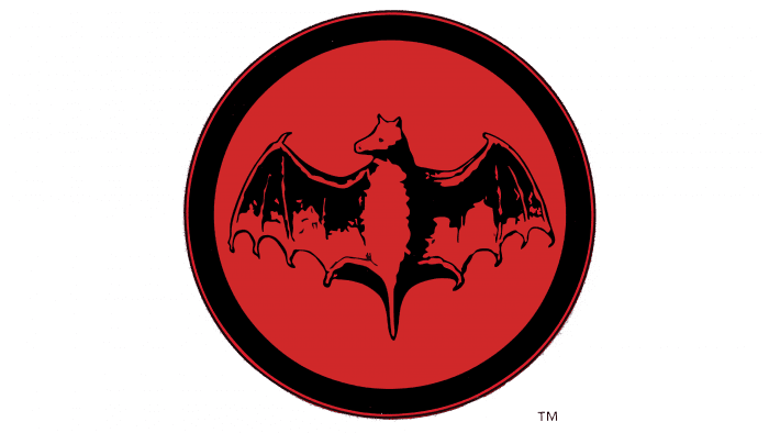
In 1862, the Italian entrepreneur Facundo Bacardi Masso acquired a distillery building. It was so old that fruit bats had settled in its rafters. These animals became the prototype of the emblem, taking a central place in a red circle with a black outline. According to another version, the company’s founder was inspired by numerous Cuban legends in which bats were symbols of health and success.
the 1890s – 1900
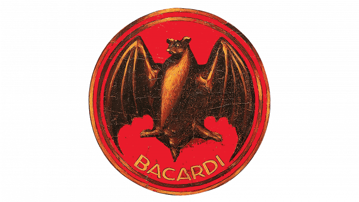
This period is significant in the brand’s history as it first saw the striking combination of black, burgundy, and gold colors. Compared to the previous version, the bat became much more realistic. For this, designers drew light spots on the wings along the skeleton bones and added brightness to the front, highlighting the fur. They also colored the ears, eyes, and tip of the nose in yellow. The frame near the circle also became golden, with double edging and highlights. Under the widely spread paws, the inscription “Bacardi” appeared, which is pushed from the right and left into the sharp ends of the wings, as if the bat took the distillery under personal protection.
1900 – 1931
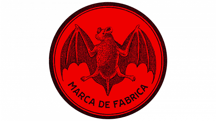
The logo featured a structured image of a bat. Each scale on the wing membranes and each hair of fur is visible. The head acquired realistic features. However, designers removed the gold color and reduced the animal’s size. Along the edges of the circle, they placed two black stripes: one wide and one narrow, resembling a thread. The word “BACARDI” was replaced by the phrase “MARCA DE FABRICA.”
1931 – 1959
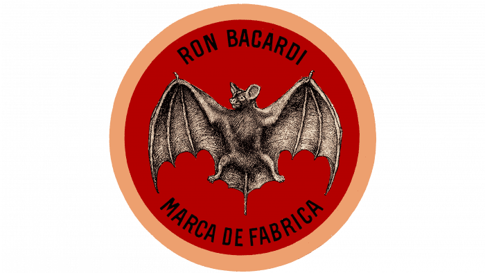
The company continued its search for a realistic logo, adopting a new look for the bat. Now, it is smiling, natural gray, with large ears. It is complemented by a double inscription around the circle: “RON BACARDI” on top and “MARCA DE FABRICA” on the bottom. The burgundy circle has a gradient and a wide gold line of edging.
1959 – 2002
In 1959, the era of realistic images ended. Henceforth, the bat is depicted in contour. The authors only left the head turned to the left, and the animal’s size was the same, and the rest was stylized using black and gold colors. The background and frame were retained. Compared to previous logos, such an emblem looks friendlier on the label, without aggression.
2002 – 2005
Thanks to double underlining and shadows, the lines became smooth and relief. A 3D effect is traced in everything: in shape, edging, and even in the background, which slightly protrudes above the edge. The gradient on the red has been preserved, as has the traditional combination of black and gold.
2005 – 2010
This logo enhances the embossing effect due to the clear central part. The bat looks more voluminous not only because of the shading but also because of the lighting. White lines draw attention to the animal’s wings, paws, head, and body. At the same time, shadows are present mainly on the border and red background, serving as a gradient. All strokes are smooth and long. The wings extend beyond the inner circle and merge with it in color.
2010 – 2013
In 2010, another redesign occurred. In this version, designers moved to sharp strokes and figurative elements. The clear contours of the Gothic are gone, so the emblem looks modern. The only thing that remained unchanged was the combination of black and gold colors. Otherwise, the redesign completely changed the logo. The head of the bat is turned not to the left but to the right. The massive wings and tail are increased in size, so they protrude beyond the outer border of the circle. The edging strip is uneven: it is narrow at the top and wide at the bottom. Under the symbol is the printed inscription “BACARDÍ” with an elegant flourish over the letter “i” instead of the classic dot.
2013 – today
The last changes occurred in 2013. Specialists from the London studio Here Design turned to historical archives. They combined three emblems used from the 1890s to 1931. As a result, they managed to create an authentic image of the bat, close to classical canons.
Designers also updated the wordmark. Now, it conveys the retro vibe of Cuban art deco from the early 1900s, characteristic of the architecture of the Edificio Bacardi headquarters in Havana.
Bacardi: Interesting Facts
Bacardi is a famous rum brand that started in 1862 in Santiago de Cuba, Cuba. It was founded by Don Facundo Bacardí Massó, who devised a new way to make rum taste better.
- How It Started: Don Facundo made a smoother rum by filtering it and aging it in white oak barrels. This was the first time rum was made this way.
- The Bat Logo: The Bacardi logo features a bat because a bat lived in the company’s first distillery. Don Facundo’s wife thought bats were lucky, so they used them as a symbol.
- Prohibition Era: When alcohol was banned in the United States (1920-1933), Bacardi became popular in places like Cuba, where Americans went to drink legally. This helped Bacardi sell a lot of rum.
- Famous Drinks: Bacardi helped create famous drinks like the Cuba Libre, Daiquiri, and Mojito, which are now loved worldwide.
- Growing Big: The company moved and grew after Cuba’s government took over Bacardi’s property in 1960. It’s one of the biggest family-owned liquor companies with many different drinks.
- Caring for the Environment: Bacardi works hard not to harm the environment. They use special boilers and have a plan to help nature.
- More Than Rum: Bacardi isn’t just about drinks. They support music, art, and fashion, hosting festivals and making special bottles.
- Green Bottles: In 2016, Bacardi made a bottle that can break down naturally to help the planet.
- World Record: In 2006, for their 144th birthday, Bacardi made the world’s biggest Mojito in Germany.
Bacardi has a long history of making tasty rum, helping with fun parties, and caring for the Earth.
Font and Colors
The history of the Bacardi logo is a movement from old to old. This paradox is confirmed by the transition in 2013 to the original design. The Here Design studio in London handled it. Developers traced the similarity of the first three emblems and proposed a combined version with historical roots. But there is no gold on it – only black, red, and gray colors. A large inscription at the bottom remained.
The word “Bacardi” is written in bold capital letters. The letters are classic, without serifs, with slight curves. The font resembles an elegant version of Varvara Bold. With its help, designers stylized the text under the decor of the 1900s, characteristic of the Cuban spirit. The logo’s colors are stable and consist of red, black, gray, and gold, which appear and disappear from time to time.
Bacardi color codes
| Persian Red | Hex color: | #d23433 |
|---|---|---|
| RGB: | 210 52 51 | |
| CMYK: | 0 75 76 18 | |
| Pantone: | PMS 1788 C |
| Black | Hex color: | #000000 |
|---|---|---|
| RGB: | 0 0 0 | |
| CMYK: | 0 0 0 100 | |
| Pantone: | PMS Process Black C |
FAQ
What is the Bacardi symbol?
The iconic symbol of Bacardi is a bat, depicted inside a circle. In Spain, where the company’s founder is from, it is considered a protector of luck, health, and family unity. It is also the main protector and pollinator of sugarcane crops, necessary for rum production. In addition, bats lived in the rafters of the first Bacardi brewery.
What animal is depicted on the Bacardi logo?
The Bacardi logo depicts a bat from the Phyllostomidae family. Artists detailed the anatomical details: the membranes between the wings, fingers, hind limbs, ears, head, and other body parts.
