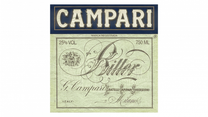
The Campari logo resembles a retro sign, and that’s its main feature. It also looks like an old pharmacy label because bitter is not just an alcoholic drink. It’s also an effective remedy for improving appetite, made from various medicinal plants. Designers have endeavored to play up the product’s beneficial properties in its emblem.
Campari: Brand overview
| Founded: | 1860 |
| Founder: | Campari Group |
| Headquarters: | Italy |
| Website: | campari.com |
Meaning and History
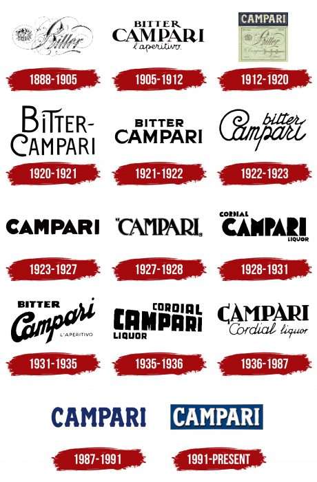
The brand’s marketing policy involves frequent image changes. It became famous for its advertising posters, which were also worked on by renowned artists, and for the brand’s original name adorning each label.
The brand had many stylistically resonant emblems. In 1987, its owners decided to revisit graphic design standards and assigned this task to the company G & R Associati. Studying early logos, specialists noted the version registered in 1912. As it turned out, it was the most popular after World War II and often used to identify the manufacturer.
What is Campari?
Campari is a sophisticated Italian liqueur made from water, sugar syrup, citrus, and aromatic herbs. In total, up to 70 ingredients can be included in its composition. The alcoholic drink’s strength is 20-30%, depending on the country where it is produced. Its distinctive feature is the rich dark red color, which used to be achieved using carmine. The brand has existed since 1860 and belongs to the company Davide Campari-Milano N.V.
1888 – 1905
The famous logo of the bitter liqueur infused with herbs, berries, and fruits consisted of delicate swirls and the word “Bitter.” It was in the center of twisted lines of varying thickness that radiated from the letter “B.” This is a reminder of the grapevine, which is part of the bitter. The main emphasis in the emblem was made precisely on the first letter. It has an original design and replaces the graphic sign. The word is semi-connected, elegant, and written with a slight tilt in calligraphic handwriting.
1905 – 1912
During this period, the variant with triple inscription prevailed. Each part was located in a separate row and had an individual font. No font matched in any of the lines. The top word “Bitter” was squat, with serifs, and the impressively protruding forward leg of “R.” The central element was the inscription “Campari,” done in large letters with expressive serifs at the ends. The lower fragment consisted of the word “aperitive,” indicating the type of drink, and was drawn in a handwritten font without tilt.
1912 – 1920
The legendary liquor manufacturer returned to the original logo version, adding additional product information. As a result, the label became similar to an advertising leaflet with lots of detailed data. The background was light, and the letters, as usual, dark.
1920 – 1921
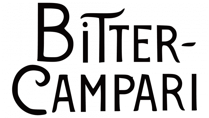
After the redesign, the company received a double inscription: at the top was the word “Bitter,” and at the bottom – “Campari.” The playful nature of the drink was told by the letters “C” and “T,” which were uniquely designed. The first letter had the shape of a semicircle with a sharp top and a straight bottom directed downwards. The second was supplemented with a wavy cap covering the lowercase “i” on the left. All symbols were thin, chopped, and uppercase.
1921 – 1922
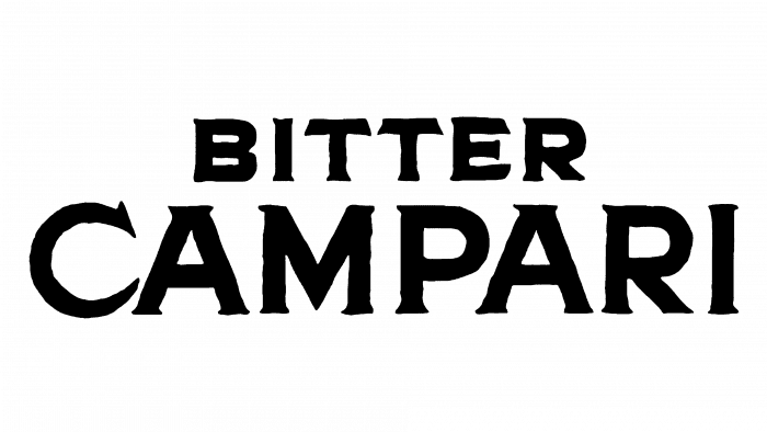
During this period, the same two words were used in the logo as in the previous version, but without a hyphen between them. Designers also replaced the thin font with a bold one, added serifs to the letters, reduced the upper inscription, and enlarged the lower one.
1922 – 1923
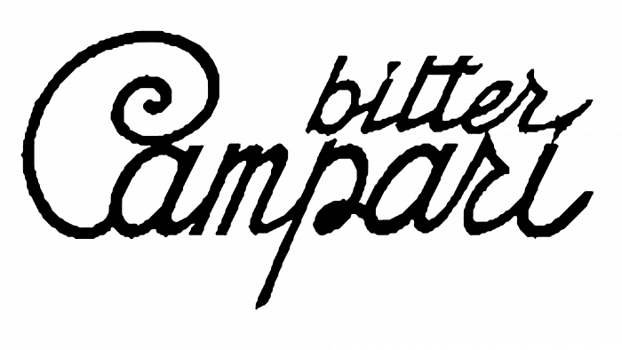
For a whole year, the emblem was adorned with the “C” sign in a unique presentation: with a top rolled several times and a narrow bottom without the traditional expansion. The inscription “Campari” remained integral, highlighted in italics, as all symbols were closely related and seemed to flow into each other. The word “bitter” was done in lowercase letters in the same style as the lower one. The “tt” had one common bar.
1923 – 1927
As a result of a radical redesign, a logo with a single inscription appeared. The brand name and type of alcoholic drink were highlighted in bold font. The spaces inside the letters looked so narrow that the white background was barely visible through them.
1927 – 1928
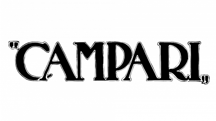
Designers revisited the writing of the word “Campari”: they returned to the 1905-1912 version, removing unnecessary information from the logo. Developers also significantly shifted the symbols, but in the words in quotes, they slightly stretched the lower end of “C” and brought it out beyond the left leg of “A.”
1928 – 1931
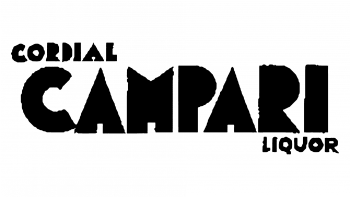
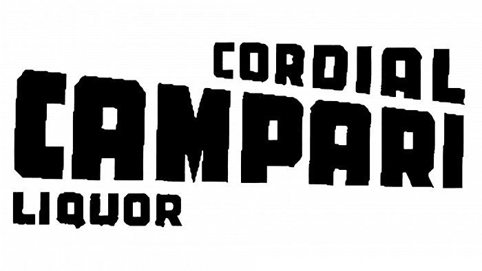
In 1928, the authors regrouped the name again. They added two more words to the title – “Cordial” and “Liguor.” The logo was intended for another type of product that appeared in the assortment – liqueur. The upper and lower elements (by the way, they were located at the corners) are small, and the central is large, done in bold letters. The symbols were completely black, dull, and without internal spaces.
1931 – 1935
The label of that time had a triple inscription: “Bitter,” “Campari,” and “L’aperitivo.” The middle word was diagonally placed with a disconnected italic; the upper one was typed in bold print letters, and the lower one was in thin signs.
1935 – 1936
The emblem contained the brand name, the type of drink, and its purpose. The inscriptions were grouped in a balanced way: the upper one on the right, the lower one on the left, and the central one in the middle. The size was also suitable so as not to visually overload the logo: the keyword was written in large font, and the other two – were in the medium. Moreover, they were arranged according to the principle of perspective: close letters – large, distant – small.
1936 – 1987
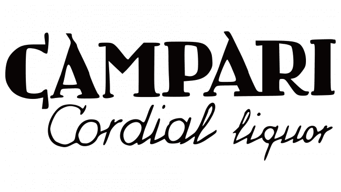
For one year, the products of the Italian brand were adorned with an emblem of a very original design. The letters “C” and both “A”s in the top row had elongated ends. The lower phrase was done in a font resembling a handwritten text.
1987 – 1991
A universal version appeared during this period, which became the basis for the current variant. The logo contained clear print letters with good readability. They were large, with an average breakdown between symbols and wide serifs at the ends on both sides. At the same time, the company first moved away from monochromaticity, using a dark blue color.
1991 – today
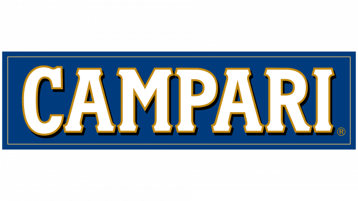
The modern trademark contains the word “Campari.” The letters are placed very close, almost without intervals. They have short but wide serifs of an unusual shape. The font is Campari Bold. The marketing agency Landor Milano specifically developed it for the Italian brand. The typography was modeled on the letters on advertising posters of the 1900s.
Each print sign has a dark gold outline with a black shadow – this graphic technique allowed achieving a subtle 3D effect. White letters stand out contrastingly against a blue rectangle background. At the same time, they harmonize with the golden frame surrounding the logo.
Campari: Interesting Facts
Campari is a famous drink from Italy that’s known for its bright red color and unique taste. People enjoy it worldwide for its flavor, its cool history, and the way it’s part of many stylish and fancy drinks.
- Made in Italy: Campari was created by a guy named Gaspare Campari in 1860 in a city called Novara, and it first became popular in his café in Milan.
- Secret Ingredients: The exact recipe for Campari is a big secret, and only a few people know it. It’s made with more than 60 ingredients, such as herbs and fruit peels, which give it a special taste.
- Why It’s Red: The red color used to come from a natural dye made from bugs, but now they use artificial colors to keep up with health rules.
- Simple but Classic Drink: One of the oldest drinks made with Campari is Campari and Soda. It’s just Campari mixed with soda water, and people have loved it for its simple, bitter-sweet taste since the early 1900s.
- The Negroni: Another famous drink with Campari is the Negroni, which consists of Campari, gin, and sweet vermouth mixed. It originated in Florence, Italy, and has become loved for its complex taste.
- Cool Ads: Campari has always produced interesting ads with the help of famous artists. These ads are so cool that people collect them.
- Loved Everywhere: Even though Campari is very Italian, people worldwide enjoy it in different cocktails, like the Americano and Spritz, because they are so versatile.
- Smart Advertising: Campari has always been good at developing new advertising methods, like using movies in the early days and keeping up with new technology to reach people.
- Fancy Calendar: Since 2000, Campari has made a calendar every year with famous people and models in fancy settings, showing off its style and connection to art and fashion.
Campari isn’t just a drink; it’s a symbol of Italian style and creativity that greatly impacts the world of drinks, art, and fashion.
Font and Colors
In its early years, the brand chose retro labels for its products, indicating the type of alcohol. Therefore, the emblems consisted of two or even three lines. Now, the brand has settled on a solid logo that is versatile.
Throughout its existence, Campari has used an incredible variety of fonts. Some of them were conventional, others – individual: for example, Mostra Nuova, Fairplex Narrow Black, and Campari Bold, which is relevant. The color palette of the emblem has always remained monospaced – it’s a monochrome of black or dark blue with white.
Campari color codes
| Dark Cerulean | Hex color: | #003c7d |
|---|---|---|
| RGB: | 0 60 125 | |
| CMYK: | 100 52 0 51 | |
| Pantone: | PMS 2154 C |
| Dark Goldenrod | Hex color: | #c48a10 |
|---|---|---|
| RGB: | 196 138 16 | |
| CMYK: | 0 30 92 23 | |
| Pantone: | PMS 1245 C |
| Davy’s Grey | Hex color: | #505153 |
|---|---|---|
| RGB: | 80 81 83 | |
| CMYK: | 4 2 0 68 | |
| Pantone: | PMS 7540 C |
