The Coca-Cola logo has become even more famous due to Christmas advertising, making the emblem associated with the holiday, good mood, and anticipation of miracles. The red letters resemble bright ribbons, and their color symbolizes love, fullness of life, and beauty.
Coca-Cola: Brand overview
Coca-Cola is a soft drink brand that emerged in 1886. It’s believed the first recipe belonged to optometrist and pharmacist John Stith Pemberton. However, the founder of The Coca-Cola Company was businessman Asa Griggs Candler, who acquired the trademark rights in 1888. He initiated mass production of the drink, making it globally renowned.
Meaning and History
All the company’s logos feature the inscription “Coca-Cola.” This name was coined by accountant Frank Robinson, based on the main ingredients of the original product: the leaves of the coca bush and kola nuts. John Pemberton entrusted him with branding matters. Mastering the art of beautiful writing, Robinson wrote the words Coca-Cola in neat, ornate letters. The trademark he proposed is still in use, and time has not affected the font or proportions.
What is Coca-Cola?
Coca-Cola is the flagship brand of the American corporation The Coca-Cola Company. This non-alcoholic beverage initially contained cocaine and caffeine and was distributed in pharmacies as medicine. Today, the recipe for the soda is a commercial secret. The primary manufacturer produces a concentrate according to a secret formula and then sells it to bottlers.
1886 – 1887
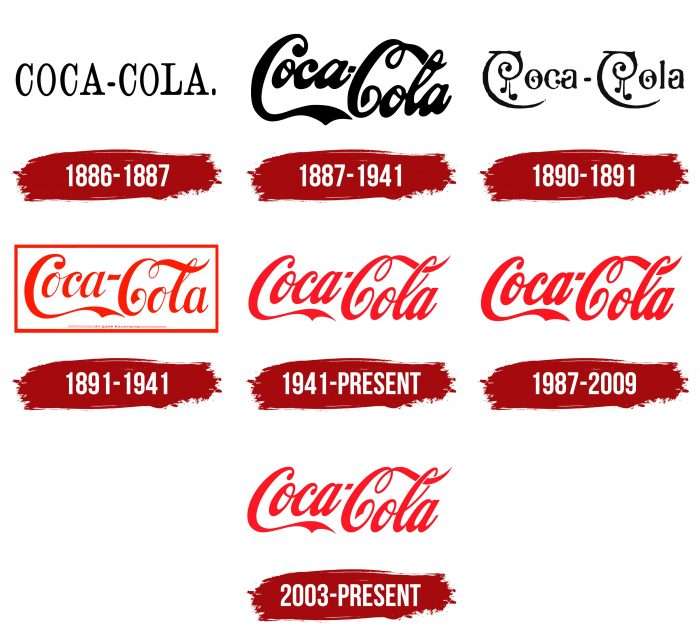
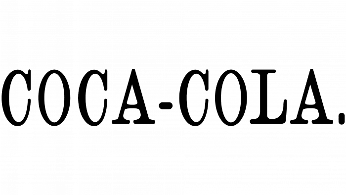
In the first year after production started, the brand had no individual style. Its emblem looked standard: a strict black-and-white “Coca-Cola.” inscription with serifs.
1887 – 1941
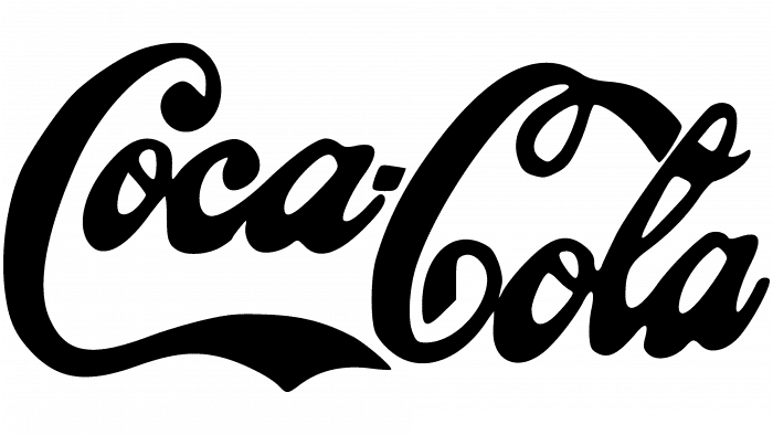
In 1887, a calligraphic version of the logo appeared. It was worked on by Frank Robinson, immortalizing his handwriting on the labels of the famous soft drink.
1890 – 1891
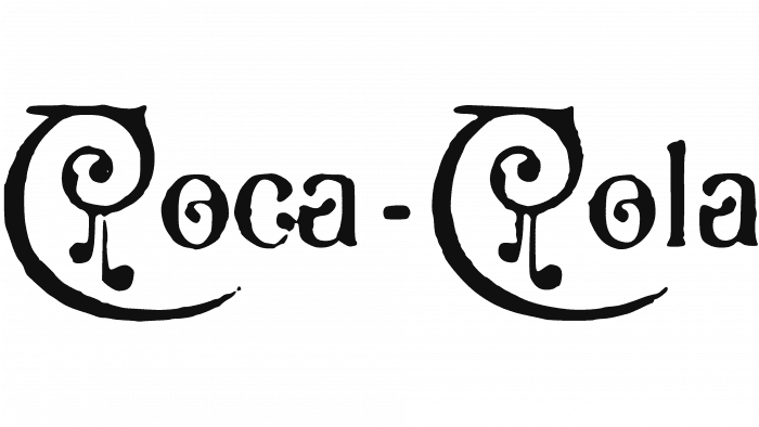
At the turn of the millennium, designers decided to experiment. They used a stylized font with many curls. The first letter – “C” – was twisted into a spiral. Despite its originality, this font was unpopular and lasted only one year.
1891 – 1941
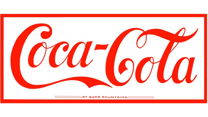
In 1891, an updated version of the 1887 logo appeared. The inscription was red, and the handwritten font was thin and clear. The words were placed in a rectangular frame.
1941 – today
The new design carries historical changes. In 1941, the famous emblem, which is still used today, appeared. Developers removed the red frame and made the letters italic. This version looks more compact compared to previous ones, as the word “Coca” reduces the distance between the letters “C” and “oca.”
1987 – 2009
In 1987, the soft drink manufacturer adopted a new trademark. Designers made minor changes to the font: they reduced the slant of the letters and increased the line width but kept the previous proportions. The modernized version appeared on labels until 2003. From 2006 to 2009, it was also used in The Coke Side of Life campaign.
2003 – today
In 2003, the logo presented 60 years ago returned. The recognizable Coca-Cola sign, preserved to this day, became the main distinctive symbol of the brand.
Coca Cola: Interesting Facts
Coca-Cola is a super famous drink almost everyone knows about.
- How It Started: In 1886, Dr. John S. Pemberton, in Atlanta, Georgia, made the first Coca-Cola. He was trying to make a medicine to help with various health problems.
- The Name: Frank Robinson, who worked with Pemberton, created “Coca-Cola” and wrote the fancy logo we still see today.
- First Sold: On May 8, 1886, the first glass of Coca-Cola was sold for 5 cents at a pharmacy in Atlanta. At first, the store sold only about nine drinks a day.
- Secret Recipe: Coca-Cola’s recipe is a big secret, kept in a vault in Atlanta. It’s called “Merchandise 7X.”
- Ingredients: The original recipe included parts of coca leaves and kola nuts. Today, the coca leaves don’t contain cocaine, but they’re still used.
- Bottles: In 1894, a man in Mississippi was the first to put Coca-Cola in bottles. This helped Coca-Cola reach more places.
- World War II: During the war, Coca-Cola promised to sell Coke to soldiers for 5 cents, no matter what. This helped make Coca-Cola famous worldwide.
- Special Bottle: In 1915, the Coca-Cola bottle was given a special shape to ensure it stood out from other drinks, even in the dark.
- Diet Coke: Coca-Cola’s first diet soda, Tab, was made in 1963. Diet Coke came out in 1982 and became very popular.
- Movies and Music: Coca-Cola has been in many movies and songs. Like the one where they wanted to buy the world a Coke, their ads are famous, too.
- Santa Claus: Some people think Coca-Cola made up the modern look of Santa Claus in a red suit. While they didn’t invent it, their ads in the 1930s made this image very popular.
So, Coca-Cola went from medicine to one of the biggest drinks in the world, with a secret recipe, a unique bottle, and a big part in movies and music.
Font and Colors
The brand name is written in large letters on Coca-Cola cans and bottles. This famous emblem, conceived by accountant Frank Robinson in 1887, has been slightly adjusted by modern designers in terms of slant and color. However, as before, the changes did not affect the overall concept: the central place on the emblem is occupied by an imaginative inscription executed in calligraphic handwriting.
Special attention was given to typography, as the brand name contains no graphic images, only text elements. The font mimics handwriting, but the first letter – “C” – is distanced from the rest and adorned with long decorative curls. This is a bright example of Spencerian script, which was created in the 1840s and used in the USA for business correspondence until the invention of typewriters.
The handwriting depicted on the emblem of 1890-1891 is radically different. At that time, the company’s name looked atmospheric: the letters had many large dots and unusual curls, creating a sense of an enchanted forest. However, the company’s owners decided to return to the familiar Spencerian Script font, forever abandoning such experiments.
The color palette is also not diverse. Until 1891, only black-and-white emblems were used. Then Coca-Cola became associated with bright shades of red, and black color receded into the past. White color remains the background, although the palette can change depending on the visual context. For example, there are versions with a white inscription and a red substrate. This combination of colors expresses perfection, purity, optimism, and youth – all the values the brand aspires to.
Coca-Cola Primary Colors:
- Coke Red: Hex Code: #F40009; RGB: (244, 0, 0); CMYK: (4, 100, 95, 0); Pantone: PMS 2347 C
- Black: Hex Code: #000000; RGB: (0, 0, 0); CMYK: (0, 0, 0, 100); Pantone: PMS Process Black C
- White: Hex Code: #FFFFFF; RGB: (255, 255, 255); CMYK: (0, 0, 0, 0); Pantone: White
FAQ
What does the Coca-Cola logo represent?
The logo represents the brand name and the bright mood created by its beverages. It’s also a tribute to the past, as the stylized script dates back to 1887 when accountant Frank Robinson studied calligraphy and created the trademark for Coca-Cola.
What makes the Coke logo unique?
The Coca-Cola logo uses the unique Spencerian font, making it distinctive. The handwritten cursive font with loops and elongated lines has become a recognizable brand feature. The combination of two capital “C”s in short four-letter words makes the font an effective advertising tool, as simplicity and creativity are key in marketing. The red color, of course, also has significance.
Why did Coca-Cola use red in its logo?
In the last century, Coca-Cola made red its trademark color when its drinks were stored in barrels and sold in pharmacies as medicine. It used red containers so no one would confuse them with regular barrels storing taxable alcohol, unlike non-alcoholic products.
What is the real Coca-Cola logo?
The authentic symbol of Coca-Cola consists of the brand name, written in clear script. This text is complemented by a white curved stripe, known as the “Dynamic Ribbon Device,” set against a red background.
What is the Coca-Cola font called?
The unique style of writing created by Frank Mason Robinson in 1885 and used in the Coca-Cola logo is identified as the Spencerian font. This form of writing was widespread in the USA from 1850 to 1925.
What is Coca-Cola’s company slogan?
Over the years, Coca-Cola has used various slogans, such as “Make It Real” in 2005, “The Coke Side of Life” in 2006, “Open Happiness” in 2009, “Taste the Feeling” in 2016, and “Real Magic” in 2021.
Why is the Coca-Cola logo so famous?
The timeless appeal of the Coca-Cola logo is due to its visually pleasing and balanced design. First adopted in 1887, this symbol has undergone minimal changes and continues to remain iconic.
How many logos does Coca-Cola have?
Over its 135-year history, Coca-Cola has undergone two significant logo transformations, with only a few minor changes.
