A red bow tie is a globally recognized symbol of American brewing. The Budweiser logo includes this element because it is visually appealing and draws attention to the brand name. The design of two connected triangles represents not some abstract concepts but Budweiser itself, as the emblem is firmly associated with the brand.
Budweiser: Brand overview
| Founded: | 1876 |
| Founder: | Anheuser–Busch |
| Headquarters: | United States |
| Website: | budweiser.com |
Meaning and History
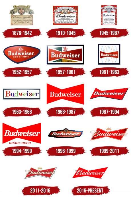
The brand became popular back in the last century thanks to an aggressive marketing campaign. One of the factors of its advertising success was a successful and visually appealing logo that inspires consumer trust. Over the years, it has undergone no less than 15 changes. But the design remained the same: each subsequent version was somewhat similar to the previous one. This has made the brand recognizable despite frequent changes in the trademark.
What is Budweiser?
Budweiser is a North American beer brand introduced in 1876, owned by Anheuser-Busch Companies, LLC, and created by Carl Conrad & Co. The American Budweiser should not be confused with the Czech brand of the same name. It differs not only in the country of production but also in composition: in addition to barley malt and hops, American beer contains up to 30% rice.
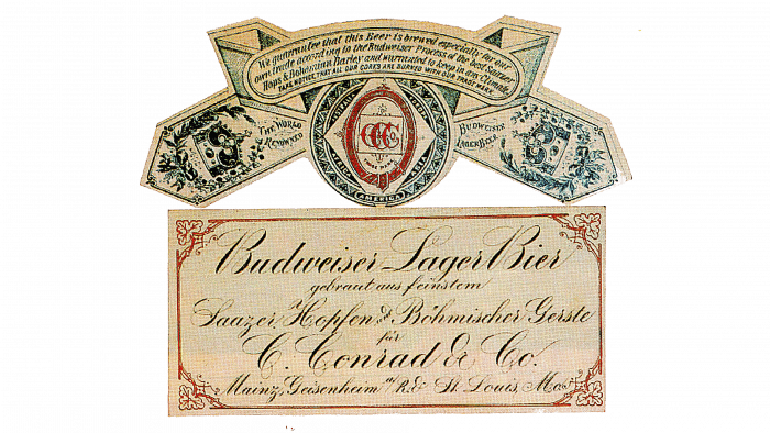
1876 - 1942
The debut logo resembles an informational label or handout. It contains many inscriptions and small details that are visually appealing. But the text is hard to read as it was done by hand. The central part stands out best – an elongated oval in a diamond with three red “C” letters. Below is a rectangular business card with the main information about the manufacturer. A floral pattern frames it.
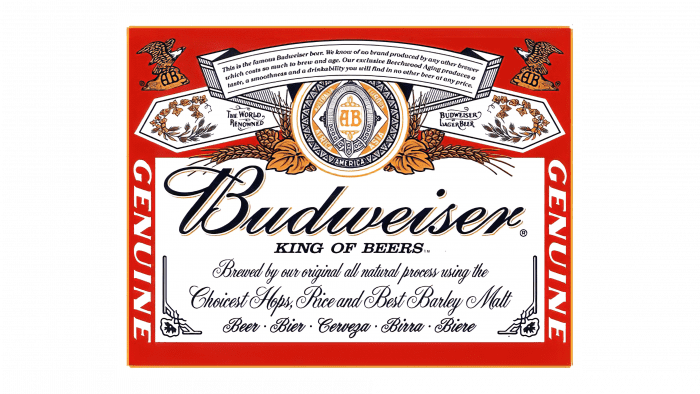
1910 – 1945
The brand got a new business card, having no standalone logo. It contains the maximum information about the product and its manufacturer. The text, as before, is italicized, handwritten, connected, and located on a light background. Unlike the previous version, it has no frame, only fancy corners on the right and left at the bottom. Also present are printed letters: “Genuine” and “King of Beers,” which balance the text. Above it is the graphic part: a ribbon with sharp ends, a circle in the center, ears, leaves, wreaths, and the abbreviation “AB” (from “Anheuser-Busch”). The background is painted red.
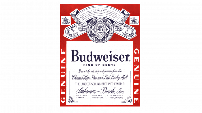
1945 – 1987
Designers expanded the rectangle and positioned it vertically, not horizontally, to make it look less like a business card. The text section added information about the product and its place of production. In some places, developers changed the font, so now it is presented in five variants. The authors left the upper zone elements the same, making them more compact and visually clearer, thanks to which the brand’s round sign with an ornament and the “AB” abbreviation in the center clearly stand out.
1952 – 1957
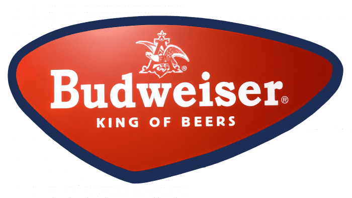
In 1952, Budweiser adopted a logo in the form of a triangle with rounded edges and a wide black outline. Inside was the brand name and the motto “King of Beer.” They were complemented by the Anheuser-Busch brand symbol: an eagle in the letter “A.” The background color is red with a white gradient.
1957 – 1961
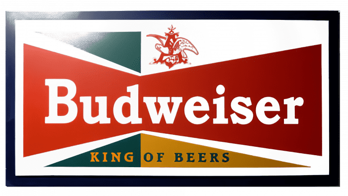
For eleven years, the company used rectangular emblems with a black frame. In the 1957 version, the figure first appeared as two inverted triangles joined to form a bow tie.
1961 – 1963
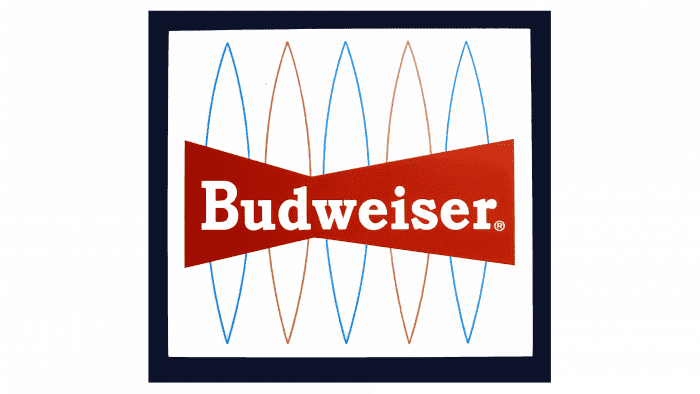
The bow tie shape of the logo is also present in the 1961 trademark, but this time, the designers removed the “King of Beers” slogan and decorated the background with five-point ellipses.
1963 – 1968
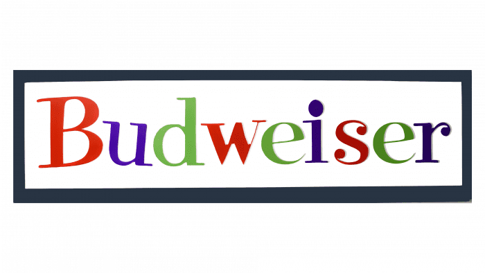
The 1963 version of the emblem has a completely different design. There is no famous “bow-tie” – there is only the word “Budweiser.” Each letter has its own color. The palette includes red, blue, and green.
1968 – 1987
In 1968, the trademark made its trademark two inverted red triangles encountered in the logos of previous years. The focus was on the name of the beer brand. A small change occurred in 1987: the shape of the geometric figure changed, and the font became italic.
1987 – 1994
This version is a stylization of the 1957 logo. Designers removed all unnecessary details to make the logo as simple as possible. It depicts only a red geometric figure in the form of two connected triangles and a white inscription on it – printed letters, lowercase, with a slight slant. On the right side is a shadow in the form of a thin black stripe placed at an angle, making the logo voluminous.
1994 – 1999
Developers reduced the tilt of the logo and the word “Budweiser,” removed the shadow, elongated the letters, and added the phrase “Biere Beer.” The geometric shape remained the same.
1996 – 1999
The emblem depicts a multistructured figure of elongated shape placed horizontally. The brand name is written on it in white. Below is the phrase “Classic American Lager.” Above is the brand symbol in the form of a circle with an ornament and a talisman. The emblem also features several multicolored lines and a 3D effect.
1999 – 2011
Management approved an emblem in the form of a butterfly with italic text extending beyond the geometric figure. A double thin line runs along the edges of the mark, and above it is a five-pointed crown. The main background color is red with a gradient transition to black (in the corners).
2011 – 2016
The logo received a slight scatter on the plane, a pastel palette, and an additional edging line. There was also a shadow on the right, which again made the emblem three-dimensional.
2016 – today
The most concise version is now used. It consists only of a slanting geometric butterfly figure and the word “Budweiser.”
Budweiser: Interesting Facts
Budweiser is a famous beer called “The King of Beers.” It started in the United States a long time ago, back in 1876.
- How It Started: A company in St. Louis, Missouri, made Budweiser first. Later, Adolphus Busch and his father-in-law, Eberhard Anheuser, took over.
- Why “Budweiser”?: They named it after a place in the Czech Republic because they wanted to make a beer like the one from there.
- Making Beer Better: Budweiser was among the first to ensure their beer didn’t go bad when sent far away. They did this by heating the beer slightly (pasteurization) and using special train cars to keep it cold.
- The Clydesdale Horses: In 1933, when it became legal to sell beer again in the U.S., Budweiser celebrated by showing off big horses in parades. These horses are still famous today.
- Becoming Even Bigger: In 2008, Budweiser joined with a company from Belgium and Brazil, making it part of one of the biggest beer companies in the world.
- Famous Ads: Budweiser’s TV ads are well known, especially during the Super Bowl. They’ve made ads that lots of people talk about, like the talking frogs and the “Wassup?” ad.
- Loves Sports: Budweiser sponsors many sports, like baseball, and supports many teams, making it a big part of sports in America.
- Around the World: Although Budweiser is very American, It is sold in many countries, making it known worldwide.
- Different Kinds of Budweiser: Over time, Budweiser has made different kinds of beers, like Budweiser Select and Budweiser Black Crown, to give people more choices.
Budweiser’s story shows how American beer became famous not just in the U.S. but worldwide, thanks to good ideas, big events, and smart advertising.
Font and Colors
The logo has changed in leaps and bounds: for several years in a row, it was rectangular, then complex, then in the shape of a butterfly. Initially, it was necessarily present together with the distinctive sign of the Anheuser-Busch brewery – a round sign with a multi-structure ornament and the abbreviation “AB.” After rebranding, the abbreviated name of the parent company disappeared – only the name of the beer variety remained, which became the branding. The emblem gradually transformed from complex to simple and simplified to a red butterfly with a white italic font.
Michael Hagemann developed Budweiser’s special inscription style. He based it on the Brewmaster font. The word turned out to be handwritten, connected, and slightly slanted. The beer brand used a chopped font in its logo at different times. The color palette has become standard. Now, it consists of red and white; earlier, it also included gold, blue, and black.
Budweiser color codes
| Philippine Red | Hex color: | #c8102e |
|---|---|---|
| RGB: | 200 16 46 | |
| CMYK: | 2 100 85 6 | |
| Pantone: | PMS 186 C |
FAQ
What does the Budweiser symbol mean?
Bottles and cans of Budweiser bear the seal of Anheuser-Busch, which owns the brand. Barley and wheat ears traditionally surround this element. Together, they symbolize the ancient brewing tradition. The inscription King of Beers is a rephrased phrase, The Beer of Kings, historically referring to Budweis beer. And two eagles are a tribute to American patriotism.
What shape is the Budweiser logo?
The basis of the Budweiser logo is shaped like a disproportionate bow tie. The figure consists of two asymmetrical triangles connected by sharp sides.
Is the Budweiser logo a bow tie?
By shape, the Budweiser logo indeed resembles a bow tie. This is a distinctive feature of the brand, its main marketing ploy. The first version of the symbol appeared in the late 1950s. Although the overall contours of the geometric figure have changed over time, the concept itself has remained unchanged.
Why did Budweiser change its logo?
The Budweiser logo was simplified to match modern minimalism. The designers’ goal was to make the trademark cleaner, clearer, and more legible.
When did Budweiser change its logo?
The beer brand Budweiser has changed its logo several times. This happened in 1910, 1945, 1952, 1957, 1961, 1963, 1968, 1987, 1994, 1996, 1999, 2011, and 2016.

