


![]() Starbucks Logo PNG
Starbucks Logo PNG
Sirens in mythology symbolize the mysterious, alluring sea that makes one’s head spin. The Starbucks logo, created for the brand, conveys the enchanting essence of the coffeehouse chain. The long-haired girl on the emblem smiles invitingly, beckoning travelers to stop by for a cup of freshly brewed coffee.
Starbucks began in 1971 in Seattle, when Jerry Baldwin, Gordon Bowker, and Zev Siegl opened a store selling roasted coffee beans, tea, and spices near Pike Place Market. The name came from Moby Dick, and early supplies were sourced from Peet’s Coffee.
In 1982, Howard Schultz joined as marketing director. After a 1983 trip to Milan, he proposed turning Starbucks into a café chain. The founders declined, so in 1985 he launched Il Giornale, inspired by Italian espresso bars.
In 1987, Schultz acquired Starbucks with investors and merged it with Il Giornale under one name. Growth accelerated from about 20 stores to 100 within four years. In 1992, the company went public on NASDAQ under the ticker symbol SBUX, raising $271 million.
By the mid-1990s, expansion reached one new store per day. The first international location opened in Tokyo in 1996, followed by the UK, China, and South Korea. By 2007, the network exceeded 15,000 stores.
The business model focused on a “third place” between home and work. Menu development included espresso drinks and the 1995 launch of Frappuccino.
In 2000, Schultz stepped down as CEO. By 2008, overexpansion and competition from McDonald’s McCafé led to declining performance. Schultz returned, closing about 900 stores and restructuring operations.
In 2011, the logo was simplified to the siren symbol. Schultz left in 2018, returned briefly in 2022, and in April 2023, leadership passed to Laxman Narasimhan.
Meaning and History
![]()
The brand was founded in 1971 by three friends: writer Gordon Bowker, history teacher Zev Siegl, and English teacher Jerry Baldwin. Their acquaintance, Alfred Peet, taught the friends a new way to roast coffee beans, prompting them to open their coffeehouse. The young men pooled $1,350 each, borrowed an additional $5,000, and rented a space at Seattle’s Puppy Market in Washington. Starbucks Coffee Tea Spices opened on September 30, and its incredible aroma attracted customers. The sign also featured a mythological mermaid with a bare bust and two tails.
The establishment was located right on the waterfront, and the young men decided to play on the maritime theme in the company’s name and emblem. They borrowed the name Starbucks from Herman Melville’s novel “Moby-Dick.” In the novel, Starbucks is Ahab’s friend, who is very fond of strong coffee. The sound and memorable words were slightly altered to add meaning: “Star” (star) and “bucks” (dollars).
Artist Terry Heckler suggested the original emblem to young entrepreneurs. He studied over ten historical books on navigation and proposed using a drawing of a two-tailed mermaid, La Sirena. He found this engraving in a 1500 book that illustrated Scandinavian sagas. D. Darden designed the first logo.
What is Starbucks?
This is the world’s largest coffeehouse chain, which redefined how people drink coffee by transforming regular coffee shops into welcoming “third places” between home and work. A special roasting method was developed to highlight the unique qualities of each coffee variety, allowing for coffee beans with varying roast levels from light to dark. The chain offers a variety of beverages, including signature Frappuccinos, seasonal drinks, classic espresso, snacks, and pastries. The product lineup includes coffee-making items such as ground coffee, coffee beans, capsules, and branded accessories.
1971 – 1987
![]()
First Starbucks 1971 logo
The first logo, created in 1971, was an exact reproduction of a woodcut: a bare-breasted Siren with a lush bust and a crown on her head, holding her two tails with her hands. The image was placed in a circle, which in turn was placed in a larger concentric circle. At the top of the frame was Starbucks, and at the bottom was Fresh Roasted Coffee. The white image was set against a dark background of roasted coffee.
1987 – 1992
![]()
In 1987, the emblem was modified. The siren’s image became more stylized due to strong discontent among Seattle’s Puritan residents. By then, Starbucks had a large network of coffeehouses, branded paper cups, and branded coffee delivery vehicles. City authorities received complaints about small children seeing the mermaid’s bare chest. The owners decided not to provoke the public, making the mermaid more modest: her seductive bust was covered by wavy hair. The crown on her head became clearer and bigger, and a five-pointed star was placed in the center. The inner circle remained almost black, while the outer one became green. The Starbucks name was enlarged, leaving only the word coffee at the bottom, separated by stars.
1992 – 2011
![]()
In 1992, the owners of the thriving coffeehouses were again forced to change the emblem’s design under public pressure; the mermaid’s bare navel troubled conservative citizens. This was done radically: the lower part of the Siren was cut off, thereby enlarging the rest of the image.
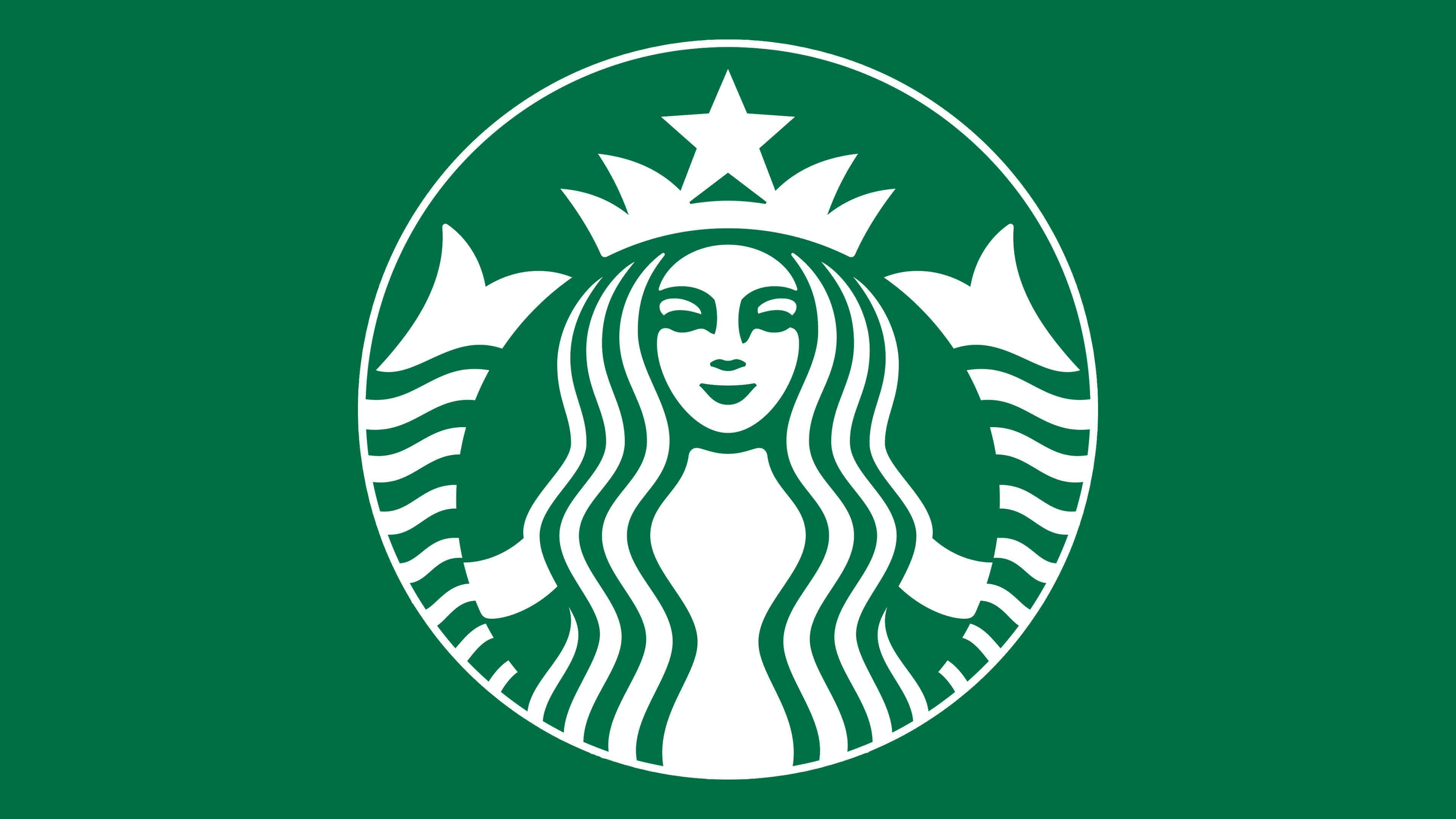
2011 – today
![]()
In 2011, as the brand became globally recognized, the company’s management decided to remove unnecessary design elements, including the entire outer circle with inscriptions. Only the beautiful mermaid on a green background remained. Similar changes were made in line with the modern trend of ECO-logos, simplifying the design and reducing the amount of paint used to preserve the environment.
Font and Colors
Another interesting feature is associated with this logo. Conspiracy theorists saw many strange signs in the trademark. The mermaid on the 1971 emblem closely resembles Queen Esther, suggesting the company owners are Zionists. If the image is turned upside down, it resembles a goat’s head, a devil symbol. The five-pointed star on the crown is a Satanic pentagram.
These speculations have long been exaggerated in the press. On the one hand, like Siren’s bare chest, it was additional free advertising; on the other, in conditions of successful growth, the company did not want to risk its reputation. Therefore, it was decided to replace the old image with a simpler, more beautiful one.
An unconventional logo choice was one of the three main factors in global success, alongside product quality and the coffeehouse network idea.
Today, the new logo symbolizes the union of modernity with the traditions and values of American society. Green color and minimalism are a tribute to the company’s ecological direction aimed at preserving the environment.
From the beginning, the old logo played a key role in the rapid growth of the coffee shops’ popularity. The unusual design attracted attention and generated interest in Starbucks products. The history of this logo’s creation is studied in design schools as an example of a successful combination of smart marketing and the visual language of information.
The product packaging is printed with the company name, documentation, class, and features. A font with clear, legible letters without serifs is used. The modern logo’s main color scheme is a shade of green, with the hexadecimal code #00704A; in the Pantone color system, it is designated as 3425C. The name is white (hexadecimal: #FFFFFF) and black (hexadecimal: #000000).
FAQ
What is the meaning behind the Starbucks logo?
The Starbucks logo features a siren, copied from a 16th-century engraving. There are parallels here: Starbucks coffee lures weary travelers, just as sirens lure sailors. At the same time, the maritime theme conveys Seattle’s spirit.
Who is the queen in the Starbucks logo?
Some people think the girl on the Starbucks logo is Queen Esther. This is not true. The image of the woman with wavy hair was taken from a 16th-century engraving depicting a two-tailed mermaid.
Is the Starbucks emblem a mermaid?
The Starbucks emblem features a two-tailed mermaid siren. Looking closely, you can see the tails to the right and left of her face.
Is Medusa the emblem of Starbucks?
The woman on the Starbucks emblem is not Medusa the Gorgon, as she does not have snakes on her head.