The Nescafe logo conceals a rich coffee aroma behind its symbols. Simply opening the lid attracts those wanting to enjoy a cup of invigorating drink. The emblem suggests hiding this treasure and savoring its taste away from prying eyes.
Nescafe: Brand overview
Nescafe is a globally renowned trademark of the Swiss corporation Nestle S.A. It emerged in 1938 when Brazil asked Nestle for help with the problem of storing coffee beans. The South American country sought technologies to extend the shelf life of the raw material after drying. The food company enthusiastically embarked on the project. Over the next seven years, it invented the “coffee cube,” and in 1938, released the product under the Nescafe brand.
Meaning and History
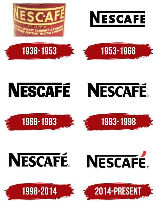
Over decades, the brand has changed six logos, all remarkably similar to one another. Even the font transformation went unnoticed: conservative designers never deviated from the original concept. Thus, updating the logo is essentially an evolution of the dash above the last letter “É.” From a normal superscript mark used to indicate sound, it transformed into a small cloud, symbolizing coffee aroma.
What is Nescafe?
Nescafe is a leading global supplier of instant coffee. Owned by Nestle, it entered the market in the spring of 1938. It is now the most popular brand worldwide as it supplies coffee products to all countries. Its name is derived from the first segment of the parent company’s name (“Nes”) and the word “cafe.”
1938 – 1953
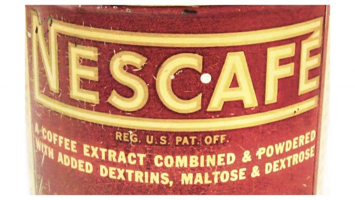
The first logo version was in light brown shades: inside a coffee rectangle, the word “NESCAFÉ” was colored like baked milk. The inscription was in a standard sans-serif font. From the letter “N” to the right ran two long horizontal stripes – one above, the other below.
1953 – 1968
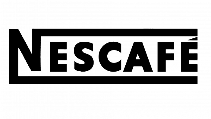
After a slight redesign in 1953, the palette changed. The background became white, and the word – gray, so the obvious coffee associations disappeared. The proportions changed, too: designers reduced the size of all letters except the first.
1968 – 1983
The new logo lacks underlining. The top stripe is shortened – continued by a large horizontal line above the letter “É.” The letters “S” and “C” have horizontal cuts on the edges, not vertical as before. Black was used instead of gray to make the brand more noticeable.
1983 – 1998
Another redesign in 1983 brought minor changes to the logo: vertical cuts at the ends of the letters “S” and “C,” a sharpened line over the letter “É” in the shape of a triangle, the top line’s end coming off the letter “N” trimmed, and elegant serifs added to the letters. After the update, the font faintly resembled Majesty and Agenda URW Bold.
1998 – 2014
In 1998, the font was modernized again. The serifs were lengthened and slightly slanted, giving the logo dynamism. The most significant change was the stick above the letter “É”: the rectangular triangle turned into a smooth line, resembling the famous Nike swoosh.
Simultaneously, the brand acquired another equivalent emblem. Designers made the word “NESCAFÉ” gray and complemented it with the corporate slogan “Open up.” The phrase was diagonally positioned in the lower right corner, ascending. The letters were red, and the font mimicked handwriting.
For the 75th anniversary, a commemorative logo was created: a red square with rounded corners. Inside it was the white inscription “NESCAFÉ,” overlaid with large golden numbers “7” and “5” with the suffix “years.”
2014 – today
The 2014 logo was developed by three companies: Publicis Groupe and CBA from Paris, and OgilvyOne from New York. Designers strived to preserve Nescafe’s original style, presenting it in a renewed form. They reimagined what had become familiar:
- Replaced the old font with a grotesque one.
- Eliminated rectangular forms.
- Made the line over “É” red and elegantly curved.
Nescafe: Interesting Facts
Nescafé is a famous instant coffee that is loved by people all around the world.
- How It Started: Nescafé began in the 1930s when Brazil had too many coffee beans and needed a way to keep them from going to waste. Max Morgenthaler and his team spent seven years creating Nescafé, which first came out in Switzerland on April 1, 1938.
- Becoming Popular: During World War II, American soldiers drank a lot of Nescafé, which helped make it famous worldwide.
- How It’s Made: To make Nescafé, coffee beans are roasted, mixed with water to extract the flavor, and dried into a powder that can be used as coffee by adding hot water.
- Going Global: Nescafé was sold in over 50 countries by the 1950s after it became popular in Switzerland. Now, it’s available in over 180 countries.
- Different Kinds: Nescafé makes many types of coffee, including decaf, flavored coffees, and fancy ones like Nescafé Gold.
- Caring for the Planet and People: In 2010, Nescafé started the Nescafé Plan to ensure coffee farming is good for the earth and helps farmers live better lives.
- Getting Social: Nescafé was one of the first to use social media to talk to coffee lovers, starting a blog on Tumblr in 2014.
- A Love Story on TV: In the UK, Nescafé Gold Blend was known for TV ads in the 1980s and 1990s that told a love story people enjoyed.
- Not Just Instant Coffee: Nescafé also makes coffee machines like Nescafé Dolce Gusto and Nescafé Gold Blend Barista so people can make their favorite coffee drinks at home.
- Setting Records: Nescafé even set a world record for creating the largest coffee mosaic, showing how much people love the brand.
Nescafé’s story shows how a simple idea to save coffee beans turned into a drink millions enjoy daily.
Font and Colors
The Nescafe trademark name is creatively played out. It represents a combination of the words “Nestle” (the parent company’s name) and “cafe” (the range includes instant coffee in granules or powder). Characteristic style elements are the long horizontal line coming from the top of the letter “N” and a small diacritical mark in the form of a cloud over the letter “É.”
The custom serif font is based on Neuropa. In this case, the two letters “E” resemble a mug handle, and the stick above “É” symbolizes steam rising from a hot drink. Since 1998, the color palette includes black, white, and red.
Nescafe color codes
| Dark Charcoal | Hex color: | #302e2e |
|---|---|---|
| RGB: | 48 46 46 | |
| CMYK: | 0 4 4 81 | |
| Pantone: | PMS Black C |
| Red Orange | Hex color: | #ff2f2d |
|---|---|---|
| RGB: | 227 212 173 | |
| CMYK: | 0 4 20 7 | |
| Pantone: | PMS Bright Red C |
FAQ
What does the Nescafe logo mean?
The Nescafe logo is a marketing tool that inspires trust in the instant coffee produced under this brand. Above the last vowel is the diacritical letter é, turned into steam seductively emanating from a cup of hot coffee.
What does the Nescafe symbol represent?
The Nescafe symbol contains the company’s name, reproduced in a stylized inscription. Designers rounded all the letters, giving them a softness, and transformed the accent over “é” into a seductive element – steam, seemingly emanating from a hot coffee mug. The letter “N” has a long stripe at the top, which transitions to the right and connects all the letters.
What font is used in the Nescafe logo?
The modern version of the Nescafe logo features an inscription in a grotesque font. It’s a hybrid between Friz Quadrata Bold and Angie Black, with elements taken from both versions. It most closely resembles Neuropa.
