


![]() Jagermeister Logo PNG
Jagermeister Logo PNG
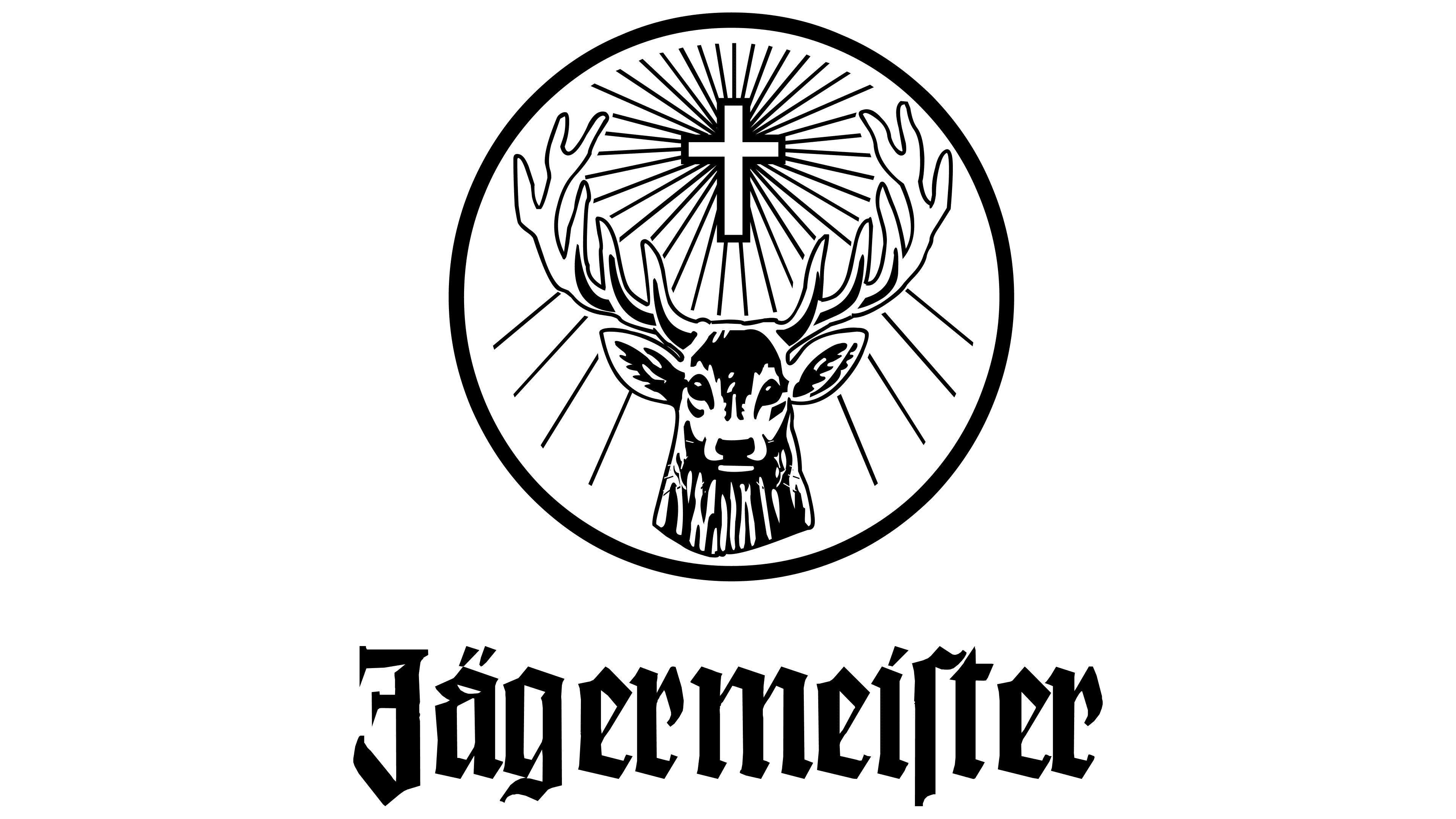
The Jagermeister emblem reflects the brand’s connection to and commitment to the health of the strong German alcoholic drink made from an infusion of 56 herbs. The emblem is dedicated to Bishop Hubertus, the patron saint of hunters, linking the brand to its origins and reflecting the drink’s uniqueness.
Jägermeister began in 1878 in Wolfenbüttel when Wilhelm Mast founded a vinegar business. After World War I, debt pushed the company to the edge. Around 1918, his son, Kurt Mast, shifted to wine trading and began experimenting with herbal infusions.
By 1934, after years of trial and error, Kurt Mast created a recipe with 56 ingredients, including anise, ginger, cinnamon, and juniper, blended with 35% alcohol and aged in oak barrels for about a year. The formula remained unchanged. The name Jägermeister reflected a hunting title used in Germany, and the logo referenced the legend of Saint Hubert.
The drink was initially sold in Germany as a digestif, mainly for older consumers. In 1972, the brand sponsored Eintracht Braunschweig, becoming the first German company to place a logo on a football shirt after a legal dispute.
In 1975, US importer Sidney Frank ordered 2,400 cases and repositioned the drink for a younger audience. Marketing campaigns, including Jägerettes and chilled service at -18 degrees, expanded its presence in bars.
By 2005, Jägermeister became the top imported liqueur in the United States and was sold in over 70 countries. In 2006, production reached 76.5 million bottles.
Competitors such as Averna and Chartreuse remained niche in comparison. In 2015, Mast-Jägermeister SE acquired Sidney Frank Importing, gaining full control of US distribution. In 2017, the company introduced Jägermeister Manifest as a premium variant.
Meaning and History
![]()
The progenitor of the alcoholic drink is considered to be Curt Mast, who developed it as a pharmaceutical remedy that improves digestion. The exact recipe of the liqueur is a commercial secret and is not disclosed. It is only known that bark, roots, flowers, leaves, and other parts of plants are poured with an alcoholic product and placed in wooden oak barrels for about a year. Then, the contents are drained, filtered, and sealed in bottles with original labels.
They feature the head and powerful torso of a deer with a cross between its antlers. This image is the emblem of the strong drink. It was proposed by Curt Mast and dedicated to Saint Hubert, the patron saint of all hunters. The story of the original emblem is connected with the ancient legend of the jäger-monk, the former Count Hubert of Liège.
Once, while in the Christmas forest, he saw a large deer with a glowing cross between its antlers. This event greatly influenced the avid hunter: he considered it a sign from God and took monastic vows, leaving worldly vanity. In the monastery, to which he donated all his fortune, the count died and was canonized. Since then, Hubert of Liège has been considered the patron saint of hunting and hunters.
Since the liqueur is named Jagermeister and is dedicated to this theme, it was immediately decided to associate it with the image of Saint Hubert and a unique vision. As a result, an ancient religious event gave the brand of strong drinks its name and logo.
What is Jagermeister?
Jägermeister is a German herbal liqueur brand. Its recipe has never changed: as far as we know, it contains alcohol, caramel, sugar, and 56 herbal ingredients, including spices, roots, and fruits. This composition gives it a sweeter taste compared to European spirits. The liqueur is produced by Mast-Jägermeister SE and sold in branded green rectangular bottles.
1937 – 1949
![]()
The approved emblem (essentially the bottle label) embodies the company’s core spiritual values: a deer, a cross between its large antlers, and the radiance emanating from the Christian relic. The animal is depicted in both close-up and full-length. It looks concentratedly forward. All main elements are set against a brown circle. The first line contains the trademark name and information about the product being produced: volume, alcohol content, variety, manufacturer, and the year the company was founded. A separate field is allocated for each label. In front of the deer is a green branch of a coniferous tree, as a connection to Christmas.
1949 – 1970
![]()
In the mid-20th century, the manufacturer redesigned the logo, removing some details. The simplified version also resembles a vertical rectangle with a northern deer at the center. But unlike the previous image, the animal is not drawn so realistically. The designers made the cross smaller, gave the glow clear contours, added oak to the spruce branch, and replaced the green color with light beige. A dark brown background frames the gold ring. Overall, all elements have become more symmetrical. The only things that remained unchanged were the orange substrate for the brand name and the green edging strip.
1970 – 1987
![]()
The adjustments were minimal. The developers changed the gold color to light gray, reduced its brightness, and added informative inscriptions at the bottom.
1987 – 2002
![]()
In this version, the content and location of the text changed: instead of three lines, there were two, and the indication of the bottle volume was moved to the lower-left corner.
2002 – 2006
![]()
This time, the designers rearranged almost all the elements, rounding the rectangle’s top. In addition, they removed the narrow brown-orange ribbon from the logo, moved the brand name up, and reduced the deer’s circumference. The developers also made the cross luminous, removed the white stripes around it on a gray background, adjusted the informational inscription, and split it into six lines. A gradient was added to the green frame.
2011 – 2016
![]()
In 2011, an option was chosen with detailed leaves and spruce needles on the branches. The logo’s color became more muted.
2016 – today
![]()
The current logo has changed its shape and now looks like a vertical rectangle with rounded corners again. Instead of a brown circle, there is now a green one with a gradient that creates a bright glow from the cross. In addition, the artists redrew the deer, making it slightly larger so that the branched antlers touched the gold ring. The informational design, occupying all the space from the middle down, has also changed. The final touch of the logo is a dark edging strip around the perimeter of the rectangle, stretching upwards.
Font and Colors
The trademark for the legendary liqueur was registered in 1937. It consists of several elements. The most important of them is a deer with branched antlers. It stands in the center, and above its head shines a large Catholic cross. The glow is rendered as a foggy circle, highlighted in a different color.
The deer is depicted frontally, looking straight ahead. On the relief emblem, the animal is depicted in detail, with a pattern that closely matches the artiodactyl’s natural appearance. In the foreground, a spruce branch indicates the forest and New Year’s theme. In later versions, the spruce paws are shaped like a semi-fir tree.
Almost in the center of the logo runs a wide red strip on which the drink name, the manufacturer, the trademark, and other marketing information are placed. The corrections made in 1947 are reflected in the image of the deer. In particular, the glowing mist has received clear outlines. Several more minor changes were made, so today the liqueur’s emblem looks the same as it did at the beginning. The latest changes were made in 2011.

The name is written in a Gothic font that combines elements of Wilhelm Klingspor Gotisch, KochFraktur-Regular, and Deutsche Schrift Schmal. The brand’s color palette includes several shades of brown, beige, green, white, and red.