The Pepsi logo used to look a lot like the red Coca-Cola sign. But then designers decided to personalize it and created a red, white, and blue symbol that originally looked like a bottle cap. The multicolored circle of the Pepsi logo resembles a globe – not in color, of course, but in shape – and represents the brand’s worldwide popularity.
Pepsi: Brand overview
Pepsi is one of the most popular soft drinks with its iconic logo. It is owned by the eponymous company PepsiCo and has changed its name several times. It was called Brad’s Drink until 1898, Pepsi-Cola until 1961, and now Pepsi. The drink’s creator is Caleb Bradham, who, in 1893, mixed several unique ingredients to produce a product with an authentic flavor.
In the heart of 1893 North Carolina, within the small town of New Bern, pharmacist Caleb Bradham embarked on an endeavor that would forever alter the landscape of American beverages. Initially concocted as a medicinal tonic named “Brad’s Drink,” it aimed to offer relief from digestive disorders, blending a mix of kola nut extract, vanilla, and rare oils. Little did Bradham know his creation would evolve far beyond its humble origins.
By 1898, a pivotal rebranding took place, transforming “Brad’s Drink” into the iconic Pepsi-Cola, setting the stage for the birth of the Pepsi-Cola Company in 1902. Bradham’s vision extended to franchising, enabling the distribution of his concentrate to franchises eager to add fizz and bottle the elixir under the Pepsi name.
However, the journey was not without its trials. The Great Depression of 1931 saw Pepsi navigating financial turmoil, culminating in bankruptcy. It was Charles Guth, a confectionery mogul, who saw the untapped potential in Pepsi. By acquiring the company, Guth introduced strategic pricing and packaging changes, significantly lowering the price while upsizing the bottle and revitalizing Pepsi into a profitable venture.
The mid-20th century marked Pepsi’s audacious move to position itself as the vibrant, youthful counterpart to its rival, Coca-Cola. This era heralded Pepsi’s expansion into the international market and its aggressive marketing campaigns aimed at capturing the hearts of the younger generation.
The innovation continued into the 1960s with the introduction of Diet Pepsi and Mountain Dew, complementing its strategy to sponsor music and sports events, further cementing its appeal among the youth. The subsequent decades saw Pepsi diversifying its portfolio through acquisitions, including snack giant Frito-Lay and Pizza Hut, broadening its dominion in the food and beverage industry.
Entering the “Cola Wars” of the late 20th century, Pepsi sparred with Coca-Cola in a high-stakes marketing showdown, pouring millions into advertising and embracing a shift towards healthier beverage options, responding to changing consumer demands.
Today, as a titan in the global food and beverage sector, PepsiCo boasts an extensive array of brands, including not just Pepsi but also Gatorade, Quaker, Lay’s, and many more. Standing tall as Coca-Cola’s foremost challenger, PepsiCo continues to innovate and adapt, proving itself a dynamic force attuned to consumers’ evolving tastes worldwide.
Meaning and History
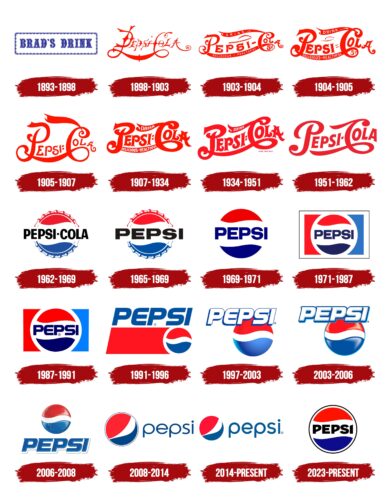
The Pepsi brand of soft carbonated beverages, owned by the PepsiCo Corporation of America, has a unique visual identity. The most recognizable part of it is a round emblem that combines three colors: red, white, and blue. They are presented as three even stripes, an iconic identity element. The lines became diagonal only in 2008. Until then, they were predominantly horizontal (since 1962) or not at all, as the logo contained only a stylized bright red lettering until the early 1950s. The design of the word mark was constantly changing, but each version featured elements such as spirals, loops, and sharp serifs at the ends of the letters.
What is Pepsi?
Pepsi is a brand of carbonated drink that does not contain alcohol. It belongs to PepsiCo, which has been producing it since 1893 (though under a different name at first). The developer of the drink is Caleb Bradham. The pharmacist proposed to treat diseases of the gastrointestinal tract, which is directly indicated by the name because “pepsis” translates from Latin as “digestion.”
1893 – 1898
The logo consisted of “Brad’s Drink” inscribed in blue capital letters with serifs and a decorative rectangular frame. At the same time, a red version appeared with graceful curves and ornate lines resembling a monogram.
1898 – 1903
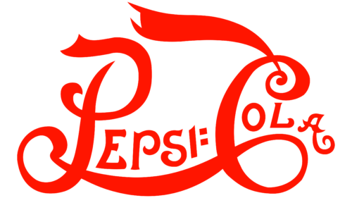
In 1898, the first emblem was proposed, consisting of the main components of the drink – “Pepsi” and “Cola.”
1903 – 1904
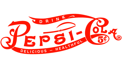
In 1903, the typeface changed noticeably. Designers removed some decorative elements – primarily dots, loops, jumpers, and protrusions, which reduced the legibility of the text. The distance between the letters became evener, although they were still far from ideal proportions. In addition, the logo developers shortened the leg of the letter “A” with a spiral. They added another spiral at the top of the letter “C” so that from the word “Cola” to the left side could be drawn a long strip in the form of a flag with the inscription “DRINK” white color. And on the bottom line connecting the initials “P” and “C” appeared the phrase “DELICIOUS – HEALTHFUL.” At the same time, in the outline of “C,” an element was added: the number “5” with the symbol of a cent. That is, the emblem acquired an obvious marketing function.
1904 – 1905
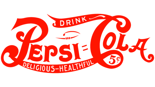
Designers additionally balanced the distance between the letters of the words “Pepsi” and “Cola” to make them legible. At the same time, the glyphs in “DRINK” and “DELICIOUS – HEALTHFUL” became uneven in height: they increased where the ribbon widened and decreased where it narrowed. The spiral at the end of the letter “A” is no longer as twisted as it used to be. The hyphen that separated the two parts of the brand name has turned into an equal sign made of two thin strips. Some letters have sharp and symmetrical serifs. The letter “O” has acquired an oval shape, and the logo creators slanted it diagonally, as it was above the lower loop of the letter “C.” The decorative element above the “C” also changed: the two side lines became shorter and pointed at the ends.
1905 – 1907
The developers used the logo in a bold font with elongated legs: “C” and “P.” The letters join to form a loop-shaped line with the rest of the letters.
1907 – 1934
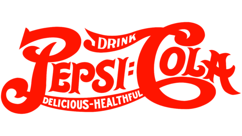
In 1907, on the “ribbons” formed by the protruding parts of the initials “C” and “P,” white inscriptions reappeared: above – “DRINK,” below – “DELICIOUS – HEALTHFUL.” At the same time, designers made the Pepsi logo more compact, reducing the distance between all elements by thickening the lines and reducing the distance between the letters. But at the same time, the previously reduced serifs became long and sharp, which added visual dynamics to the inscriptions.
1934 – 1951
It was replaced by a laconic version, which removed small and unimportant details. The letters became smoother and stretched into one diagonal line. The word “Drink” appeared on the “S” ribbon.
1951 – 1962
In 1951, designers brought all but the first letter to the same standard, using a modified bold typeface with short and sharp serifs. The word “DRINK” disappeared after the phrase “DELICIOUS – HEALTHFUL” was present in the emblem until 1934. The initials “P” and “C” became separated for the first time in a long time: the authors of the emblem made it so that both ribbons belonged only to “C.” Spiral elements turned into decorative dots. At the same time, the red color acquired a deeper and darker shade.
At the same time, a sign with the image of a bottle cap appeared. Since the logos of Pepsi-Cola and Coca-Cola were very similar in font and color, the designers decided to decorate the metal caps with three wavy stripes: red, white, and blue. As a result, this became the distinctive symbol of the Pepsi brand and evolved into its logo.
1962 – 1969
Designers repainted the phrase “PEPSI-COLA” in black and decorated it with a standard bold sans-serif font. For brand recognition, an image of a bottle cap with a wavy white stripe in the middle, red top, and blue bottom was still used. The lettering was located in the center and protruded far beyond the cap, dividing it into two equal parts.
Such global changes occurred because the manufacturer positioned its product as a youth beverage, not as a pharmaceutical drug, which Pepsi was in the beginning. At the same time, the wavy lines preserved the sense of inner energy and movement.
1965 – 1969
Pepsi-Cola removed the second part of its name to avoid being associated with Coca-Cola. As a result, only the word “PEPSI” remained on the logo, and its font changed. The letters became flatter, and the middle stroke, “E,” was shortened compared to the upper and lower strokes. The redesign was done by merging Pepsi-Cola and Frito Lay Inc. into PepsiCo Inc.
1969 – 1971
In the late 1960s, the logo progressed, with the bottle cap becoming an elegant circle. The ratio and arrangement of colors did not change, but the red and blue took on richer, brighter, and deeper hues. And the only inscription, which was previously black, was repainted in blue. At the same time, the designers adjusted the proportions of the letters so that they did not seem too flattened. As a result, the word “PEPSI” became more compact and no longer protruded so much to either side.
1971 – 1987
In 1971, the experiments with the emblem continued. The developers reduced the circle and placed it in a white ring, dulling the main colors. On the sides, two mirrored polygons appeared: left-red and right-blue. Together, they formed a kind of rectangle. This part of the logo was inside a white frame with a thin black outline.
1987 – 1991
After another redesign, the colors became brighter, and the black rectangular frame disappeared. The registered trademark sign appeared next to the second letter, “P,” at the bottom. But the main changes were in the lettering itself: instead of the standard bold grotesque, a futuristic font with rounded edges was used for “E” and “S.” The new glyphs emphasized the energy of movement hidden in the waves.
1991 – 1996
In the first half of the 1990s, the Logo was completely redesigned. The designers moved the “PEPSI” lettering to the top and italicized it while keeping the bold lettering. The iconic tricolor circle appeared in the lower right corner. The white stripe was reduced, while the red and blue stripes widened. To the left of the circle was a red polygon with one diagonal side, resembling a trapezoid. Because of the muted colors, the emblem did not look as bright as before. But it was compensated by the unusual shape of the elements.
1997 – 2003
In 1997, the era of Pepsi’s new three-dimensional logo began. The designers made the circle three-dimensional by using a gradient. To do this, they added a vertical dark line on the left side, respecting the geometric proportions of the ball. Only the central white stripe remained unchanged, resulting in the circle appearing not as a whole but divided into two multicolored fragments. The lettering was also visually convex, but this was achieved without a gradient. To draw attention to the name of the brand, the developers of the emblem repainted the letters in white and supplemented them with blue contours of uneven thickness. This created the impression that the word hangs in space and casts shadows.
2003 – 2006
In the early 2000s, the manufacturer of carbonated drinks continued to use the 3D emblem. However, after several changes, the circle became volumetric, not due to the usual gradient but due to light highlights, creating the effect of plasticity and artificiality. In addition, it has a light blue contour, which prevents the white wavy stripe from dissolving into the surrounding space when the emblem is placed on the same white background. A thin blue line also outlines the lettering below and to the right. Light gray shadows were added to give more volume to the letters. At the same time, the designers modernized the font by adding single sharp serifs to the letters “P,” “E,” and “I” in the upper left corner.
2006 – 2008
The designers turned Pepsi’s iconic circle into a stylized balloon. On the logo of that time, it looked as realistic as possible, as it had a balanced gradient extending to the central white part. The splashes of water enhanced the three-dimensionality of the image and created a sense of freshness and coolness associated with quenching thirst. The smaller circle was moved to the top and aligned in the center. The brand name was at the bottom. Its font remained practically unchanged, but the color did:
- The letters are dark blue.
- The backlighting is light blue.
- The shadows are wide and white.
- The bottom outlines are light gray.
2008 – 2014
In 2008, the designers introduced a completely new logo with the lettering to the left of the word “Pepsi.” The letters are made in a thin, rounded font in lowercase, and the colors form the likeness of a good-natured smile. The updated logo is the most minimalistic in the brand’s years.
2014 – 2023
A 2D version of the Pepsi logo is now used, devoid of the gradient that dominated the decade from 1997 to 2008. The circle is still on the left and divided into three color blocks, but now it has no dark border. The top half is a deep red, while the bottom half is traditionally in two parts: white and blue. The white stripe is no longer wavy – it resembles a feather curved on one side. But the wavy line replaces the horizontal stroke of “e” in the word “Pepsi,” where all letters are lowercase. Geometric font with rounded glyphs harmonizes with the round shape of the emblem.
2023 – today
The logo presented in 2008 is noticeably outdated. The main problem was that “Pepsi” was not associated with the globe. The muted color of the lettering and the modest font did not inspire confidence or match the brand’s energetic image. So, in 2023, PepsiCo modernized its flagship brand logo to highlight a new product – a sugar-free carbonated beverage. This line, Pepsi Zero, became the basis of the company’s future strategy. Thus, the emblem hints at Zero’s dark label: the emphasized black color. It is used for the lettering and the surrounding frame.
You could say that this is an attempt to evoke nostalgia because, before the 1990s, Pepsi already had a logo in the form of a circle of three wavy lines with text in the middle. The company simply updated it by making the lettering clear. All the letters are uppercase, bold, and black. They do not have serifs, but they have symmetrical cuts: the diagonal parts of the letters “P,” “S,” and “I” are beveled at the same angle. This creates a sense of movement. The red-white-blue wave is outlined by a black ring, which pulsates energetically in the video ad.
As Mauro Porcini (the company’s chief designer) explained, moving the lettering to the center was not spontaneous. PepsiCo conducted experiments, asking random people to draw its logo from memory. However, it turned out to be a difficult task: most respondents placed the name of the carbonated drink in a circle, although the real logo looked completely different. The owners of the brand decided not to reject public opinion but to accept it. Therefore, the word is now located in the center of the globe. This is a hint that Pepsi is in the center of the world.
Pepsi: Interesting Facts
Pepsi is a well-known brand with a rich history of key moments and achievements.
- How It Started: In 1893, Caleb Bradham’s pharmacist made Pepsi in New Bern, North Carolina. First called “Brad’s Drink,” it got the name Pepsi-Cola in 1898 from ingredients like pepsin and kola nuts.
- Logo Changes: The Pepsi logo has changed significantly. It went from simple writing to the current globe design with red, white, and blue colors, showing how Pepsi has kept up with times and trends.
- Thriving in Tough Times: During the Great Depression, Pepsi offered a 12-ounce bottle for 5 cents, twice as much as others for the same price. This clever move helped Pepsi grow.
- Pepsi Challenge: In the 1970s, Pepsi ran a campaign where people blind tasted Pepsi and Coke, and more people liked Pepsi. This was a big deal in Pepsi’s rivalry with Coca-Cola.
- Famous Faces: Pepsi’s ads have featured stars like Michael Jackson and Britney Spears, keeping the brand young and trendy.
- Space: Pepsi was the first soft drink in space. In 1985, they made a special can for space to test how liquids handle in zero gravity.
- Worldwide Love: People in over 200 countries enjoy Pepsi. The brand has made sure its flavors and ads fit different cultures.
- Caring for the Planet: PepsiCo, the company behind Pepsi, is working on being more sustainable. They’re trying to use less water, reduce waste, and use energy more efficiently.
- More Than Cola: PepsiCo owns drinks like Mountain Dew and Gatorade and snacks like Frito-Lay chips, showing they’re always coming up with new ideas.
- Helping Out: PepsiCo does a lot of charity work, like helping in disasters, improving access to clean water, and supporting communities that need it.
These points highlight Pepsi’s growth from a small pharmacy drink to a global drink giant, famous for its marketing, cultural influence, and efforts to be more responsible and helpful to society.
Font and Colors
The famous brand has changed more than ten logos in its more than 100-year history. Initially, the adjustments were forced and related to the competition between the Pepsi and Coca-Cola brands. But the modern logo is completely different. Because it resembled the globe, it was named Pepsi Globe, symbolizing the original drink’s worldwide popularity.
The word part uses a custom-made italic Roman type font called Pepsi Light. The emblem also uses a font vaguely reminiscent of Harry Plain. The trademark’s color scheme has always remained the same: a multivariant combination of blue, white, and red. In addition, the bands of color form an attractive smile. It came after a recent redesign (in 2008) by Arnell Studio. The agency received $1,000,000 for its innovation.
FAQ
What does the Pepsi logo represent?
The modern Pepsi logo is a circle consisting of three fragments of blue, red, and white colors. They are arranged in such a way that they form a slight smile. To the right of it is the name of the drink, typed in lowercase letters in the form of a smooth and rounded grotesque.
Why is the Pepsi logo effective?
The effectiveness of the Pepsi logo lies in its shape and color. First, the lid of the drink bottle is enticingly depicted from above, as if it is being looked at and about to be opened. Second, it is painted in blue, red, and white, which convey the colors of the U.S. national flag, influencing the patriotic feelings of customers.
Why did Pepsi add the color blue to its logo?
The Pepsi logo was first colored blue in 1950. This color was chosen to support the patriotic spirit, as the emblem lacked the blue color needed to convey the palette of the U.S. national flag.
Who designed the Pepsi logo?
The Arnell Group design agency worked on the Pepsi logo. Typographer Gerard Huerta created the Pepsi Light typeface.
