


![]() Heineken Logo PNG
Heineken Logo PNG
Leadership is evident in the beer logo. The company outperforms its competitors in many ways. The Heineken logo emphasizes the most important of them: the drink’s richness and its use of only natural ingredients. As a result, the product turns out soft to the taste and pleasant to the touch.
Heineken began in 1864 when 22-year-old Gerard Adriaan Heineken bought the Amsterdam brewery De Hooiberg, founded in 1592, with 50,000 guilders borrowed from his mother. The site produced outdated ale, but he treated it as a base for change.
In 1867, production moved to a new plant in southern Amsterdam. He hired Wilhelm Feltkamp, trained under Louis Pasteur. In 1886, Feltkamp developed Heineken A-yeast, still used today. The company shifted from ale to lager, aligning with a broader European trend.
In 1873, the firm became Heineken’s Bierbrouwerij Maatschappij. Awards were held in Vienna in 1873 and in Paris in 1875 and 1889, building a reputation through exhibitions.
After Gerard died in 1893, control passed to his son, Henry Pierre Heineken, who led from 1914 onward. In 1933, after Prohibition ended, Heineken became the first European beer imported into the United States, opening a key export market.
In the 1940s, Alfred Heineken took over and focused on branding. In 1954, he introduced the green bottle and red star. In 1968, the company acquired Amstel and Ridder, strengthening its domestic position.
From the 1970s onward, expansion relied on acquiring breweries across Africa and Europe. In later decades, consolidation intensified competition with AB InBev. Major deals included BBAG in 2003 and, with Carlsberg, Scottish & Newcastle in 2008.
In 2010, Heineken acquired FEMSA Cerveza, adding Dos Equis, Tecate, and Sol to its portfolio. Stakes in Kirin Holdings in 2017 and China Resources Beer in 2021 expanded its global footprint.
Meaning and History
![]()
The founder of the modern logo is often considered Alfred Henry (Freddy) Heineken, who first worked as an advertising manager and later became the CEO. He oversaw all design changes and made revisions. He immortalized his family name, turning it into a famous brand.
What is Heineken?
Heineken Lager Beer is a brand of strong alcoholic beverage with an alcohol content of 5%. It belongs to the Dutch company Heineken N.V., which began as an Amsterdam brewery and has since become a leader in the alcohol market. The key ingredient of the beer is “Heineken A-yeast” yeast, bred by a student of French microbiologist Louis Pasteur in 1886, and production of Heineken lager beer began in 1864.
1864 – 1884
![]()
The first version of the emblem has not survived. It is believed that it served as a model for the next trademark, and there is no exact information about what it looked like.
1884 – 1889
![]()
In 1884, the legendary oval logo appeared on Heineken beer bottles. It was divided into three parts:
- A white center with artistic ornamentation and a five-pointed star containing the abbreviation “HBM.”
- A green border with the inscription “HEINEKEN’S AMSTERDAM-ROTTERDAM.”
- A horizontal black ribbon marked the product name: “PILSENER BIER.”
1889 – the 1930s
![]()
After a slight redesign, the colors took on cooler shades. In the upper half of the oval, red inscriptions, “GRAND PRIX PARIS 1889”, “HORS CONCOURS MEMBRE DU JURY PARIS 1900,” and “TRADEMARK” appeared. The figural ornament was replaced by two medals supplemented by the inscriptions “DIPLOME D’HONNEUR AMSTERDAM 1883” and “MEDAILLE D’OR PARIS 1875”.
1930 – 1954 (Dutch version)
![]()
Beers sold in the Netherlands before 1954 used a rectangular emblem with rounded corners. In the center was a large five-pointed red star. To the right and left of the upper ray were two old coats of arms. Across the star were the words HEINEKEN’S, PILSENER, and BIER. Below it was “AMSTERDAM ROTTERDAM”.
1930 – 1951 (international version)
![]()
From 1930 to 1951, bottles in all countries except the Netherlands were decorated with an oval logo. It was a revised version of the trademark that had appeared as early as 1889. Its main difference is the new inscriptions “HEINEKEN’S LAGER BEER” and “HEINEKEN’S BREWED IN HOLLAND.” The former is at the top of the green frame, the latter on a black cross ribbon. The star in the upper half of the oval has turned red.
1951 – 1954 (international version)
![]()
In 1951, the designers finalized the previous emblem, adding a white frame. Moreover, they managed to fit in the whole text: “BREWED AND BOTTLED BY HEINEKEN’S BREWERY. ROTTERDAM (HOLLAND) NET CONTENT 12 FL. OZ.” in red. The star became white again to avoid association with communism.
1954 – 1974
![]()
In 1954, the brewery introduced an oval logo with the word “Heineken” on a black horizontal ribbon. All letters except the first were lowercase. Freddy Heineken wanted the label to be credible, so he chose a rounded font.
1974 – 1991
![]()
In the mid-1970s, designers changed the emblem’s shape, making the oval flatter. Also, some lettering was removed, the band with the concern’s name was enlarged, and the outer white border was outlined in green.
1991 – today
![]()
![]()
The brand moved into the new century with a minimalist logo consisting only of the word “Heineken” and a red five-pointed star.
Font and Colors
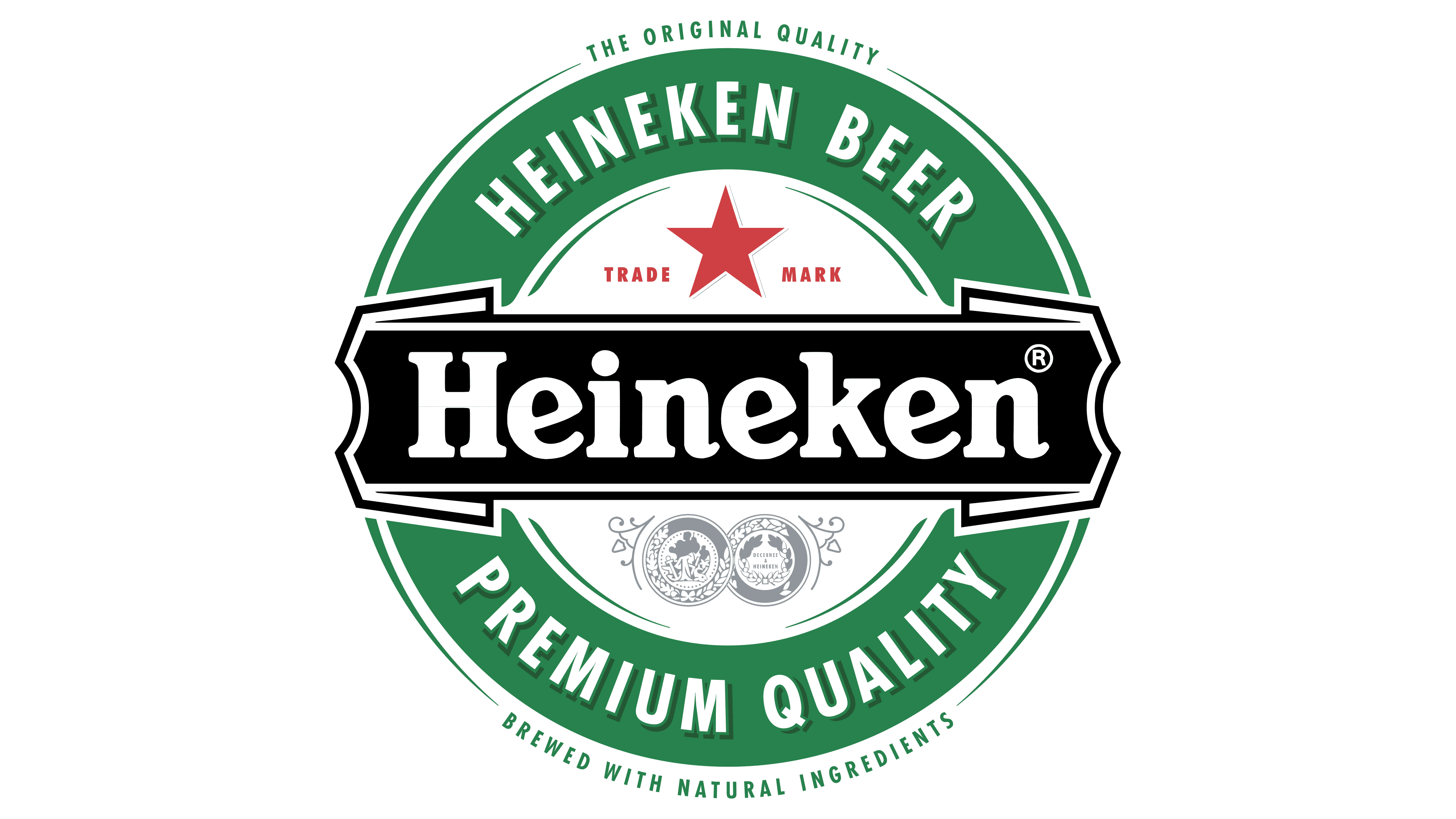
The brand’s recognizable name is one of the factors behind Heineken’s global success. It has always been oval, except for the Dutch version from 1930 to 1954. The basic elements, a black ribbon, a five-pointed star, quality marks, and numerous inscriptions, adorned beer bottle labels for about 127 years. Everything changed in 1991, when designers removed unnecessary details, leaving only the star and the company name.
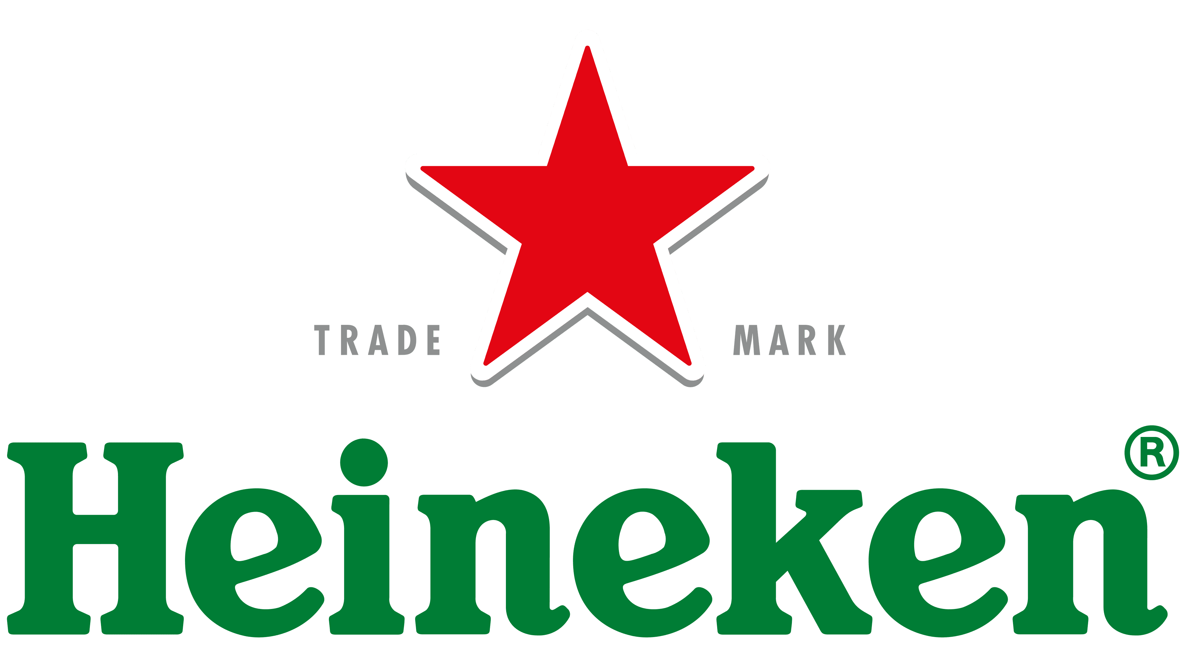
The modern version of the logo served as the basis for the Heineken Serif corporate font, featuring a characteristic beveled letter e. It was developed by the design firm Eden based on the Horizon font. The palette includes three colors: green, white, and red.