


![]() Carling Logo PNG
Carling Logo PNG
The updated Carling logo symbolizes the unity of the deservedly old and the promising new in modern design. It ensures brand recognition, external attractiveness, and differentiation from competing products.
Thomas Carling was born in 1797 in Etton, East Yorkshire. In 1818, he left Hull for Canada, taking a family ale recipe with him. He settled in London, Upper Canada (later London, Ontario), cleared land, and built a farm. Neighbors helped with fieldwork, and he repaid them with food and home-brewed beer. Demand grew quickly, with support from a nearby British garrison, and Carling began selling beer locally.
In 1840, he opened a small brewery with two kettles and six workers. Around 1849–1850, control passed to his sons, William and John. By 1875, they built a six-story brewery on the Thames River. A fire in 1879 destroyed it. William died of burns; Thomas died in 1880; and John rebuilt the plant and continued operations while pursuing a political career under Prime Minister Macdonald.
In 1930, E. P. Taylor absorbed the business into Brewing Corporation of Ontario, later Canadian Breweries Limited, alongside O’Keefe Brewery. Carling Red Cap Ale became a leading brand in Ontario in the 1960s. Expansion into the US began in 1934 in Cleveland, though Carling later faced pressure from Anheuser-Busch and Miller Brewing.
Carling Black Label entered the UK in 1952 via Hope & Anchor. By the early 1980s, it led the market, ahead of Heineken and Foster’s. In 1989, Carling O’Keefe merged with Molson Brewery, and in 2005, Molson joined Coors to form Molson Coors. In 1993, Carling became the title sponsor of the Premier League, and by 2007, UK sales reached 2.3 billion pints.
Meaning and History
![]()
What the original Carling logos looked like is unknown, as there is no visual information. It is known only that in Canada, it bore the name and image of a lion sculpture from Westminster Bridge in London, symbolizing the brand’s British origin.
What is Carling?
This is one of the leading British beer brands, owned by Molson Coors Brewing Company, known for its crisp, refreshing taste and popularity in pubs across the United Kingdom. From the flagship lager to specialty brews like Carling Black Label and citrus-flavored options, the company offers a variety of beers with consistent quality and flavor. The brewery in Burton-upon-Trent uses a process that combines traditional methods with modern technology, creating a lager with a balance of malty notes and subtle hop character, suitable for celebratory occasions and everyday enjoyment.
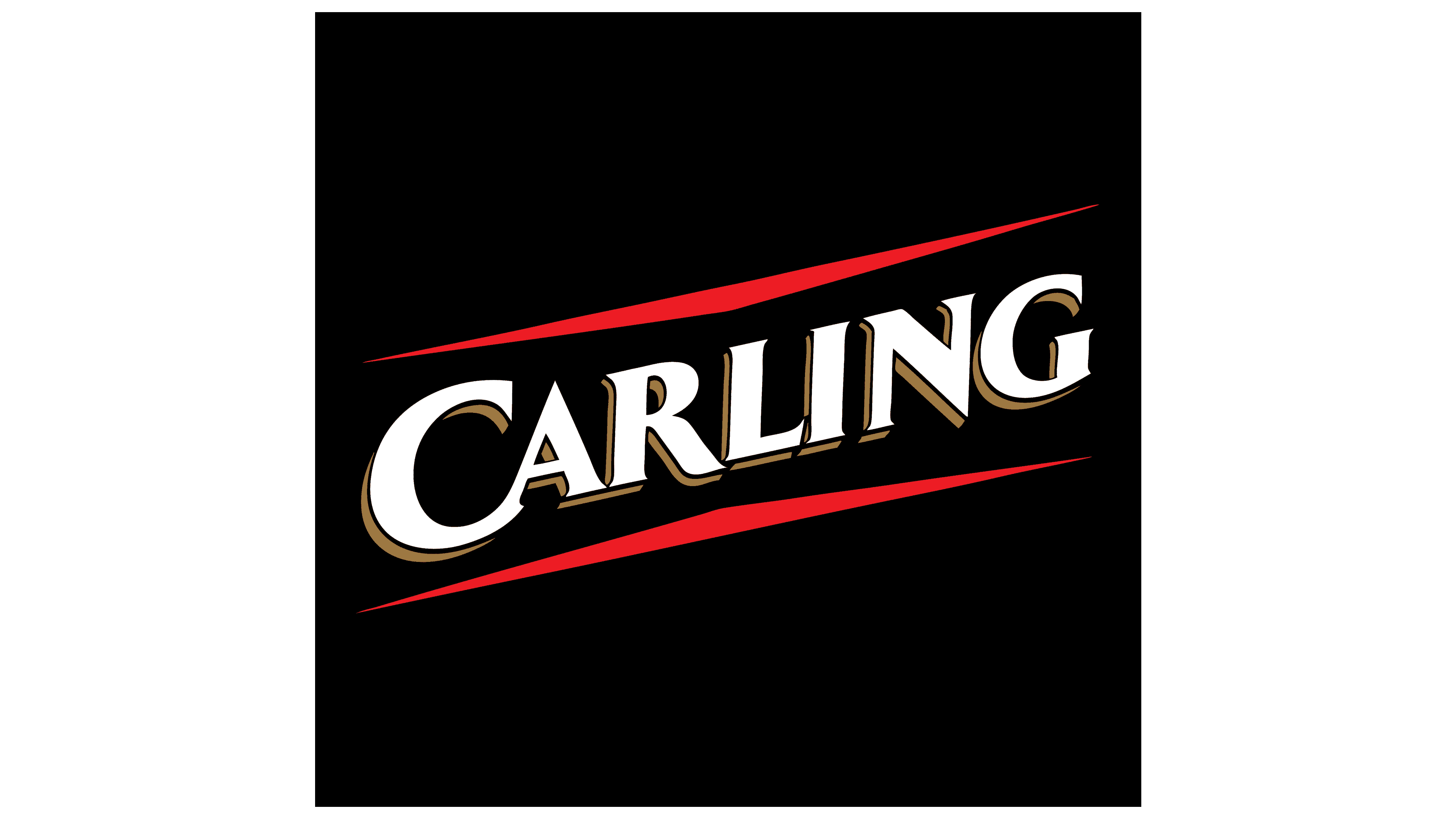
the 1990s – 2011
![]()
The logo is a simple diagonal rectangle. It contains only one word, “Carling.” It’s in white, augmented with shadows, giving it a three-dimensional look. Each letter has a golden outline at the bottom and on the left, separated from the main character by a thin black line. This visually expands the symbols, adding a 3D effect. Above and below the inscription are two elongated red triangles with extremely sharp angles. The logo’s main background is black.
2011 – 2017
![]()
In the next redesign, the beer brand decided to move away from the emblem’s massiveness and adopt a radically different, light, and airy design. The logo features a crest with wheat ears, a hop cone, and two heraldic lions standing on either side, each placing a paw on a miniature shield. The brand name is centered. The word “Carling” is black and simple, with small one-sided serifs on the left. Below it is a red line, and even lower, a place from which thin grey stripes radiate upwards. The branding also indicates the year the brewery was founded.
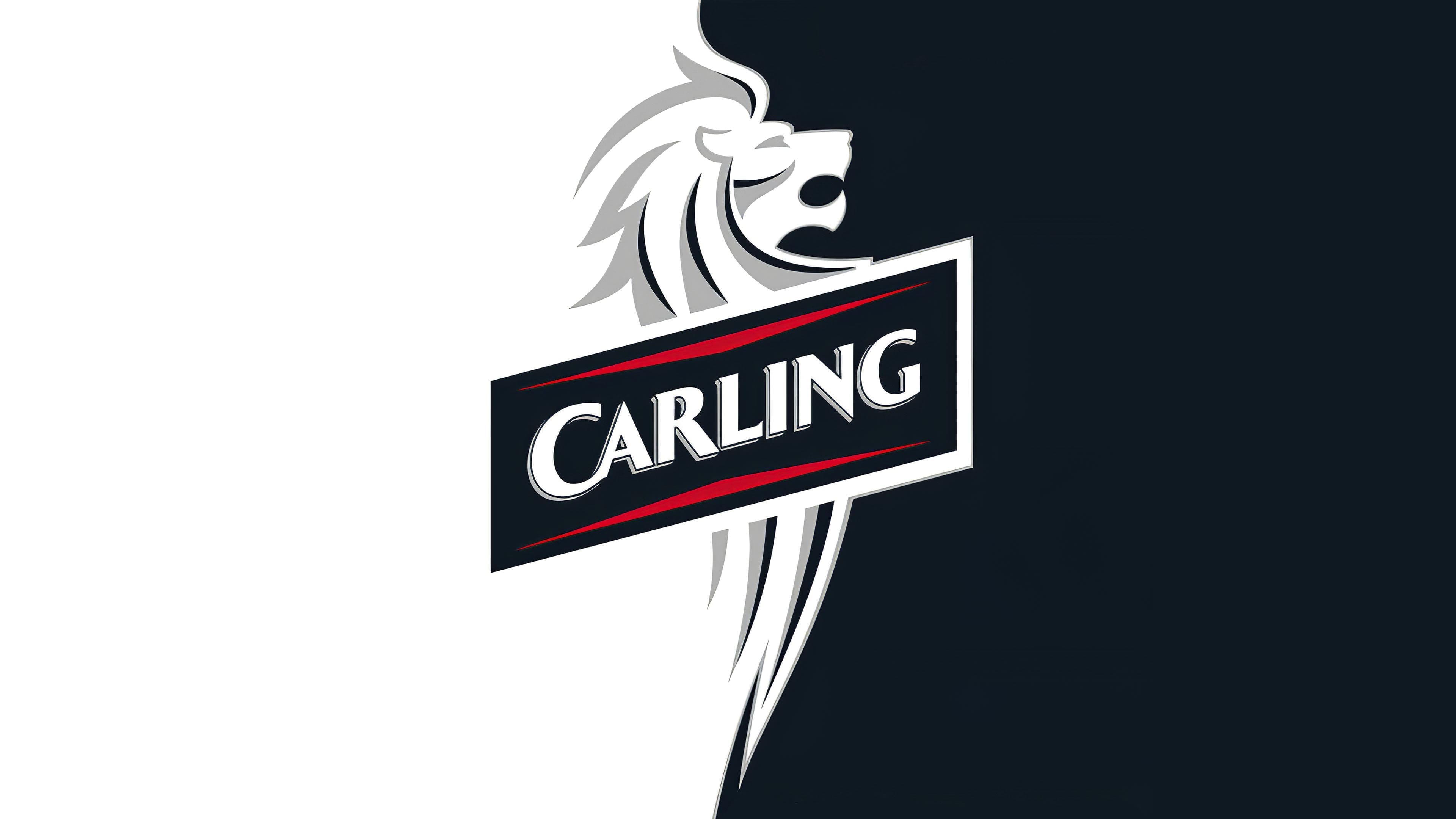
2017 – today
![]()
The leading design agency, BrandOpus, was invited to create the new logo. They started by creating an exclusive custom font called Regular Carling. The development was based on Trade Gothic Bold Condensed #20, which was used in previous versions of the writing.
The background of the new logo is white, with the company name written in black letters at the bottom. Above it is a black parallelogram with a twisted red corner. These are the company’s corporate colors. Moreover, the white, silver, and gold emblem in the shape of a lion’s head is still used on the cans.
The new logo is very elegant and modern, and is among the best designs of the last decade.
Font and Colors
While the text and graphics were once combined, they are now separate. The inscription and the drawing do not overlap; they are separate. At the top is a black rectangle with a “bent” corner; below is the brand name. Thus, the designers combined the old and the new: the geometric figure runs diagonally (as before), and the word is set in a smooth font (as now).
The London-based design bureau BrandOpus, entrusted with updating the logo, created an individual font, Carling Regular. It is based on the Trade Gothic Bold Condensed font. The brand emblem’s corporate colors are black, gold, red, and gray.
FAQ
What does the Carling logo represent?
The logo features the brand name in the Regular Carling font. Above the black word is the same black parallelogram with one bent red corner. The quadrilateral is placed diagonally.
What font is used in Carling?
The current brand font is called Regular Carling. BrandOpus created it based on the font Trade Gothic Bold Condensed No. 20.
Why is the beer called Carling Black Label?
Black Label beer is so named because, as part of the rebranding, the Carling Company shortened its previous name, Black & White Lager. The word “Black” refers to the drink’s color, and “Label” indicates that it is a separate brand.
How to claim Carling Golden in 2021?
To find a golden Carling can with a ticket under the lid, you need to buy promotional beer packs at retail stores. Everyone has a chance, but time is limited; the promotion is valid only until the end of 2021.