


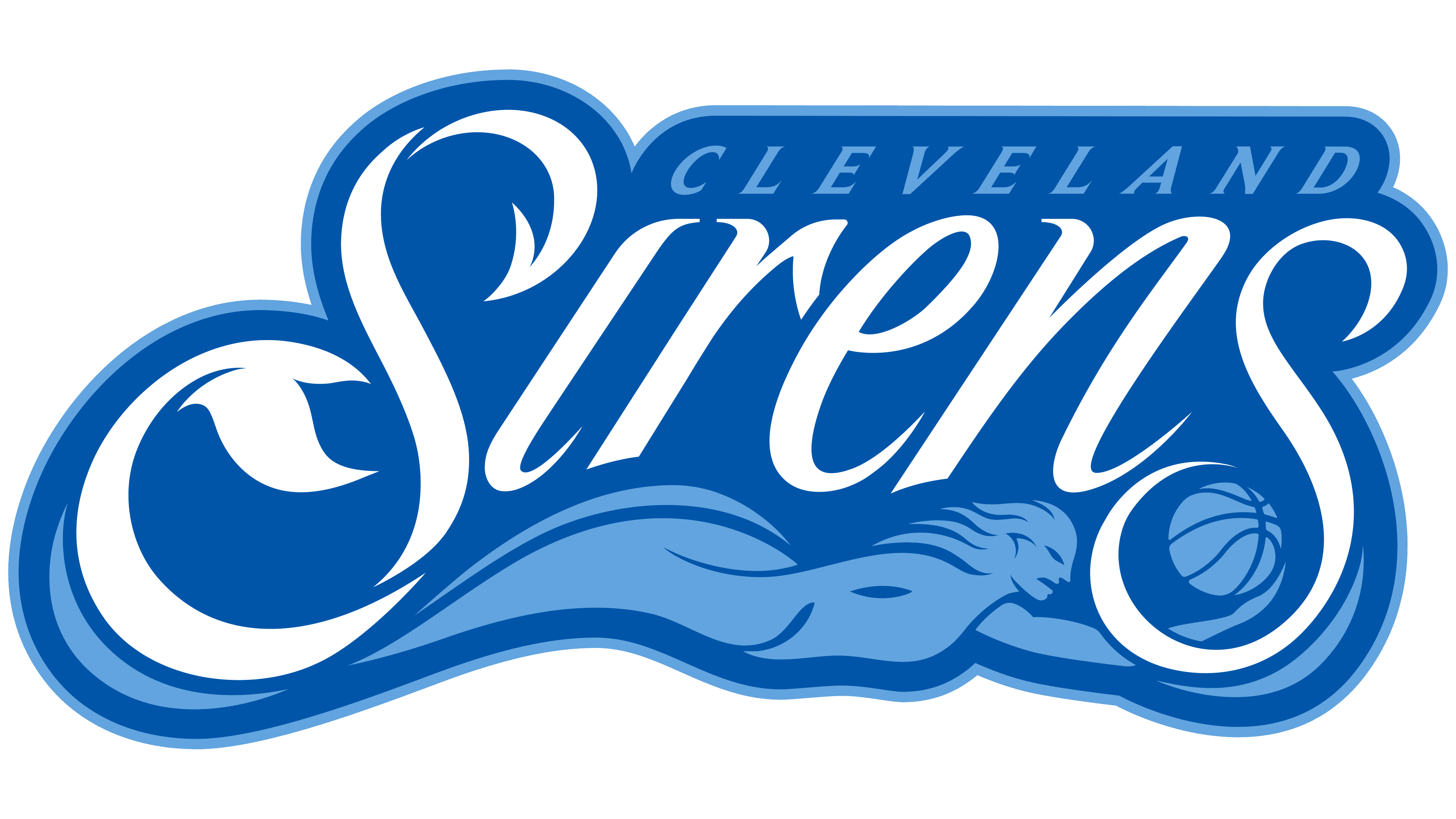
The Cleveland Sirens unveiled their name and logo ahead of their inaugural 2028 WNBA season. The presentation took place on August 4, 2026, at Rocket Arena, where the team will play at home. A siren holding a basketball connects the franchise to Lake Erie and the return of women’s basketball to Cleveland. Founded in 2025, the team belongs to Rock Entertainment Group, led by Cleveland Cavaliers owner Dan Gilbert.
Supper, a Detroit- and New York-based agency, developed the name and identity with the Cleveland Cavaliers and Rock Entertainment Group. The process took 13 months. Surveys, fan meetings, and local audience research reached over 10,000 people. Cleveland Rockers was among the names suggested. The former team was a founding WNBA franchise and played from 1997 to 2003. For the new club, the designers ultimately developed a distinct identity rooted in the city’s connection to the water.
The Sirens’ name refers to the mythological creatures and their call. Lake Erie grounds the aquatic theme in a familiar part of life in Cleveland and Northeast Ohio. The tagline “Hear the Call” invites women’s sports fans to fill the stands.
Before the unveiling, the franchise used the working name Cleveland WNBA. Its temporary logo placed white sans-serif “CLE” lettering beside the orange WNBA player silhouette on a black background. For the Cleveland Sirens, the agency created a horizontally extended logo combining the team name with the mythological figure.
Small “CLEVELAND” lettering sits above the much larger “Sirens” wordmark. A light blue siren stretches beneath the name, with a fish tail, swept-back hair, and a ball in one hand. The tail on the left and the ball on the right intertwine with the lettering’s flourishes. According to the club, the figure’s body is submerged, while the tail and ball rise above the waves. The white lettering and light blue figure sit against a blue background with a pale outline around the edge. The hair has 5 pointed strands, representing a basketball starting lineup and the 5 Great Lakes.
The letters in “Sirens” lean right, with thick strokes tapering to thin lines and rounded loops ending in sharp points. The opening “S” and final “s” are oversized. Their lower swashes curve around the siren, while their outer contours suggest the waves radiating from her call. The city name appears in widely spaced, italic serif capitals.
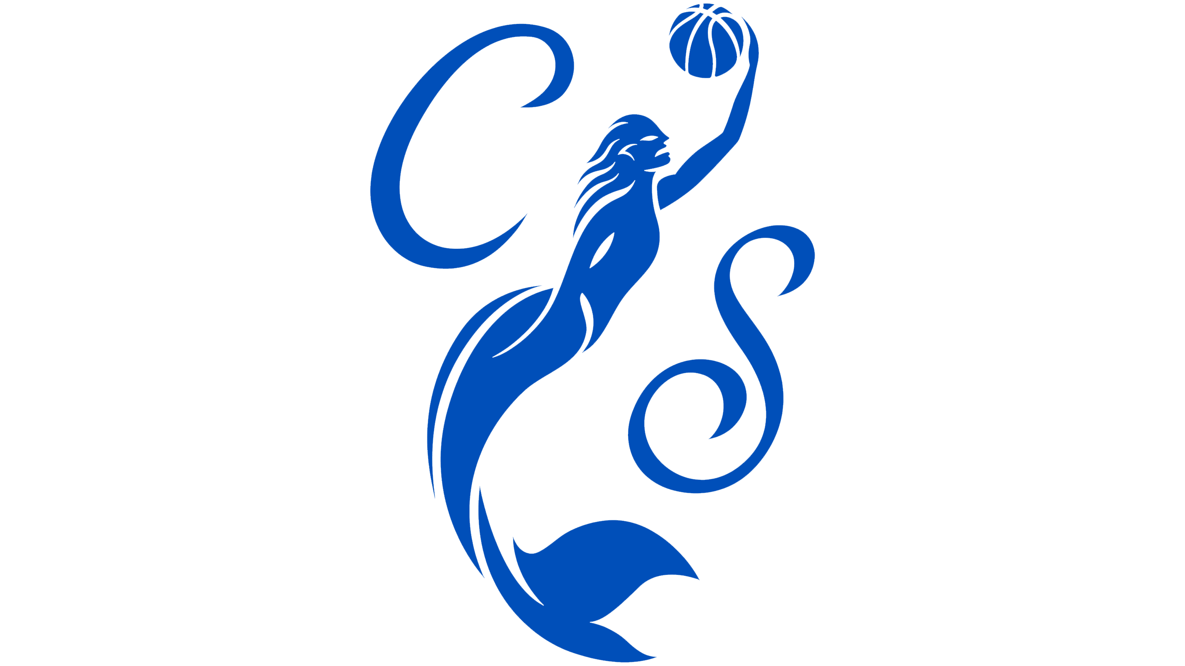
The opening “S” also serves as a standalone logo. Its contours conceal the letters “C,” “L,” and “E,” forming the abbreviation “CLE.” The upper terminal resembles a trident, conveying command over the water. The lower portion references the siren’s tail. Additional logos include the figure reaching toward a basketball hoop and a clawed hand holding a ball above a wave. The claws evoke the mythological creature’s dangerous nature.
The primary colors are Sirens Blue and Erie Blue. The two shades reinforce the lake theme and provide a link to the Cleveland Rockers, connecting generations of women’s basketball in the city through color. The primary logo uses white for the team name, while select applications use a pale seafoam mint.
Supper credited designer Max Amato as a project contributor. On the team side, Grant Gilbert, the Cavaliers’ vice president of basketball and business operations, helped oversee the work. Before the unveiling, a sand sculpture bearing the phrase “Hear the Call” appeared in Edgewater Park. Organizers also announced a free Fan Fest on August 8 at Edgewater Beach, where fans could meet the Cleveland Sirens.