


![]() Cleveland Cavaliers Logo PNG
Cleveland Cavaliers Logo PNG
The Cleveland Cavaliers logo, designed in a knightly style, embodies a maximum focus on competition and victory. Yet, the nobility is overshadowed by a single stroke of a sharp rapier, as these are not medieval tournaments for a lady’s heart but sports battles of professional basketball players.
The Cleveland Cavaliers joined the NBA in 1970 as an expansion team with the Portland Trail Blazers and the Buffalo Braves. Nick Mileti created the franchise, and the name came from a contest run by The Plain Dealer. “Cavaliers,” proposed by Jerry Tomko, was adopted along with the colors wine and gold.
The first season ended 15–67. The team played at Cleveland Arena before moving to Richfield Coliseum in 1974. Under coach Bill Fitch, progress came in 1976 with a division title and a playoff run that ended against the Boston Celtics.
In 1980, Mileti sold the team to Ted Stepien for $2 million. His period included frequent coaching changes, weak trades, and a 24-game losing streak. In 1983, George and Gordon Gund took control and stabilized operations. By the late 1980s and 1990s, with Mark Price and Brad Daugherty, Cleveland became a steady playoff team, reaching the 1992 Eastern Finals against the Chicago Bulls.
In 2003, the club drafted LeBron James. In 2005, Dan Gilbert bought the franchise and hired Mike Brown and Danny Ferry. Cleveland reached the 2007 NBA Finals but lost to the San Antonio Spurs, and in 2009, recorded 66 wins with James as MVP.
On July 8, 2010, James announced his move to the Miami Heat on ESPN. The team dropped to 19 wins and set a 26-game losing streak. Draft picks included Kyrie Irving in 2011, Anthony Bennett in 2013, and Andrew Wiggins in 2014.
James returned in 2014, joining Irving and Kevin Love from the Minnesota Timberwolves. From 2015 to 2018, Cleveland reached the Finals four times against the Golden State Warriors. In 2016, the team won its first title after coming back from a 1–3 deficit. James left again in 2018 for the Los Angeles Lakers.
Meaning and History
![]()
The team has had six emblems, each reflecting a different period of the franchise’s history. The main visual identity became the musketeer version; hence, the Cleveland Cavaliers are known as the musketeers. They owe their nickname and debut logo to Pitt Studios from Pittsburgh, which represented Cleveland. The original logo was approved in May 1970.
What is Cleveland Cavaliers?
This is an American professional basketball team. It is a member of the NBA, part of the Eastern Conference, and competes in the Central Division. The club started in 1970 as an expansion franchise alongside two other basketball teams (the Buffalo Braves and the Portland Trail Blazers). Since 1994, it has been hosting its home competitions at Rocket Mortgage FieldHouse.
1971 – 1983
![]()
The team’s earliest logo features “wine and gold” colors. It depicts a musketeer fencing with a rapier, turned away from viewers. He’s in full attire: a wide-brimmed hat with a large feather, a doublet with cuffs, a short cloak, gloves, and high boots with cuffs.
The red figure is set against a sun with characteristic white lines. At the end of the visual row is the club’s name. It surrounds the central elements: “Cavaliers” at the top with decorative “C” and “S,” and “Cleveland” at the bottom. The letters are large, red, with a yellow outline.
1984 – 1994
![]()
In 1984, the team’s symbolism underwent radical changes. Only the color light and pure wine remained from the previous version. Everything else was new. The focus was on the text, specifically the nickname’s shortened form, “Cavs.” The letters are uppercase and serifed, and the letter “V” resembles a basketball hoop. It has a white net and a red ball.
1995 – 2003
![]()
In the 90s, fans nicknamed the new logo “Toilet Bowl Destruction.” Designers developed a range of hoops, balls, and nicknames, but depicted everything in a radically different style. The emblem now has a black rectangular background, a white schematic net, and an orange ball flying into the hoop. Below is the club’s abbreviated name, in blue letters with a thin black line running through the middle.
2004 – 2010
![]()
In 2003, with LeBron James’ arrival, the club management suddenly changed its mind and returned to its roots. The logo, approved in 2004, features a golden musketeer rapier, which, hooking the letter “C,” pierces the white phrase “CLEVELAND CAVALIERS.” The background is a wine-colored basketball. The text is on a dark blue substrate, the same shade as the stripes on the ball.
2011 – 2017
![]()
The changes during this period of the logo’s history are quite minor. The team switched to a modified version of the classic “wine and gold” palette from 2003 – 2004. The existing version also added a yellow tint, represented in the shadows on the sword and the outlining line that runs around all elements. The text remains diagonal and upward. The letter “C” has characteristic points at the ends and in the middle.
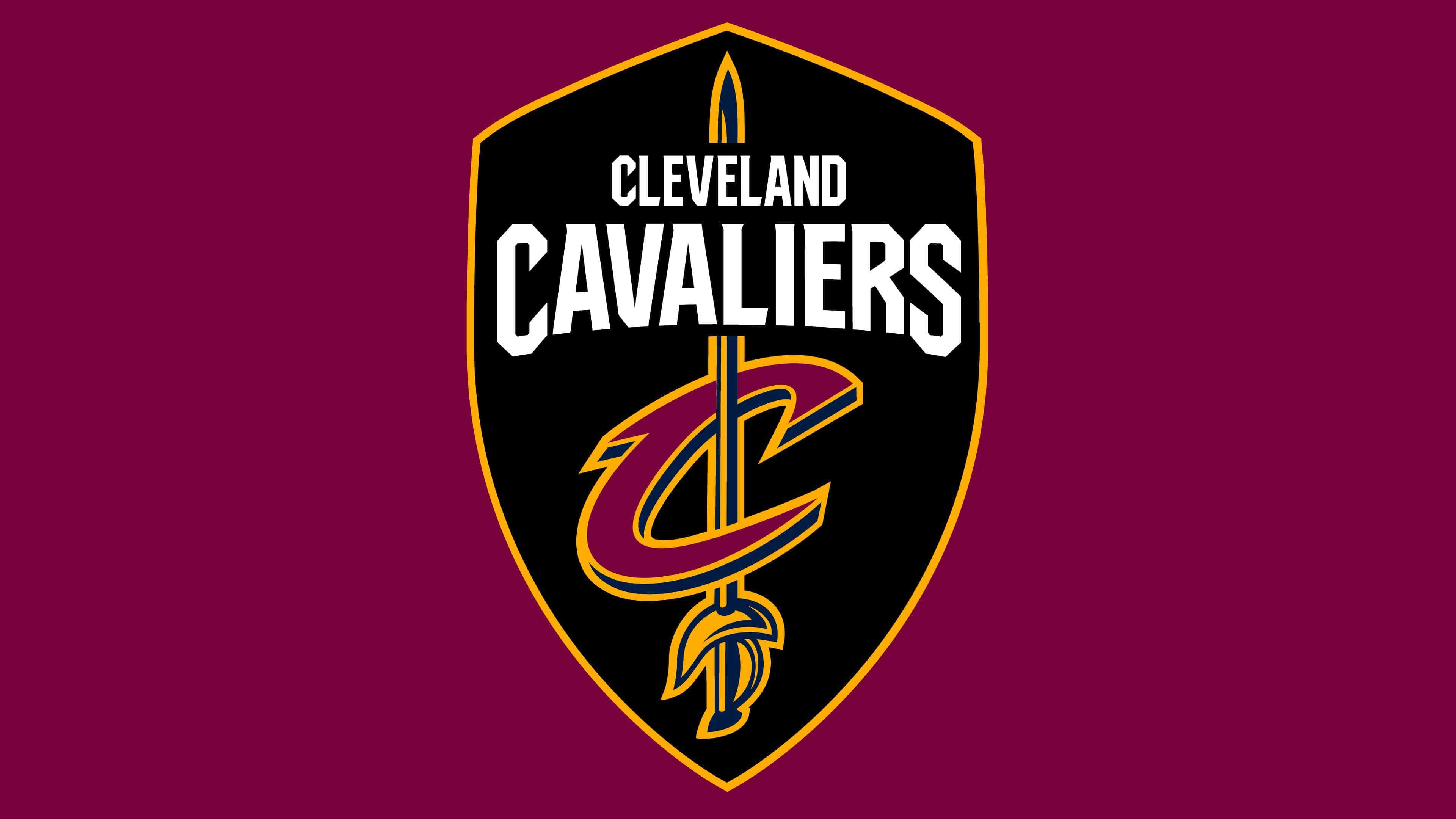
2017 – 2022
![]()
In the 2017-18 season, the “Cleveland Cavaliers” introduced a new team logo, simplifying and modernizing the brand’s appearance. The Cavaliers collaborated with Nike to develop the perfect emblem and incorporate the franchise’s most popular features into a new design reflecting the organization’s progress and success.
After the 2017 redesign, the emblem received a new design, deepening the musketeer theme and “C-Sword” style. Now, a black shield serves as the background. It features a vertically placed rapier, its tip upwards, and the club’s name (in two horizontal rows). The stabbing weapon passes through the letter “C,” separated from the inscription.
Cleveland Cavaliers Logo Elements:
- The sharp edges of the Cleveland Cavaliers font evoke thoughts of a defender, the sword’s motion, and the aggressive appearance it creates.
- The sword represents the spirit of the modern defender, Cleveland’s resilience.
- The shield embodies the Cavaliers’ commitment to defending the nation. It’s a direct nod to the most loyal and passionate Cavaliers fans, including Wine & Gold United.
- The letter “C” signifies more than “Cavaliers.” It stands for Cleveland – the city uniting everyone and symbolizes the Cavaliers’ dedication to defending our hometown, both on and off the court.
- The wine-and-gold shades pay homage to the team’s first colors from its inaugural 1970 season. Navy remains an additional color, and black is officially introduced as a new and permanent addition to the color palette.
2022 – today
![]()
Today, the team’s emblem still includes a quadrilateral crest, “CLEVELAND CAVALIERS” inscription, and a stylized letter “C.” The designers removed the sword, a symbol of fighting spirit, and opted to minimize the elements. The updated brand style is the work of artist Daniel Arsham, who became the Cavs’ creative director in 2020.
The modern emblem was introduced shortly before the 2022-2023 NBA season. Its color palette is simpler than in the previous version. Now, the team’s name, the contour around the standalone letter, and the edge line of the shield are colored in gold with a metallic sheen. This is the true “gold” of the Cavaliers, used in the early 1980s. The letter “C” is wine-red, almost purple, and the shield’s base is black.
Font and Colors
No matter how radically the logos have changed, there are several common factors: the color palette, the name, a ball, or a sword. But the structure is always different, except for two periods.
Each stage in the logo’s history has its own writing style. In early versions, the letters were serifed. Then came a cursive version. In the modern logo, a strictly sans-serif font is used, but with decorative elements. Throughout time, “C” and “S” have been interestingly manipulated: designers have made them larger than the others and added unique elements.
The team’s signature colors are Wine & Gold. Now, black is considered equivalent to them. Although dark blue appears in the logo, it is not part of the official palette; it is an additional color.