


Outland turned to the pencil and a designer’s first sketches for Vizcom’s new identity. A geometric pencil tip became the AI platform’s emblem, paired with a bold lowercase wordmark. The logo and identity began appearing in public-facing materials in summer 2026.
Founded in 2021, Vizcom helps industrial and product designers turn sketches into realistic images and 3D models. Users explore forms and materials, compare options, rotate and refine objects, and organize individual ideas into collections. As the service evolved, it needed an identity suited to large design teams that still felt connected to studio experimentation.
Outland, a team based in Minnesota and Wales, called the concept “The Messy Canvas.” It draws on the intermediate stages of design, from sketches and prototypes to material samples, repeated attempts, and unexpected discoveries. Vizcom Head of Marketing Emily Lonetto participated in the project and highlighted Jordan Jenkins and Evan Place as collaborators.
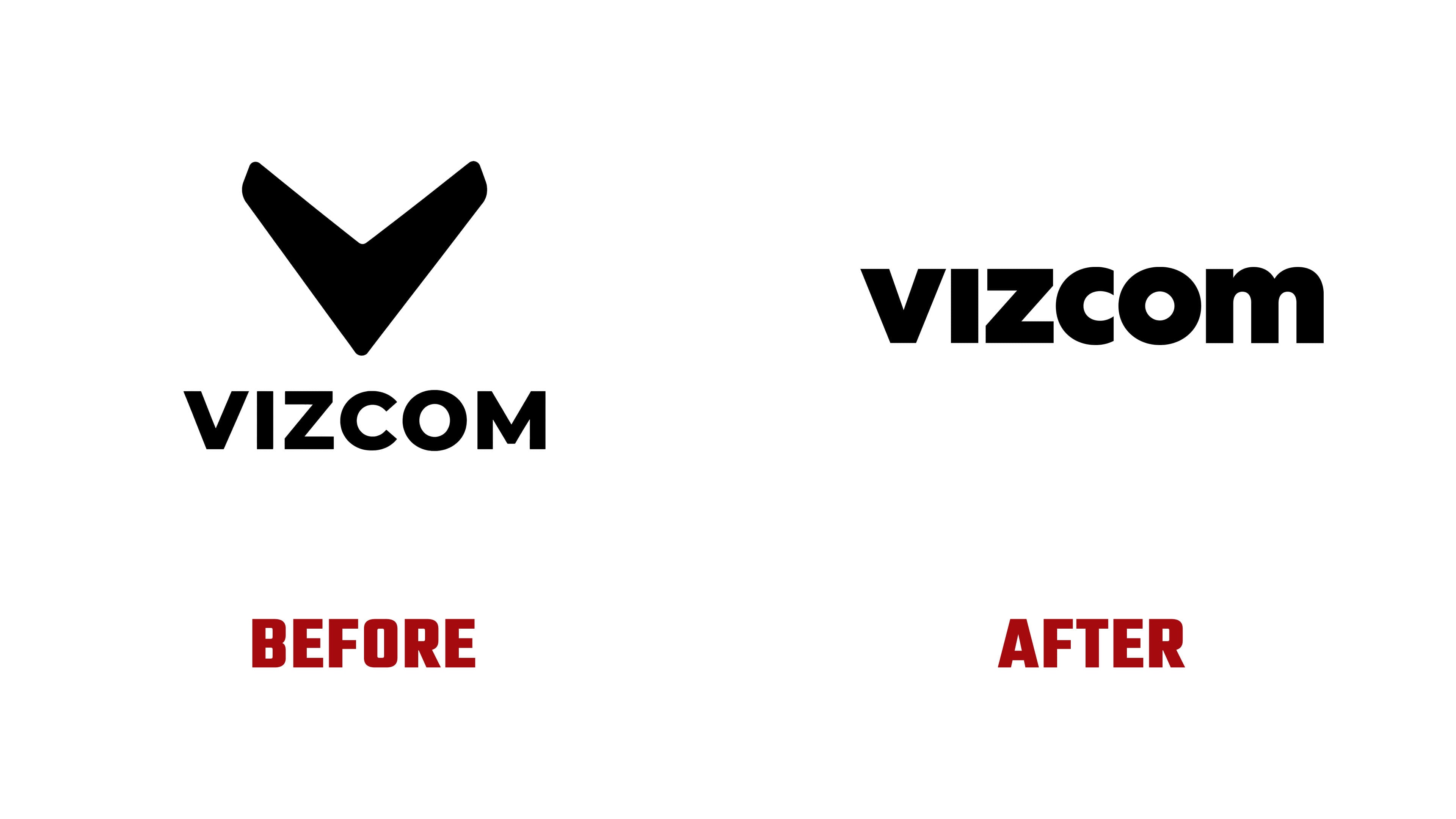
The previous logo paired a lowercase vizcom wordmark with a large black V-shaped emblem above it. Two diagonal sections met at a bottom point, with slightly rounded upper ends. The new wordmark is more compact. Heavy strokes and tight spacing bring similarly sized letters together into a horizontal form.
The bottom point of the “v” is clipped horizontally. The “i” consists of a single vertical stroke. A broad diagonal joins the two horizontal strokes of the “z,” the “o” is nearly circular, and the “m” has two rounded shoulders. The wordmark appears in white on blue and in black on light backgrounds.
Outland founder and Design Director Jordan Jenkins explains that the restrained lettering provides a constant amid a busy visual environment. As textures, drawings, and objects change around it, the name remains consistent. Its form is designed for both the product interface and the brand’s experimental materials.
The pencil tip connects the standalone emblem to the initial sketch that starts the Vizcom process. Its geometric outline serves as an image frame and a foundation for patterns and three-dimensional objects. In animation, the shape evolves from a sketch into a finished object, echoing the platform’s development stages.
The colors continue the studio theme. Their names reference blueprint blue, cutting-mat green, orange clay, peach sticky notes, and black ink. Harri Owain created illustrations of people at work, while patterns draw on drafting grids, seams, wood grain, and fabric. Krystof Jezek developed the 3D assets. The identity appears on posters, stickers, apparel, and digital media alongside the phrase “Make it real.”