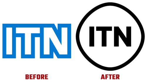
In early December of this year, the ITN logo was updated. Seems like a common thing. However, this fact caused a wave of dissatisfaction among users with the non-rhetorical question, “Why?”. Over the years of its existence, the consortium of independent television companies has changed its identity several times, but this is the first time it has faced such indignation.
Its famous monogram emblem has undergone minor adjustments since 1955. The 1969 version remained the most recognizable for a long period. It was considered one of the most enduring in the UK broadcast system. However, the time has come for a change. Two agencies were involved in the modernization process:
- Rudd Studio
- Undivided
Instead of a static sign, they proposed an animated one to respond dynamically to the modern world and meet advanced requirements. Experts took the abbreviation as a basis. Simple letters should represent impartiality, efficiency, and accuracy, regardless of what is happening around them. They must remain the nucleus of the cell. To do this, designers:
- removed the angular and hard lines around the glyphs;
- circled the name with a slightly blurry and moving shell;
- made the ring react to stimuli.
But the revamped ITN logo was coldly received:
- Viewers believe that the former emblem added solidity and rigor to the channel.
- The simple design made the symbolism unique and well-recognizable.
- The new design turns the logo into the identity of the telephone operator BT.
- There is also a fourth factor – individual. It’s just that users are used to the old and want to avoid accepting the new.
And to the question “Why?” the British television company replied that this is how she sees her future. She wants to get out of the tough news circle, become an international broadcaster, and branch out into documentaries, sports, and other content. Therefore, from the point of view of ITN, the modernized emblem reflects a very deep meaning.


