


![]()
Bit-O-Honey, the iconic candy brand renowned for its honey-flavored taffy interspersed with crunchy almond pieces, has witnessed a succession of ownerships since its introduction to the sweet-toothed public in 1924 by the Schutter-Johnson Company of Chicago. Over the years, the much-loved brand passed through the hands of various stakeholders, including the Ward Candy Company, Terson Company, Nestlé, and Pearson’s Candy Company, until it was ultimately bought by the Spangler Candy Company in 2020.
Spangler Candy Company, a family-owned business established in 1906, has been delighting candy lovers for more than a century with its popular confectionery classics such as Sweethearts®, Necco® Wafers, Canada® Mints, and Dum-Dums®. After relocating the manufacturing equipment from Pearson’s factory to its facility in the previous year, Spangler is set to reintroduce Bit-O-Honey to the market with a refreshed look designed by the Indianapolis-based agency Young & Laramore.
![]()
Despite its rich and savory flavor, Bit-O-Honey’s earlier packaging failed to communicate its unique taste profile effectively. Spangler’s market research revealed that the confectionery’s real honey and roasted almonds appealed to an adult demographic seeking a light yet satisfying sweet treat, a consumer segment often neglected by the candy industry.
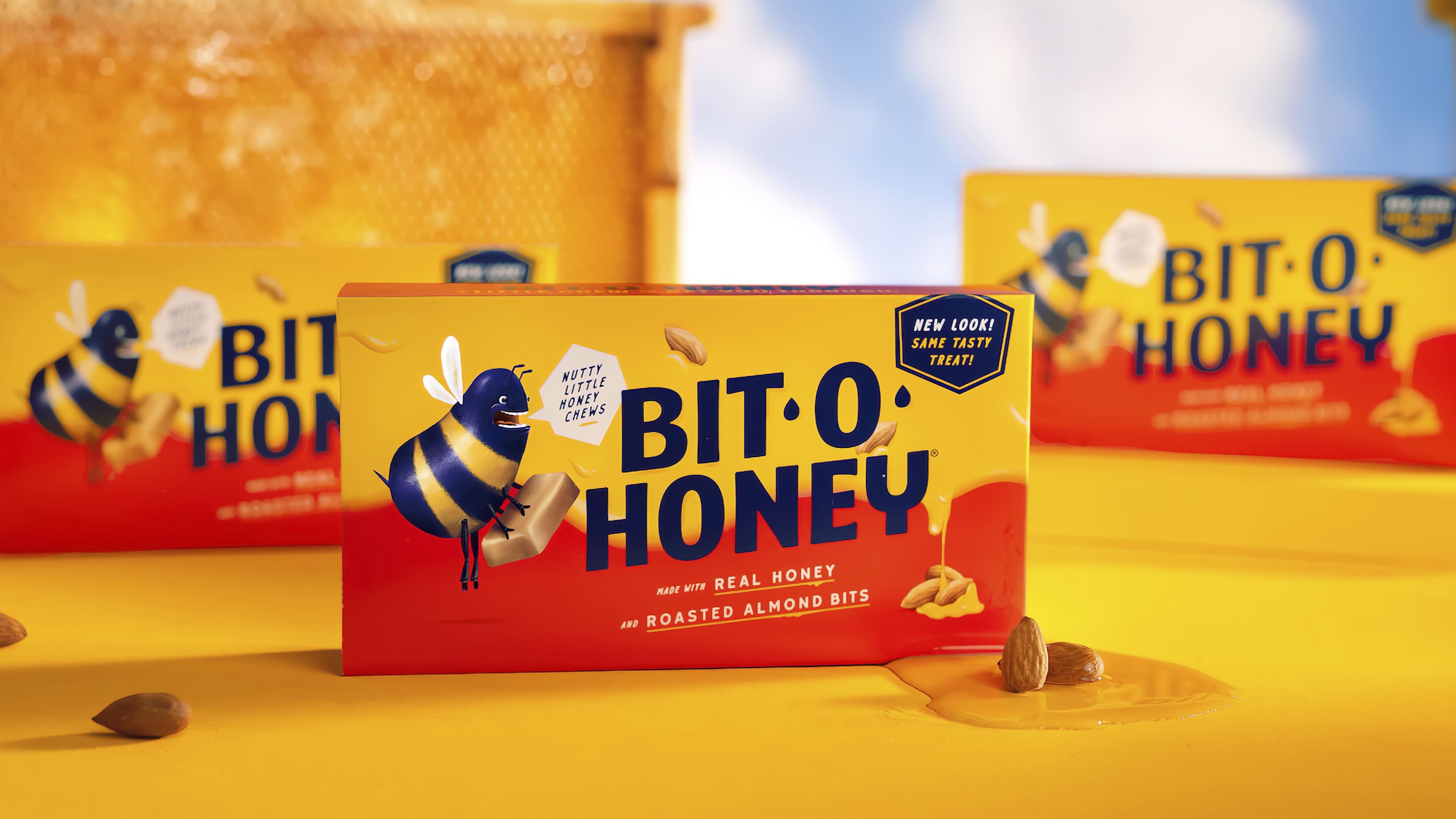
The rebranding effort by Young & Laramore positions Bit-O-Honey as an understated sweet indulgence, ideal for infusing everyday moments, such as a long stretch of meetings or a seemingly endless school pick-up queue, with a touch of sweetness. The newly designed logo, set in Yeahright Type Studio’s Culture Vulture typeface, presents a fun, taffy-inspired look with a hint of sophistication. The off-center placement of the “O,” along with its accompanying honey drops, enclosed within an irregular honeycomb shape, adds to the allure of the revamped logo, effectively capturing the brand’s honey-centric essence.

The rebranding also introduces a fresh bee mascot, marking a dramatic shift from its cutesy and cartoonish incarnation. With its broad smile and quirky personality, the redesigned bee could evoke mixed reactions, finding favor with some and possibly bemusement with others.
The redesigned packaging strays from its predecessor’s bright hues and prominent logo, leaning towards a refined look with muted yellow and red shades on matte bags, boxes, and wraps. The standout dark blue color, paired with the unusual bee mascot, further distinguishes the brand’s new visual identity. The use of dripping honey textures and the complementary fonts, Wide Rule and Ginza Loop from Yeahright Type Studio, contribute to the playful yet chic packaging design.
Bit-O-Honey’s rebranding represents an impressive transformation, elevating the brand from a seemingly budget candy to a stylish yet accessible confectionery option. Successfully avoiding the pitfall of appearing overly artisanal, the new branding effectively caters to a more mature audience, establishing Bit-O-Honey as a preferred adult-friendly treat.