The logo of Brandt Bit-O-Honey captures the lasting charm of this classic candy, beloved by generations since its debut. The emblem honors the candy’s rich heritage and the happiness it delivers to the young and old, symbolizing this cherished snack’s simple sweetness and lasting popularity.
Bit-O-Honey: Brand overview
In 1924, Harry Evans, a candy maker in Chicago, started experimenting to create a new chewy candy. His work led to Bit-O-Honey, a unique candy that combines a stretchy texture with the sweet taste of honey and bits of almond for crunch. This combination quickly became popular across the country.
In the 1930s, Evans sold Bit-O-Honey to the Schutter-Johnson Company, a local candy manufacturer. This move helped the candy become a household name in the US. Later, in the 1960s, the brand was acquired by Beatrice Foods, which helped Bit-O-Honey reach even more people.
Bit-O-Honey remained a favorite throughout the 1970s and 1980s, often found in movie theaters, stores, and vending machines. In 1984, Nestlé bought the brand and updated the packaging and marketing, keeping the candy’s original taste.
In 2013, Pearson’s Candy Company, a family-owned business in Saint Paul, Minnesota, took over Bit-O-Honey. They promised to keep the candy’s classic recipe the same, continuing its long tradition.
Today, Pearson’s Candy Company still makes and sells Bit-O-Honey. While it might not be as everywhere as before, it still has a special place in many people’s hearts, reminding them of the past and keeping a tradition alive.
Bit-O-Honey has been around for nearly a century and is owned by several companies. But it has always kept its distinctive taste and texture. It’s a reminder of a time when candies with unique textures and bold flavors were more common.
Meaning and History
What is Bit-O-Honey?
Bit-O-Honey, a classic American candy brand now owned by Pearson’s Candy Company, features candies with a chewy texture similar to toffee. Made primarily with honey and bits of almond for added crunch, each large candy is segmented into six pieces and individually wrapped in wax paper to keep it fresh. There is also a miniature single-piece version available. First developed in Chicago by the Schutter-Johnson Company in 1924, the candy’s distinctive texture and honey flavor have made it a cherished treat. Bit-O-Honey is known for its bright wrapper and bar shape, enhancing its nostalgic appeal.
Old
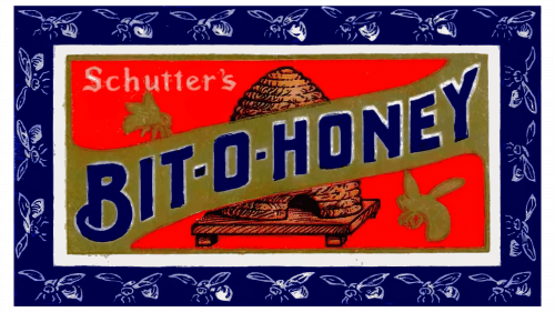
The first Bit-O-Honey candy logo effectively uses visual elements to represent the taste and texture of the candy. Initially, the brand adopted a bee theme to reflect its main ingredient, honey. The logo vividly captures this theme, where a purple background sets off bee silhouettes, adding vibrancy and motion. Purple is chosen for its association with luxury and quality, underscoring the candy’s high standards.
At the center of the design, a red rectangle draws attention and features an image of a beehive surrounded by busy bees. This imagery isn’t merely decorative; it underscores the natural quality of the ingredients and highlights the honey-based candy. Bees and the beehive symbolize diligence and sweetness, aligning well with Bit-O-Honey’s product qualities.
Across the image, a ribbon of stretchy nougat bearing the brand name visually suggests the candy’s chewy and sticky texture. The logo’s use of colors, textures, and symbols informs consumers about the candy’s taste and quality even before they try it.
The brown color, used to represent the nougat, complements the color scheme and links to the candy’s appearance. It recalls the main ingredient, honey, and emphasizes the candy’s natural origin and high quality.
Before 2023
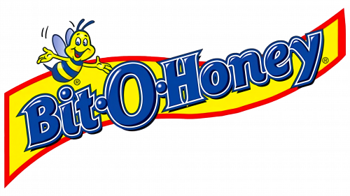
The Ward Candy Company logo is a standout example of creative design in the candy industry. The logo captures attention with its bright colors and lively movement, featuring a friendly little bee, creating a welcoming feel that invites consumers to explore a fun and tasty experience.
This emblem is the product of the company’s innovative approach to design. Their goal was to create a memorable logo brimming with personality, making it an integral part of the brand’s story. Expressive elements infuse the logo with a distinctive character.
The logo includes shiny blue, bubble-like letters resembling water droplets against a yellow, wavy background reminiscent of a honey river. This attractive design highlights the main ingredient, natural honey, emphasizing the product’s sweetness and quality.
The logo’s elongated design mirrors the chewy nature of the candy, suggesting its lasting flavor and texture. This design effectively sets consumer expectations about the product’s features and flavor profile before their first taste.
2023 – today
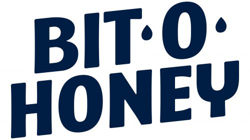
In 2023, Spangler purchased the Bit-O-Honey brand and updated its logo to align with a new strategic direction and product positioning. The Bit-O-Honey candy logo stands out because it’s smart and easy to recognize. It spells out “Bit-O-Honey” in two lines right in the center. The first part of the name and the “O” are on the top, while “Honey” sits below. Instead of a regular dash, there are dots shaped like drops, which ties in with the honey theme and makes the logo catchy.
The logo uses a big, bold, sans-serif font. This choice makes the logo easy to spot and gives the brand a friendly vibe. The font choice keeps things simple and approachable.
The dark blue text pops against the candy’s bright red wrapper. This contrast isn’t just for looks; it makes the logo easy to see and helps people remember the brand. Dark blue also gives off a trustworthy feel.
The logo is placed at an angle, leaning to the left, which makes it look dynamic. This angle isn’t just for style; it helps draw the eye across the packaging, helping to stick the brand name in people’s minds.
The Bit-O-Honey logo does a great job of showcasing the brand’s offerings. Its design choices, from the drop-like dots and clear font to the striking color contrast and angled placement, all work together to make it memorable. This logo isn’t just a symbol; it tells a story about the sweet treat Bit-O-Honey offers.
Font and Colors
The “Bit-O-Honey” logo features a bold, straight font with slightly rounded corners, creating a friendly and approachable feel. The font is large and clear, making it easily readable from any distance and in various sizes, whether on product packaging or advertising posters. The straight yet soft lines of the font evoke the pleasant sweetness of honey, an ingredient in the product. A distinctive feature is using honey drop shapes instead of dots between words, emphasizing the product’s uniqueness and playing on associations with natural sweetness.
The use of dark blue in the logo conveys a sense of reliability and quality while strengthening the brand’s identity and memorability. This versatile color matches well with different backgrounds and packaging styles.
FAQ
Why did Bit-O-Honey change its logo?
Bit-O-Honey, known for its real honey, roasted almonds, and chewiness, realized its packaging wasn’t attracting new customers. People now prefer healthier options and clear information about what they’re eating. Research showed many health-conscious candy fans didn’t know about Bit-O-Honey’s natural ingredients.
Spangler, the company owning Bit-O-Honey, updated the brand’s look to appeal to these consumers. They wanted Bit-O-Honey’s natural ingredients to be the focus, hoping to stand out to people looking for healthier candy choices.
The update aimed to modernize Bit-O-Honey’s image to better showcase its quality and appeal as a healthier option. The new logo, packaging, and branding highlighted the candy’s real honey, almonds, and chewiness. This wasn’t just about keeping current fans and attracting new ones who care about eating natural, quality ingredients.
This change was all about staying relevant and appealing in a market where people’s preferences and demands evolve. Spangler wanted to make sure Bit-O-Honey stayed loved by its loyal fans while also reaching out to new customers who look for natural, high-quality candy.
What is the slogan of Bit-O-Honey?
The slogan “Every Bit of Bit-O-Honey Goes A Long Way…” perfectly captures what Bit-O-Honey candy is all about. It’s a way of saying that this candy, with its chewy texture and the rich flavors of honey and almonds, provides a long-lasting and enjoyable taste. The phrase cleverly uses “bit” to highlight how even a small piece can give you a big flavor experience.
This slogan shows how Bit-O-Honey is committed to delivering quality and value. It’s not just any candy; it’s a unique treat that offers a taste journey that lasts. Bit-O-Honey sticks with you, making it a great choice for those wanting a fulfilling snack.
The slogan has been crucial in marketing Bit-O-Honey, helping to build its reputation as a candy that lasts long and tastes great. It stands out in the candy world by promising a lingering taste experience different from other candies. Bit-O-Honey uses this slogan to invite everyone to try a candy that’s not just a quick bite but a lasting treat.
Is Bit-O-Honey real, honey?
Bit-O-Honey candies are made with real honey, a key ingredient that gives them a sweet flavor. Since they first came out in 1924, these small taffy candies have been loved for their unique mix of honey and almonds. This makes them taste different from other candies and gives them a chewy texture that people enjoy.
Using real honey matches the increasing demand for natural ingredients in food. It improves the candy flavor and appeals to people who like knowing their snacks have genuine, natural ingredients. The mix of honey’s sweetness and the almonds’ crunch offers a taste and eating experience that stands out from other taffy candies.
Bit-O-Honey has stayed popular because of its quality and the warm memories it brings back for many. Using real honey has played a big part in making Bit-O-Honey known as a quality candy. Even with different companies owning it over the years and the many other candy options, Bit-O-Honey has always used real honey. This keeps it a favorite choice for anyone wanting a sweet, chewy candy that has the real taste of honey.
Is Bit-O-Honey discontinued?
Bit-O-Honey is still being made despite changing owners a few times. In 2013, Nestlé sold it to Pearson’s Candy Company in Saint Paul, Minnesota. Then, in 2020, Spangler Candy Company in Bryan, Ohio, bought Bit-O-Honey, starting a new chapter for this classic candy. Spangler, known for their variety of sweets, showed they’re serious about keeping Bit-O-Honey around by moving its manufacturing equipment from Saint Paul to Bryan in 2022. This move ensured that Bit-O-Honey could be produced efficiently in its new home.
All these changes show that Spangler plans to keep Bit-O-Honey available for its fans. This candy has managed to stick around because it’s good at adapting to new situations without losing what makes it special. So, if you love Bit-O-Honey’s unique mix of honey and almond in a chewy taffy, you don’t have to worry about it disappearing. It’s still here and doesn’t seem to go anywhere anytime soon.
How long has a bit of honey been around?
Bit-O-Honey has been a favorite candy for almost 100 years since it was made in 1924 by the Shutter-Johnson Company in Chicago. Although this company wasn’t known for candy initially, Bit-O-Honey changed that, making it a well-known name in the candy business.
This candy quickly became popular with its honey flavor, chewy texture, and almond pieces. Its unique taste has kept it loved by many people across different generations. Bit-O-Honey’s lasting appeal shows that people always enjoy good quality and great-tasting ingredients.
Even though the company that makes Bit-O-Honey has changed over the years, the candy itself has remained the same. Its long history speaks to how good it is and how much nostalgia it brings up for many people. Bit-O-Honey is still a beloved candy today, showing that some tastes never go out of style.
Bit-O-Honey changed its logo?
The logo was redesigned to a simpler, more minimalist style. It features a large, dark blue inscription on two levels, with blue droplets replacing the dots in the brand’s name. This design aims to provide a modern look emphasizing the brand’s updated vision.
The redesign helps to modernize the brand’s image and adapt its marketing strategy. The focus on honey was reduced because honey is a minor ingredient in the candy, constituting less than 2% of its composition. Additionally, Bit-O-Honey has expanded its product range to include other flavors like licorice and chocolate, making it unnecessary to focus solely on honey.
The change also reflects a shift in the brand’s target audience. Bit-O-Honey candies have become popular among adults who enjoy them as a light snack. This prompted Spangler to adopt a more mature and restrained logo design that appeals to adult consumers and matches modern design trends. The new logo supports the product’s appeal as a versatile adult snack.

