


![]() Dunkin Logo PNG
Dunkin Logo PNG
The Dunkin’ Donuts logo evokes appetite and warm associations with coffee and fresh pastries. The soft colors and rounded typeface create a friendly mood, emphasizing the café’s comfort and simple pleasures.
Dunkin’ Donuts traces its origins to 1948, when William Rosenberg opened “Open Kettle” in Quincy, Massachusetts, offering coffee and fresh donuts to local customers. In 1950, the shop was renamed Dunkin’ Donuts, reflecting its product focus and laying the groundwork for a franchise model.
By 1955, the brand moved beyond its home state with a new store in Miami. Expansion continued through the 1960s, and by 1963, the chain reached its 100th location, building a presence in major cities such as New York and Philadelphia.
In the 1970s, Dunkin’ Donuts entered international markets, opening locations in Japan, the United Kingdom, Canada, and Colombia. The business structure changed in 1990, when Allied Lyons acquired the company, and again in 1999, when Pernod Ricard acquired it.
A new ownership phase began in 2004, led by Bain Capital, Carlyle Group, and Thomas H. Lee Partners. In 2006, the menu expanded beyond donuts to include croissants, bagels, and breakfast sandwiches, aligning the brand with broader demand for morning foods.
The company went public in 2011, listing on NASDAQ under the ticker DNKN. Later in the decade, the brand adjusted its positioning, shifting focus toward beverages in 2018. In 2019, the name was shortened to Dunkin’, signaling a move beyond donuts.
Today, Dunkin’ Brands oversees more than 12,500 locations across 46 countries, maintaining its presence in both the coffee and quick-service restaurant sectors.
Meaning and History
![]()
The donut café’s first logo dates back to 1950, when it was adopted at the company’s founding. Over the past years, it has undergone several significant changes.
What is Dunkin Donuts?
It is an American company that sells its coffee and donuts. It has an entire network of restaurants: more than 12,800 points worldwide. The menu also includes cool drinks and various sandwich options.
1950 – 1967
![]()
The debut emblem features a handwritten font. The phrase “Dunkin Donuts” is set in italics and placed diagonally. The style is formal. The letters are brownish-red. Both “D” letters are uppercase. The crossbar of the “t” is elongated, reaching the “u” and “s,” the tails of which are elegantly curved.
1967 – 1976
![]()
The original pink shade of powdered candy, still used in the brand name, appeared during this period. The logo’s central element is a cup, hinting that the company sells coffee. A donut, made from its name, is placed at the top of the graphic symbol.
1976 – 1977
![]()
1977 – 2002
![]()
In 1977, the logo was redesigned: the cup and donut were replaced with a bright inscription, “Dunkin’ Donuts,” arranged in a column. The upper word is colored in powder orange, and the lower is in candy pink.
2002 – 2007
![]()
Designers added a plastic cup to the previous version so visitors would immediately understand that one can buy coffee with donuts here. Inside, one can see a drink poured to the top, above which clouds of steam twirl. This confirms that it is always fresh and hot. The graphic emblem is placed to the left of the name.
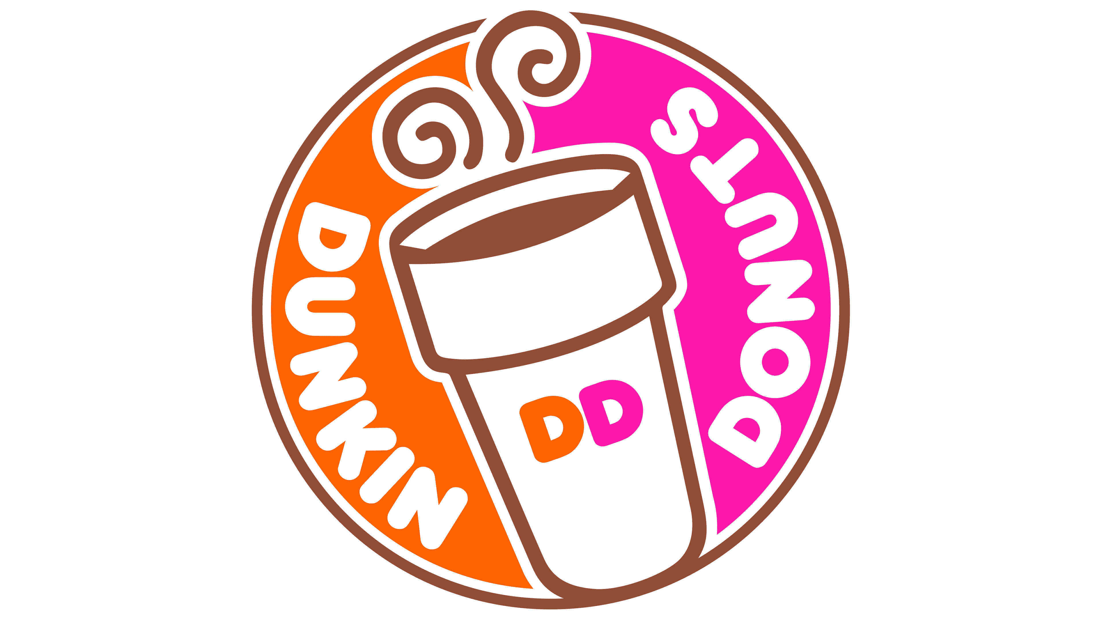
2007 – 2019
![]()
In 2007, an attempt was made to improve the current version. To this end, the developers made slight adjustments to some elements. They made the cup’s background colorful: the top part was made pink, and the bottom was repainted orange. The drink inside also changed: it turned brown, matching the contour of the disposable dish, which now featured a “DD” monogram.
2019 – 2022
![]()
Designers removed one word from the name, leaving “Dunkin.” They made it larger and more attractive to catch the eye immediately. The apostrophe at the top was given raspberry sorbet color.
2022 – today
![]()
Font and Colors
The donut-and-coffee sales network aimed to visually emphasize the assortment and orientation of its work graphically. Therefore, it chose candy pink and powder yellow as its official colors. The first symbolizes brightness, a joyful atmosphere, and an elevated mood; the second is a freshly baked donut. Its task is to evoke appetite.
To convey the product’s taste, artists used a cheerful font reminiscent of Frankfurter and Debussy, which made the letters “plump.” Moreover, the 2007 text indicates the range of goods, coffee, and donuts. The current version emphasizes only the presence of donuts, which relates to the expansion of the range of modern drinks.