


![]() Lay’s Logo PNG
Lay’s Logo PNG
The Lay’s logo evokes hunger and the desire to taste the product. Its bright color combination and smooth lines evoke crispness and rich flavor, conveying a sense of enjoyment and lightness.
Lay’s traces its origins to the 1930s, when Herman W. Lay acquired Barrett Food Company and renamed it HW Lay Lingo & Company. By 1932, in Nashville, Tennessee, he was selling potato chips from his car, building a small but growing business.
In 1938, Lay formally established HW Lay & Company and hired his first employee. During the 1940s, the company merged with Frito, founded in San Antonio in 1932 by Elmer Doolin. Postwar demand and the rise of television advertising in the late 1940s and 1950s turned Lay’s into a national snack brand.
A major shift came in 1965 with the merger of Lay’s and Pepsi-Cola, forming PepsiCo. This expanded distribution and marketing capacity. Earlier, in 1963, Lay’s introduced flavored chips such as barbecue and sour cream and onion, followed in 1970 by foil packaging to improve freshness.
Throughout the 1980s and 1990s, the brand entered international markets, including Mexico, Brazil, and Poland, and adapted its flavors to local demand. Marketing campaigns like “Bet you can’t eat just one” reinforced its mass appeal.
In the 2000s, Lay’s expanded its product line with Stax, Sensations, and Wavy. They launched “Do Us a Flavor,” inviting consumers to create new variants such as Cheesy Garlic Bread and Wasabi Ginger. Today, Lay’s products are sold in over 200 countries, maintaining a leading position in the global snack market.
Meaning and History
![]()
Lay’s has a recognizable corporate style. The company underwent several global redesigns, but its name has always been on the logo. The goal of making the logo popular was set from the moment it was introduced, because chips are an excellent snack that can be eaten anytime, anywhere. Meanwhile, the company’s management emphasized the brand and its products: over the years, it changed the logo 6 times, focusing on modernity and consumer demand. The key element of the logo has been and remains the name of the company’s founder, Herman Lay. However, he initially named the company HW Lay Lingo & Co.
What is Lays?
It is one of the brands of Frito-Lay, which is owned by the American corporation PepsiCo, Inc. Under this brand, potato chips with various flavors are produced. It appeared in 1932 and was named after its creator, Herman Warden Lays.
1940 – 1955
![]()
The debut version indicated the direction the identity would take. The original emblem depicted cookware – a pot, vat, kettle, or deep food bowl. It directly indicated that this is food. At the bottom is a wavy bracket reminiscent of a hot cooking surface. The wavy line is also present in the capital letter “L.” Its right segment resembles a sharp spike and extends beyond the middle of the letter. The lowercase letter “y” has a straight stem directed downwards, and the upper part of the letter resembles the letter “u” with curled serifs.
1955 – 1981
![]()
The emblem is a white inscription, “Lay’s,” depicted inside a red rectangle. The corners of the geometric figure are rounded. The word is stretched vertically. The letters do not have serifs. The protruding letters L and Y and the apostrophe are painted red for an original contrast.
1981 – 1984
![]()
The new version of the Lay’s logo continues the previous stylistic direction, but it now appears softer and more cohesive. This time, the designers removed the solid background and replaced it with a rich red outline. The outline closely follows the lettering, repeating its shape.
The Lay’s wordmark inside the outline is rendered in white. The typeface retains the basic style of the previous version. The letters remain sans serif, dense, and rounded. The only change concerns the smoothing of the corners, with curves becoming softer and featuring a larger radius.
In the new logo, the focus is entirely on the name, emphasizing the brand itself.
1984 – 1995
![]()
The overall concept and color palette are preserved. Only the shapes have changed. The word “Lay’s” is now typed in italics, with smaller angles than in the previous version. The rectangle disappeared, replaced by a wide red contour that runs along the entire text.
1995 – 2003
![]()
In 1995, the company began using a logo similar to Walkers’. It is based on simple contrasting colors. The aggressive red looks good alongside the calm yellow.
A round potato chip in the background symbolizes the sun. In front of it is a bright curved ribbon with the inscription “Lay’s.” The white letters have small blue shadows, which give the word a three-dimensional effect.
This version of the logo can still be found on the lids of Lay’s Stax, the packaging of Lay’s Deli Style Original, and some Frito-Lay trucks.
2003 – 2009
![]()
At the end of 2003, the designers rotated the logo counterclockwise, causing the inscription to rise slightly. The contours of the letters were also changed: now they are burgundy, not blue. The word “Brand” is printed in small font. A gradient formed by a red palette has been added.
2007 – 2019
![]()
On July 30, 2007, Lay’s introduced another logo, developed by Perspective Branding in collaboration with designer Jon Burns. The brand received a deeper, more dimensional image inspired by the Frito-Lay emblem.
The designers replaced the flat sun chip image with a three-dimensional yellow sphere featuring a realistic light effect. The sphere appears convex because the gradients transition from a bright upper edge to a darker lower part. The red ribbon carrying the Lay’s name was also transformed. It took the form of a physical object with curves and rounded edges, resembling real packaging film. Along the edges of the ribbon runs a golden trim emphasizing its material quality.
The lettering is set in white type on a cream base with a slight shadow, making the text appear raised above the ribbon’s surface. The typeface became more even and gained a connecting stroke between the letters “a” and “y.” In the lower-right corner, the word “BRAND” appeared, identifying the logo as a trademark on international packaging.
The logo color remained defined by traditional shades of yellow and red, but gradients, shadows, and volume made the visual style livelier and more dimensional, creating the impression of a real object on the packaging.
2019 – 2025
![]()
When Lay’s introduced a new logo in the United States on September 13, 2019, the brand focused on simplicity and ease of perception. The design was handled by PepsiCo Design & Innovation, in collaboration with designer Ian Brignell, and the creation process took about 2 years. In China, the mark appeared earlier in March, but it was officially approved in June. Over time, the logo became standard for other markets as well. In France, it appeared in 2020; in Canada, the emblem was introduced in January 2021, although Lay’s Stax and Poppables there continued to use the previous version until 2022. In Indonesia, the mark appeared after the brand’s return in 2025 with the opening of a new PepsiCo plant in Cikarang, when Lay’s was renamed Chitato Lite.
The designers chose to simplify the logo as much as possible by removing unnecessary details. The yellow circle retained its shape and slight volume through a smooth gradient. The circle’s color ranges from a lemon shade at the top to a warmer orange at the bottom, evoking the sun or a classic potato chip.
The red ribbon now looks more concise and compact. The golden trim and complex shadows disappeared, but a sense of volume remains through soft curves. The edges of the ribbon are slightly twisted, resembling a neat fabric fold.
The brand name is written in white, rounded type with a light shadow and an elongated tail on the letter “y.” The inscription “Brand” was removed as unnecessary. The logo became universal, without a packaging effect, well-suited for digital formats and various advertising uses.
2024 – today (international)
![]()
In some countries, the Lay’s brand introduced a new logo style, offering a flat version of the familiar mark. The work was again carried out by PepsiCo Design & Innovation together with designer Ian Brignell. The main elements remained unchanged. At the center is still a yellow circle, with a red ribbon carrying the name placed over it. However, the designers abandoned three-dimensionality.
The yellow circle became uniform, without gradients or highlights, losing its convex effect and turning into a flat color field. The red ribbon also lost its volume, golden border, and other small elements, becoming a single smooth curve.
The white Lay’s inscription was preserved, and the type style remained the same. The type is not accompanied by complex shadows or bases, simplifying perception.
This transformation is explained by the company’s intention to create a universal logo suitable for digital platforms and various packaging types. The simplified form allows the mark to be easily scaled and ensures high-quality reproduction on different materials and surfaces, reflecting modern minimalist design trends.
2025 – today
![]()
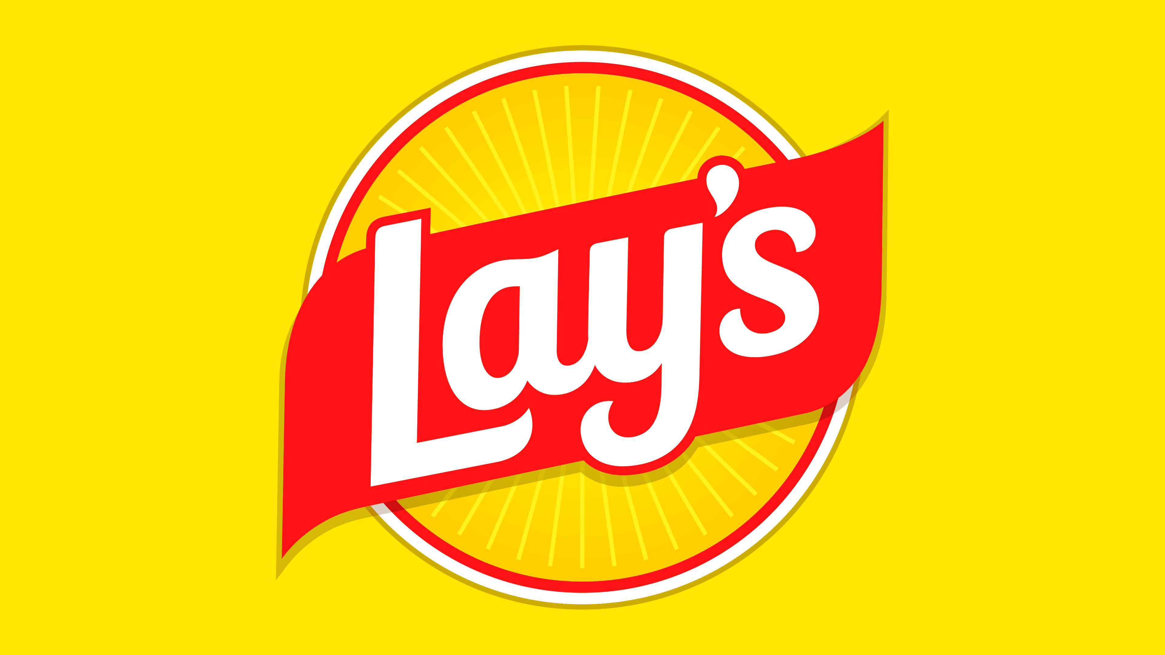
In October 2025, the American brand Lay’s presented an updated logo prepared by its in-house design team, PepsiCo Design & Innovation. In the new version, the yellow circle and the red ribbon with the name were retained. However, the designers added freshness and expressiveness by placing thin radial rays on the yellow circle.
The yellow circle symbolizes the sun and, at the same time, a chip, strengthening the brand’s association with natural ingredients and freshness. The rays extending from the center emphasize the potato’s agricultural origins and natural character, recalling its journey from the fields to packaging.
The red diagonal ribbon passing over the circle at a slight angle appears refined and neat. It serves as the base for the white Lay’s name. The letters are set in a smooth, soft-lined typeface. The ribbon is slightly raised through a shadow to create a sense of lightness.
The color scheme did not change. The brand retained the classic combination of red, yellow, and white.
The logo was named “Lay’s Rays,” a direct reference to the sun’s rays. Through this style, Lay’s emphasizes the natural qualities of the potato, freshness, and the brand’s long history as it approaches its centennial anniversary.
Font and Colors
Lay’s corporate style traces stability and respect for the company’s roots. The brand name is still the key element of the logo. Until 1997, it occupied all the spaces, serving as a fried potato wedge. Another important element is the cookware. Over time, designers turned it into a rectangle with a ribbon and a large inscription, which is still used today.
From print form, the text transitioned into semi-script italic with a slight slant. The logo uses several fonts, specifically Helvetica Neue and Hobo. In some places, they are combined; in others, they are complemented by separate styles.
Some designers say this font has smooth, clear, and elegant lines, similar to popular fonts like Makozin Heavy Italic and Bluestar Medium Italic. Still, it includes unique tweaks to better align with Lay’s brand style.
The color palette has been bright from the beginning. For maximum attractiveness, designers chose six striking colors: Sun Metallic (#957531), white, Pastel Yellow (#FDF597), Spanish Yellow (#F1B11B), Pigment Red (#EF1C24), and Animal Blood (#AB0E14). These colors represent energy, power, and passion, highlighting Lay’s commitment to creating exciting, tasty snacks. The white color adds a professional touch, emphasizing the brand’s focus on quality.