


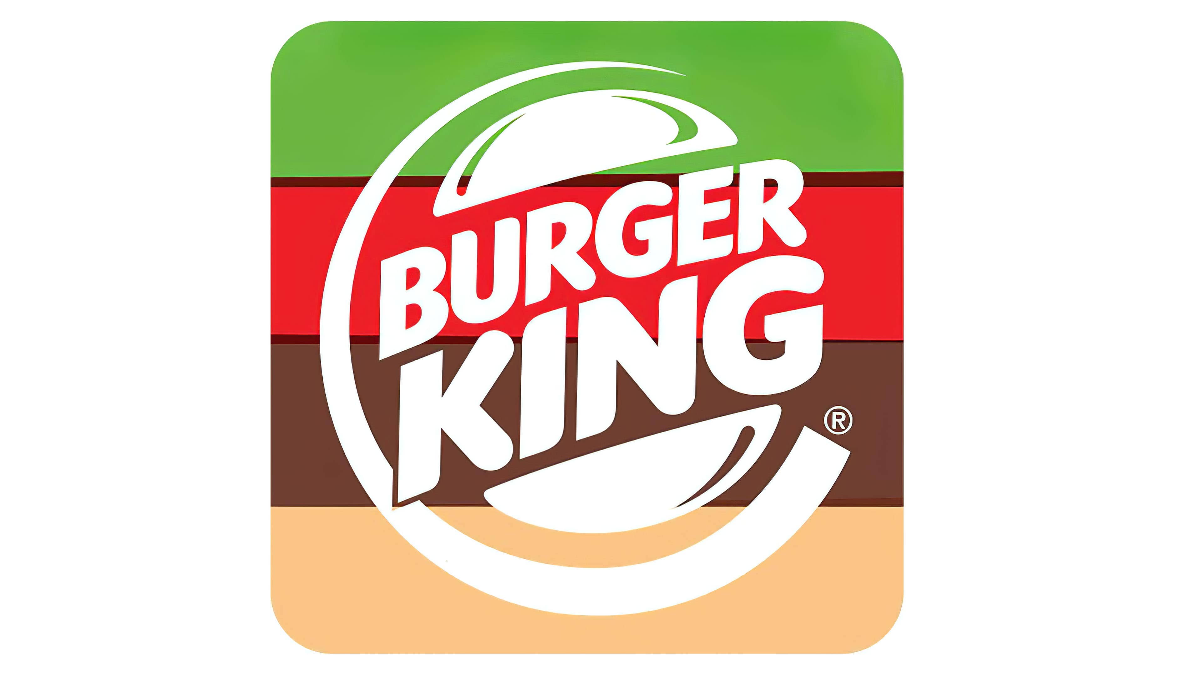
![]() Burger King Logo PNG
Burger King Logo PNG
The Burger King logo, known for its originality and “appetizing” appeal, embodies the popular fast-food chain. The bright and memorable emblem has become a symbol of unique taste and high quality, reflecting the brand’s inception and serving as a tribute to its past.
Burger King began in 1953 in Jacksonville, Florida, when Keith J. Kramer and Matthew Burns opened Insta-Burger King, which was built around the Insta-Broiler oven. Early operations struggled, and by 1954, the business faced financial pressure.
In 1954, franchisees James McLamore and David Edgerton acquired the company, renamed it Burger King, and shifted development to Miami. Ownership changed several times in the years that followed, with control eventually moving to 3G Capital, while the headquarters remained in Miami.
In the late 1950s and 1960s, Burger King introduced the Whopper, which became its key product. Expansion across the United States and abroad followed in the 1960s and 1970s, with support from Pillsbury. The slogan “Have It Your Way” reflected a focus on customization.
During the 1980s and 1990s, the menu expanded with chicken sandwiches and salads, and restaurant formats were updated. The early 2000s brought instability with multiple ownership changes. In 2010, Burger King returned to the stock market, and in 2012, it was acquired by 3G Capital, followed by product revisions and ingredient updates.
In 2014, Burger King acquired Tim Hortons and, together with Tim Hortons, formed Restaurant Brands International, combining the chains into a unified structure. Today, the chain operates more than 18,000 locations across over 100 countries, continuing to center its offering on the Whopper while adjusting its menu and expanding its global presence.
Meaning and History
![]()
Originally, the company was named Insta Burger King, and its emblem featured a sun-like symbol. However, within a year, the founders began facing financial difficulties and sold the company to David Edgerton and James McLamore, who renamed it Burger King. Over the next 50 years, the company changed owners four times, as reflected in the corporate design.
The company is the second most recognizable brand among fast-food restaurants worldwide, after McDonald’s famous “Golden Arches.” This is largely thanks to its bright and memorable logo.
The company’s logo originally had only one textual incarnation (even before David Edgerton and James McLamore acquired the company’s shares). The image of the Hamburger King was drawn on restaurant signs and actively advertised in the media.
In subsequent decades, logos became quite complex in terms of the number of elements and details. An integral part of them became the king himself (the very Burger King), sitting on a hamburger with a drink and a straw.
In 1967, the company adopted a logo that later became the prototype for the current logo. It was so successful that it underwent only minor changes. Since then, all logo versions have had a simple design and a delightful, memorable color palette.
For many years, the logo featured two halves of a bun (Bun Halves) with the company’s name between them. This detail became a key part of the brand’s image.
What is Burger King?
Burger King is a corporation that manages the eponymous fast-food restaurant brand. At the same time, it is part of Burger King Holdings and Restaurant Brands International Inc. Its predecessor was the company Insta-Burger King, founded in 1953 and named after the Insta-Broiler oven in which the patties were originally fried. It was renamed in 1959 after restructuring.
1953 – 1954
![]()
The debut logo resembled a rising or setting sun. It featured a semi-disc with short triangular rays, and its color palette was gray and black.
1954 – 1957
![]()
The franchisees’ merit was removing the extra word from the name. Therefore, the emblem of this period looks minimalist, practical, and restrained. Nothing superfluous exists on it, only the name, executed in black letters on a white background. The font is individual, with a shortened stem at the “R” and pointed ends at the “U.”
1957 – 1969
![]()
The next set of establishment owners changed the logo to emphasize the phrase “Burger King.” They used the image of a king sitting on a large hamburger with a drink in a plastic cup. Below, on a yellow background, was the company’s name and the phrase “Home of the Whopper.” Thus, it was an advertising badge, not a trademark symbol. The logo was very colorful. In addition to yellow, it contained red (two types), blue, white, and black (for contours). Simultaneously, the previous version of the logo appeared in the inscription.
1969 – 1994
![]()
In 1969, the company switched to an updated logo. It depicted a bun cut in two, with the restaurant chain’s name placed in two tiers between the halves. This variant lasted only briefly and was revived in 2019 for Super Bowl LIII (in February) and the third season of the Netflix series Stranger Things (in May).
The color palette was borrowed from the previous version, but the shape, composition, and style underwent radical changes. The bold red inscription, executed in a round sans-serif font with smooth lines, came to the forefront. The designers stretched the “King” part to create an optimal balance between long and short words.
1994 – 1999
![]()
This emblem is an improved version of the previous one. It was introduced in April 1994 with less caricatured text. The Burger King inscription style is strict, with straight letters and a fluffy top of the improvised bun.
1999 – 2021
![]()
On the brink of a new century, Burger King changed its logo design again. It was developed by the professional studio Sterling Brands. Outwardly, it resembles the original 1969 version and the 1994 version. The only difference is a blue semicircle shaped like the letter “C,” which complements the logo. The company name is still inside the burger between the two bun halves. But it is enlarged, placed diagonally, and written in a modern sans-serif font.
The logo’s color is extremely important to the fast-food joint. Initially, the designers aimed to whet potential customers’ appetites by using appealing images and colors. The colors of the modern logo correspond to the ultra-modern culture of fast food. The company owners understood this well and tried to fill the logo with colors closest to the natural color of bread, meat, and vegetables. As a result, juicy yellow, orange, and red were chosen, and blue was added recently.
2021 – today
![]()
The current logo harmoniously stylizes the two previous versions. The designers borrowed the round letters from the 1969-1994 emblems and the 1994-1999 bun shape. The unifying element is a light lilac background, on which a yellow-orange burger with a red inscription inside is improvisationally depicted.
Font and Colors
Thanks to constant updates, the brand style has become recognizable worldwide. It visually stylizes the name of the restaurant chain – Burger King. The most successful variants feature a large appetizing “Burger King.”
The Burger King logo has used different fonts over time. They have been smooth, bubbly, convex, streamlined, or strict. One of the old variants resembles the TILT font, modern ones – VAG Rounded ExtraBold. Some design experts note that the Burger King logo resembles the Corkboard JNL and Frankfurter Std Normal fonts, though with minor adjustments.
The brand palette consists of colors closest to the food theme. These colors awaken the appetite, which is crucial for a fast-food restaurant’s marketing. That is why the management chose yellow-orange (the natural color of the bun’s crust) and red, which are known to actively stimulate the appetite.
FAQ
How does Burger King prepare their burgers?
Burger King stands out in the fast-food world because they care about how it makes its burgers. They have a special way of ensuring every burger is top-notch, tastes great, and leaves customers happy. Their famous burgers start with 100% beef, no fillers or anything else, just good quality beef that tastes amazing.
The secret to their burgers’ great taste is that they only have a special grill. It uses real flames to cook the burgers, which gives them a unique, smoky flavor you can’t find anywhere else. The burgers grill for about 2 to 3 minutes, but this can vary depending on their size and thickness. This makes sure every burger is cooked just right.
Thanks to the all-beef patties and the special way they’re grilled, Burger King’s burgers are juicy, flavorful, and unlike any other. This whole process shows how much Burger King focuses on quality. Their approach mixes old-school methods with new ideas, setting their burgers apart in a busy market. It’s not just about getting a burger at Burger King; it’s about enjoying a meal that’s a commitment to making burgers correctly. This is why people return for that special flame-grilled taste when they commit to making burgers.
How many people go to Burger King a day?
Over 11 million people eat at Burger King restaurants worldwide every day, a huge number that shows just how popular Burger King is. People keep returning because the food is good, tastes great, and doesn’t cost much.
Burger King started in 1954 and is now the second-largest fast-food hamburger chain. This success shows that Burger King has been doing things right for a long time, making food that people enjoy and can afford.
Millions of people choosing Burger King daily tell us it’s a favorite spot for many. It’s the place people think of when they need a quick morning meal, lunch during a busy day, or dinner with their family. Burger King has become a big part of daily life for folks everywhere, showing that it’s more than just fast food; it’s a trusted choice for good meals that won’t break the bank.
Can you ask Burger King to make it fresh?
At Burger King, you can ask for your burger to be made fresh by ordering it “off the broiler.” This phrase is like a secret code that lets the staff know you want a freshly cooked patty, not one made ahead and warmed up. It’s a simple way to ensure your burger is as juicy and tasty as possible. So next time you’re at Burger King and want the best burger they can make, just say you want it “off the broiler.” This way, you’ll get a burger straight from the grill, making it more delicious.
What is Burger King’s strategy?
Burger King’s approach is to offer good deals without cutting corners on quality. They focus on making their food affordable, targeting people who want to save money. The company does this through value meals, combo deals, and discounts, offering customers a full meal for less.
The point of this strategy isn’t just to bring in more customers; it’s also to keep Burger King profitable. Burger King prices its menu items to be affordable for customers while still profitable for the company. This makes people see Burger King as a place to get a good meal worth their money.
In short, Burger King works hard to ensure that people can enjoy delicious meals without spending a lot. This approach helps customers save money, which in turn helps Burger King remain profitable and maintain its market position.
Why did Burger King change its logo?
In 2021, Burger King refreshed its logo to mark a new chapter and honor its history. They aimed to revive the classic feel of their 1969 logo, a key moment in their story, to strengthen their connection with their origins and show how the brand has grown.
The update wasn’t just about looking modern and making the logo more appealing. The designers chose colors that evoke real food: the bun part of the logo looks like a baked good, and the text mimics the color of a well-cooked burger. This was done purposefully to warm and invite the logo, just like their food.
The new logo is designed to reflect the quality and taste of their burgers, reminding everyone of what Burger King stands for. This mix of old and new is meant to draw in everyone, whether they’ve loved Burger King for years or are just getting to know them. It’s a clear sign that Burger King wants to keep up with the times while staying true to what makes their food special in the fast-food world.
What does the Burger King logo symbolize?
The Burger King logo cleverly shows off its famous hamburgers. The designers made the logo look like a burger by drawing a bun and cutting it in half. Then, they put the brand name in the middle as the “patty.” This design isn’t just for looks; it tells everyone exactly what Burger King is proud of: its tasty burgers.
When you see the logo, you’re meant to think of a delicious burger right away. This helps draw people into their restaurants, promising a good meal. The logo also says a lot about Burger King itself. It shows they’re all about making great burgers that customers will love. In short, the logo is a smart way of letting people know what Burger King stands for: good food and happy customers.
What does the Burger King logo represent?
The Burger King logo is not just nice to look at; it’s designed to make you hungry and want to visit their restaurants for a delicious burger. The logo features a large, fluffy bun painted in warm, natural colors, making it look like it’s just come out of the oven. This yellow bun is meant to remind you of freshly baked bread.
The brand’s name is placed inside the bun, using colors that evoke a juicy, perfectly cooked burger patty. This suggests that a tasty, well-prepared burger is waiting for you. The logo’s design and colors convey that Burger King is about simple yet delicious food.
By combining an attractive design with colors that make your mouth water, the Burger King logo effectively showcases the quality and flavor of its food. It’s like a friendly hint that eating at Burger King will fulfill your burger cravings. In short, the logo represents Burger King’s commitment to serving tasty, quality fast food.
Why does Burger King have a new logo?
In 2021, Burger King rolled out a new logo, signaling a big change in how it presents itself. This new logo shows the brand’s commitment to fresh, natural ingredients. It’s a nod to Burger King’s history, taking cues from older logos that were simple and immediately grabbed your attention.
This wasn’t just a one-off change. It was part of a big makeover that touched everything from the staff uniforms and restaurant interiors to the packaging. The idea was to show that Burger King is serious about quality and using natural ingredients, which people nowadays care about.
Jones Knowles Ritchie, the creative team behind this, set out to make a logo that would not get lost in the busy fast-food scene and remind people of the Burger King they’ve always known. The new logo is simple and easy to recognize, linking Burger King’s long history to its plans.
By revamping its look, Burger King wants to make it clear that it’s all about good, honest food. In an industry with choices, Burger King is betting that customers will prefer fast food with quality, natural ingredients. The clean, straightforward design of the new logo is meant to attract people who value these qualities, blending tradition with a modern approach to what we eat.
Is the Burger King mascot a man or a woman?
The Burger King mascot, known as the King, is a man who first appeared in the brand’s logo in 1957. Even after being removed from the logo, the King remained an important part of Burger King’s identity. He got a new job appearing in animated ads to help promote the restaurant.
Starting in 2004, the King made his mark in Burger King’s ads, fitting in with the brand’s royal theme. He’s become a memorable part of the brand, standing out for his unique, fun personality in a sea of fast-food options. The King adds a playful, welcoming vibe to Burger King, helping it stay top of mind for customers.
When was the Burger King logo used?
The Burger King logo started in 1953, kicking off the brand’s journey. A few years later, in 1957, they added the king’s image to the logo, making it stand out and stick in people’s minds. The big change came in 1969 when Burger King introduced a logo that hit the mark. It showed the “Burger King” name squeezed between two halves of a bun, clearly showing off what they’re all about: burgers. This design was such a good fit that, with just a few small updates here and there, it’s still the face of Burger King today.
This logo’s staying power shows how well it captures what Burger King is all about. Not just focusing on hamburgers, but also becoming a symbol that people everywhere instantly recognize. The way the Burger King logo has stayed relevant over the years shows the strength of a great design. It’s more than just a logo; it’s a piece of the brand’s story and what it offers.
What is the hidden meaning behind the Burger King logo?
The Burger King logo clearly shows what the brand is all about. It stands for tasty, high-quality food made with attention to detail. The word “King” in the name suggests that you can expect big, filling meals, perfect for those who want a satisfying meal.
The logo also tells us that Burger King’s food is affordable. Despite the large portions and high quality, the prices are reasonable. This mix of good-quality food at fair prices is why people keep returning.
Plus, the logo hints at a welcoming vibe, making it clear that Burger King isn’t just a place to eat; it’s also about enjoying a good time while you’re there.
In short, the Burger King logo shows off the brand’s key points: great food, generous portions, fair prices, and a friendly place to eat. This helps attract customers by promising a quality dining experience that’s hard to beat.
Who designed the Burger King logo?
The Burger King logo has changed a lot over the years, thanks to the work of various designers. Kramer and Matthew Burns designed the first logo, which showed a grey sun with triangular rays, setting the stage for Burger King’s look. Later, Sterling Brands updated the logo to a rounder, more colorful version that better fits modern times and appeals to a wider audience.
In 2021, Jones Knowles Ritchie refreshed the logo once again. This update kept the brand’s look up to date with current trends while still nodding to Burger King’s long history. This latest design keeps Burger King looking modern and attractive to its customers.
All these changes to the logo, made by different designers over the years, have helped keep Burger King’s image fresh and relevant. This shows how the logo isn’t just a static symbol; it grows with the brand, reflecting its values and appealing to each new generation of fast-food lovers.
What is the Burger King mascot based on?
The Burger King mascot is based on a king, but he’s not your usual royal figure. Instead, he represents the heart of the Burger King brand. Created in 1957, the designers added a fun twist by having the king sit on a hamburger bun rather than a throne. The restaurant’s name replaced the burger patty, linking the king to Burger King’s food.
This idea cleverly combined the theme of royalty with Burger King’s main product: burgers. It highlighted the brand’s promise to serve big, tasty meals worthy of a king, helping to build its identity. Having the king on a burger bun was a unique touch that made Burger King stand out in the fast-food world. Over the years, this mascot concept has grown. Still, the core idea remains the same: the mascot symbolizes top-notch burger quality and customer satisfaction, which is what Burger King aims to deliver.
When was the old Burger King logo used?
The old Burger King logo, known for its burger design, first appeared in 1969. It quickly became a key part of the brand, showing everyone that burgers were what Burger King was all about. This logo remained in use until 1999, with a few small changes. It played a big part in making Burger King a well-known name in fast food worldwide.
In 2021, Burger King brought back the burger design in its logo. This move brought back memories for many people and highlighted Burger King’s longstanding focus on burgers. It was a way for the brand to update its look while still honoring its past and reminding people of what Burger King stands for.
But Burger King’s story starts even earlier, with its first logo in 1953, which shows a sun with triangular rays, quite different from the burger images we recognize today. Moving from the sun to the burger logo showed a significant change in how Burger King presented itself, tying its look to what it’s best at: serving delicious, high-quality burgers.