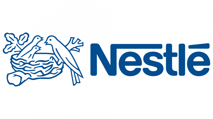
The primary emotions conveyed by the Nestle logo through the use of a nest are reliability, care, and warmth. The bird represents the present, feeding the future – the chicks. This illustrates the continuity of generations and traditions passed from parents to children. With this company’s products, families become more cohesive and responsible. All of this is reflected in the subtle stylization of a simple image.
Nestle: Brand overview
Nestle is a food and beverage manufacturing company leader in several key industries. Its logo can be seen on tea, coffee, confectionery, frozen fast food, cereals, snacks, bottled water, health and baby food. The brand is based in Vevey, Switzerland, formed by the merger of two companies founded in 1866. Its founders were brothers George and Charles Page and Henri Nestle. Today, the former dairy companies have transformed into a food industry giant, owning 29 brands and 447 factories, and are recognized worldwide.
Nestlé, the world’s largest food and beverage company, started in Vevey, Switzerland, in 1866 when German pharmacist Henri Nestlé created the first infant food, Farine Lactée Henri Nestlé. This innovation laid the foundation for what would become a global empire.
By 1905, Nestlé had merged with the Anglo-Swiss Condensed Milk Company, kicking off a period of rapid growth and international expansion. The company broadened its product range in the 1920s and 1930s, introducing Nescafé instant coffee and Nestlé chocolate bars. Nescafé became a staple for American soldiers in World War II.
In the 1940s and 1950s, Nestlé expanded further, acquiring brands like Maggi and Crosse & Blackwell and entering the frozen food market with Findus in Europe. The 1960s and 1970s saw the company diversify its portfolio by acquiring Libby’s fruit juices and Stouffer’s frozen foods, increasing its presence in developing markets in Latin America and Asia.
The 1980s marked a significant phase as Nestlé acquired Carnation, an American dairy product maker, and coffee brands Hills Bros. and MJB, despite facing criticism for promoting breast milk substitutes in developing countries.
The 1990s continued with strategic acquisitions, including San Pellegrino, Spillers Petfoods, and Ralston Purina, while divesting non-core businesses like Contadina and Findus.
The 2000s were characterized by significant brand acquisitions, such as Dreyer’s, Chef America, and Novartis Medical Nutrition, amid controversies over marketing practices and palm oil usage.
From the 2010s onwards, Nestlé focused on health and wellness innovations, acquiring companies like Atrium Innovations and Aimmune Therapeutics and committing to sustainable development goals like fully recyclable or reusable packaging by 2025.
Nestlé operates in 187 countries with around 291,000 employees and a portfolio of over 2,000 brands spanning various food and beverage categories.
Nestlé’s success is attributed to its focus on research and development, strategic acquisitions, and skillful branding. Iconic products like Nescafé, KitKat, and Maggi have become staples in diets worldwide.
Meaning and History
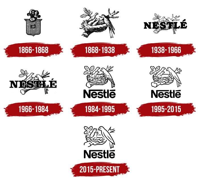
Over its 150-year history, Nestle has changed its logo several times. Seven known versions are almost identical, as the edits involved minor details. Overall, the logo’s evolution has shifted from a complex version with many details to a simple and understandable one. The company’s visual style appeared even before its formation.
What is Nestle?
Nestle Société Anonyme is the largest food manufacturer, including various beverages, snacks, dry breakfasts, and specialized products. The company has been in existence since 1866 and is based in Vevey, Switzerland.
1866 – 1868
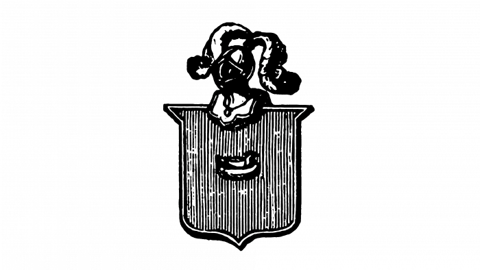
Since its founding in 1866, the Swiss company Nestlé has rooted its visual identity in the family name of its founder, Henri Nestlé, which means “nest” in German. The original logo included the Nestlé family crest—a shield with an extended upper edge that added a touch of nobility. The crest featured a bird in a nest at its center, symbolizing the company’s name and paying homage to its founder’s origins.
Instead of a traditional crown, the logo sported a feathered metal helmet, making it unique and memorable. Although this initial logo was short-lived and only used for two years, it was crucial in establishing Nestlé’s brand identity. This emblem set the tone for Nestlé’s branding.
1868 – 1938
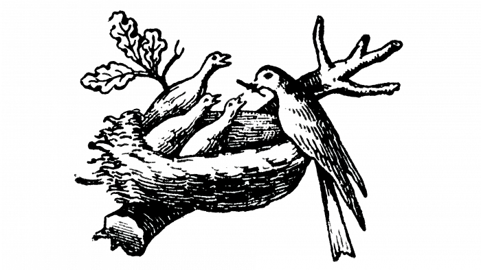
This emblem appeared during the founder’s lifetime and was used for 70 years until it received a long-awaited update. It depicts a nest with three chicks and a mother sitting beside them. Such an interpretation of the logo best emphasizes the company’s main activity—producing infant food. According to the owner, these are thrushes on an oak branch.
1938 – 1966
This period is characterized by the appearance of a horizontal inscription – the company’s name, Nestle. It was much darker than the bird’s nest, obscuring the view.
1966 – 1984
In 1966, artists redrawn the central element: the nest with birds became outlined, simple, and without unnecessary details.
1984 – 1995
At this time, the legendary version, most similar to the modern logo, appeared. Designers moved the text to the bottom, left two chicks in the nest, and removed the worm from the bird’s beak.
1995 – 2015
In 1995, Nestle revamped its visual identity to keep up with modern design trends and strengthen its appeal in the market. The update included a cleaner, more contemporary typeface with softer angles and thicker lines, enhancing readability and modern appeal. This font choice made the text easier to read and more visually attractive.
The logo underwent a significant simplification. The goal was to remove unnecessary details, creating a simpler but impactful logo with a strong, unified look. This move was designed to make the brand more memorable and distinctive.
The redesign refreshed Nestle’s image to make it more approachable and relevant while maintaining its long-standing heritage.
2015 – today
In 2015, Nestle made a small but significant update to its logo. The emblem was slightly enlarged to improve the balance and strength of its appearance. This adjustment enhanced the logo’s visual appeal without changing its classic and recognizable design. This subtle change helped make the logo look more commanding and unified, reinforcing Nestle’s strong presence in the market.
Nestle: Interesting Facts
Nestlé started way back in 1866 when a man named Henri Nestlé made the first milk-based baby food. He wanted to help babies who weren’t getting enough to eat. Nestlé is a huge company that makes various food and drinks, like water, coffee, and dairy products.
- First Steps: Henri Nestlé made a special baby food to help keep babies healthy. This idea helped start the whole Nestlé company.
- Growing Big: Nestlé grew rapidly after starting in Switzerland. Now, it operates in 186 countries and offers over 2,000 different types of food and drink.
- Nescafé: In 1938, Nestlé made the first instant coffee, Nescafé, which became very popular with American soldiers during World War II.
- Buying Other Companies: Over the years, Nestlé has bought other food companies, such as Stouffer’s and Gerber, to offer more kinds of food.
- Always Discovering: Nestlé spends a lot of money on research to make better food and learn more about what we eat.
- Taking Care of the Planet: The company wants all its packaging to be recyclable by 2025 and aims to not add to the earth’s warming by 2050.
- Water Problems: Some people don’t like how Nestlé uses water for its bottled drinks. The company says it’s working to use water wisely.
- Focusing on Health: In 2011, Nestlé started a special division that develops foods that help people stay healthy.
- Plant-Based Foods: With more people wanting to eat plants instead of meat, Nestlé makes foods from plants.
- Helping with Health: Nestlé also tries to help solve health problems by teaching people about good nutrition and healthy eating.
Nestlé went from making baby food to being one of the biggest food companies, always focusing on making food that’s good for us and the planet.
Font and Colors
The logo’s symbolism is directly related to the lineage of its founder, as it uses the image of a bird from the family crest sitting on a nest. It appeared there thanks to the surname Nestle, which translates from German as “bird.”
Since 1984, the name has been written in a font reminiscent of Helvetica, and before that, a classic serif font was used. The capital letter “N” is graphically emphasized: one of its legs is extended horizontally, creating the impression of protecting infants, as the other characters are small lowercase. The logo’s color palette is simple and based on a combination of white with brown, gray, or black.
FAQ
What are the colors of the Nestlé brand?
Nestlé’s brand is instantly recognizable by its unique brown color, which isn’t chosen by chance. This brown reflects Nestlé’s history, trustworthiness, and connection to nature, representing its products’ natural ingredients and rich taste.
This specific brown is identified using various color systems to keep the look the same no matter where you see it. In digital design, it’s shown with the Hex code #63513D. For screens like TVs and monitors, it uses RGB values (99, 81, 61) to mix red, green, and blue light to get this brown. In printed materials, it’s made using CMYK colors (0, 18, 38, 61), a mix of cyan, magenta, yellow, and black ink. To ensure the exact color in design and printing, it matches Pantone 7532 C in the Pantone Matching System. Nestlé’s choice of colors shows how much they focus on details and staying true to their brand everywhere.
What is the slogan of Nestlé?
Nestlé’s motto, “The Good Food, Good Life Company,” perfectly sums up the company’s mission. This tells us that Nestlé believes that food is about improving lives worldwide. This slogan shows Nestlé’s aim to make healthy and enjoyable products. They see good food as something that can bring happiness, help people connect, and lead to a healthier way of life. For Nestlé, every meal is a chance to make someone’s day better.
The slogan “Good Food, Good Life” focuses on delivering high-quality, tasty, and nutritious products, aiming to positively impact millions of people’s lives daily. Nestlé’s slogan is a commitment to providing food supporting a healthy and happy life.
What is the significance of the Nestle logo?
The logo, featuring a mother bird feeding her chicks, symbolizes the nurturing and love central to the brand’s identity. This image aligns perfectly with Nestle’s origins as a baby food producer and its mission to provide nourishing food, mirroring the natural care a mother bird gives her young.
Henri Nestle, the founder, initially chose his family crest, featuring a bird in a nest, as the company symbol. Though somewhat accidental, this choice was later enriched by designers who added the image of a mother bird feeding her chicks, transforming the logo into a powerful symbol of care, family, and nutrition.
The logo closely connects to the core food production business, embodying the brand’s commitment to high-quality, caring, and nutritious products. It communicates that offerings are designed with the same love and care a mother has for her children, extending beyond mere food products to embody values and desire to positively affect its consumers’ lives, particularly the youngest ones. The logo effectively conveys the company’s goal to be a source of nourishment and care, drawing a parallel between its products and the fundamental act of caring for others.
What does the Nestle logo symbolize?
The logo, with a bird feeding its young, is a powerful sign of maternal love and care. This symbol is deeply connected to the brand’s history and its main role as a provider of baby food. The image of a mother bird caring for her chicks represents the natural, loving bond between a parent and their children, a feeling Nestle aims to reflect in its commitment to high-quality, nutritious baby food.
This meaningful symbol was carefully chosen to match the company’s mission. It shows Nestle as a caregiver who knows and meets kids’ nutritional needs. The logo tells people they can trust Nestle to care for their children’s health and well-being, just like a mother bird instinctively cares for her chicks.
Why is a bird depicted on the Nestle logo?
The presence of a bird on the logo is deeply rooted in the company’s origins and the personal history of its founder, Henri Nestle. When establishing the company that would bear his name—a name which means “little nest” in German—Nestle chose to use his family crest as the emblem for his burgeoning business. This crest featured a single bird safely nestled within a nest, a symbol that resonated with the themes of care and nurture fundamental to the brand’s identity, especially given its initial focus on infant nutrition.
The first version of the logo was adopted in 1868, showcasing a solitary bird in a nest. However, this imagery was refined to align with the company’s mission of providing nourishing, mother-like care to its consumers. Designers enhanced the emblem by including two additional chicks alongside the original bird, transforming the logo into a representation of a mother bird feeding her young. The bird on the logo is a decorative and meaningful symbol that captures the company’s heritage, values, and foundational commitment to nurturing life.
Why did Nestle change its logo?
Nestle has repeatedly refined its logo to make it simpler, clearer, and more suitable for the digital world. The company focused on removing unnecessary details, smoothing lines, and rounding off sharp edges to improve the logo’s look and functionality. These updates aimed to make the logo easily recognizable across all media types.
The 2015 update was especially important because it targeted the growing use of mobile devices. As more people view content on small screens, Nestle wanted its logo to stand out and be easily seen, regardless of the device. This change is part of a larger trend where companies are updating their brands to be more digital-friendly, recognizing the shift in how consumers interact with brands online.
Nestle’s efforts to simplify its logo and adapt it for digital use show its commitment to staying relevant and recognizable in a digitally driven world. This strategy acknowledges how media consumption has changed and highlights the importance of a logo that works well on large billboards and small smartphone screens.
What bird is depicted on the Nestle logo?
The bird on the logo, often considered from the thrush family, is a white bird that doesn’t look like any particular type of thrush. Instead, this bird symbolizes a mother caring for her chicks, representing the idea of nurturing and protection. This choice reflected Nestle’s mission of providing care and nourishment, much like a mother bird does for her young.
By not choosing a specific bird species, the logo sends a message of universal maternal care, which is key to identity, especially given its beginnings in making infant food. The bird seen in the logo isn’t meant to mimic a real bird in detail but is a broader symbol of motherhood and caring for the young.
What font is used in the Nestle logo?
Until 1984, the logo featured a bold serif font known for its decorative lines at the end of letters, a style that often suggests tradition and reliability. This choice matched Nestle’s longstanding reputation. Yet, Nestle decided on a new design direction to modernize and make the logo more flexible across different platforms.
The company then switched to a customized version of the Helvetica font for its logo. Helvetica, a sans-serif typeface recognized for its clean, simple, and neutral look, was created in 1957 by Swiss typographers Max Miedinger and Eduard Hoffmann. Initially named Neue Haas Grotesk, Helvetica captures the minimalist and clean Swiss design style, making it a perfect fit for Nestle’s desire for a contemporary and universally appealing logo. This font ensures the logo is easy to read and versatile, suitable for everything from packaging to digital use.
