The McDonald’s logo encapsulates the company’s role as a pioneer in the fast food industry and its global influence. It promotes a sense of nostalgia and comfort that connects millions worldwide. It is a symbol that transcends cultural and geographic boundaries, making McDonald’s not just a restaurant but a destination familiar to almost everyone, anywhere.
McDonald’s: Brand overview
McDonald’s is a well-known corporation and a chain of fast-food restaurants of the same name. It operates on a franchise system. The company was created in 1940 by brothers Maurice and Richard McDonald. Its career began in San Bernardino, California.
In 1940, Richard and Maurice McDonald opened their first restaurant in San Bernardino, California, called McDonald’s Bar-B-Q. It was just a BBQ place at first. Then, in 1948, they devised a fast way to serve food, which was a big deal for the food industry.
In 1954, Ray Kroc, who sold milkshake mixers, saw McDonald’s popularity and decided to work with the McDonald brothers. He opened his own McDonald’s in 1955 in Des Plaines, Illinois, when the famous golden arches appeared for the first time.
Kroc had big dreams for McDonald’s. By 1961, he had bought the company from the brothers for $2.7 million and started opening more McDonald’s all over the U.S. and Canada. McDonald’s started serving food in other countries in 1967, with the first international stores in Canada and Puerto Rico. The 1970s and 1980s saw McDonald’s opening in Europe, Asia, and South America, with the first UK restaurant opening in 1975.
By the 1990s, McDonald’s was a global name with over 11,000 restaurants, including a special vegetarian menu in India in 1996.
However, the 2000s brought challenges regarding health and environmental concerns. McDonald’s responded by adding healthier menu options and working on sustainability.
The 2010s were about technology and adapting to customer needs, with new features like self-service kiosks, mobile ordering, and delivery.
Today, McDonald’s is the largest fast-food chain in the world, with over 38,000 locations in more than 100 countries. From its beginnings as a BBQ joint to becoming a global fast-food empire, McDonald’s story shows its innovation and evolving ability.
Meaning and History
The dawn of the great empire named McDonald’s dates back to the mid-20th century. The restaurant opened in 1940 and was founded by the McDonald brothers. It had a menu of only 20 items, including hamburgers, fries, and Coca-Cola.
Realizing the demand was high, they decided to create and implement their system of fast customer service. They created a kitchen where people could work quickly to serve customers more efficiently. This allowed them to reduce customer service time, enabling faster operations and selling more dishes much cheaper. For instance, burgers were priced at $0.15, half the competitors’ price. As the business evolved, the brothers opened the first McDonald’s restaurant with yellow arches, now the restaurant’s logo. These arches crossed the restaurant but were not together, as now in the restaurant’s logo. After several franchise attempts, Ray Kroc joined the story, managing to expand the company worldwide.
As the company expanded, it decided to use marketing strategies; initially, it used the famous clown Ronald McDonald, who later became another company symbol. In the 1970s, the idea to implement a “Drive-Thru” feature emerged, which was a complete success, and a few years later, Happy Meal was launched. The idea of “happy boxes” was a massive hit, as children worldwide eagerly awaited receiving a toy with their favorite food. By the end of the 20th century, the “McCafé” idea was implemented, offering breakfasts, and in Israel, even a kosher restaurant opened. The McDonald’s chain opened in Moscow, which cannot be ignored.
In 2000, the slogan “I’m Lovin’ It” was coined, becoming an immutable guidepost for the brand. With this slogan, McDonald’s is not advertising its food as much as it embodies the joyful spirit felt in every franchise worldwide. It’s important to remember that this is not just a name but an entire era – from a long and well-studied history to establishing the company as an empire.
Although the company was officially founded in 1955, its roots date back 15 years. The birth of the great empire, based on hamburgers, fries, and Coca-Cola, dates back to the mid-20th century. The restaurant opened in 1940 beside a gas station with only three menu items. Thus began the era of minimal menus, reliable self-service, and affordable food.
Over time, the project turned into a franchise – trading a business idea. Ray Kroc, who first bought the franchise (in 1954) and then fully acquired the rights to the catering enterprise (in 1961), facilitated this. Therefore, April 1955 is considered the start of McDonald’s operation.
With the new owner, the system became more active and entered a phase of rapid development, as Kroc was knowledgeable in marketing. He suggested transforming the company’s logo, which later became recognizable worldwide. Moreover, the owner did not abandon the original image but used it to his advantage. But before becoming a recognizable emblem, it underwent several transformations.
It’s impossible to single out one particular emblem the company adheres to today. All logos have the right to exist and are used in one situation or another on McDonald’s products.
What is McDonald’s?
McDonald’s is an American company that owns an international fast-food restaurant chain of the same name. It emerged in 1940 and initially was a simple kiosk selling hamburgers. Fifteen years later, Raymond Albert Kroc transformed the corporation into a franchise, took full control of the business, and expanded McDonald’s presence worldwide. Now, the chain comprises over 386,000 restaurants.
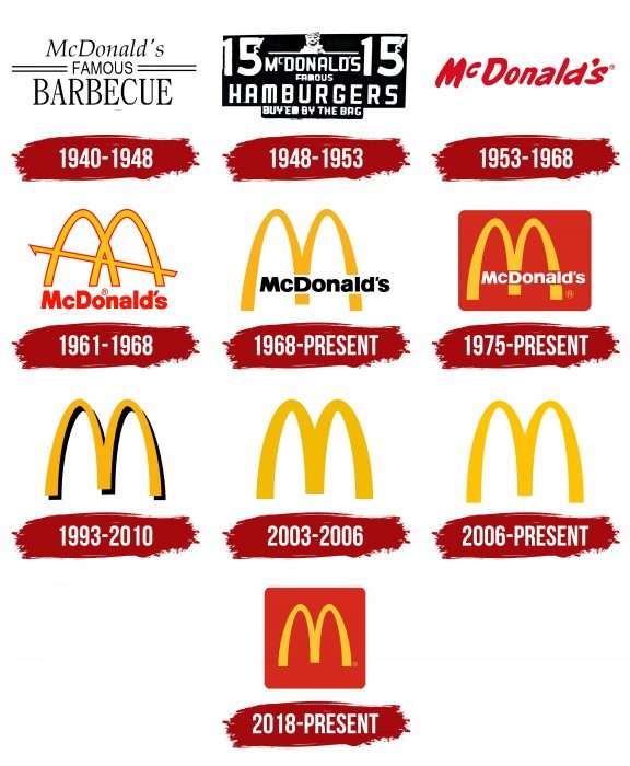
1940 – 1948
The debut trademark looks classic: a rectangle with several inscriptions in different fonts. At the top of the sign is the word “McDonald’s,” in the middle is “Famous,” and at the bottom is “Barbecue.” The palette is monochromatic and unattractive.
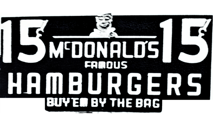
1948 – 1953
The eatery was experiencing tough times and needed changes. The owners decided to redo the logo and change the contrast principle. Previously, there were black letters on a white background; now, everything is the opposite. They added the phrase “Buyer for a bag” and an image of a chef in a white cap placed in a circle.
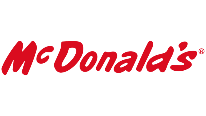
1953 – 1968
On the eve of Ray Kroc’s career in fast-food restaurants, the logo underwent another significant transformation. It featured the word “McDonald’s” in bright red, with an uneven and slanted font. The image of the chef in a circle remained on the logo, and the inscription “Coast to Coast” was added.
1961 – 1968
This was a legendary time when the “Golden Arches” became the restaurant chain’s trademark. They were displayed at a restaurant in Phoenix, Arizona. The central legs are crossed (one behind the other) and intersected by a diagonal line of the same color.
1968 – today
In 1968, the company simplified its logo. They removed a diagonal line and shortened the arches. The central element’s placement was changed, connecting the arches’ legs so that the object visually resembled the letter “M.” This change made the logo clearer and more modern.
They updated the colors: The emblem was turned yellow, and the wordmark was black. During this period, the lower inscription (the name “McDonald’s”) was moved up, and the color was changed from red to black to make it easier to see and more striking. They improved the typeface on the nameplate to make the letters bolder and more visible.
This cleaner logo is still used on some products and in the company’s international outlets.
1975 – today
In 1975, the brand underwent a significant makeover that introduced a new logo, quickly becoming a defining symbol of fast-food culture worldwide. This new design featured the brand’s name inside a red rectangle with rounded corners, shifting from black to white text. This alteration made the logo stand out and gave it a warmer, more inviting feel.
Over the years, this logo has become one of the most recognized in the fast-food sector, maintaining its relevance and appeal. It is famous globally and evokes joy, happiness, and excitement among people of all ages. The logo’s sustained popularity in international markets demonstrates its success in design and emotional appeal.
1993 – 2010
Ten years later, the restaurant chain received an emblem, most similar to the modern one – without inscriptions and other signs. It depicts only double golden arches – yellow and black. This makes the arch stand out above the surface it’s applied to. Such a change is associated with the overall recognizability of the trademark.
2003 – 2006
During this period, two versions were related to removing the black contour on the right, giving the arches volume. In one version, the logo is placed against a red square background; in the other, it is against a white background.
2006 – today
2006, the brand introduced a highly minimalist logo, quickly becoming its hallmark worldwide. The logo features a simple “M” formed by two arches in striking yellow against a white background. This logo offers a modern and clean look without outlines or extra text. Designed to evoke happiness and nostalgia, it connects globally, reminding people of good times and the brand’s long history. This streamlined design highlights the brand’s focus on simplicity and effectively communicates its values and broad appeal.
2018 – today
Another variation of the logo used on the product appeared, with the golden arch placed on a square with a red background. In 2020, due to the spread of the COVID-19 virus, the company introduced a logo in which the arches are separated from each other. The company decided to show its attitude to the situation, urging customers of its products to keep a distance between people to avoid infection.
McDonalds: Interesting Facts
McDonald’s was started in 1940 in San Bernardino, California, by two brothers, Richard and Maurice McDonald. It was just one restaurant at first, but now it’s the world’s biggest chain of hamburger places.
- The Beginning: It first opened as a place that sold barbecue food but then switched to selling mainly hamburgers, fries, and drinks in 1948 because that’s what people liked the most. They made their service fast.
- Ray Kroc: In 1954, a guy named Ray Kroc, who sold milkshake machines, liked how the restaurant worked. He opened his own McDonald’s in 1955 in Des Plaines, Illinois, and later bought the company from the McDonald brothers in 1961.
- Lots of Customers: McDonald’s is super popular and serves over 69 million people daily in more than 100 countries.
- New Foods: They started with the Big Mac in 1968 but now offer many different foods, including salads, fruit, fish, and smoothies, to ensure something for everyone.
- Ronald McDonald and Happy Meals: The clown Ronald McDonald started appearing in 1963, and the Happy Meal, which comes with a toy and is for kids, came out in 1979.
- Unique Menus: McDonald’s offers special items in different countries, such as paneer burgers in India, shrimp burgers in Japan, and chicken sandwiches in flatbreads in the Middle East.
- Olympics: McDonald’s was the official restaurant for the Olympic Games from 1976 to 2017.
- Helping the Planet: They’re working on using better packaging that’s good for the environment and wants all their packaging to be eco-friendly by 2025.
- Jobs and Learning: McDonald’s is a huge company that teaches its workers and managers how to run the business through Hamburger University.
- More Than Just Food: McDonald’s makes a lot of money by owning the land and buildings where its restaurants are located. This way, they get rent and other payments from the restaurant owners.
McDonald’s is a big deal in the fast-food world. Its logo, with golden arches, is one of the most well-known. The company keeps coming up with new ideas to stay popular.
Font and Colors
The golden arches symbolize the wealth they can gain by joining the company and symbolize protection and safety.
The letter “M” has been on the restaurant’s logo since the beginning. Initially, it was doubled, reminiscent of the two McDonald brothers who founded McDonald’s. In the late 1960s, the icon was adjusted, giving it a clear shape of arches, connected in the form of the letter “M” with thickening at the end.
The brand’s color palette consists of a combination of yellow, red, and green. According to the creators, the red color attracts attention and excites appetite. Yellow symbolizes joy, a lifted mood, robust health, and friendliness. The green color (which appeared in 2007) symbolizes a commitment to sustainable development and stability.
Why are McDonald’s colors red and yellow? Red color attracts attention and induces a feeling of hunger. On the other hand, yellow evokes feelings of joy and friendship. Undoubtedly, the red and yellow colors create high contrast, making people want to eat at McDonald’s, as these colors unconsciously prompt the consumer to eat there.
The dark green color, which appeared in 2007, symbolizes a commitment to eco-friendliness. It should be noted that logos in Europe are mostly green. However, the background color of the logo periodically changes.
This is how a small fast-food restaurant transformed into an empire and expanded worldwide, eventually becoming a large company. This logo is one of the most recognizable globally, impossible to confuse with any other, and behind its golden arches lies an entire era. It’s no secret that the letter “M” has been, is, and will continue to delight children and adults.
FAQ
What is the slogan of the McDonald’s logo?
The slogan “I’m Lovin’ It” isn’t simply a catchy phrase; it represents a significant aspect of their identity. Introduced in 2003, it gained popularity around the world quickly. This slogan was transformative as it sought to create a stronger customer bond, highlighting the joy and satisfaction of dining at McDonald’s. “I’m Lovin’ It” stands out due to its simplicity and universal appeal. It promotes a positive outlook that resonates with people globally. McDonald’s has utilized this slogan extensively in various advertising mediums, including TV commercials, billboards, and online platforms, often accompanied by memorable music.
This slogan complements McDonald’s iconic “Golden Arches” logo, a globally recognized symbol. These arches symbolize McDonald’s tradition of offering quick, tasty meals. The slogan and logo encapsulate McDonald’s essence, contributing to its dominance in the fast-food industry and widespread appeal.
What does the McDonald’s symbol represent?
The McDonald’s logo, a golden “M” set against a red background, represents far more than a sign for the restaurant. It’s a globally recognized symbol. The shape of the “M” intentionally resembles a mother’s breasts, a concept proposed by design expert Louis Cheskin. He believed this design would subconsciously evoke feelings of comfort and care, making McDonald’s a welcoming place for everyone.
The design of the golden arches is simple and bright, easily catching the eye of potential customers. This distinctiveness helps differentiate itself from a multitude of fast-food competitors. The choice of gold suggests quality food, while the red background captures attention and stimulates appetite. As McDonald’s expanded globally, its logo came to signify American fast food across the globe. It assures customers of consistent quality and quick service at any location.
How many McDonald’s are in the world?
By the end of 2018, McDonald’s expanded to 37,855 restaurants across 120 countries, marking its status as a leading fast-food chain. Around 68 million people choose McDonald’s for their meals daily, highlighting its widespread appeal.
With over 210,000 employees worldwide, McDonald’s plays a significant role in the job market, providing a variety of positions that support many individuals and their families. McDonald’s continuous growth, despite changing food trends and competition, underscores its commitment to meeting customer preferences with fast, delicious, and affordable meals everywhere.
Why is the McDonald’s logo so successful?
The McDonald’s logo, with its golden arches, is incredibly famous and brings joy to people all over the globe. It’s not just about quick service, delicious meals, and joyful times; it connects with us emotionally, bringing back fond memories whenever we see it.
Its simplicity is another reason it’s so effective. The “M” is styled in an easy-to-recognize way that you can spot it from afar, whether on a sign or packaging and instantly know it’s McDonald’s. The color scheme is eye-catching. The bright gold on a red background is hard to miss, whether in a bustling city, on a highway, or looking at an advertisement. Its memorability is key to its success. Its distinctive look ensures it stays in your mind. This is perfect for McDonald’s because it means you’ll think of them the next time you decide where to eat.
The logo succeeds because it connects emotionally, is simple and recognizable, stands out visually, and is memorable. These qualities make the golden arches more than just a symbol; they’re a crucial part of identity, helping it remain a favorite worldwide.
What is the McDonald’s symbol?
The McDonald’s golden arches are well-known across the globe, symbolizing a top fast-food chain. These bright yellow arches form an “M” for McDonald’s, a choice that combines simplicity with impact. The idea for the arches originated from the first McDonald’s restaurant to offer franchises in Phoenix. Architect Stanley Clark Meston designed it, embedding the “M” into the building’s structure, initially making the restaurant easily noticeable. Over time, the significance of the golden arches evolved. Some think they evoke feelings of a mother’s care and comfort, broadening the logo’s appeal.
Why did McDonald’s choose its logo?
In 1961, Ray Kroc took over McDonald’s and needed a fresh logo to show off what the company represented. He wanted a simple yet striking design to make McDonald’s more visible among fast-food chains. He tasked Fred Turner, the company’s president, with creating this new logo. Turner selected Jim Schindler, a construction manager with a flair for design and architectural knowledge, for this critical task.
Schindler drew inspiration from the arches, a prominent feature of McDonald’s restaurant buildings. Schindler aimed to transform these arches into a significant and noticeable logo. His decision was ingenious. Schindler morphed the architectural arches into an “M” shape, crafting a logo easily identified with McDonald’s and becoming a globally recognized symbol. This new Golden Arches logo transformed McDonald’s.
What does the McDonald’s logo symbolize?
The McDonald’s logo, famous for its eye-catching red and yellow colors, means a lot to the brand. It features a big “M” made of golden arches with a strong visual appeal and significant representation.
The red logo represents passion for food and its dynamic nature. Red is often associated with the food industry because it tends to make people feel more hungry, which fits well with McDonald’s status as a major fast-food player. The red background highlights McDonald’s commitment to delivering tasty and satisfying meals.
The yellow color used for the “M” makes people think of sunshine, warmth, and joy. It aims to present McDonald’s as a welcoming and friendly spot for enjoyable gatherings. This shade of yellow links back to the famous crispy, golden fries, connecting the logo to the delicious food offered.
Does the McDonald’s logo depict a breast?
Jim Schindler, the head of McDonald’s construction department, created the famous “Golden Arches” logo, drawing inspiration from the arches on their restaurant buildings. He turned these arches into an “M” for McDonald’s, aiming for a standout design.
As the logo became well-known, some people started to see it differently. For example, a few thought the arches resembled a woman’s breast. This interpretation led to consider changing the logo. However, psychologist Louis Cheskin advised against it. He argued that the resemblance might subconsciously make customers feel comforted and nourished, potentially leading to a more positive view. Cheskin’s insight was that these feelings could deeply connect customers to the brand emotionally and psychologically. McDonald’s decided to keep the logo following Cheskin’s recommendation.
What do the golden arches of McDonald’s symbolize?
The golden arches of McDonald’s are recognized all over the world and are directly connected to the fast-food chain. At a quick look, they form the letter “M,” which stands for McDonald’s. This design has become globally known, linking people to the brand. Some people even see these arches as comforting, similar to a mother caring for her child, because of their nurturing and feeding association.
These arches symbolize stability. Their sturdy and symmetrical appearance makes people feel secure and confident, similar to how McDonald’s is a reliable fixture in communities worldwide.
They are more than places to eat; they represent how McDonald’s has integrated into global culture and demonstrate the extent of American capitalism. They stand for the McDonald’s brand, convey a sense of care and stability, and highlight the company’s role in global culture and capitalism.
Is there a hidden meaning in the McDonald’s logo?
With its golden arches, the McDonald’s logo is widely recognized as the “M” in McDonald’s. Interestingly, some people see the arches as resembling a woman’s breast, which introduces a new perspective on the logo. This interpretation links the logo to motherhood and the nurturing, love, and care it represents. As this view gained attention, McDonald’s chose to keep the logo unchanged. They saw the value in the logo’s ability to evoke feelings of comfort and care akin to the warmth of a mother’s embrace.
When was the McDonald’s logo created?
In 1962, Jim Schindler, who was in charge of McDonald’s construction department, created the first design for what we now know as the “Golden Arches.” He designed an “M” with two arches connected by a diagonal line, making a unique and memorable symbol for McDonald’s.
Following Schindler’s design, other designers refined the logo to what we see today. They removed the diagonal line, leaving just the golden arches that form an “M.” This simpler design made the logo one of the most recognizable worldwide, strengthening the brand’s image. The logo has changed a bit over the years, but Schindler’s original concept remains, showing his lasting impact on identity.
