


![]() KFC Logo PNG
KFC Logo PNG
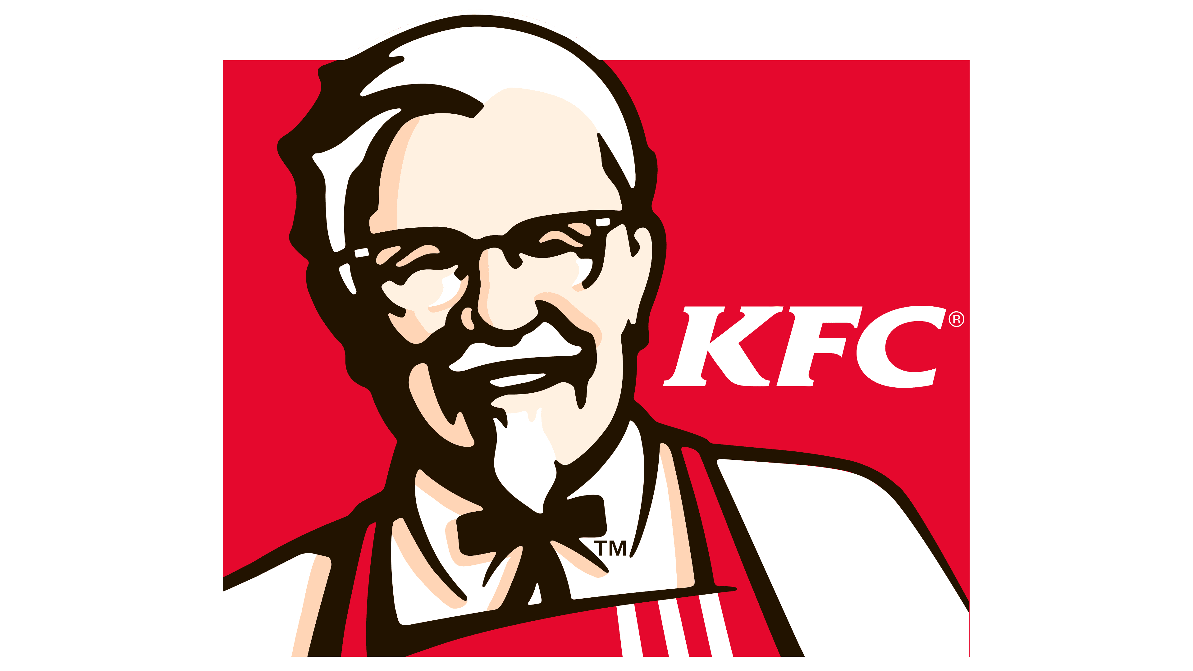
The KFC logo reminds us of how it all began, of the chicken that became an alternative to hamburgers, and of the man who conceived it. The cheerful portrait of the founder warms and livens the sign, creating a feeling of comfort and friendliness, like in a favorite place where everything feels familiar and homely.
The history of KFC dates back to 1930, when Harland Sanders served fried chicken at a gas station in Corbin, Kentucky. His recipe of 11 herbs and spices became widely known and formed the base of the business. In 1939, he received the honorary title “Colonel” from the governor of Kentucky, which later became part of the brand image.
In 1952, the first franchise opened in Salt Lake City, marking the shift from a local operation to a scalable model. By 1963, the chain had grown to more than 600 restaurants across the United States and Canada. In 1964, Sanders sold the company to investors led by John Y. Brown Jr. for $2 million, resulting in unified standards and faster expansion.
Over the following decades, KFC expanded into the UK, Mexico, and Japan. Ownership changed several times, and in 1991, the brand was acquired by PepsiCo, which strengthened its international position, especially in China. In 1997, the name Kentucky Fried Chicken was shortened to KFC, reflecting changes in the fast food industry.
The chain later became part of Yum! Brands, which also operates McDonald’s, Pizza Hut, and Taco Bell. By the 2010s, KFC focused on adapting menus and formats for regional markets, particularly in Asia, while continuing to use the Colonel Sanders image and expanding to more than 25,000 locations in 145 countries.
Meaning and History
![]()
The KFC logo has always consisted of two main elements: the brand color palette and a portrait of the founder. Over the years, it has changed five times. These were not radical changes but adjustments that can rightly be called the trademark’s evolution.
What is KFC?
It is a popular chicken option in the fast-food industry, offering an alternative to hamburgers. It was founded in 1930 when Harland David Sanders opened his first restaurant. The company’s full name is Kentucky Fried Chicken.
1952 – 1978
![]()
KFC began shaping its visual identity around the image of Colonel Sanders. Over time, the founder’s face became the chain’s main visual symbol. In the early years, a black-and-white emblem was used with a clear, straightforward idea: fried chicken from the Colonel.
The portrait of Harland Sanders is concise. Bold lines form a recognizable face with a mustache, glasses, and a neat goatee. Light falls from the right, while the left side recedes into shadow. A black bow tie is added beneath the head. It suggests a cartoon character’s simplified body, with small arms and legs, and introduces a touch of light irony.
The name “Kentucky Fried Chicken” is handwritten in black marker. The line is uneven, the outline breaks in places, and the stroke thickness varies. The writing style is close to Brush Script, with a quick, spontaneous look. The abbreviation KFC appeared later, but the letters K, F, and C already stood out visually in the name and were easy to remember. The emblem was used alongside other versions, and the portrait-based design became the foundation for the chain’s later identity.
1954 – 1959
![]()
In 1954, KFC began expanding through franchising and introduced a new mark that influenced the brand’s future style. The visual design pointed directly to the restaurant’s main product, without complex or hidden symbolism or metaphors.
The inscription “Kentucky Fried Chicken” is set in black letters, drawn specifically for the brand. The style resembles marker writing. The lines are uneven, slightly slanted, and the stroke thickness varies from letter to letter. In style, the lettering is close to Brush Script and Marker Felt.
The main visual focus is on drawings of chicks placed along the text. One character appears next to the letter K. Another pair of figures is positioned between the words “Kentucky” and “Fried,” with one chick emerging from a cracked shell. Another character is placed closer to the letter C. The chick drawings are simple and flat, without fine detail, but include eyes, legs, beaks, and pieces of shell.
Through these illustrations, the brand emphasized its connection to chicken as the core of the menu. In 1954, the agency Lippincott & Margulies developed this mark for KFC, which became an early starting point for the brand’s further development of its symbolism.
1959 – 1978
![]()
In the late 1950s, KFC updated its logo. The main change was the removal of the chick illustrations. From 1959 onward, bird imagery was no longer used, while the Kentucky Fried Chicken lettering remained unchanged.
Despite the introduction of a new logo version in 1978, the 1959 design continued to appear on packaging for many years. It was used into the early 1980s and was fully phased out only in 1982. The removal of illustrations and the focus on handwritten lettering gave the emblem a calmer, more restrained look that accompanied KFC for a long time.
1978 – 1991
![]()
Kentucky Fried logo
In March 1978, KFC introduced a new logo as part of a large-scale network update. The appearance of the restaurants was also changing. Across the United States, mansard roofs and decorative towers began appearing on facades to make locations look more consistent. The first restaurant in the new format opened in Zanesville, Ohio. It was there that visitors first saw the updated image of Colonel Sanders.
Sanders’ portrait was redesigned. The figure was shifted left and enlarged. The face became softer, with a slight smile. The glasses, hairstyle, and mustache were retained to keep the image recognizable. A stylized black bow tie appeared beneath the head, resembling a simplified human figure.
The brand name was moved to the right and split into three lines: Kentucky, Fried, Chicken. The text is set in bright red letters. The typeface used is American Typewriter Bold Condensed, with rounded serifs and a closely related style to Clarendon and Rockwell. The letters are heavy. The K features a long lower stroke that curls and extends beneath the following e.
The project was developed by Lippincott & Margulies. Changes to restaurant interiors and facades accompanied the logo update and formed part of a unified, comprehensive brand development program.
1991 – 1997
![]()
In the early 1990s, KFC shortened its name to three letters and introduced a new logo. It was developed by The Schechter Group under the direction of Alvin Schechter, with the presentation held on February 12, 1991. The word fried was removed from the name. The company sought to move away from its association with fried chicken and to highlight the expansion of its menu.
At the same time, the appearance of the restaurants was changing. Instead of the familiar brown roof tiles, bright red plastic stripes appeared on facades. The same approach was carried out in the upper part of the mark. The stripes are angled to the right and gradually widen. Thin blue lines were added along their left edges, creating a subtle sense of depth.
The outermost stripe is larger than the others and is shaped as a red parallelogram. A simplified portrait of Colonel Sanders is partially placed on it. The face is white, with glasses, a mustache, and hair outlined in blue. Beneath the chin, the bow tie is retained, with a horizontal bar and long hanging ends. The portrait extends partially beyond the red block.
Below the mark is the abbreviation KFC set in red Friz Quadrata type. The letters are angled to the right with small serifs. A thin blue line runs along the outline, separating the lettering from the background. Later versions of the logo appeared, but the early 1990s design can still be found in some restaurants, including locations in Canada.
1997 – 2006
![]()
In June 1997, KFC introduced an updated logo. The work was carried out by Landor Associates together with the Cincinnati-based agency Pavone Fite Fulwiler. The exterior look of restaurants also changed. Mansard roofs were removed and replaced with flat canopies over windows and entrances. Towers at newly built locations became larger and more angular, moved toward the edges of facades, while in renovated restaurants, they often remained centered.
The logo was based on a vertical red rectangle. It featured a poster-style portrait of Colonel Sanders. Three colors were used: dark blue, white, and beige. The head is slightly turned to the left, with a friendly expression. Glasses, beard, and mustache are drawn with blue outlines and silhouettes. Lighter areas of the face and clothing are highlighted in beige, with volume suggested without using shadow gradients.
For the first time, the logo showed the upper part of Sanders’ figure. A light jacket and a dark blue bow tie with long hanging ends are visible. In the lower-right corner is the inscription “KFC”. It is set in italic Friz Quadrata ITC Bold. The red letters are outlined with a thin white line, giving the wordmark a slight dimensional effect.
Later, this logo version changed, but the 1997 mark can still be found in several restaurants around the world.
2006 – 2014
![]()
In 2006, KFC updated its logo. The Landor Associates team developed the project. The new version was introduced on May 1. By November, the image of Colonel Sanders was softened. Age lines were removed from the face, and a red apron replaced the classic tuxedo, emphasizing the character’s connection to the kitchen and the everyday work of the restaurants.
The composition centers on a red circle containing Sanders’ portrait. The illustration uses a simple, bright color palette. The face is large and friendly. Bold lines define glasses, mustache, mouth, and hairstyle. Soft color transitions appear on the skin, creating volume without excessive detail. The Colonel is shown wearing a jacket and a white shirt, with a red apron over them featuring three vertical white stripes. The stripes reference earlier stages of the brand’s development. The black bow tie is retained, with a short center bar and long hanging ends.
To the right is the inscription KFC in white letters. The typeface used is Friz Quadrata with serifs.
After the logo update, the restaurant exteriors also changed. Canopies became flatter and more compact, installed above windows near the towers. Hanging black panels reading “WELCOME” and “DRIVE THRU” were placed above the entrances and pickup areas.
The 2006 version was used in China until 2021. In many countries, signage with this logo can still be found today.
2014 – 2018
![]()
In 2014, KFC returned to its early visual style and launched a campaign featuring an updated emblem inspired by the brand’s earliest versions. The Grand Army team developed the project. The earliest 1952 mark was chosen as the reference point. The design was executed in black and white.
The portrait of Colonel Sanders is rendered in a linear style with minimal detail. The face is composed of bold lines that depict the hairstyle, glasses, mustache, and beard. The hair is combed to the side, the eyeglass frames are simple, and the smile is calm and restrained. A smooth-line bow tie is placed under the chin.
Below the portrait is a short inscription from KFC. The text is set in italic with a slight rightward slant. The letters are large, uppercase, with heavy serifs. In style, the typeface is close to Times Black Italic.
This version had an important distinction. Only the Colonel’s head was shown, without the full figure. Previously, a similar approach had been used only in the early 1990s version. In China, however, the company did not switch to the updated emblem and continued using the previous version.
This version did not last long. In 2016, the company announced a new design direction, and from 2017, the updated style began appearing in different countries, sometimes with local adaptations.
2014 – today
![]()
In 2014, KFC brought back a wordmark stylistically similar to the late 1950s version. The inscription almost repeats the 1959 sample in proportions and letter style. The words Kentucky Fried Chicken are arranged horizontally. The letters are tall and uppercase.
In the early years, the 2014 version was used on its own. Starting in 2016, the portrait of Colonel Sanders was increasingly added alongside it.
Outside North America, the wordmark was used alongside other versions.
2018 – today
![]()
In late 2018, KFC introduced a new mark whose silhouette resembles a chicken bucket. These buckets are used to serve chicken pieces, and their design aligns with the brand’s red-and-white color scheme.
The logo is based on a trapezoidal shield. Two vertical red stripes were added on the sides, referencing the brand’s packaging. At the center, on a white background, is a portrait of Colonel Sanders. It was reworked from the previous version and enhanced with additional detail, including more careful rendering of the left ear. At the bottom is the inscription “KFC,” set in large, italic, serif letters with a heavier weight. The entire mark is outlined in black, which separates it from the background and visually unifies the composition.
After the 2018 update was launched, implementation happened gradually. In the Philippines, the new version appeared in 2019; in China, in 2020; and in the United States, it began to be used closer to the end of 2023. In some markets, earlier versions of the logo are still in use.
Font and Colors
Regardless of the year, design, or style, all logo variants feature Colonel Sanders’s smiling face, the founder of the fast-food restaurant chain. The friendly atmosphere sets diners at ease. This also speaks of the great hospitality and delicious food prepared here. Another factor in this design is the signboard. The emblem serves not only as the original brand name but also as a decorative element on the building’s facade, where signature dishes are served, in keeping with the first owner’s principles.
The abbreviations have always been written in one style: italics in a serifed uppercase font. The color continues to evoke positive emotions: the owner’s friendly smile is emphasized by a non-aggressive red. Black strokes depict Colonel Sanders’s head and bow tie, clearly visible on a white background.
FAQ
What is the KFC symbol?
The KFC logo shows Colonel Sanders. He is a man wearing glasses and a bow tie, with a kind smile on a red background. The red color stimulates appetite and a sense of warmth, as if inviting you inside.
The lines on the face and clothing are expressive, making the portrait look lively. All this underscores that Colonel Sanders himself stood at the stove and developed the signature recipe. His image became a symbol of homemade food and guest care.
Over time, the logo changed, but the Colonel’s face and his expression remained the same. It is like a sign that KFC’s taste and traditions remain unchanged.
What does KFC stand for?
KFC stands for Kentucky Fried Chicken. It all began in the 1930s in Corbin, Kentucky, where Harland Sanders opened a small café. His fried chicken, seasoned with a blend of 11 herbs and spices, quickly became legendary. Over time, KFC grew into one of the world’s largest fast-food chains.
In 1991, the brand shortened its name to three letters, but for many, it is still known as Kentucky Fried Chicken. Today, the chain has thousands of restaurants worldwide, and each menu, in addition to the classic chicken, includes dishes tailored to local tastes.
Why is the KFC logo important?
The KFC logo is a symbol of the brand and its spirit. It depicts Colonel Harland Sanders, the founder. His image makes the brand recognizable and inspires trust, reminding people of the signature chicken with its secret recipe. Sanders’ smile has remained on the logo across all versions, making it easily recognized worldwide.
The red background conveys warmth and hospitality. It creates a feeling of comfort, as if you are being invited to dinner. The simple, open design makes the logo appear friendly, while Sanders’ image underscores the brand’s commitment to its recipes and quality. Altogether, this creates an atmosphere of trust and distinguishes the brand from other restaurant chains.
What does the K in KFC stand for?
The letter “K” in the name stands for Kentucky, where it all began. In the 1930s, Harland Sanders opened his first café in Corbin, Kentucky. He developed a new method for cooking chicken in a pressure cooker, keeping it juicy while cooking faster than in a frying pan. This method gave the flavor a distinctive character unlike that of any other chain.
The aromatic blend of spices and the brand’s Southern cooking style linked it to Kentucky’s culinary traditions. Even as it grew into an international chain with thousands of restaurants in more than 145 countries, the brand has maintained its connection to its origins.
What does the KFC logo represent?
The KFC logo is one of the most recognizable in the fast-food world. It shows Colonel Harland David Sanders, the founder of the chain and the author of the famous fried chicken recipe that conquered many countries. His friendly smile reminds us of the brand’s Southern roots and home-cooked style.
The image of Sanders makes the logo warm and human. It connects the brand with its history and original taste. The simple yet expressive composition draws attention to the Colonel’s face and conveys the brand’s hospitality, as experienced by millions of visitors.
Is the KFC logo a body?
The KFC logo shows a smiling Colonel Harland Sanders. Some people notice an interesting detail: his bow tie looks like the tiny body of a cartoon man. The wide ends resemble arms, and the narrow ones resemble legs. The chain has not confirmed that this was intentional and prefers not to comment on the theory. These small mysteries make the logo interesting and add a touch of humor and individuality to the brand.
Why did KFC choose its logo?
The KFC logo, featuring the smiling face of Colonel Harland Sanders, creates a feeling of friendliness and comfort. This image inspires the desire to visit the restaurant and enjoy delicious food in a pleasant atmosphere. In earlier versions, Sanders’ portrait was set against a white background, which made it look too neutral. To add warmth and liveliness, a bright red background was introduced, enhancing appetite and making the logo more appealing.
The red color was chosen for its associations with energy, love, and passion. Combined with Sanders’ smile, it creates an emotional connection and makes the brand’s image memorable. Altogether, these elements convey a mood of comfort and enjoyment of food.