


![]() Taco Bell Logo PNG
Taco Bell Logo PNG
The Taco Bell logo references its founder, Glen Bell, and invites you to try a new flavor. The chain’s symbol reflects the company’s path from a single restaurant in Downey, California, to thousands of locations worldwide, as well as the evolution of its menu from classic tacos to items that have reshaped expectations for fast food. For the audience, the bell signals bold combinations and a rejection of familiar standards. It is addressed to those who seek in food not a limitation to an everyday format, but a mood and a new culinary experience.
Taco Bell’s story began in 1962 when Glen Bell introduced the first restaurant in Downey, California. He offered a new kind of fast-food experience with a Tex-Mex menu that catered to American tastes, providing both affordability and speed. This successful model led to the opening of the first franchise in Torrance, California, in 1964, signaling the start of nationwide expansion.
By the 1970s, Taco Bell had reached 1,000 locations. In 1978, PepsiCo’s acquisition gave Taco Bell the resources it needed to grow further. The next two decades saw the introduction of signature menu items that remain favorites today. Taco Bell expanded internationally into Canada, the UK, and Latin America. The 1990s were notable for Taco Bell’s memorable marketing efforts, including the famous talking Chihuahua commercials and partnerships with blockbuster movies.
The early 2000s were marked by innovation, with menu items like Doritos and Locos Tacos introduced. Taco Bell also updated its image, modernizing its restaurants and focusing on healthier, fresher ingredients. The 2010s focused on enhancing customer experience through digital ordering, delivery services, and a loyalty program.
When the COVID-19 pandemic hit, Taco Bell quickly adapted by emphasizing drive-thru, delivery, and online orders. The brand continued to innovate by adding limited-time offers and plant-based options to the menu. Today, Taco Bell operates over 7,000 restaurants in more than 30 countries, maintaining its status as a beloved Tex-Mex fast-food brand that evolves with consumer tastes and preferences.
The brand’s enduring appeal lies in its unique menu, strong branding, and continuous innovation. As Taco Bell looks to the future, it aims to maintain its leadership in the Tex-Mex fast-food category by exploring new markets and adapting to changing consumer preferences. With a robust brand, iconic status, and a history of innovation, Taco Bell is well-positioned for ongoing growth in the competitive fast-food industry, leveraging its significant milestones and strategic adaptations to remain relevant and beloved by customers worldwide.
Meaning and History
![]()
Each event affected the identity, so the original restaurant, like the franchise, had several emblems reflecting its development. To date, there are six options.
What is Taco Bell?
It is an American company that owns over 7,000 fast food outlets under the same name and logo. She was named after her original owner and creator, Glen William Bell Jr. The entrepreneur opened the first Taco Bell in 1962, and the 100th restaurant appeared in 1967. Now the chain is part of the Yum! Brands. The basis of her menu is extraordinary Mexican-style dishes.
1962 – 1971
![]()
When the first Taco Bell restaurant opened in March 1962 in Downey, California, guests were greeted by a bright logo that immediately caught their attention. It remained on the exterior of the restaurants until the early eighties, after which it took on a secondary role.
The mark was built from eight colored rectangles, each slightly tilted in its own direction. These shapes served as a background for large white uppercase letters forming the brand name. The colors were warm and varied, namely orange, green, burgundy, and yellow, reflecting the wide selection of products and spices on the restaurant’s menu.
The typeface was white, sans serif, simple and light, yet the large lettering and the unusual tilt of the shapes created a playful atmosphere. The symbol’s overall style emphasized the restaurant chain’s youthful, energetic direction.
Over time, the logo lost its primary role in restaurant design but remained a secondary element, reminding visitors of Taco Bell’s early years and the era’s atmosphere.
1971 – 1984
![]()
When Taco Bell updated its logo in December 1971, it moved from a bright, playful design to a more subdued, formal style. Instead of colored rectangles and a cheerful mood, the brand chose minimalism, presenting a concise text mark.
In the new emblem, which many referred to as corporate, the designers abandoned graphics and color, focusing on the strict rendering of the name in brown Macbeth type. Each letter became large, heavy, with serifs and sharp endings.
Although the next logo appeared in 1984, this style continued to coexist with it in documentation until 1987. Even today, many years later, the sign is still on the facade of the historic chain restaurant in Santa Barbara, which opened in 1966.
PepsiCo acquired Taco Bell in 1978, and the corporate logo gradually became the primary version. However, restaurants opened earlier retained the old signs on their facades, highlighting the chain’s history and the diversity of its visual heritage.
1984 – 1995
![]()
In 1984, the Taco Bell restaurant chain introduced a new friendly logo developed by S&O Consultants of San Francisco. The designers moved away from the aggressive forms of previous versions and shifted to soft lines, smoothly transitioning into pointed elements. The new style proved so successful that it remained on restaurant signs until 2010.
The mark is centered on a bell figure set against a red background shaped like the upper part of an arched window. The bell is yellow, with a bright green accent inside and an orange outline. The symbol directly reflects the word “Bell” in the brand name. In the lower area appears the bold inscription “TACO BELL” in a serif typeface. The letterforms are softly rounded, though the designers added distinctive hooks to the letters “T” and “B,” and the letters “A” and “E” gained a slight curve in their central lines.
The logo colors became bright and contrasting. Red and yellow emphasized energy and associations with fast food, while green served as a calm accent, balancing the overall image.
This style remained widespread among new chain restaurants until the mid-nineties, and older locations retained it until modernization began only in the 2010s. In cities in Arizona, California, North Carolina, and Ohio, restaurants can still be found preserving the design of that period.
1992 – 1994 (secondary)
![]()
When the studio Landor Associates took on a new Taco Bell logo in the early nineties, it offered an alternative view of the brand symbol. First published in February 1992, this logo was used alongside the previous one as an addition in the chain’s advertising materials.
The familiar image of the bell remained the basis of the mark, though the designers presented it in an unusual way. The bell was bright red and purple, placed at an angle. This positioning created the impression that it was in motion and ringing. The outline of the bell was highlighted in white. An additional dark stroke on the bell imitated a shadow and added volume.
The bell’s background was rendered in a rich purple, emphasizing the composition’s main element. The brand name was placed below and divided into two lines. The word “Taco” appeared above, with “Bell” beneath it. The typeface remained the same. It was heavy with serifs emphasizing the strength of the letters.
The new logo version successfully combined traditional elements with a lively presentation. Despite its secondary status, the symbol was used in marketing and helped diversify the restaurants’ visual design.
1994 – 2017
![]()
In February 1994, Taco Bell updated its brand mark with the help of the American studio Lippincott & Margulies. The new version was based on the symbols used in 1984 and 1992, combining their key features.
The designers reworked the bell image, making it wider and giving it a rich reddish pink color. The lower edge was emphasized by a border running along the entire width. The white outline around the figure remained unchanged, separating it from the dark purple dome-shaped background. This combination kept the bell at the center of the composition.
The bottom of the logo featured the name Taco Bell. The letters changed proportions, becoming lower and wider. The typeface took on solid, weighty forms, emphasizing the brand’s solidity and seriousness.
Despite the appearance of a new version in 2016, this logo remained popular among chain restaurants. It appeared in new locations until the summer of 2017, and in some countries even longer. For example, in Boise, Idaho, it was used as the Taco Bell Arena until 2019, after which it was renamed ExtraMile Arena.
The bell presented in this version remained relevant. Today, the company uses it as part of the mobile app’s interface to notify customers about various events.
2016 – 2023
![]()
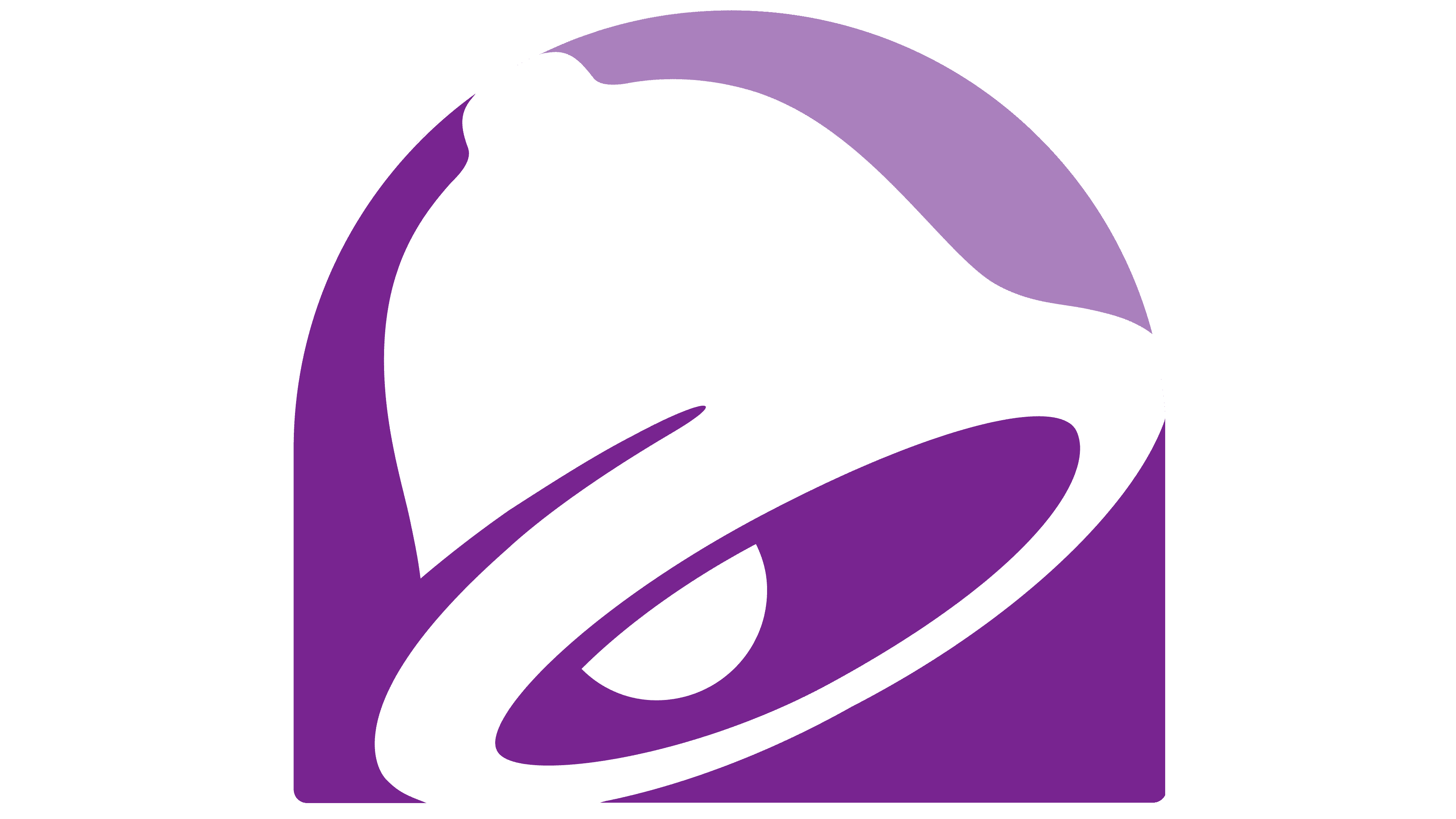
For the opening of the Taco Bell flagship restaurant in Las Vegas in November 2016, the brand introduced an updated logo, developed with the Lippincott agency, which had worked on the previous version. The bell symbol remained the chain’s main mark, but the designers changed their approach, focusing on minimalism and simple forms.
In the new mark, the familiar bright accents disappeared. The yellow and pink colors were removed. The emphasis shifted to variations of purple, with deep shades used in the lower part of the background, gradually transitioning to lighter tones at the top. A white bell was placed in the foreground and formed from negative space, contrasting with the purple arched background.
The brand name was set in a new sans-serif typeface, “Gotham Bold.” The inscription was black and complemented the logo’s calm, concise image.
2023 – today
![]()
In September 2023, Taco Bell slightly updated the previous logo, once again working with the Lippincott studio. The changes affected several details, each influencing the mark’s overall perception. The logo is now rendered in a single purple color without tonal transitions or gradients.
The bell remained transparent, standing out against the purple background. The brand name, set in Gotham Bold, changed only in size. The inscription was placed below the symbol and reduced in width against the enlarged symbol. All other elements remained unchanged.
Font and Colors
Early logos used only text. Graphics appeared in 1985. It was directly related to the founders’ surname and, accordingly, to the restaurant chain’s name. The bell has a classic shape, only its location has changed. At first, it was directed downward; later, the designers placed it diagonally to create the effect of a ringing sound. Now, its body is slightly wider than before and is drawn against a purple background from negative space.
Since the logo initially contained only text, the letters replaced the graphic images. To do this, the designers drew them by hand, decorating them with thorns, protruding sharp points, and elongated legs. They developed them based on fonts from the Sary Soft, Heebo, and Amaranth families. The thorns and protruding touches were necessary to convey the dishes’ heat, as Mexican cuisine uses many hot spices. The latest version of the logo uses the Gotham Bold typeface.
The color scheme is varied and bright. It consisted of green, red, yellow, orange, purple, brown, pink, white, and black at various times.
FAQ
Why did Taco Bell change its colors?
In 2016, Taco Bell updated its look to match new trends and customer preferences. The company revamped its logo, keeping the familiar bell but opting for a simpler, one-color design instead of the previous colorful one.
The goal was to modernize Taco Bell’s image, making it look more current and stylish. The new logo was designed to be flexible and easy to use across different media, such as online and on signs, with a clean, straightforward style to attract more people.
This makeover showed Taco Bell’s dedication to staying up to date and ensuring its brand remained appealing. It was a clear sign to customers that Taco Bell is a brand that keeps moving forward, ready to update its style to stay in tune with what’s current.
What does the bell in Taco Bell stand for?
The bell in Taco Bell’s logo is more than a design choice; it’s inspired by the founder’s name, Glen Bell. This connection to the founder adds a personal touch to the brand and highlights its roots. Glen Bell started in the fast-food business in 1954 with Bell’s Drive-In and Taco Tia in San Bernardino, California. He aimed to blend quick service with Mexican food, making it widely available to Americans.
The name “Taco Bell” and the bell symbol in the logo reflect the brand’s mission to combine traditional Mexican food with the convenience of American fast food. This connection to Glen Bell reminds us of Taco Bell’s start and growth into a major fast-food brand that offers a unique take on Mexican cuisine.
What is the meaning of the Taco Bell Logo?
The Taco Bell logo is well-known and carries a deep meaning. It showcases the brand’s values and identity. The bell in the center is a clear link to the brand’s name. It’s like an invitation to customers, using a symbol that has historically brought people together or alerted them to something important.
The bell’s design is lively and tilted, giving a sense of motion. This suggests that Taco Bell is a fun, lively place to eat, not a regular restaurant. They aim to give customers a memorable, appealing experience, especially young and active people. The logo also features a unique shape at the bottom that resembles an oven damper. This part evokes warmth and the process of cooking fresh meals. It’s a smart way to show that Taco Bell cares about providing quick, tasty food made with attention to quality. The logo’s energetic look matches the brand’s lively spirit, and the design hints at the importance of fresh, enjoyable food.
What is Taco Bell’s slogan?
Since 2012, Taco Bell’s motto has been “Live Más,” which means “Live More” in English. This saying encourages people to try new things and have fun. It’s a big change from their old slogan, “Think Outside the Bun,” and shows that Taco Bell wants its customers to enjoy life and not be afraid to explore.
“Live Más” isn’t just a catchy phrase; it represents what Taco Bell is all about. It encourages people to be adventurous and enjoy life, which aligns with Taco Bell’s exciting, diverse menu. The idea is to get customers to think of Taco Bell as a place to try new and interesting foods, such as their famous tacos and unique dishes like the Crunchwrap Supreme and Doritos Locos Tacos.
Taco Bell uses “Live Más” to show it’s more than just a place to eat; it’s about having great experiences. This motto isn’t only about the food; it’s about enjoying life and making the most of every moment. It speaks to everyone, whether you’re looking for a quick, tasty meal or something to change up your daily routine.
When was the Taco Bell logo created?
The first Taco Bell logo appeared in 1962, when the first restaurant opened. This logo had a sombrero and a bell, matching Taco Bell’s name and Mexican-style food. Taco Bell has updated its logo many times to keep it fresh and aligned with the brand’s evolving style and goals.
Over the years, the logo changed in important ways. In 1972, it became simpler, focusing on the bell. In 1985, it received a modern look. By 1994, the design and colors were improved to make it look better. The latest big change came in 2016, thanks to Lippincott Studios and Taco Bell’s designers. Now, we have the badge-style logo that showcases Taco Bell as a modern, lively brand.
Taco Bell has always worked to ensure its logo remains appealing and modern for everyone who loves its food. Each new design helped keep Taco Bell’s look fresh and exciting, ensuring the brand stood out.
What does the Taco Bell logo symbolize?
The Taco Bell logo means a lot, connecting directly to the brand and its Mexican-flavored food. A bell at its heart hints at the founder, Glen Bell’s, last name and symbolizes warmth and welcome, just what you’d expect from a place where friends and family come to eat together.
Over time, as Taco Bell updated its image, the logo got sleeker and more modern. This change shows Taco Bell’s commitment to being a fast-food leader by introducing new and exciting offerings. The logo’s current look, with its simple bell design, emphasizes freshness and efficiency, ensuring customers have a good, quick dining experience.
The bell’s tilt in the logo suggests movement and life, echoing Taco Bell’s motto to “Live Más” or “Live More.” This encourages customers to seek adventure and fun, positioning Taco Bell as a brand that moves forward and enjoys life. So, the logo isn’t just about the name or the food; it’s about living a life full of joy, creativity, and togetherness.
Why did Taco Bell choose its logo?
Glen Bell, the founder of Taco Bell, chose a bell for the logo because it reflects his last name. This makes the brand feel personal and gives it a unique look. Bells remind people to gather for events or meals, which aligns with Taco Bell’s goal of being a place where people enjoy food together. The bell symbolizes hospitality, welcoming everyone to share the joy of eating. It’s like Taco Bell is inviting people to come and try their food.
Over the years, Taco Bell has updated its logo to keep it fresh, but the bell has always been a part of it. This shows the brand’s dedication to its origins and willingness to innovate. Keeping the bell in the logo balances tradition with a modern touch, reflecting Taco Bell’s way of offering Mexican-inspired food with a new twist. This choice helps Taco Bell stand out and shows what the brand is about: bringing people together to enjoy good food.
Why did Taco Bell choose purple?
In 1995, Taco Bell made a big change by choosing a purple color scheme for its brand. This new color, “Taco Bell Purple,” was a big departure from the usual fast-food colors like red, yellow, and white. Taco Bell wanted to stand out from other fast-food chains and show that it was a modern, innovative company.
Purple symbolizes creativity, uniqueness, and fun, which aligns perfectly with Taco Bell’s goal of being known for its one-of-a-kind and new takes on Mexican food. The company chose purple to attract young people seeking something fresh and different.
Taco Bell also wanted to make its restaurants feel more welcoming and up-to-date. Purple helped make Taco Bell seem more creative and unique, drawing in the customers they were looking for. Choosing purple also signaled that Taco Bell was willing to stand out from other fast-food restaurants. It showed that the company is focused on innovation and on offering customers a unique experience. This choice helped Taco Bell stand out and appeal to younger diners, making it clear that the brand is all about creativity, fun, and a fresh approach to food.