


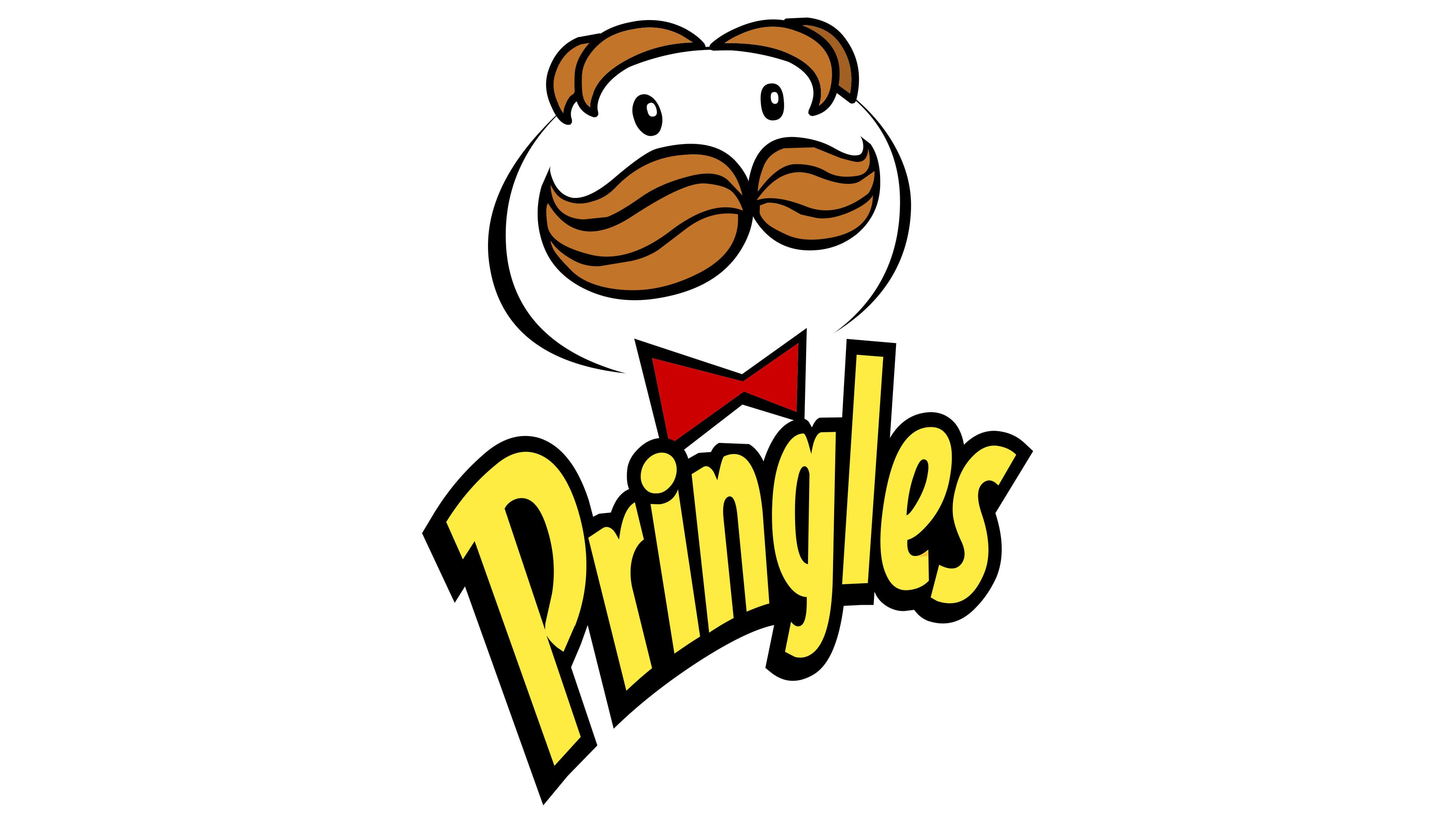
![]() Pringles Logo PNG
Pringles Logo PNG
The Pringles logo, modern and relevant today, has helped ensure the recognition and success of a favorite American product: potato chips. This attractive, fun logo, representing a multi-component mascot, has retained its historical significance.
The Pringles emblem captures the brand’s unique approach to snack-making, distinguished by the shape and packaging of its products and its wide variety of flavors. This emblem emphasizes that the company offers consumers a chance to enjoy moments of fun and entertainment. Every aspect of the brand, including its visual identity, is designed to evoke associations with enjoyable, informal gatherings among friends or family, where everyone can find something to their taste.
The Pringles brand appeared on the US market in 1968, but its development began earlier. In 1956, food chemist Frederick Baur at Procter & Gamble began working on a new type of chip that would keep a uniform shape and resist breaking. The result was a saddle-shaped product, based on a concept linked to Mark Pringle, that defined the chips’ look for decades.
From the start, the product stood apart through structure and packaging. The cylindrical can protects the chips and extends shelf life, while the slogan about not being able to stop reinforced brand recall. By the 1970s, Pringles had secured a stable position in the US snack market, supported by consistent quality and recognizable presentation.
In the 1980s and 1990s, the brand expanded its flavor range, adding variants such as sour cream and onion, cheddar, and cheese nachos. At the same time, Pringles entered Europe and Asia, where demand grew quickly. Advertising with the Julius Pringle mascot helped establish the brand’s image in new markets.
The 2000s brought further product variety, including flavors such as cheeseburger and grilled shrimp. In 2012, Kellogg Company acquired the brand from Procter & Gamble and integrated it into a broader portfolio alongside other food lines.
In recent years, Pringles has continued to release region-inspired flavors, including spicy chicken and pizza-style options, while adding reduced-sodium and gluten-free versions to address changing consumer preferences.
Meaning and History
![]()
This snack brand is often confused with regular chips, but that is wrong. The brand’s products contain only 40% regular potatoes; the rest is wheat flour and starch, mixed with vegetable oil and emulsifiers. Therefore, it is more accurate to call them a light snack. They resemble crispy potato crackers, and once you open the package, you instantly grab one because the smell and taste make you want to eat more and enjoy every moment.
The recipe for the famous brand’s potatoes belongs to the mind of a genius named Alexander Liepa, a professional chemist. Originally, it was invented for Procter & Gamble in 1956, and nobody anticipated that this brand would conquer the world. However, it took several years to perfect the recipe and taste of the brand’s products. In 1968, the company introduced the potato to the North American market.
There are different legends about the name’s origin. Some claim that the marketing department found the name of the potato chips in a telephone directory. Pringle Drive in Cincinnati, Ohio, was listed in the phone book. Another slightly crazy idea is that the chips were named after Mark Pringle, who proposed a new method of processing potatoes in 1973.
The brand’s creators worked hard to honor his legend. By the time the first brand’s chips appeared on the shelves, branding was complete. Procter & Gamble came up with the name for the new product simply by looking in the phone book. In the pages of the Cincinnati address book, they saw the inscription “Pringle Avenue,” and they immediately liked it. It was decided to keep the first word and add the letter “s” at the end.
No less attention was paid to the logo. It features the brand’s main mascot, baker Julius Pringles. Although his appearance has changed several times, the image remains recognizable.
What is Pringles?
It is a brand of potato chips with various flavors, the most popular of which are onion, sour cream, and cheese. The chips are packed in tall cans and are produced at five factories in the USA, China, Poland, Malaysia, and Belgium.
1967 – 1980
![]()
In the first emblem, the baker’s head was oval. The curly mustache touched the bottom edge of the contour, and the eyes looked like the inverted letter “Ps.” The word “PRINGLE’S” was written on the bow tie under the white collar.
1980 – 1986
![]()
Between 1980 and 1986, the brand introduced a new logo featuring Julius, a cheerful character who quickly became a key part of the brand identity. He represents the brand’s friendliness, fun, and unique flavor.
Julius Pringles is shown in various roles, like a chef, a waiter, or a salesperson. He sometimes appears as a customer enjoying the brand’s products at a restaurant. His outfit includes a white shirt and tie, contributing to a charming, tidy image that enhances the brand’s appeal.
His oval head resembles a chip, cleverly linking him to the brand. Features like his parting and mustache make him look similar to Mr. Potato Head, a popular toy in the USA, adding a playful and lovable quality. His rosy cheeks and round face suggest he enjoys the chips, and his eyes, shaped like two letter “P”s, show his deep connection to the brand.
The product name in this logo is set against a black rectangle that resembles an open menu or a newspaper more than a bow tie. It’s as if Julius is looking at a page where the brand name is prominently displayed. The red square background highlights the chip’s cylindrical can and emphasizes the chip’s vibrant taste, inviting people to enjoy what the brand has to offer.
1986 – 1996
![]()
In 1986, the face took on a round shape; the eyes became big black dots, and eyebrows and a mouth appeared. At the same time, the white collar and the apostrophe before the letter “S” in the brand name disappeared. This version of the logo vanished in 1996, returned in 2011, and has since adorned the cans of Rewind Edition chips.
1996 – 2002
![]()
Designers removed the mouth and rosy cheeks, thereby changing the image’s mood. They also muted the colors and slightly shifted the image to the left.
2002 – 2009
![]()
A brand new logo appeared in 2002. The baker now has bangs, bright eyes, and a small red bow tie. Eyebrows are missing, and the mustache looks voluminous. Pringles is set against an orange background.
2009 – 2020
![]()
In 2009, the brand introduced a simplified version of the logo. The artists again changed the man’s hairstyle and simultaneously removed the orange polygon in the background.
The font used for the inscription resembles Bodega Sans Medium. The letters are very close together; the last “l,” “e,” and “s” are connected. The dot above the “i” is drop-shaped. The color scheme includes yellow (# FFEA00) for the brand name, red (# E51B23) for the bow tie, white (#FFFFFFFF) for the head, black (# 000000) for the outline, chocolate (# 744304), and brown (# B76E23) for the mustache and hair.
2020 – 2021
![]()
The Pringles logo has been simplified to match modern tastes. The design now features the character’s distinctive mustache, eyes, and eyebrows, eliminating the full head outline. This minimalist approach keeps the brand’s iconic look while making it subtler and letting the essential features stand out more.
The logo’s plain white background highlights the new design’s simplicity and cleanliness. This backdrop makes the character’s facial features more prominent and eye-catching without distractions.
The logo’s text has also been updated to a new font. This smooth italic font has sans-serif details and is outlined in bold black with a gradient yellow fill, adding a vibrant touch that draws attention and enhances visibility. The brand name is smaller, allowing the character to dominate the design.
This evolution of the Pringles logo embraces minimalism, focusing on essential elements while maintaining a strong link to the brand’s heritage.
2021 – today
![]()
The latest Pringles logo has been simplified to a modern, more abstract design. It shows only Julius Pringles’ eyes and mustache, which now subtly resemble a chip, linking back to their main product.
The logo uses a red bow tie and the name “Pringles” in yellow text. The color choice matches the golden hue of the chips, enhancing their appeal. Even the dot over the ‘i’ is styled like a small chip, adding a playful detail.
This new emblem suggests sophistication and resembles a well-dressed waiter serving a snack, which reflects the brand’s commitment to quality and taste. Its streamlined and expressive design makes the logo easily recognizable and captures the essence of Pringles’ high standards and unique flavor.
The packaging that conquered the world
What makes Pringles so famous and recognizable worldwide? The right answer is on the packaging: it is a tall, metallic package whose color varies by flavor. Many flavors have become so well-known that consumers associate the color with the corresponding potato flavor. The packaging is easily recognizable and has been successful for the company. It is very easy to transport, and your hands do not get dirty when taking the product from the can. Most importantly, unlike regular soft packaging, the product is not damaged during transportation. The shape of the chips appeared simultaneously with the packaging.
Genuine brand identity
The font on the packaging is memorable and stays in consumers’ minds. This is one of the things that does not change regardless of the potato’s flavor. The fact that the letter and color have not changed helps it remain recognizable as a symbol. The first letter is uppercase; the rest are lowercase and slightly slanted. The yellow inscription further highlights the packaging. The brand and logo are connected, meaning the yellow letters and the mustached man are the brand’s identity. Two eyes, a bright, memorable hairstyle, chestnut hair, big, beautiful mustaches, and a red bow tie on the suit make the logo memorable.
It is also very important that the potato depicted on the packaging matches what the buyer finds when they open it. The packaging convinces the buyer that the potato has a rich and strong taste. In most countries, Pringles are produced in different sizes.
Font and Colors
The logo features the head of a fictional character. It is a stylized caricature of Julius Pringles, a baker who became a marketing legend. Until 2002, the mascot had eyebrows and a black bow tie with the company name on it. More recent versions have a modern look: designer Louis R. Dixon gave them a three-dimensional look and removed the word from the bow tie.
The logo uses a bold sans-serif font, likely derived from well-known typefaces such as Futura or Helvetica Bold. The design helps attract attention and makes the company name easy to read across various chip packages.
This same font is used on all brand packaging, marketing, and advertising, helping to build a strong identity. The typeface adds a playful, modern touch that aligns with the brand’s reputation as a fun, innovative company. Its boldness and straightforward design convey reliability and professionalism, appealing to consumers seeking quality and consistency.
The logo features a vivid contrast of white text on a red background. Red symbolizes energy and passion, fitting for the brand’s lively image, while white boosts the text’s visibility, ensuring it stands out against the bright red.
The logo’s font style and color scheme are carefully chosen to reflect the brand’s cheerful, energetic, and engaging personality.
FAQ
What is the Pringles mascot?
Mr. P, also known as Julius Pringles, is the brand’s friendly face. Designed in 1967 by Arch Drummond, the character is known worldwide for his big mustache, parted hair, and bow tie.
Julius Pringles is all about fun. He’s there to make opening a can of the brand’s product enjoyable. His smile and welcoming look help make him a lasting symbol for snack lovers everywhere, regardless of age. Julius Pringles plays a key role in the brand’s ads. You’ll see him on the packaging and in promotional stuff, helping people recognize and remember the brand. He’s also in digital and media ads, with his role increasing. The brand has created an image that is welcoming and well-liked globally.
What is the brand name of Pringles?
Pringles is a famous American brand known for its stackable potato-based chips. It started in 1968 with Procter & Gamble (P&G), a big name in consumer goods. The brand was a new idea in the chips world because of its even shape, stackability, and unique packaging.
The company set out to solve the common problems of regular chips, like breaking easily and not always tasting the same. They’re not made from whole potatoes but from a mix of dried potatoes, flours, and starches. This mix gets shaped, cut, and fried into chips. This makes the brand’s products different from regular chips, making them more like a specially made snack. In 2012, Kellogg’s, known for breakfast cereals and snacks, bought the brand from P&G, which helped the brand grow even more worldwide. One thing that makes the brand’s products special is their packaging. The chips come in a tube that keeps them in good shape and makes them easy to take and enjoy. This variety and packaging have made the brand’s products a favorite snack for many.
What does the Pringles logo symbolize?
The logo shows Julius Pringles, known as “Mr. P,” a character that brings the fun and good vibes of eating the brand’s chips to life. He has an oval head, big eyebrows, a large mustache, and a bow tie. As a made-up baker who’s always smiling, Mr. P makes the brand seem friendly and inviting. The logo’s design and colors are all about making people feel good.
The brown on Mr. P’s face symbolizes trust and stability, indicating the brand is reliable. The white in his eyes and the background mean purity and high quality, telling customers they’re getting great chips. The red in his bow tie and the brand name grab your attention because they represent love and the joy of eating the brand’s products. Yellow adds energy and a sense of happiness, making the brand’s chips seem like sunshine.
What is the Pringles logo called?
The logo character is officially named Julius Pringles. Before 2006, people called him “Pringles Man” or “Mr. Pringle,” without an official first name. That all changed thanks to a Wikipedia editor nicknamed Platypus Man.
Platypus Man saw that the character had no official name, so he asked Michael A. Weisman for ideas. Weisman created “Julius Pringles,” inspired by the football player Julius Peppers, to give the mascot a unique, catchy name. They didn’t stop at just suggesting the name; they worked to make it known by updating the mascot’s Wikipedia page and starting a Facebook group to spread the word. Their plan worked, and what started as a prank became real when the company officially adopted Julius Pringles in 2013.
Did the Pringles company change its logo?
In 2021, the brand refreshed its image by updating its logo and packaging to feel more modern. The goal was to keep the brand looking fresh while still holding onto the classic features people love. The mascot, Mr. P, also known as Julius Pringles, got a makeover with changes meant to make the logo simpler and more appealing to today’s customers.
The new design kept Mr. P’s head from the 2020 logo, so he still looks familiar. But they changed his red bowtie to make it bigger, darker, and horizontal. The bowtie now has a white interior with the brand name written inside it. These updates were designed to make the brand stand out more and reach a wider audience.
How old is the Pringles logo?
The logo, featuring the mascot Mr. Julius Pringles, first appeared in 1967. This was just before the brand introduced its wheat and potato chips in the U.S., calling them “Pringle’s Newfangled Potato Chips.” Over the years, the logo has changed to keep up with the times and people’s likes, but it’s always remained recognizable.
Mr. P is known for his mustache and bowtie, representing the brand’s fun and creative side. His look has changed to match new marketing plans and customers’ wants. Despite these changes, Mr. P’s core character has stayed the same, keeping him a key brand symbol. In 2020, the logo was updated to look more modern and simpler. Mr. P now has a cleaner look with big eyebrows and no hair, which is new for him. The changes to the logo over more than 50 years show the brand’s effort to stay fresh and interesting to customers.
Why is the Pringles man now bald?
In 2020, the brand gave its mascot, Mr. P (Julius Pringles), a new look by making him bald. This was to simplify and modernize the mascot’s image. They thought removing his hair and leaving just his eyebrows would make him more expressive. The team at Jones Knowles Ritchie, which led the redesign, also wanted to highlight Mr. P’s oval head, believing that hair detracted from the design’s simplicity.
Their main goal was to make Mr. P’s image cleaner and more smiley-faced, matching the brand’s fun, lively image. This new design lets Mr. P show different emotions more clearly, making him more relatable and interesting to customers.
What is the hidden meaning behind the Pringles logo?
The logo, with its mascot, Mr. P, also known as Julius Pringles, has a special meaning linked to the chips it represents. Mr. P’s oval head matches the curved shape of the brand’s chips, immediately showing its unique style.
Mr. P is a happy-looking character with a round face, big mustaches, and no hair. He seems like a friendly baker who makes tasty snacks. His bow tie adds a smart touch, suggesting that making the brand’s products is both an art and a science.
The brand name text was yellow, likely to match the chips’ color, but it was changed to white in 2021 to make the logo clearer and more modern. This change kept the logo’s core message the same, emphasizing the fun and quality of the brand’s chips. The logo stands out; it tells a story about the chips’ quality and the care that goes into making them.
Who created the Pringles logo?
The logo, featuring Mr. P or Julius Pringles, was created by TEAGUE, a New York design firm. At the time, Arch Drummond, TEAGUE’s design director, wanted Mr. P to evoke friendly bakery owners, hoping to link the brand’s chips to the cozy feeling of eating baked goods.
In 2021, Jones Knowles Ritchie, known for its brand updates, gave the logo a fresh look. They aimed to keep Mr. P’s familiar charm while making the logo fit better in today’s world. This update focused on ensuring the brand remained appealing and relevant to shoppers.
The work by Arch Drummond and Jones Knowles Ritchie shows the brand’s continued effort to evolve. The logo’s changes over the years show how the brand has adapted, keeping what people love about it while staying up to date.
When did the Pringles logo change?
The logo has changed significantly over the years to stay modern. In 1986, they made Mr. P’s eyes just two black dots for a simpler look. Then, in 1996, they tilted his head to make the logo feel more alive and active. In 2002, they changed Mr. P’s bow tie to red, making it pop more and helping the logo stand out.
In 2020, they went for a big change by removing Mr. P’s hair and giving him raised eyebrows, making him look surprised. This made Mr. P express more emotion. The next year, in 2021, they updated the logo again by placing the word “PRINGLES” inside the bow tie, making everything look more cohesive and focusing on the brand name.
All these updates show how the brand keeps trying to stay fresh and interesting to people. By changing Mr. P’s look over time, the brand has kept its logo up to date with what looks good now, ensuring it’s a logo people love and recognize in the snack aisle.