The KitKat logo highlights the importance of preserving traditions as they help advance the future. It reflects the company’s success and its drive for progress and modernity. The concise design conveys the outward simplicity of the treat with its delightful contents. The joy wafer sticks’ flavor brings is unparalleled, providing a positive mood and relaxation. The emblem encapsulates this concept in the brand’s colorful design. Its style is carefree and fun. Even the “K” letters convey the shape of the confectionery item: they are maximally elongated. They have a paired structure of legs, influencing the marketing strategy.
Kit Kat: Brand overview
Kit Kat is a popular brand of chocolate wafers that hit the market in 1935. It originally belonged to the British company Rowntree’s. The rights to its use are divided between the Swiss multinational corporation Nestlé and the American confectioner The Hershey Company.
Kit Kat, a famous chocolate brand, has been making breaks enjoyable for over 80 years. It all started in 1935 in the United Kingdom, introduced by Rowntree’s of York as “Rowntree’s Chocolate Crisp.” By 1937, it got the name we all recognize today: Kit Kat. The name’s origin is a bit of a fun puzzle, possibly linked to the Kit-Cat Club in London or slang for a tea break.
World War II played a big role in Kit Kat’s history. Thanks to its compact size and nutritional value, it was a source of comfort for soldiers. The war also led to the creation of Kit Kat Dark due to a milk shortage, a variant that continued to be popular even after the war.
The brand took off after the war, especially with the introduction of the slogan “Have a break, have a Kit Kat” in 1958. Kit Kat expanded worldwide, forming partnerships in the US with Hershey’s and Japan with Fujiya. This expansion was crucial for introducing Kit Kat to different cultures and tastes.
Nestlé’s acquisition of Kit Kat in 1988 marked a new era of innovation. The ’90s and 2000s saw the introduction of new flavors and versions, like Kit Kat Chunky. A standout moment was Japan’s Kit Kat Mail campaign launch in 2012, allowing personalized messages on the packaging, combining innovation and tradition.
Today, Kit Kat is one of the top-selling chocolate bars globally, available in over 80 countries and leading markets in Japan and the UK. Despite its global reach and the introduction of over 300 varieties in Japan, the classic milk chocolate Kit Kat remains a bestseller.
Meaning and History
One reason for Kit Kat’s phenomenal success is its memorable, contrasting logo. This powerful marketing tool is present on all product packaging. Although the logo’s design has been updated several times, the fundamental graphic principles have remained unchanged.
What is Kit Kat?
Kit Kat is a confectionery brand that includes milk chocolate and crispy wafers. It is owned by the Swiss company Nestle, which acquired it in 1989. The brand of chocolate bars appeared much earlier – in 1935. It was founded by the British firm Rowntree’s.
1935 – 1937
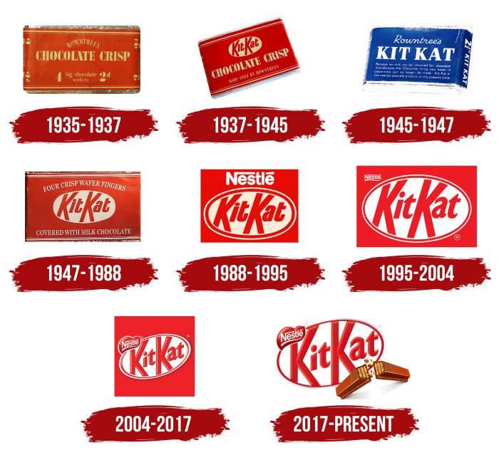
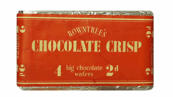
Rowntree’s Chocolate Crisp, established in 1935, quickly developed a unique visual identity with its first logo. The design was simple but striking, with white text on a red background that grabbed attention. “Chocolate Crisp” was displayed in a bold, elegant serif font in all caps, suggesting quality and luxury. Above this, “Rowntree’s” appeared in a lighter, more delicate font, arched elegantly to complement the robust text below. This design effectively communicated the brand’s values and helped it stand out.
1937 – 1945
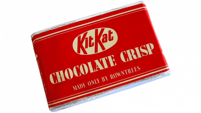
In 1937, Kit Kat introduced a new logo to match its updated name, setting the stage for the iconic branding recognized worldwide today. The logo kept its original red background and “Chocolate Crisp” tag but changed its typography significantly. It replaced the curved “Rowntree’s” script with a white oval stretched horizontally across the logo, prominently featuring the red “Kit Kat” text in a bold, custom sans-serif font. The ‘K’s in “Kit Kat” was notably extended, giving the logo a unique touch. This redesign was essential in modernizing Kit Kat’s visual identity, aligning it with the new brand name while preserving its historical elements.
1945 – 1947
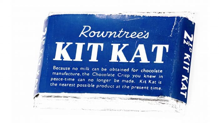
From 1945 to 1947, the wrapper was blue, as only dark chocolate was used due to ingredient shortages. This was related to the aftermath of World War II. The oval around the inscription disappeared. The letters became serifed.
1947 – 1988
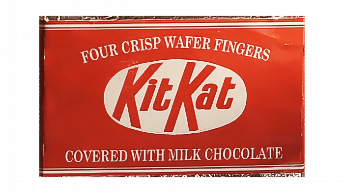
In 1947, Kit Kat’s logo was thoroughly updated, bringing back its red and white color scheme. The redesign included a larger, white oval in the center with the “Kit Kat” name displayed. Surrounding this central feature, text was added above and below in a classic serif font, all in uppercase letters. This design put the brand name at the forefront and maintained a traditional look that reflects its heritage. The arrangement of these elements made the logo more visually striking, ensuring the Kit Kat name is easily recognizable in advertisements and on the packaging.
1988 – 1995
In 1988, Nestlé purchased Rowntree’s and the Kit Kat brand with it. After this, it changed the corporate style of its chocolate and wafer products. The wrapper became bright red. It featured white inscriptions “Nestlé” (at the top) and “Kit Kat” (inside a white ellipse with a double contour).
1995 – 2004
In 1996, Kit Kat refreshed its logo to reflect its quality and style better. The update made the logo’s text bolder and more elegant, enhancing its visual impact. The red logo was also brightened to a richer hue, adding a professional touch. The “Nestle” logotype was resized to smaller letters and subtly positioned on the left side of the emblem, highlighted with an understated, flowing underline. This redesign updated the brand’s look and strengthened its iconic image in the competitive confectionery market.
2004 – 2017
Designers used shadows to make the logo more noticeable. This graphic technique gives the drawing a three-dimensional effect. Developers also placed “Nestlé” in an elongated red heart shape. Another change concerned the placement of the ellipse—now, its right side is slightly raised along with the “Kit Kat” inscription.
2017 – 2022
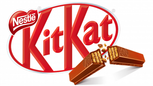
In 2017, the logo was updated to sharpen its features and make it more visually striking while keeping its original structure intact for easy recognition. The logo’s color shifted to a deeper and darker red, adding a bold and intense look. An image of crispy chocolate was added at the bottom of the logo to highlight the product’s texture and quality, further enriching the logo’s meaning and emphasizing the brand’s focus on sensory appeal.
2022 – today
The new KitKat logo embodies continuity. Its heritage is carefully preserved in every detail, adapted to modernity. This is evident in the soft curves of the large oval, the smooth grotesque letters, the even strokes of the double “K,” the red color, and the heart subtly nestled in the top left corner.
Thus, the classic design is fully retained. While it does not show obvious changes in the emblem’s structure, they are present:
- The broken-in-half bar is gone.
- There is no double outline anywhere.
- The glyphs do not touch the oval.
The font style is geometric and professional, with perfectly straight edges on the letters. Both “K”s look identical, resembling the slightly broken legs of chocolate wafer sticks. This typography makes the emblem recognizable and adds dynamism. This is especially well achieved through the angular cuts harmoniously combined with the lowercase italic glyphs on the capital letters.
The ellipse is tilted on the right side, indicating optimism and the company’s growing ambitions. The oval’s border is clear. The deep red color signifies the bar’s bold flavor and wide accessibility. This palette speaks of passion, emotional peaks, and enjoyment.
Kit Kat: Interesting Facts
Kit Kat, the chocolate wafer bar we all know, has a pretty cool story and has become special in the world of sweets.
- How It Started: Kit Kat was first introduced in the UK in 1935, made by Rowntree’s of York, now part of Nestlé. It was first called “Rowntree’s Chocolate Crisp” but changed to “Kit Kat Chocolate Crisp” two years later and then just “Kit Kat.”
- Famous Slogan: Since 1957, Kit Kat has used the slogan “Have a break, have a Kit Kat,” encouraging people to take a little break with a Kit Kat bar. The idea of taking a “break” has become a big part of what Kit Kat is all about.
- Different in the USA: While Nestlé makes Kit Kats in most places, Hershey’s makes it in the United States. This started from an agreement made in 1970, which is why Kit Kat might taste a bit different in the US.
- Kit Kat in Japan: Japan loves Kit Kat and has created over 300 flavors, from green tea to wasabi. Kit Kats are popular gifts because “Kitto Katsu” sounds like a Japanese phrase that means good luck.
- Space Kit Kat: In 2008, a Kit Kat bar was tied to a helium balloon for a science project and went to space. It floated 18 miles high, making it the first chocolate bar to reach near space.
- Using Good Cocoa: Nestlé promises to use cocoa that’s gotten in a way that’s okay for the planet and good for the farmers, aiming to make all Kit Kats with this kind of cocoa.
- Make Your Kit Kat: In some places like Japan and Australia, there are special Kit Kat stores called Chocolatory, where you can make Kit Kats with flavors and toppings you can’t find in regular stores.
- A Huge Kit Kat: For its 75th birthday in 2010, Kit Kat fans in the UK made the world’s biggest Kit Kat, weighing over 5,440 kg (about 12,000 lbs), setting a world record.
- Eco-Friendly Wrapping: In Japan, Kit Kat tried out paper wrappers that you can turn into origami. This is part of using less plastic and being nicer to the environment.
- Kit Kat and Pop Culture: Kit Kat has been involved in many fun collaborations, like making special bars with Hello Kitty in Japan, which shows how much it’s part of the culture.
From starting in the UK to becoming a favorite treat worldwide, with lots of flavors and creative ideas, Kit Kat has a special spot in the world of chocolate lovers.
Font and Colors
Nestlé and The Hershey Company have different Kit Kat logos. Hershey’s version features the brand name in white letters with black outlines on a red background. The font is similar to the Kit Kat font by Dennis Ludlow.
The Nestlé logo contains more original elements. The “Kit Kat” inscription is inside a slanted oval with a double frame. The style of the inscription is reminiscent of a modified Gill Sans font developed by Arthur Eric Rowton Gill.
The graphic sign shares many color palettes with Oxo, Virgin, and Coca-Cola—they also combine white and red. This combination of shades is advantageous from a marketing perspective, as it creates a winning contrast.
FAQ
Why is it called a KitKat?
The name “Kit Kat” has a unique history dating back to the 18th century. It was inspired by a literary club started by Christopher Catling, also known as “Kit Cat.” He ran a pie shop in London where the club met. This place was popular among famous writers, politicians, and influential British culture and political figures.
When the Rowntree’s company in the UK named their chocolate bar “Kit Kat,” they wanted to remember this history of social breaks and pleasant gatherings, adding a new twist. They linked the chocolate bar with a long-standing tradition, showing how an old name can give a brand a special meaning and connect it to a broad cultural story.
After Nestlé bought Rowntree’s in 1988, they continued to share the story behind the Kit Kat name on their website. They honor the origin of Catling’s club, showing respect for the brand’s past and cultural importance. Nestlé’s approach adds a layer of meaning to the Kit Kat brand, associating it with a delicious snack, a tradition of social interaction, and historical significance.
Why is the KitKat logo red?
The KitKat logo, designed between 1935 and 1937, stands out with its white letters on a vibrant red background. This design choice wasn’t just for looks; it aimed to make an impact. Red is a color that catches the eye and is often associated with energy, passion, and action—qualities that KitKat aimed to embody.
The contrast of red and white in the logo was especially effective in making the logo noticeable on store shelves, drawing customers’ attention. During the 1930s, as color printing was becoming more common, this bright red helped KitKat to be distinctive and appealed to consumers seeking novelty and luxury in everyday items. The choice of red for the logo aligns with KitKat’s goal to offer warmth, enjoyment, and a break from the daily routine. The color effectively conveys KitKat’s message of relaxing, enjoying, and indulging in a little treat.
What is an interesting fact about Kit Kat?
Kit Kat bars started in 1935 in England, initially called “Rowntree’s Chocolate Crisp.” The name highlighted the candy’s crispy wafer, a distinctive feature. By 1937, the name changed to “KIT KAT® Chocolate Crisp,” marking the beginning of its journey to becoming a globally loved brand. Kit Kat bars contain dairy products, so they are unsuitable for vegans. The milk in the chocolate coating and other animal-based ingredients in some flavors means vegans cannot eat them.
How long is open Kit Kat good for?
If you store it correctly, an unopened Kit Kat can last around nine months to a year. The chocolate’s ingredients help it stay fresh. Just remember to keep it somewhere dry and away from the sun to make it last longer. After opening a Kit Kat, it can still be good for about 2-3 months. Opening it exposes the chocolate to air, which might change its texture and taste. To keep it tasting fresh longer, store it in an airtight container or a sealable bag in a dry place.
What does the KitKat logo mean?
The KitKat logo tells the brand’s story and history, not just through its design but also with symbols. It features a chocolate bar broken in half to show off KitKat’s signature crunch. This image encourages people to pause and enjoy a moment of break. The logo includes “Nestlé” within a red heart, indicating Nestlé’s ownership of KitKat and suggesting that care and high quality are important in making each bar.
The KitKat logo merges the brand’s heritage with its central idea: taking a break with a crunchy chocolate bar. It links history and the simple pleasure of enjoying a break in one memorable symbol.
What is the symbol of Kit Kat?
The Kit Kat logo is famous around the world for its eye-catching design. It features the word “kitkat” in red, placed inside a white oval, both tilted to give a dynamic appearance. The vibrant red color conveys energy, aligning with the brand’s message.
The logo’s letters mimic the look of chocolate bars, which adds a playful element and underscores the product’s key feature: the chocolate. This 3D effect makes the logo stand out and visually links it to the experience of enjoying a Kit Kat, focusing on the joy of the chocolate. This has made the logo recognizable and a global symbol for enjoying a tasty treat.
Why is the Kit Kat logo different from others?
The Kit Kat logo varies by location, which is uncommon for a worldwide brand. This variation is due to the brand’s ownership and licensing arrangements. While Nestlé, a Swiss company, owns Kit Kat globally, the Hershey Company holds the license in the United States. As a result, the Kit Kat logo has two distinct designs.
Globally, Nestlé’s version of the Kit Kat logo features the brand name in red within a white oval, sometimes appearing three-dimensional to resemble chocolate bars. This design emphasizes the chocolate’s texture and the pleasure of eating a Kit Kat.
In contrast, the US version by Hershey displays black and white letters against a red background, differing significantly from the global design. This reflects Hershey’s unique branding strategy for Kit Kat in America, distinguishing it from the international version. The contrast between these logos underscores the unique business partnership between Nestlé and Hershey, illustrating how licensing agreements can give a single brand different identities in various markets.
What does the Kit Kat logo symbolize?
The Kit Kat logo highlights the chocolate bar’s quality and distinctive features. It shows the bar broken in half to emphasize the crispy layers inside, drawing attention to the crunchy wafers that make Kit Kat unique. The flying crumbs in the image further underline the crunchiness, often associated with freshness, making the chocolate even more appealing.
The logo uses red and white colors to stand out. Red is chosen for its ability to catch the eye, making the logo more visible on store shelves and in advertisements, conveying energy and excitement. White is used for the text and bar image, ensuring the logo is easy to read and stands against the red background.
What is the symbol of KitKat?
The KitKat symbol catches your eye with its bright red name inside a matching oval against a white background. The font has a modern feel, especially the “K” s designed to look like chocolate bars, making it easy to spot the brand. Below the logo, you often see a picture of a KitKat bar broken in half, showcasing the crunchy layers inside. This image displays the product and invites people to take a moment and enjoy a KitKat break. The symbol goes beyond a logo; it represents the brand’s promise to deliver a unique chocolate experience. Through its design and imagery, the symbol stands as an icon of pleasure and indulgence in the world of chocolates.
Why do Kit Kat logos differ from each other?
The KitKat logo looks different worldwide due to unique licensing and branding strategies. Nestlé, a Swiss company, owns KitKat and uses a classic logo featuring a red oval with the brand name and a chocolate bar image. This design is famous worldwide for its traditional appearance. However, the Hershey Company sells KitKat chocolates in the United States under a different logo: “KitKat” in white letters on a red rectangle. This is because of an agreement between Hershey and Nestlé, allowing Hershey to use its branding style for KitKat in the U.S.
These variations in the KitKat logo, from the classic design to those used in the U.S. and Australia, illustrate how the brand adapts to different markets and consumer interests. The classic logo maintains KitKat’s well-known identity, while the changes in the U.S. and Australia showcase the brand’s flexibility in meeting regional tastes and supporting causes like sustainability.
When did Kit Kat change its logo?
In 2017, KitKat updated its logo to make it look fresher and better reflect what the brand stands for. The new logo shows a KitKat bar broken in two, which is something all chocolate lovers recognize. The colors changed, too, with a deeper red, and the letter outlines got thicker with an orange tint. This made the logo pop out more and gave it a three-dimensional appearance.
In 2020, KitKat Australia introduced a unique logo to show its commitment to sustainability. This logo featured three brown arrows forming a recycling symbol, a significant departure from the usual design to promote recycling and environmental care. Though this special logo was used only in Australia and for a limited time, it demonstrated KitKat’s willingness to innovate and tackle big issues like sustainability.
