![]() Kellogg Logo PNG
Kellogg Logo PNG
The Kellogg’s logo retains the founder’s signature, remaining a symbol of continuity and trust. Its appearance reflects the company’s evolution and new production directions. The modern color palette emphasizes the brand’s energy and vitality, reflecting its role as a producer of convenience foods and snacks under various labels.
Kellogg’s traces its origin to 1894, when Will Keith Kellogg and John Harvey Kellogg worked with grain-based diets at a sanitarium in Battle Creek, Michigan. An accidental process led to flaked corn, which became popular among patients. In 1906, Will Keith Kellogg launched large-scale production, and the first shipment sold out within hours.
By 1909, the business had been renamed the Kellogg Company and began promoting cereal as part of a balanced diet. New products followed, including All-Bran in 1916 and Rice Krispies in 1928. During the 1930s, the company expanded its marketing toward children, adding toys to boxes and introducing characters such as Snap, Crackle, and Pop.
After World War II, Kellogg’s expanded its product line to include Sugar Smacks and Frosted Flakes, strengthening its position in the snack and cracker market. Production moved beyond the United States, with factories in Canada, Australia, and the United Kingdom. By the late 1960s, the brand operated in 18 countries.
From the 1980s onward, growth continued through acquisitions, including Keebler and Pringles, and the launch of products like Nutri-Grain bars. In the 2010s, recipes were revised to reduce sugar, increase whole grains, and introduce organic and gluten-free lines.
In 2022, Kellogg’s announced plans to split its business into three companies focused on snacks, North American cereals, and plant-based foods, reflecting structural changes in the food industry.
Meaning and History
![]()
Will Keith personally signed each package to distinguish Kellogg’s corn flakes from similar products from other manufacturers. This continued for a whole year. Then, the company’s owners decided to expedite the process and created a logo featuring the stylized inscription “Kellogg’s.” According to legal documents, the adopted trademark was first used on May 1, 1907.
What is Kellogg’s?
It is the trade name of the Kellogg Company. It’s a manufacturer of semi-finished products and snacks, selling products under various brands. Despite the company’s American origin, it holds a royal warrant.
1906 – 1907
![]()
When Will Keith Kellogg first picked up a pencil to leave his autograph on a cereal package, he could not have known that his personal signature would become the beginning of a long brand story for W.K. Kellogg Battle Creek Toasted Corn Flake Co. For an entire year, every cereal box was marked with the owner’s signature, turning it into a sign of quality and authenticity.
The Kellogg emblem of that period consists of not one but three text blocks. The top section features a handwritten cursive autograph. The letter strokes connect softly and naturally, conveying the character and individuality of the person behind the brand. The name “W.K. Kellogg” is easy to read and immediately recognizable.
Below are two bold lines set in a large, powerful sans-serif typeface. The first line reads “BATTLE CREEK,” and the second line reads “TOASTED CORN FLAKE CO.”
The third line is slightly lighter and set in uppercase. Its color is a deep burgundy red, as if gently faded with time. The inscription BATTLE CREEK, MICH. points to the brand’s birthplace, Battle Creek, Michigan.
1907 – 1916
![]()
The brand shifted from the long name “W.K. Kellogg Battle Creek Toasted Corn Flake Co.” to the shorter “Kellogg’s.” The logo was simplified, with the founder’s lively signature becoming the central element. The new name and image felt more like an autograph than a traditional logo, making them feel closer and more personal to consumers.
The name Kellogg’s appears as if written in a single motion of the hand. All letters are connected, creating a sense of natural flow and handwriting. They smoothly transition into one another, as though freshly written with a fountain pen. The lettering has no serifs, and the softly rounded letter endings, combined with a slight rightward slant, emphasize the brand’s light, friendly character.
The inscription is burgundy. It strengthens associations with comfort and a sense of home, as Kellogg’s cereal is often perceived as part of a family breakfast.
The typeface clearly imitates Will Kellogg’s handwriting. The brand deliberately preserved the owner’s signature as the foundation of its visual identity, highlighting the individual who once turned ordinary corn flakes into a symbol of the morning routine for an entire generation.
1916 – 1955
![]()
When updating the logo, Kellogg’s retained the cursive lettering while altering the letterforms. The new forms became simpler and freer, breaking away from the slightly strict geometric rules of the previous version. The letters grew more concise and straightforward, written with ease. The handwriting is smooth, and the strokes connect neatly, forming a single cohesive word.
The new red color evenly fills the lettering, creating a calm image. Its tone is soft and slightly muted, fitting naturally into the atmosphere of a morning meal while remaining pleasant and recognizable.
1955 – 2011
![]()
On June 20, 1955, Kellogg’s introduced another logo. The lettering remained handwritten, but the letters became heavier and wider. The typeface continued to imitate handwriting, with each letter connected to the next, as if the word were written without lifting the hand from the paper. The entire inscription is slightly slanted to the right, yet it became more structured and stylized than before.
The logo color is bright red. The shade is fresh and clean, and the lettering is easy to read. The updated logo form did not lose the warmth and individuality established by the brand’s founder.
2011 – today
![]()
At the end of 2011, the Kellogg’s brand decided to refresh its visual style. The project was handled by “Interbrand”. Designers Ferris Crane and Andrew Y. Ames, who oversaw the update, proposed a new color for the lettering. It became a bright pink, and the identity was accompanied by the phrase “Let’s make today great.” The typeface was developed by Monotype Imaging specialists based on St Ryde, specifically adapted for Kellogg’s, and named Kellogg’s Sans. For the average consumer, however, the changes likely went unnoticed. The previous and current logo lettering are almost identical, except for color.
After the rebrand, the inscription began to look more modern and vivid, although the letter shapes and handwriting style remained the same. The changes focused on the color aspect of the Kellogg’s logo, which is now rendered in an energetic pink. The brand was already so familiar to consumers that a major redesign was not required.
In June 2022, Kellogg’s announced plans to split the business into three independent entities, one for cereal, one for snacks, and one for plant-based foods. However, in January 2023, the plan to create a separate Plant Co. for the plant-based segment was postponed, and the segment was instead combined with the snacks division. Then, on March 15, 2023, the creation of two separate companies was announced: WK Kellogg Co. for the North American cereal market and Kellanova for the international snacks and plant-based foods market. The separation process was fully completed on October 2, 2023.
Nevertheless, Kellogg’s did not disappear or lose its influence. The brand and its pink logo continue to appear on packaging in many countries, maintaining the loyalty of millions of consumers.
Font and Colors
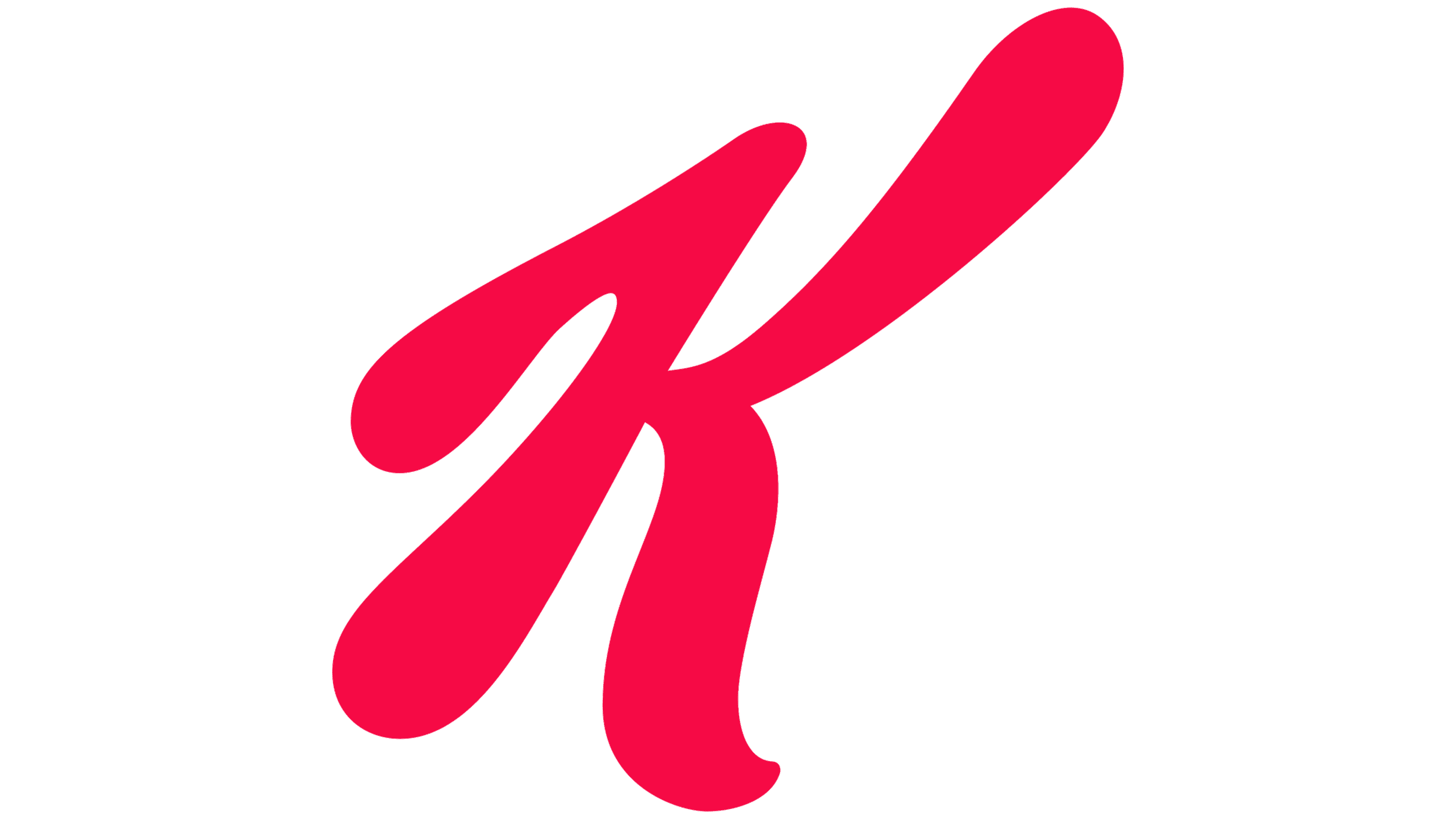
The logo’s concept has never changed. The word “Kellogg’s” mimics Will Keith’s signature, written a hundred years ago. The letters are inclined to the right and connected. Only the capital letter “K” is set in a separate position. The lines are smooth and rounded, like typographic laundry cursive. However, the company uses its handwritten font, Kellogg’s Sans, which gives the logo a distinctive character.