“You will leave us fed and satisfied,” the Pizza Hut logo promises. The image symbols show a large selection of hot, fresh, oven-cooked food. The emblem ensures that the establishments taste like home.
Pizza Hut: Brand overview
Pizza Hut is an American fast food chain and international franchise that offers Italian-American cuisine. It prepares pizzas of different types and side dishes, pasta, and desserts. The first point appeared in the city of Wichita, Kansas, where it was founded by the Carney brothers – Dan and Frank. Today, the pizzeria is the world’s largest catering structure, with more than 18,700 restaurants (as of January 2020). It is no coincidence that the British company Richtopia ranked it 24th in the 200 most influential brands. The service is currently a subsidiary of Yum! Brands, Inc.
In 1958, brothers Dan and Frank Carney opened the first company location in Wichita, Kansas, using a small loan from their mother. They wanted to offer something new, and by 1959, they did just that by introducing a buffet concept that customers loved. This idea helped the company grow quickly; by the late 1960s, it had over 300 restaurants.
Their expansion continued in the 1970s and 1980s, reaching beyond the US to open their first international location in Canada in 1968. After going public and listing on the New York Stock Exchange, the brand caught the eye of PepsiCo, which acquired it in 1977. This move provided the company with more resources to grow. Around this time, they started offering more variety on their menu, including pasta, sandwiches, and salads, introducing their iconic red roof logo.
The growth didn’t stop in the 1990s and 2000s. The company opened more than 7,500 locations worldwide and embraced unique marketing strategies like movie sponsorships and introducing stuffed crust pizza. In 1997, the brands KFC and Taco Bell merged under Tricon Global Restaurants, which later became Yum! Brands, creating the world’s largest restaurant company.
Recently, the company has focused on digital innovations to make ordering easier and more convenient for customers. They launched online ordering in 2013, allowing customers to customize their pizzas and track delivery. They’ve also explored new technologies like drone delivery and AI chatbots. In 2017, the company became the official pizza sponsor of the NFL, increasing its visibility and attracting more customers.
With over 18,000 restaurants in more than 100 countries, the company is one of the largest pizza chains in the world. They continue to adapt to changing consumer tastes and new technologies.
Meaning and History
In 1958, two student brothers from Wichita State University decided to open an Italian pizzeria in their town. Six months later, they established a second location, and in 1959, they had a real fast food chain with nine restaurants. That same year, Dan and Frank switched to a franchise system. The iconic Pizza Hut building design came later (in 1963). It was designed by architect George Lindstrom, who worked in Chicago. The project was completed in 1969.
In 1977, the restaurant chain was taken over by another owner: it was bought by PepsiCo. After 20 years, Pizza Hut and two other food service chains (Kentucky Fried Chicken and Taco Bell) left the chain and formed a new entity called Tricon Global Restaurants, Inc. But then, a few years later, it changed it: the result was Yum! Brands in the spring of 2020.
All this time, the restaurant kept its recognizable identity: the logo, the sign, and the design of the building with the red roof, which eventually became the emblem. So, the Chicago architect can be counted among its authors. However, there are nine characters in the franchisee’s career.
What is Pizza Hut?
The brand has more than 17,000 restaurants serving customers in nearly one hundred countries around the world. Their main product is pizza baked on a deep-dish tray. The menu also features numerous desserts, breadsticks, pastas, and other entrees. The brand was born in 1958, and its funny logo in the form of a red cap was created in 1974 and since then has been repeatedly finalized. The birthplace of the transnational pizza chain is Wichita, the largest city in the state of Kansas.
1958 – 1970
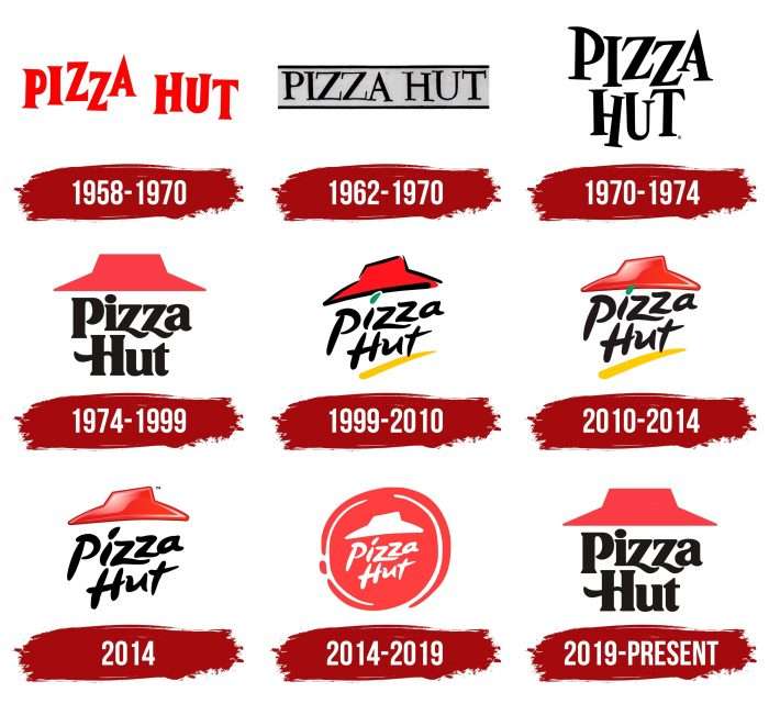
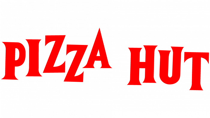
The debut logo of the pizza chain consists of a name arranged horizontally and decorated with “jumping” letters. By design, they do not mean playfulness but impatience, with which visitors are waiting for their order. It hints at the excellent taste of dishes Pizza Hut offers. The letters in the words are scarlet, uppercase, and typed in a clear serif font.
1962 – 1970
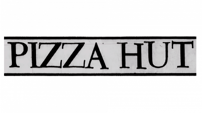
This was the emblem of the Coca-Cola Company. It also used the franchise name but in a completely different style, instead of red and black, instead of “jumping” lines – straight lines, instead of sharp signs – symbols with flat tops. However, looking closely, you will notice that not all letters are aligned. For example, the right leg of “A” is longer than the others, and “U” is higher. At the top and bottom, the phrase is chiseled off with thin lines.
1970 – 1974
The redesign brought the perfect combination of the debut and new logos. From one, the developers used the style and geometry of the letters; from the other – the restraint and color of the lettering. In addition to the monochrome, the updated arrangement of the words was added: they are now arranged in a column, one above the other. This proportionality became iconic, as it was maintained virtually the rest of the time (except for a few periods). The “jumping” characters are hand-drawn.
1974 – 1999
The logo was approved in 1974 and designed by Lippincott in collaboration with marketing manager Sam Moyers. It is famous for featuring the first appearance of the iconic red roof, as on the restaurant chain’s signature buildings. The iconic element has remained forever. Under the roof is a two-level inscription in an updated font. It uses wavy lines – lowercase “h” and uppercase “H.” In the first case, they replace the lower part of the letters; in the second, they replace the center stripe.
1999 – 2010
In 1999, the company switched to a conceptually different logo – with more loose lines, as if drawn with a single brush stroke. This applies to both graphics and text. The author of the new identity was Landor Associates. The roof is now diagonal and has black stripes on all sides. The lettering also goes diagonally from bottom to top. The letters look unobtrusive and not as strict as the previous version, although they share some commonalities in lettering. In the word “Pizza,” the dot above the letter “i” is elongated and colored green. The characters resemble handwritten characters. There is a yellow underline at the bottom.
2010 – 2014
This version is a redesigned version of the previous emblem. There are no thick black lines around the perimeter of the roof. In addition, the underline has been enlarged, and a sunburst-like shine has been added. The designers also straightened the roof horizontally, leaving all other elements in the same place.
2014 (North America)
This logo is based on the 2010 emblem. The designers removed the yellow underline at the bottom of the lettering and repainted the green leaf above the “i” in black. In some countries, this logo is still used today.
2014 – 2019
In 2014, Pizza Hut announced a total rebranding to attract more diners and boost its declining revenues. It updated everything: signage, uniforms, menus, and symbols. As a result, the emblem took on a round shape and became pizza-like. This is associated with developing eleven new branded pizzas, so the emphasis was placed on them. Only red remained from the old emblem, resembling the roof’s iconic shade and fried pizza. The names of the chain and the rooftop were placed in the center of a circle with a white dotted border. Deutsch LA conducted a redesign of the logo.
2019 – today
In the summer of 2019, Pizza Hut returned the old logo and red roof from 1974 to 1999. The logo is now dominated by three wavy lines, a flat roof, and the classic Lippincott lettering.
Pizza Hut: Interesting Facts
Pizza Hut, recognized globally for its extensive pizza selection and other offerings, boasts a storied past and a profound influence on the quick-service restaurant sector.
- Origins: In 1958, brothers Dan and Frank Carney established Pizza Hut in Wichita, Kansas, with a $600 loan from their mother. Due to the sign’s eight-letter limit, they settled on “Pizza Hut” as the name.
- Expansion Beginnings: In 1959, the first Pizza Hut franchise opened in Topeka, Kansas, paving the way for its growth across the U.S. and abroad.
- Menu Innovation: Pizza Hut has pioneered the pizza space. In 1995, it introduced the stuffed crust pizza, a concept in which cheese is baked into the crust’s edge. This pizza became a favorite among customers.
- Literacy Effort: Pizza Hut’s “Book It!” initiative, started in 1984, aims to foster reading habits in children. Through this program, kids earning their reading goals for the month receive a free personal pan pizza, making it one of the nation’s oldest corporate-backed literacy efforts.
- Record-Setting: Among its achievements, Pizza Hut has crafted the largest pizza ever and managed the highest altitude pizza delivery on land to Mount Kilimanjaro’s summit.
- Worldwide Reach: Pizza Hut operates in over 100 countries and has more than 16,000 restaurants worldwide, ranking it among the largest pizza chains.
- E-commerce Milestone: Pizza Hut marked the first online purchase in history in 1994 with an order for a pepperoni pizza with mushrooms and extra cheese, preceding giants like Amazon and eBay.
- Extraterrestrial Delivery: In 2001, Pizza Hut made history by delivering pizza to the International Space Station, becoming the first to deliver pizza in space.
- Signature Architecture: Pizza Hut locations’ iconic red roofs were a defining feature, designed to give the chain a distinct and recognizable look.
- Adaptation to Trends: Pizza Hut has transitioned from a primary focus on dine-in to emphasizing delivery and carryout, adapting to shifts in consumer preferences and the rise of online ordering.
From its beginnings in a small Kansas town to becoming a dominant force in the international pizza market, Pizza Hut’s journey illustrates its resilience, inventiveness, and dedication to excellence. Its enduring influence and ongoing contributions to the fast-food realm affirm its status as a significant entity in global dining.
Font and Colors
Since the 1970s, the catering chain’s identity has been based on a brick-red roof. The roof has a wide brim and a raised middle, resembling a hat. This element is a key symbol of the company, which disappeared only once (in 2014) for a radical image change but then returned.
The slanted font, used for many years in the emblem, is distinctive and looks like strokes made with a wire brush. The current font is called Hot Pizza. Its creator is designer Dennis Ludlow. He proposed a redesigned typeface with serifs.
The pizza chain’s brand palette is red, constantly combined with white. At various times, black, yellow, and green have been added.
FAQ
What is the brand name of Pizza Hut?
The company is a well-known part of “Yum! Brands” and a significant player in the fast-food world. This American company operates over 55,000 restaurants in 155 countries and includes big names like KFC, Taco Bell, and The Habit Burger Grill. The brand is especially famous for being one of the biggest pizza chains globally.
The company’s story started in 1958 in Wichita, Kansas, thanks to two brothers, Dan and Frank Carney. It’s now a go-to name for pizza lovers everywhere, known for various pizzas and other dishes that cater to different tastes—being part of “Yum! Brands” means the brand uses various resources from its parent company, like marketing and innovation strategies. This support helps the company stay ahead in the pizza business and develop new ways to serve its customers. The brand and “Yum! Brands” work well together, helping it stay on top of the game.
What is Pizza Hut’s symbol?
The brand’s logo, which some people think looks like a hat, is based on the company’s classic red roof. This design comes from the original buildings, which had distinctive red roofs, making them stand out. The logo maintains this look but simplifies it so it’s easy to recognize worldwide.
Over time, the brand has updated its logo but always kept the famous red roof part of the design. This shows they’re proud of their history but want to keep things fresh and modern. The red roof in the logo reminds people of the company’s past and signals to pizza fans that this is where they’ll find delicious pizzas and more.
What does the Pizza Hut Logo symbolize?
After its 2019 redesign, the logo took on a deeper meaning, highlighting the brand’s long history and iconic elements. The big roof in the logo is a classic part of the company’s look. It’s a symbol packed with meaning.
The roof’s red color points to tomatoes, a key pizza ingredient, showing how closely the logo’s design ties to the company’s food. This vibrant red is welcoming, making you hungry and drawing you in.
The roof’s shape, which resembles a hat, is particularly special. It doesn’t just catch your eye; it makes you feel something. This “hat” design suggests a sense of comfort and safety, echoing the friendly and warm atmosphere the brand aims to create. It’s about bringing people together in a pleasant place to share a meal. This idea is central to what the company wants: a place to eat and where you enjoy being, offering great food and a welcoming environment.
Who came up with the Pizza Hut emblem?
The well-known logo of the brand, with its distinctive red hat-shaped roof, was designed by Richard D. Burke, an artist and architect, in 1969. Burke designed the first building for the brand to look like a shack with a large red roof, aiming for a simple rather than futuristic style. This design became a key part of the brand’s identity.
However, the logo we know today didn’t come about until 1974, through teamwork. Sam Moyers, the marketing manager at the time, worked with the Lippincott brand consultancy to create the red cap logo. This design was based on Burke’s original roof, turning it into a symbol for the brand that could be used everywhere. In 1999, the logo was updated by Landor Associates to keep it modern while holding onto its iconic red roof. This careful updating process over the years has kept the logo connected to the brand’s roots and helped it stay current.
Why is the letter “i” green in Pizza Hut?
From 1999 to 2014, the brand’s logo featured a unique design element: a green dot above the letter “I,” introduced by Landor Associates. While the brand and Landor Associates have never explained why they chose the green dot, some believe it makes sense. A popular idea is that this green dot symbolizes a basil leaf, an essential topping on a classic margherita pizza. Margherita pizza matches the Italian flag’s colors with red tomatoes, white mozzarella, and green basil.
What is the slogan of the company Pizza Hut?
The brand has always known how to catch people’s attention with catchy slogans. Their latest, “No one outdoes the hut,” shows their pride in making great pizza that stands out. This slogan highlights their long history of making pizzas that people love and their knack for developing new ideas.
Before this, the brand had slogans like “Now You’re Eating!” and “Makin’ It Great,” which showed how their pizzas were about enjoying good food and quality. “Now You’re Eating!” was about moving from just any food to enjoying a tasty meal at the brand’s locations. “Makin’ It Great,” used in ads from the 1980s to the mid-1990s, and its updated version, “Make it Great,” from 2012 to 2016, both stressed how much they care about quality, from the ingredients in their pizzas to how they treat their customers.
They had “Makin’ it great again and again,” which promised customers that they could always expect delicious pizza every time they visited. Long before these, “Gather Round The Good Stuff” encouraged people to enjoy meals together, showing that the brand is a place for making memories. All these slogans show how the brand has worked hard to stay a favorite choice for pizza fans.
What does the Pizza Hut logo stand for?
The logo looks like a red hat. It’s a shout-out to the brand’s history and what it stands for. The logo brings to mind the colorful roofs of the company’s first restaurants, showing respect for where it started and how far it has come. It’s like a mini-celebration of turning from one pizza spot into a big name worldwide.
Red dominates the logo for good reasons. It indicates the delicious tomato sauce that tops the pizza and evokes a sense of excitement and energy. The brand chose red to excite people about their food, promising something delicious and satisfying. There’s also something special in how the logo is designed, especially the wavy lines around the “z” and “H.” These details might not catch your eye immediately, but they pay homage to Italian style, hinting at pizza’s roots in Italy. Since pizza is a big deal in Italian cuisine, these design choices add a touch of authenticity and honor to the logo.
Where did the Pizza Hut logo come from?
The logo, known worldwide, started with the company’s beginnings. Over time, it has changed to stay up-to-date while keeping a link to its history. The most famous part of the logo, the “red hat,” comes from the design of the first restaurant built in 1969 by Richard D. Burke. This red roof is a big part of people’s thoughts of the brand, showing the company’s identity over the years.
Designers have ensured that the logo remains modern and appealing. Even with new looks, the tribute to the red roof of the first restaurant remains, showing the brand’s strong connection to its history.
A big change came in 2014 when the logo got a new look to show pizza making creatively. It featured tomato sauce being poured on pizza dough in a spiral. This new design shows the quality and freshness of the company’s pizzas. The logo’s changes over the years tell the story of growth from one restaurant to a big chain worldwide.
Who was the designer of Pizza Hut’s logo?
The logo, known for its iconic red roof, was created by the New York design firm Lippincott and approved by Sam Moyers, the brand’s marketing director, in 1974. This collaboration led to a unique logo with stylish black lettering under a “cap” that resembled the brand’s famous red roof. It was a way to make the brand stand out and remind people of the special design of its restaurants.
This logo stayed with the brand until 1999 and returned in 2019, twenty years later. Bringing back the old logo was a big deal. It was about changing the logo, returning to the brand’s roots, and celebrating its long history. The idea was to stir up fond memories for long-time fans and show the brand’s heritage to newer customers.
Why did Pizza Hut return to its old logo?
In 2019, Pizza Hut decided to bring back its 1974 logo, originally designed by Lippincott and Sam Moyers. The company wanted to reconnect with the success and familiarity of its old logo. Pizza Hut understood that people felt a strong sense of nostalgia for the brand’s original look. Returning to this well-loved logo, the company aimed to remind everyone that it has always led the American pizza scene.
This move involved changing the logo, and it was a way for the brand to stand out in a crowded market by celebrating its history. The company wanted to show that it’s a brand with a deep history, being among the first to make pizza popular in the United States. Bringing back the old logo was a way to remind people of the brand’s long history in the pizza world. It highlighted the brand’s role in bringing pizza to Americans.
