The Chick-fil-A logo resembles a hot appetizer on a plate. The emblem demonstrates the speed of preparation, freshness of products, and nutritional value of the network’s dishes. The elements hint at the main ingredient of the recipes – chicken meat.
Chick-fil-A: Brand overview
Chick-fil-A is the largest fast-food restaurant chain in the United States, specializing in chicken sandwiches. It originated in 1946 in Hapeville, Georgia, and is currently headquartered in College Park in the same state. The founder of the massive company is S. Truett Cathy, a businessman, philanthropist, author, and investor. Today, she operates more than 2,600 restaurants in the United States. In addition, she has branches in Canada. They used to be in the UK as well. The menu includes breakfasts, lunches, and dinners, depending on when you visit the restaurant. The company also offers its food for events.
Back in 1946, in Atlanta, Georgia, S. Truett Cathy started Chick-fil-A, kicking off with a small place called Dwarf Grill, later renamed Dwarf House. This spot was all about good chicken and steaks with a dose of Southern hospitality. Cathy made waves in 1961 by inventing a tasty, simple chicken sandwich, setting the stage for what Chick-fil-A would become.
By 1967, the first official Chick-fil-A restaurant opened in Greenbriar Mall outside Atlanta, serving that famous chicken sandwich. This was the start of something big, with Chick-fil-A standing out for great food, top-notch service, and sticking to Christian values, like closing on Sundays for family and worship time.
Chick-fil-A slowly grew in the ’70s and ’80s, mostly in shopping malls across the Southeast. But then, in the ’80s and ’90s, it began opening standalone restaurants with drive-thrus and new items like chicken nuggets and breakfast biscuits.
Entering the 2000s, Chick-fil-A exploded, becoming a major player in the U.S. fast-food scene. Despite controversy over its political and social views, the chain kept a strong customer base thanks to its focus on quality and service. Chick-fil-A is known for its super polite employees who say “My pleasure” to thank you, showing their commitment to exceptional service.
Recently, Chick-fil-A started opening restaurants in Canada, the UK, and South Africa and added new options like grilled chicken sandwiches and gluten-free buns to meet different dietary needs.
With over 2,600 locations and yearly sales of over 10 billion dollars, Chick-fil-A shows what innovation, entrepreneurship, and sticking to your values can do. From Truett Cathy’s first chicken sandwich to its recognizable brand, Chick-fil-A has a strong following.
Despite hurdles, Chick-fil-A keeps growing and is loved for its tasty food, great service, and strong values. As it grows and changes, it keeps shaping the fast-food world with its unique blend of delicious food, exceptional service, and a firm commitment to its principles.
Meaning and History
The fast food restaurant chain has gone through a string of renaming: first, it was Dwarf Grill, then it was called Dwarf House, and finally, it got its current name, Chick-fil-A. It originated in 1967, which is considered the official year the company started. But in reality, the restaurant’s roots go much further than that.
After being in business for about 15 years (since 1946), Truett Cathy discovered a deep fryer that could cook a chicken sandwich at the same time as a hamburger. He emphasized his first slogan, trademarked the name, and developed a chicken-based flagship menu. All of these events date back to 1961.
The first branch of a Chick-fil-A fast food outlet appeared in 1967 in Greenbriar Mall, located in suburban Atlanta. In 2008, the company eliminated trans fats. And in 2015, it established its three-story, 460-square-foot restaurant in Manhattan, which has become the largest Chick-fil-A center in the United States.
The restaurant chain’s corporate ethics are rooted in deep Christian beliefs—particularly Baptist beliefs. The eateries are closed on Sundays, Christmas, and Thanksgiving. During Lent, Chick-fil-A offers fish sandwiches instead of chicken meat.
In all that time, the company has only twice violated its ban and opened on a weekend day. The first time was to feed passengers at Hartsfield-Jackson International Airport who were in a difficult situation due to a power outage in Atlanta. The second time was when it was needed for the birthday party of a 14-year-old with autism and cerebral palsy in Mobile, Alabama.
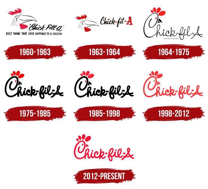
The chicken, still used in the logo, was the restaurant’s mascot. Her name was Doodles. The corporate emblem has always featured this image throughout the chain’s history, although the anthropomorphic mascot is now a cow. Chick-fil-A has seven logo variations.
What is Chick-fil-A?
Chick-fil-A is a privately held company that owns more than 2,700 fast-food restaurants. The chain is headquartered in Atlanta, Georgia’s most populous city. The menu is based on chicken dishes and a variety of sandwiches.
1960 – 1963
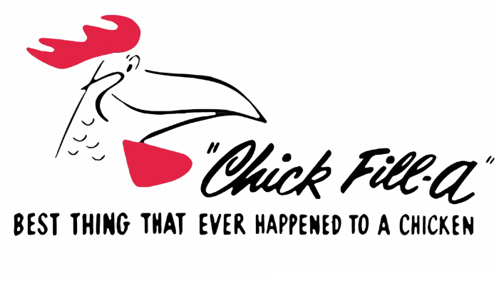
Although the restaurant officially debuted in 1967, its founder initially worked at another fast food establishment, the Dwarf Grill near Atlanta (in Hapeville, Georgia). Chick-fil-A originally appeared on the menu: that was the chicken’s name in the sandwich. But the dish was spelled differently – Chick-fil-A used the handwritten italicized logo.
On the left is a cartoon-style image of a smiling chicken head. The drawing is in a few strokes, with a red beard and crest. The final letter “a” in this variant is lowercase.
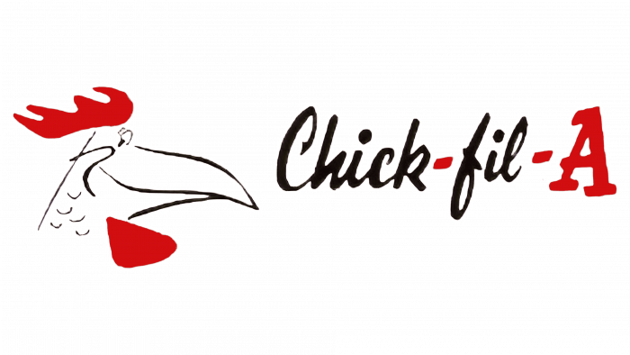
1963 – 1964
The image of the chicken remained the same. The name was changed: one letter, “l,” disappeared from it, the capital “F” became lowercase, and a big letter, “A,” appeared at the end. The designers also added two red hyphens in the form of small rectangles.
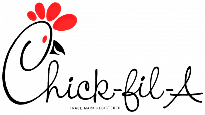
1964 – 1975
In 1964, the developers drastically changed the design of the emblem. They removed the separate chicken head and combined it with the lettering. This version became much more attractive, as the capital letter “C” now complements a beak, an eye, and a crest of four oval elements of different heights. It was this logo that adorned the fast food chain’s first restaurant.
1975 – 1985
The logo was executed in bold, handwritten type in a similar design for the next ten years.
1985 – 1998
During this period, the same old logo was used, but in a darker color. The designers intensified the red color palette and made the scarlet almost burgundy. There were no other changes.
1998 – 2012
In the next redesign, the developers took the previous version of the logo as a basis. Changes were made to the thickness of the font, which became slightly thinner, and the color was repainted red from the entire emblem.
2012 – today
The designers freshened up the emblem: they aligned the “jumping” letters a bit, making them more readable, and replaced the open beak with a closed one. Now, it looks like a slightly curved triangle. A separate trademark has also appeared. It is a round red icon with a white chicken in the same format as the large logo. The only difference is the scale, as only a fragment of the bird’s head is included in the circle. A separate symbol and some paraphernalia decorate the entrances to branded establishments.
Chick-fil-A: Interesting Facts
Chick-fil-A, famous for its chicken sandwiches, was founded by S. Truett Cathy in 1946 in Hapeville, Georgia. It’s one of the top fast-food chains in the U.S., known for its food, unique culture, and business practices.
- The Original Chicken Sandwich: Invented by Cathy in 1964, this sandwich has a hand-breaded, seasoned chicken breast on a buttered bun with pickles.
- Closed on Sundays: Reflecting Cathy’s Christian beliefs, all locations are closed on Sundays to give employees a day off for rest and worship.
- Cow Advertising Campaign: Since 1995, the “Eat Mor Chikin” cow campaign has become a signature part of Chick-fil-A’s brand. The campaign humorously suggests that people eat more chicken instead of beef.
- High Sales: Chick-fil-A achieves high sales per restaurant in the U.S., thanks to its quality food, efficient service, and customer satisfaction, despite being closed weekly on Sundays.
- Service Innovations: It was among the first to have a drive-thru and has embraced technology with its mobile app for ordering.
- Scholarships and Philanthropy: Chick-fil-A supports leadership and education through scholarships and charitable efforts, donating over $75 million to its employees since 1973.
- Unique Franchise Model: Operators are often limited to one location, ensuring they’re directly involved in their restaurant’s daily operations, which helps maintain quality and service standards.
- Fresh Ingredients: Chick-fil-A is committed to quality, using whole, fresh chicken and making items like lemonade and milkshakes from scratch.
- Menu Diversification: Over time, Chick-fil-A has added healthier options and adapted its menu to meet various dietary needs, including gluten-free buns and removing high-fructose corn syrup from its recipes.
Chick-fil-A’s blend of traditional values and modern business strategies has secured its place in the hearts of many Americans. It’s not just a fast-food chain; it’s a brand that stands for quality, innovation, and a commitment to people, whether employees or customers.
Font and Colors
Since the 1960s, the identity of the fast-food restaurant chain Chick-fil-A has been associated with a single image – a chicken or a chicken. At first, it was placed separately, but then the designers combined it with the name, turning the capital letter “C” into a bird’s head. The letter has a beak, an eye, and a scallop consisting of four ovals of different sizes.
A custom font called Chicken Hut was designed for the logo. Its author is the design studio 538Fonts. The font resembles a handwritten typeface but without the slant to the right. The letters are of unequal size, “jumping,” which emphasizes the relaxed atmosphere of the place.
The brand palette always consisted of only three primary colors: black (lettering), white (background, chicken), and red (crest, eye, beak, letters).
FAQ
What is Chick-fil-A’s brand image?
Chick-fil-A has a strong and unique brand image that comes from different parts of what it does and how it presents itself. It’s easy to spot Chick-fil-A because of its bright red logo and the chicken in a fun font. This makes the brand feel friendly and inviting. Their famous slogan, “Eat Mor Chikin,” with cows telling people to eat chicken, is funny and memorable. It highlights their focus on chicken while making everyone smile.
What sets Chick-fil-A apart is how it treats its customers and the values it stands by. It’s all about great customer service and going the extra mile to make people feel special, which has won many loyal fans. It also adheres closely to Christian values, which shape its corporate culture and business practices.
Chick-fil-A also puts a lot of effort into giving back to communities. They support local causes, offer scholarships, and get involved in volunteering. This shows they’re about more than just making money; they truly care about making a difference.
How recognizable is Chick-fil-A?
Chick-fil-A is popular in the US, especially for fast food. Many people know about it – about 92% of people who eat out at restaurant chains. This means Chick-fil-A has done a great job getting its name out there, thanks to its advertising, how it shows up in communities, and its overall vibe.
Of all the people who know Chick-fil-A, 43% eat there, making up 40% of folks who go to any restaurant chain in the US. This shows that almost half the people who’ve heard of Chick-fil-A decide to eat there. This is a big deal because many choose Chick-fil-A for its good food, nice service, and overall experience.
When we talk about how loyal customers are, about 33% of people who eat out say they’d return to Chick-fil-A. This loyalty is important in a world with so many fast-food options, and it shows Chick-fil-A is doing something right to make people want to come back.
What is the golden rule for Chick-fil-A?
Chick-fil-A follows a simple but powerful rule: “Treat the customer how you want to be treated.” This idea is all about understanding and respect, and it’s a big part of what makes Chick-fil-A special. They focus on making sure their customer service is top-notch. They aim to do more than meet basic needs; they want every visit to be a great experience. This means Chick-fil-A workers always try to see things from the customer’s perspective, leading to better, more personal service.
This way of treating people doesn’t just make customers happy one time. It builds loyal customers who love the brand and keep returning. Chick-fil-A’s approach affects everything it does, from how it trains its staff to how it decides on its service methods. It always prioritizes kindness, respect, and understanding.
This focus on great customer service helps Chick-fil-A stand out from other fast-food places. It’s not just about good food; it’s about how they make people feel. This has led to customers returning more often and telling their friends about their good experiences.
What does the Chick-fil-A logo stand for?
The Chick-fil-A logo is cool because it shows exactly what the brand is about. You might first notice the nice lettering when you look at it, but there’s a fun detail in there. The “C” in the logo looks like a chicken with a beak and a comb, which is a smart touch. This isn’t just for looks; it tells you that chicken is what they’re all about.
The chicken image does two things. First, it shows that Chick-fil-A is all about chicken dishes, making it stand out from other fast-food places that might serve different meats. Also, the “A” in their name isn’t just there for show—they use top-notch chicken.
This careful thought in the logo shows how much Chick-fil-A cares about quality and making sure their food is delicious. The logo does a great job of letting customers know that Chick-fil-A is proud of great chicken. It’s a clever way to share what they offer and what they stand for without saying a word.
Has the Chick-fil-A logo changed?
Yes, the Chick-fil-A logo has changed quite a bit since the 1960s. It’s been updated several times to keep up with the times and ensure it still grabs people’s attention. The changes have touched on everything from the style and color of the letters to their thickness and overall shape. These tweaks were all about ensuring the logo stays true to what Chick-fil-A stands for while still keeping up with what customers like.
The folks who redesign the logo always try to keep it fresh and easily recognizable without losing the classic look they love. The last big update was in 2012, and it was all about making sure the logo didn’t look outdated but still felt familiar to everyone who’s been a fan of Chick-fil-A.
Even with all these changes, the heart of the Chick-fil-A brand hasn’t been lost. The logo still has its well-known chicken and the special way the letters are written, showing that, although the brand keeps up with the times, it’s still the same Chick-fil-A at its core. This careful balance helps Chick-fil-A stay competitive and keeps customers coming back.
Why does the Chick-fil-A logo feature a cow?
Chick-fil-A is known for its unique marketing trick: using cows to promote eating more chicken instead of beef. This idea started in 1995 and quickly became a hit. The ads show cows writing “Eat Mor Chikin” on billboards and in TV ads, trying to convince people to choose chicken over beef to save themselves from becoming burgers. It’s a funny and clever way to stand out from other fast-food places.
This cow campaign has stuck with people, making Chick-fil-A’s chicken meals even more popular. You see these cows everywhere now, from ads to Chick-fil-A stores, all part of their charm. This approach makes people laugh and makes Chick-fil-A’s name stick in their minds, tying the brand closely with chicken in a fun way.
The success of the cow ads shows Chick-fil-A’s knack for being different and creative in its marketing. This has made it more well-known and loved by many, helping build a strong and loyal customer base. It proves that even something as out-of-the-box as using cows to sell chicken can make a brand memorable and beloved.
Who came up with the Chick-fil-A logo?
Evan Armstrong created the Chick-fil-A logo from The Richards Group and Louis Floyd Giglio, Jr. They worked together to create a logo that stands out in the fast-food world. The Richards Group is a big name in advertising, and Evan played a big part in creating the logo. Louis added his touch, ensuring the logo fits well with what Chick-fil-A is all about.
The logo, with its unique chicken design and special font, shows what Chick-fil-A focuses on chicken. It also feels friendly and welcoming, which has helped Chick-fil-A stand out among many fast-food places. This teamwork has been key to making Chick-fil-A’s logo something people recognize and connect with, helping the brand grow and stay popular.
What does the Chick-fil-A Logo symbolize?
The Chick-fil-A logo means a lot more than just a picture. It shows what the brand is all about top-notch chicken, a friendly place, and a promise always to do great work. The chicken in the logo lets everyone know that Chick-fil-A is all about chicken dishes, making it stand out from other fast-food places that serve different kinds of meat.
The logo’s friendly and unique style gives a vibe that Chick-fil-A is a welcoming place to eat. It’s all about making customers feel at home and ensuring they have a good meal in a nice environment. This shows how much Chick-fil-A cares about making people happy when they dine in.
Also, the “A” in the logo isn’t just there for style. It stands for “grade-A,” which means Chick-fil-A uses only the best chicken. This shows their commitment to quality and ensures customers know they’re getting great food.
What does the Chick-fil-A brand message represent?
Chick-fil-A’s message is all about doing more than just serving food. They want to make everyone’s day better, whether it’s through great service, helping out in the community, or just a friendly hello. They believe in treating everyone well, visiting their restaurants a positive customer experience and a great workplace for their employees.
Good service is key for Chick-fil-A. They train their staff well, so they know how to make customers feel special, showing that they value everyone who walks through their doors. This isn’t just good for business; it creates a positive atmosphere for customers and staff.
Quality is also important to Chick-fil-A. They ensure that their food is safe, fresh, and delicious. They understand how important food is to life and want every meal they serve to reflect their high standards. This dedication to quality shows they care about their customers’ health and happiness.
What is the story behind the creation of Chick-fil-A?
In 1946, Truett Cathy opened a small place called Dwarf Grill in Hapeville, Georgia. This was the start of what would become Chick-fil-A, a big name in fast food known for good food and treating people right.
Cathy wanted his dinner to be different. He created a special chicken sandwich that was simple yet tasty: a boneless chicken breast, breaded by hand, fried in peanut oil, and put on a buttered bun with pickles. Customers loved it.
Encouraged by the sandwich’s success, Cathy aimed higher. He didn’t just want to serve delicious food; he also wanted to offer top-notch service to make guests feel valued. This blend of great food and service became his business’s heart.
In 1967, Cathy opened the first Chick-fil-A in an Atlanta mall, beginning the chain’s growth. The name “Chick-fil-A” cleverly emphasized the focus on chicken and quality. Chick-fil-A became famous for friendly service and giving back to the community. It’s still run by Cathy’s family, who keep up his high standards.
The original chicken sandwich and Cathy’s dedication to customer service have defined Chick-fil-A. Now, it’s more than a fast-food chain. It stands for Cathy’s commitment to positively impacting everyone involved, from customers to employees.
Was there always a beak on the Chick-fil-A logo?
Since it first appeared, the Chick-fil-A logo has always had a beak, crest, eye, and goatee. These details were part of a rooster design from 1960 to 1964. Then, the logo changed to show a chicken but kept these same details. The design cleverly worked these elements into the shape of the letter “C.” This unique design was so popular that it became the lasting symbol of Chick-fil-A.
Even though the logo has seen some small changes over the years, its main features, like the beak, have stayed the same. These updates helped keep the logo fresh and appealing without losing the essence of what makes it special. The logo’s steady look shows Chick-fil-A’s dedication to its roots and identity. This design choice has played a big part in making the logo recognizable and building a strong customer connection. The smart branding strategy behind the logo has helped Chick-fil-A stand out in the fast-food world.
What is the meaning behind the Chick-fil-A logo?
The Chick-fil-A logo isn’t just eye-catching; it tells a story about the brand’s high standards and focus on quality chicken. The “A” at the end highlights the brand’s promise to serve top-quality chicken. The “fil” part subtly points out that they use a specific type of chicken cut for their sandwiches: a whole, boneless tenderloin. This shows the care Chick-fil-A puts into choosing its ingredients and its commitment to serving great food.
Since Truett Cathy founded Chick-fil-A, these high standards have been at the brand’s heart. The logo doesn’t just represent the company’s name; it symbolizes Chick-fil-A’s dedication to quality and its unique approach to fast food. It reminds customers of the brand’s history, its commitment to excellence, and how it stands out in the fast-food world. This clever logo use has been key in shaping Chick-fil-A’s identity and reputation.
Who created the original Chick-fil-A emblem?
The original Chick-fil-A logo, featuring a rooster nicknamed “Doodles,” was created by Louis Floyd Giglio, Jr. and Evan Armstrong from the Richards Group. This design was first used when the logo was spelled “Chick-fil-A.” It wasn’t just any logo; it made Chick-fil-A stand out by focusing on chicken and giving the brand a friendly feel.
Later, the brand’s look evolved with the Chicken Hut font, developed by 538Fonts. This new font matched the original logo’s vibe, making the brand more recognizable.
The teamwork behind the Chick-fil-A logo and font was all about creating a look that customers could connect with. The rooster logo and Chicken Hut font symbolize Chick-fil-A’s quality and heritage, showing the brand’s dedication to being the best. This careful branding has been key to Chick-fil-A’s lasting success and popularity.
Why does Chick-fil-A use the color red?
In 1998, Chick-fil-A used red for its logo lettering, which plays several important roles. Red isn’t just any color for Chick-fil-A; it’s their official color and a big part of their brand’s look. Red stands for passion, energy, and action, which are qualities Chick-fil-A wants to show in what they do and how they present themselves. Plus, red catches the eye, making it great for marketing and helping their logo pop wherever it’s seen.
Red also means a lot in Chick-fil-A’s loyalty program, Chick-fil-A One. This program rewards customers for eating at Chick-fil-A often. It starts with the Chick-fil-A One Silver level, where you get rewards for getting 1,000 points in a year. The top level, Chick-fil-A One Red, needs 4,000 points in a year. Getting to this level gets you the best perks and rewards they offer
What’s causing the controversy surrounding the Chick-fil-A brand?
Chick-fil-A is known for its strong efforts to protect its brand identity, sometimes criticized as “corporate bullying.” The company often sends cease and desist letters to organizations that use “eat more,” a phrase from its “eat more chicken” slogan. Chick-fil-A has won at least thirty trademark disputes, defending its brand rigorously.
Yet, not every legal challenge by Chick-fil-A ends in its favor. For example, Vermont artist Bo Muller-Moore, who used “Eat More Kale” on T-shirts, successfully defended his slogan against Chick-fil-A. In 2014, he secured a trademark from the US Patent Office, confirming his right to use the phrase. This victory supports the rights of small businesses and individuals in trademark disputes with larger companies.

