The Maggi logo represents a quick and convenient solution for preparing nutritious and tasty home-cooked meals. It reflects Maggi’s adaptability to various cultures’ culinary traditions and tastes, allowing everyone to realize their cooking ideas. The logo symbolizes Maggi’s promise to provide products that enhance the flavor of everyday dishes while saving time in the kitchen. Combining tradition with modern technology, Maggi offers various solutions to meet each family’s gastronomic preferences.
Maggi: Brand overview
Julius Maggi, a miller from Switzerland, decided to revamp his family’s business in 1863. He wanted to make food more nutritious and affordable for workers. By 1886, he had created the first instant bean soups, quickly becoming known as “Maggi soups” due to their convenience and low cost.
In 1887, the establishment of Maggi & Company in Vevey, Switzerland, marked the beginning of its journey to global recognition. Ten years later, in 1897, Maggi launched a revolutionary product, Maggi Seasoning, a protein-rich sauce that became essential in many countries.
The brand’s signature red and yellow logo, which we still see on Maggi products, was introduced in 1908. Nestlé saw the brand’s potential and acquired a controlling stake in 1947, propelling Maggi into new international markets.
The 1970s and 1980s saw Maggi becoming a staple in Africa, Asia, and Latin America, and it was celebrated for its affordable and convenient meal solutions. A significant milestone was in 1982 when Maggi launched its 2-Minute Noodles in India, which would become one of its bestselling products.
Through the 1990s and 2000s, Maggi expanded its product range to include various seasonings, bouillon cubes, sauces, and instant noodles, catering to the global demand for quick meal options.
The 2010s presented challenges, especially in India, where Maggi noodles were briefly banned in 2015 due to health concerns. However, the ban was lifted after Maggi revised its recipe to address these concerns.
Now, in the 2020s, Maggi has maintained its status as a beloved instant food brand worldwide, with a renewed focus on nutrition and sustainability.
Over more than 150 years, Maggi has transformed from a small Swiss business into a global icon. Its success is a testament to its continuous innovation, adaptability to local preferences, and the convenience it offers consumers everywhere. Maggi’s story highlights the brand’s enduring vision, resilience, and commitment to evolving consumer needs and preferences, from its iconic seasoning to the famous instant noodles. Today, Maggi remains a favorite for millions who appreciate its taste, ease of use, and nutritional value.
Meaning and History
What is Maggi?
Maggi is an international brand known for its quick-cooking products, including broths, soups, seasonings, and instant noodles. Maggi’s products are designed to simplify cooking, offering consumers easy and quick solutions for making flavorful dishes. The brand is especially popular in Europe.
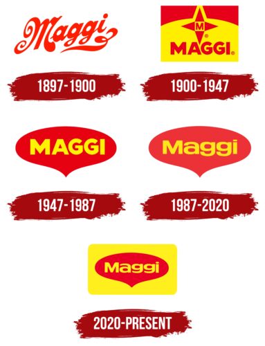
1897 – 1900
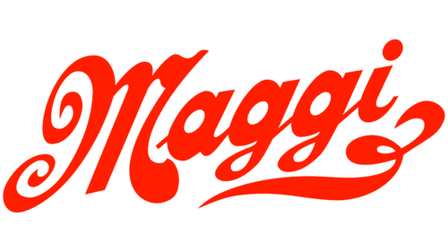
Between 1897 and 1900, a new product quickly became a favorite for millions. Its logo, designed with ornate, flowing letters that appear lifted by a breeze, evokes the lightness and buoyancy of steam rising from a hot, aromatic soup, mirroring the company’s main product. The red logo represents energy and passion and suggests the product’s pleasing taste, promising a delicious and nutritious experience.
The product was developed by the well-known entrepreneur and innovator Julius Maggi. He aimed to create a nutritious and easy-to-prepare food, leading to the innovation of a dried soup recipe rich in plant proteins, marking a significant advancement in the food industry of that time. An intricate flourish at the bottom of the logo, resembling legume plant tendrils, highlights the main ingredient of the initial product version—legume flour. This detail underscores the natural origin of the ingredients and the product’s ties to agriculture.
1900 – 1947
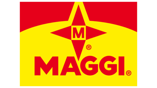
A company known for its innovative food products recently launched a broth concentrate that quickly gained popularity, partly due to its distinctive logo. The logo includes a red compass rose against a sunrise, symbolizing new opportunities. At the center is the letter “M,” which stands for the brand’s first initial, surrounded by the full company name—a sign of quality and reliability known worldwide.
The company’s products have achieved global distribution, reaching new markets and growing their fan base. The logo’s effective use of color significantly influences its popularity. The combination of yellow, evoking the color of broth and red, associated with leadership and excellent taste, effectively draws attention while emphasizing the product’s superior taste and leading market position.
1947 – 1987
When the global company Nestlé merged with the brand, it started a new chapter. This major event was marked by a rebranding that included a new logo for the seasoning. This visual change reflected Nestlé’s brand philosophy and future direction.
The new logo depicts a kitchen scene where a steam cloud rises from a pot, symbolizing home cooking and family moments. At the center is a seasoning cube, portrayed as the essential ingredient that enhances the flavor of dishes, transforming them into culinary delights.
The logo’s color scheme is carefully selected to convey the brand’s message. Red dominates, representing passion and energy. It highlights the rich flavor and aroma of the seasoning, making it appealing and emphasizing the culinary joy it brings to cooking. The brand name is in large yellow letters, matching the color of the seasoning cube, which resembles concentrated chicken broth. This yellow suggests warmth, comfort, and a focus on high-quality, natural ingredients.
1987 – 2020
Maggi updated its visual brand identity to communicate its focus on health and natural ingredients better. The logo’s cloud color was lightened to symbolize purity and health, suggesting that Maggi’s products promote healthy eating. The brand name’s font was changed to lowercase letters to make it appear more friendly and accessible, reinforcing the brand’s image as relatable. Maggi’s products are designed to enhance, not replace, the main components of meals, supporting traditional recipes and making everyday diets tastier and healthier.
2020 – today
Maggi recently updated its brand with a new logo design featuring a red cloud on a bright yellow background, shaped like a chicken bouillon cube, one of its iconic products. This design uses colors to evoke certain feelings and associations among consumers. Red symbolizes energy and passion, and yellow represents happiness and optimism. Together, they suggest a celebration, mirroring the vibrant flavors Maggi adds to food. The logo’s design reflects Maggi’s role in enhancing dishes and making each meal unique and memorable. Maggi products are designed to complement and transform any dish, making them essential for creative cooking.
Font and Colors
The Maggi logo uses rounded sans-serif letters in yellow on a bright red background. With its warm and friendly font, this design evokes comfort and reliability, matching Maggi’s role as a key provider of culinary seasonings and convenience foods. The rounded letters enhance the brand’s approachable and trusted image, aiming to make cooking enjoyable and easy.
The colors used—yellow means warmth and energy, and red means passion and appetite—attract attention and stimulate hunger, which is what a food brand like Maggi needs. This color combination is common in the food industry because it draws the eye and enhances appetite.
The consistent use of this font and color scheme across all Maggi products and marketing helps make the logo instantly recognizable, reinforcing Maggi’s market presence and strengthening consumer connections. A red “heart” behind the logo underscores Maggi’s central role in cooking, adding an emotional layer to the brand identity by linking Maggi with positive dining experiences and a love for food. Together, these design elements communicate Maggi’s values and what the brand stands for, making it a cherished part of meal preparation worldwide.
FAQ
What is the symbol of Maggi?
Maggi’s logo is famous worldwide for its bright red, golden yellow, and black colors. These colors make Maggi’s products and ads stand out so people can easily find them. Maggi has used these colors for a long time to ensure its brand is recognizable among many food choices. The bright colors reflect Maggi’s rich history and promise of quality.
In addition to these colors, Maggi products, especially in Africa, feature a unique cross-star symbol. This symbol makes Maggi products look different, showing the brand’s commitment to offering tasty and healthy food choices.
The choice of colors and the cross-star symbol make Maggi look attractive. These design elements help convey what Maggi represents, making it a key player in the culinary world.
What is the slogan of Maggi?
MAGGI, well-known for its quick-cook noodles, has updated its slogan to “2 minutes for education,” moving away from the iconic “2 minute noodles.” This change is a significant indicator of MAGGI’s commitment to positively impacting education, particularly in education. The original slogan was about the speed and convenience of preparing MAGGI noodles, catering to busy individuals. However, the updated slogan highlights MAGGI’s initiatives to support educational programs.
With “2 minutes for education,” MAGGI leverages its broad recognition to underline the importance of education. This strategic decision allows MAGGI to connect with its customers on a deeper level, demonstrating that the brand values community welfare and looks toward the future.
What is the meaning of the Maggi logo?
The Maggi logo stands out with its red background and the brand name. The design combines a heart and a drop, showing what Maggi is about. The heart symbolizes the care and love put into cooking. Maggi aims to connect people through meals that provide warmth and comfort, similar to home-cooked food. This shows Maggi’s goal to enhance cooking into a more enjoyable and heartfelt activity.
The drop symbolizes the soupy or liquid dishes that Maggi products, like the famous bouillon cubes, are often used to create. It shows how Maggi can improve a variety of meals, from soups to sauces, emphasizing the brand’s ability to help create delicious food more easily. The combination of the heart and drop in the logo symbolizes Maggi’s commitment to producing meals that are not only tasty but also bring people together.
Is Maggi a trademark?
Maggi is a brand that belongs to Nestlé, a big company known worldwide for its food and drinks. This brand, including its name, logo, and special packaging, is legally protected in every country where Nestlé operates, like Vietnam. This protection keeps others from using or copying Maggi’s brand without permission, keeping its good name safe. This way, customers always get real, top-notch Maggi products.
Which country is Maggi from?
MAGGI, a well-known brand in kitchens worldwide, began in Switzerland in 1884. Julius Maggi, a Swiss entrepreneur, aimed to create tasty, healthy food for busy, working families. He wanted to improve the diets of working-class families with meals that were quick and easy to prepare. His innovative ideas in food production helped MAGGI become famous for its flavorful, nutritious meals that are fast to make.
