


![]()
The Edmonton Elks have introduced a refreshed logo and wordmark that blends the team’s historical roots with a bold, clean design. The new visual identity focuses on the classic “EE” emblem, a symbol deeply connected to the team’s rich Canadian Football League (CFL) history.
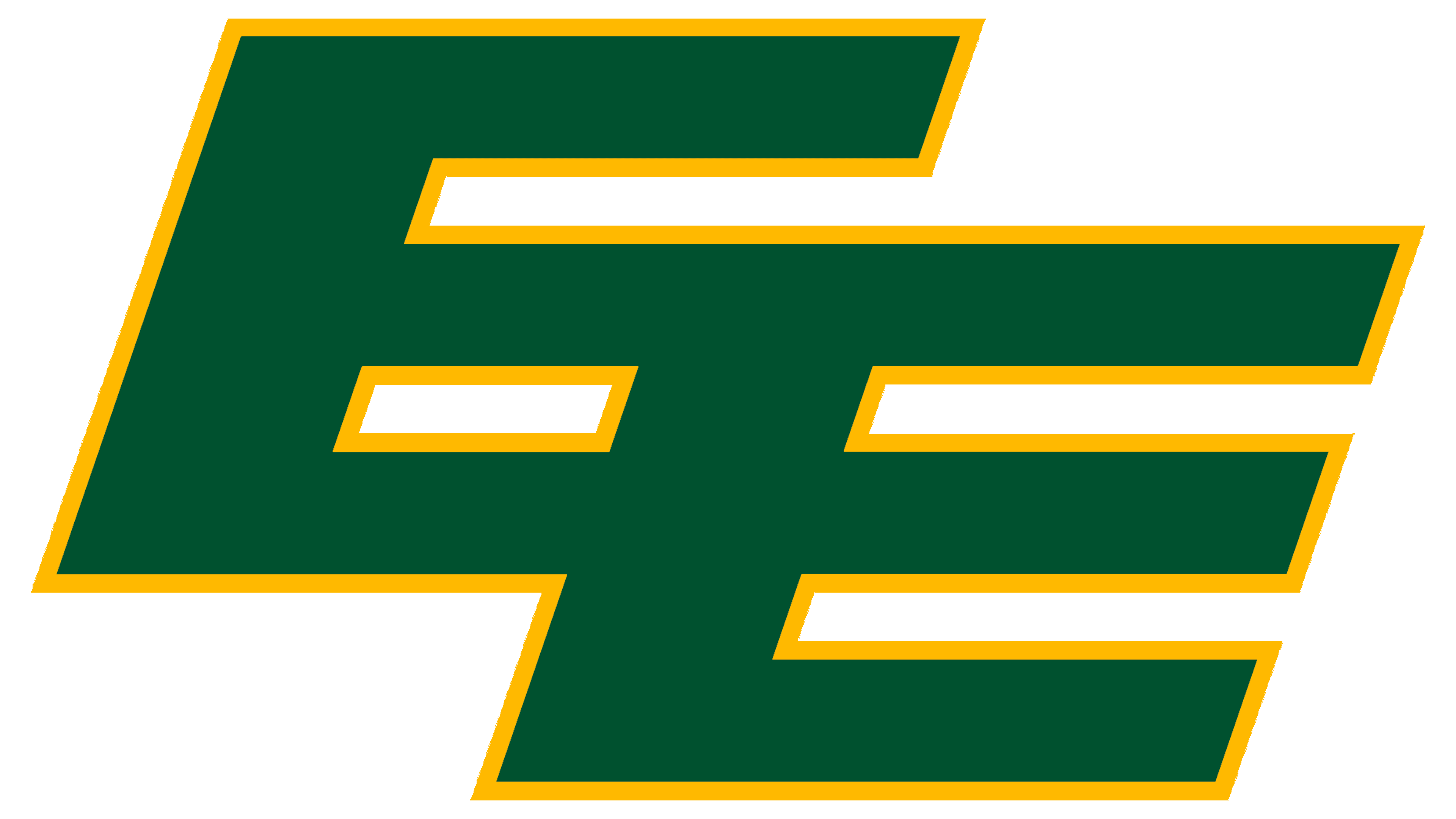
The iconic interlocking “EE” symbol is at the center of the update, a feature that has been on the team’s helmets for decades. Now officially the primary logo, it reflects a shift toward a simpler design rooted in the franchise’s past. The geometric symmetry of the letters creates a sense of balance and structure, while the bold lines convey strength and resilience. The sharp, angular shapes keep the design clear and versatile, making it easy to adapt to everything from digital media to merchandise.
![]()
Alongside the logo, the new wordmark is inspired by the team’s 1970s typography. It features bold, uppercase serif lettering with strong, block-like forms. The wide, evenly spaced letters convey stability and confidence, and the sharp serifs add a classic sports feel. Small updates to the letter shapes bring a modern touch, while the horizontal alignment keeps the look streamlined and cohesive with the “EE” emblem.
The color palette stays true to tradition, with deep green and bright yellow front and center. The green reflects endurance and a connection to Edmonton’s heritage, while the yellow adds energy and contrast. The simple and focused color makes bold letterforms stand out without extra decoration.
One key change is removing the moose head and antler design introduced in 2021. That logo featured stylized antlers with dynamic lines that suggested motion and aggression. The new look strips away those details, favoring a cleaner, typography-driven design.
Subtle horizontal lines alongside the wordmark add a sense of movement, hinting at speed and athleticism without overpowering the design. These lines are simple yet effective, giving the logo a dynamic feel that ties back to the action on the field.
![]()
While the “EE” emblem is now the primary logo, the 2021 moose-themed badge will continue as a secondary mark. It’ll still appear on certain merchandise and at special events, keeping a connection to recent versions of the team’s branding.
The new logo reinforces the team’s presence on the field and in the community, celebrating the past while embracing the future.