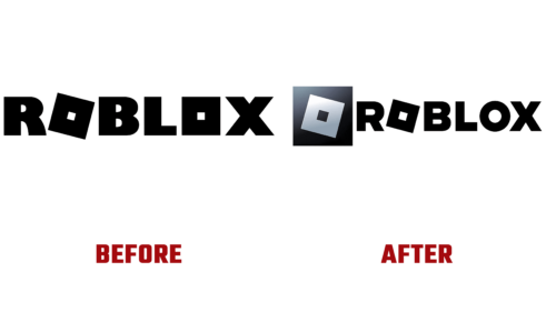
The world-famous gaming platform intends to create its own Metaverse. To do this, she has already taken the first step – she changed the identity so that it meets the intended requirements. But unlike the social network Facebook, which was renamed Meta, the company did not change its name: only the slogan and the Roblox logo were upgraded. This event took place in the last days of August 2022.
The platform’s main goal for online games is to increase the user base at the expense of representatives of different age groups. And for this, she needs to become attractive to everyone. Therefore, she began increasing the number of visitors with a change in visual identity. As part of the planned program, the management approved a new slogan, “Reimagining the way people come together,” and adopted a corrected emblem. As the regulars of the virtual platform note, the corrections are minor: the personal Roblox font has been preserved.
Indeed, the designers just replaced the square “O” with a traditional round one so that the name would be more easily perceived by an older audience. They also introduced new custom glyph shapes that are lightweight yet modern, combining classic and modern aesthetics. Now the round “O” stands out with a large intra-letter space – it has the largest slot. The holes of the rest of the characters are also enlarged, but not much. This was done in order to achieve normal readability.
The result of this intervention in the individual typeface was a decrease in the width of the lines that make up the letters. Therefore, in the new interpretation, they seem thinner. But the first “O” retained its legendary shape, and thanks to the expansion of the slot, it had another square – an inner, black one. Now he is very visible. The designers also increased the slant of the custom glyph by raising the bottom left corner slightly. Its point is almost equal to the notch in the leg of the adjacent “R.”
However, the measures taken did not affect the font type: it is still capitalized and chopped. The Roblox logo reflects the transition from playful to precise and practical.


