


![]() Roblox Logo PNG
Roblox Logo PNG
The company’s emblem resembles the construction parts used to create games. The Roblox logo features tools that enable players to participate in the process, realize their fantasies, and propose new plots.
Roblox traces back to 1989, when David Baszucki founded Knowledge Revolution and created Interactive Physics, a 2D simulation tool used in schools. In 1998, the company was sold to MSC Software for $20 million. Baszucki stayed as a vice president before leaving in 2002 to invest independently.
In 2004, Baszucki and Eric Cassel founded Roblox Corporation in California. The early concept, called DynaBlocks, focused on a physics-based 3D environment built from blocks. In 2005, the project was renamed Roblox. The platform launched publicly on September 1, 2006, attracting a small but active community of game creators using Lua scripting.
Unlike Minecraft, which centered on a single world, Roblox positioned itself as a platform hosting user-created experiences. In 2007, the company introduced Robux as a virtual currency, alongside Tix, which was later removed in 2016. Monetization relied on microtransactions and the Builders Club subscription.
In 2012, Roblox released mobile apps for iOS and Android, expanding its audience. In 2013, Eric Cassel died at age 46, and his account became a memorial. The same year, the Developer Exchange program enabled creators to convert Robux into real currency, making game development a source of income.
By 2019, the platform reached 90 million monthly users. In March 2021, Roblox Corporation went public on the New York Stock Exchange through a direct listing under the ticker RBLX, achieving a valuation of about $38 billion.
Meaning and History
![]()
The entrepreneur David Bashutsky, who invented Roblox, once created an educational application called Interactive Physics. The animated laboratory allowed you to conduct experiments directly on the computer. Children loved this creative activity, so David developed a platform for constructing 3D games. Initially, he chose the name GoBlocks, but later changed it to DynaBlocks. After a while, the service was renamed Roblox. This inconsistency was reflected in the logo, which changed almost every year.
What is Roblox?
It is not just a video game. It is a “construction platform” for building games in Roblox Studio. The platform features hundreds of user-developed virtual worlds, including races, obstacle courses, arcades, and simulators. The project owner is Roblox Corporation.
2002 – 2003
![]()
David Bashutsky would name the game platform GoBlocks, so he prepared an emblem with this inscription in advance. The word “alpha” was written in lowercase letters on the right side. It indicated the site’s version. The phrase was divided into parts using different colors: the designers combined green “Go,” dark blue “Blocks,” and light blue “alpha” into one line.
2003 – 2004
![]()
During beta testing, the GoBlocks platform was renamed. The new name, DynaBlocks, was finalized and carried forward to the next platform version. It was also retained in the logo, where each letter had a different color. The pink word “Beta” appeared after the big black dot.
2004
![]()
After launching the site’s beta version, the developers concluded that “DynaBlocks” was hard to remember and replaced it with “Roblox.” The emblem also changed: the designers added the new platform’s name, removed the dot, and made the word “beta” blue. Multicolored letters remained, as they were the main feature of the entertainment portal. It presented Roblox as a paradise for fun and entertainment, where you must use your imagination to play.
2004 – 2005
![]()
A few months after the first logo was created, a second one appeared with the same inscription but without the word “beta.” It used a new font: square white letters circled in dark red. A horizontal line was drawn above the first letter “o” to suggest how to pronounce the vowel sound.
2005 – 2006
![]()
In 2005, the platform was officially renamed Roblox. The brand name changed again, although the overall style remained the same. The letters acquired a blue-white scale, and the developers created a gradient transition between the two colors. Also, a brighter shade of red was chosen, and the letters became capitalized and italicized.
2006 – 2009
![]()
In 2006, beta testing ended, and Roblox was officially launched. The site owners abandoned the idea of using a strict square font, so in the new logo, the letters appear to jump and be uneven, as if drawn by hand. The inner part of the inscription became white, and the outline became unevenly thin.
2009 – 2010
After a minor redesign, the red color became darker. Initially, this emblem was used solely for merchandising, but it later became the primary emblem.
2010 – 2015
![]()
In 2010, the designers further darkened the outlines and added a subtle gradient. The 3D lettering represented Roblox at various events and was used in games until 2015.
2015 – 2017
![]()
In 2015, the logo designers abandoned the 3D design and reverted to a 2D version with dark red letters.
2017 – 2018
![]()
In early 2017, Roblox’s multiplayer platform adopted a new logo in which each letter stood on its own. The letter “O” resembled a large red square with white mini squares in the center. The letters “R,” “B,” “L,” and “X” were also red and matched the chosen style.
2018 – 2022
![]()
In 2018, something unprecedented occurred: the color red disappeared from the logo. The lettering turned black for the first time, and that was the only change the redesign brought.
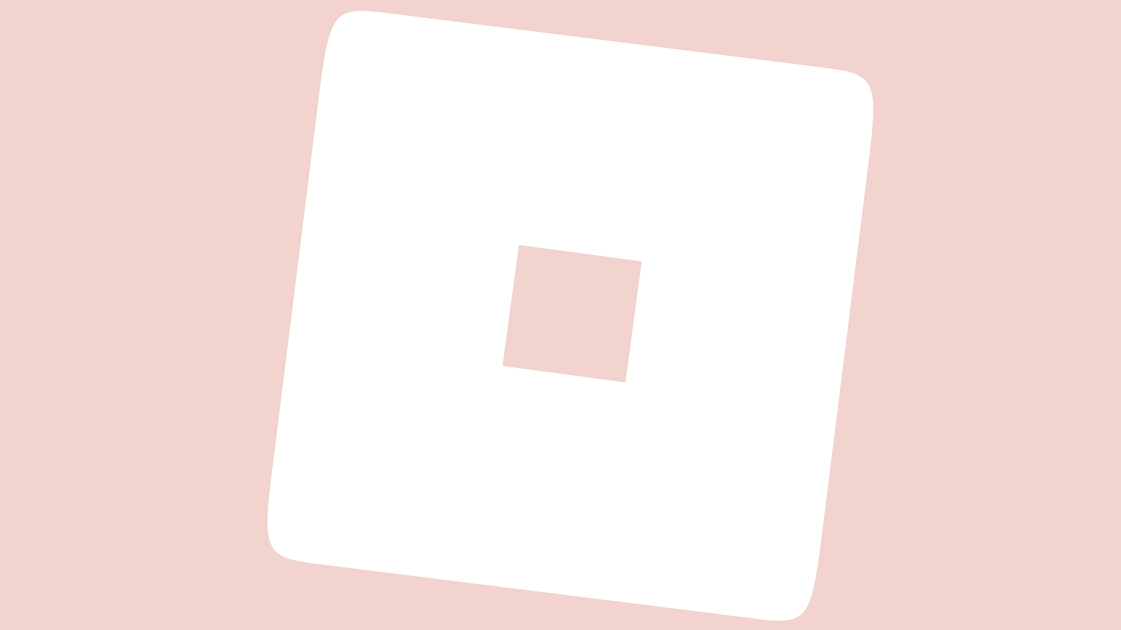
2022 – today
![]()
The change to Roblox’s logo was revealed on August 23, 2022, via a leak. It was officially announced three days later, when users learned that the symbol would be implemented on the online platform within a week. Overall, the sign is similar to the previous one in color and style. The designers kept the original slant of the square letter “O,” symbolizing movement and progress. At the same time, the letter itself, as before, resembles a building block.
To show the evolution of the game platform, the emblem developers decided to replace the Gill Sans Ultra Bold font, whose letterforms are too wide, with the more balanced Gotham Bold, which has serifs, more balanced intra-letter spacing, and lower contrast. At the same time, this is not the original font; it is a modified version, designed to reflect the Roblox concept.
Light glyphs embody modern aesthetics. This is clear even in the second letter “O,” which was previously square but is now round. This small nuance allowed us to focus on the first “O,” which is quadrangular. The slope has changed a bit: the logo developers have increased it, making it more pronounced.
Roblox Icon
![]()
Roblox app icons always contain one letter from the logo. Until 2017, the letter “R” was used, as it was the most recognizable due to its unusual shape. It was then replaced by the first letter “O,” which resembled a large inverted square with a hole. Further evolution was reflected only in the color, changing from red to gray, black, and silver.
2004 – 2005
![]()
The first icon was a stylized letter “R” rendered in a curved line with a pink-and-white gradient. It resembled an unfinished arrow pointing to the upper-left corner. A thick, dark-red band surrounded the central element.
2005 – 2006
![]()
With the release of Roblox’s beta version, a new icon was introduced. The letter “R” changed its shape: the designers stretched it vertically and tilted it slightly to the right. They rounded the corners, changed the thickness of the center line, and used a blue gradient instead of pink. The frame became bright red.
2006 – 2009
![]()
In 2006, a badge resembling a child’s drawing first appeared. The letter “R” was white, with thin red outlines. Only jagged lines were used in the writing, as the asymmetrical shape created the effect of movement. For the same reason, the right leg was wider and longer than the left.
2009 – 2011
![]()
The new icon is similar to the previous one, but some details differ. The creators rounded some corners, adjusted letter spacing, and increased outline thickness. This version was an application icon and graphic symbol for Roblox Studio and Player.
2011 – 2015
![]()
In 2011, the letter “R” was placed inside a burgundy circle with a scarlet border. The letter itself remained white. The main elements feature a double-stroke outline, further resembling a child’s drawing. The uneven stripes and rounded corners enhance the “childlike” feeling. The image seemed three-dimensional thanks to thin, light lines drawn along the edges of the letter “R” (on the left and top).
2015
![]()
The designers modified the pictogram by adjusting the size and shape of its components. As a result, the letter appeared flat, with no white reflections. It returned to its angularity, as in 2006-2009. At the same time, the “R” was enlarged. The shades of red shifted to a darker palette.
2015 – 2017
![]()
In 2015, Roblox returned to the old icon design. The round base with a circular frame disappeared, and the background and the interval between the letters became white again. The letter’s shape was slightly changed: the developers rounded the corners and shortened the right foot to nearly match the left.
2017 – 2018
![]()
Following the multiplayer platform’s rebrand, the application icon underwent a significant change. The place of the traditional letter “R” was taken by the letter “O,” not the usual one, but in the form of a falling rhombus with a hole inside. The main part was red, so the small white rhombus in the center stood out in contrast. This letter “O” was borrowed from the Roblox logo, where it was the second in a row.
2018 – 2019
![]()
In 2018, the badge was introduced in white, black, and gray. Until 2019, the colorful graphic symbol also depicted two running men.
2019 – 2022
![]()
The current version features a silver “O” letter with a gradient. It stood on the edge as before, but now a black square takes its place. This icon is available on social networks and in the app. Roblox Player uses a diamond-shaped letter “O” on a white background. It appears volumetric due to the black-and-gray shadows.
2022 – today
![]()
In 2022, Roblox Corporation updated not only its logo but also its application icon. Now, the icon of one of the largest gaming platforms features a square dominated by gray. Only a small corner at the top remained white, and the gradient was retained. Shadows remain, though they are more even and pronounced in the current version. The designers decided not to change the legendary gradient, as it is the defining element of the Roblox visual identity system.
Aesthetic Roblox Logo
![]()
Aesthetics is a separate trend on the Roblox platform, bringing together fans of youth style at the intersection of glamor and Tumblr. We are talking about girls in primary school. They create identical profiles and often use the term “aesthetics” when discussing cute things. There are entire tutorials online (on blogs and YouTube) on creating an aesthetically pleasing account.
It is unknown when and why this trend emerged. However, it has become very popular among kids who play Roblox and socialize on it. It is based on the culture of fashion and mass consumption. For supporters of aestheticism, shiny, external luxury is important; it is rooted in a glamorized worldview.
Separate groups of aesthetic items and clothing have been created for such users. These can be purchased with Robux, the virtual currency, to give the avatar a cute look. Matching faces, heads, and animation sets are also available for purchase. These outfits and accessories are important because they help supporters of Aesthetics recognize one another. They all look the same: their avatars are slim, with beautiful faces and fashionable styles. Recently, there has been an increase in insulting other players for their characters not conforming to fashion styles.
Aesthetic Roblox fans have coined aesthetic nicknames, such as AestheticArii or LuxvelyRoses. Even username generators allow you to make combinations of themed words. The same applies to group names, which often reference angels, glitter, flowers, and other glamor-related terms.
Players use “aesthetic” quotes with deep meaning when completing their profiles to convey a sense of mystery or romance. Most often, the quotes are philosophical, addressing feelings and relationships. Users design and decorate text using unusual Barbie-style fonts and cute emoticons.
Another component is selecting beautiful themes that create an aesthetically pleasing profile. We are talking about photos of beautifully dressed avatars. Thus, Aesthetic Roblox is not just a fashion trend. It is a brand that represents an entire branch of the gaming industry. Individual users (owners of virtual clothing stores) and online platforms earn good money on it because beauty requires sacrifice, and in this case, money. Children pay for things considered “aesthetically pleasing,” after which sellers convert Robux coins into real currency.
However, the brand is not fully developed. It has no visual identity, leaving players with ample room for creativity. They can choose any nicknames, avatars, clothing, or badges, as long as they are aesthetically appealing.
Fashion enthusiasts have created many unofficial Roblox logos. They imitate the application’s main icon, which resembles a square letter “O” in the lower-right corner. The original symbol is gray, but fans of aesthetics were dissatisfied with this; they wanted to paint it in different colors and add ornaments.
As a result, there were versions with a pink “O” (or white on a pink background). They can be monochrome and spotty with the so-called “strawberry cow” pattern. In addition, purple and blue emblems are popular among beauty connoisseurs. There are variants with shadows, bold black contours, and gradients.
Since the Aesthetic Roblox brand is a fashion trend with no set rules, it has no standardized fonts. The color scheme also depends on the users’ preferences. Most often, they choose pink, blue, and nude shades.
Font and Colors
The Roblox trademark may seem simple, but it carries hidden subtext. The oblique letter “O” symbolizes fantasy without boundaries and limitations. This is a game element that hints at the site’s specifics.
The latest version of the logo uses a modified version of the Gill Sans Ultra Bold font. The designers slightly modified the letters, making the “O” square. A little later, a free Roblox-2017 font was developed based on the lettering.
Most of the logo’s palette contained red, but now all the letters are black. The white color remained only as a background.