


![]() Fortnite Logo PNG
Fortnite Logo PNG
The Fortnite logo reflects the game’s spirit: dark yet thrilling. It conveys the energy of combat and the excitement of survival. The simple design conveys tension and dynamism, and the recognizable silhouette evokes associations with the virtual world.
Fortnite began in 2011 as an internal game jam at Epic Games during work on Gears of War 3. The concept focused on cooperative survival with building mechanics and was shown at The Game Awards in December 2011. Development moved slowly, and by 2016, the project remained in closed alpha as attention shifted to Paragon.
In March 2017, the rise of PlayerUnknown’s Battlegrounds changed the landscape. During a trip to a Disney meeting, Donald Mustard outlined a 100-player mode, with Tim Sweeney supporting the shift. The idea of the Battle Bus emerged during that discussion.
On July 25, 2017, Fortnite: Save the World launched in paid early access with a moderate reception. A small team led by Eric Williamson built a new mode in about two months, reusing existing assets and involving developers from Unreal Tournament.
Two weeks before release, Epic decided to make Battle Royale free rather than charge for it. The mode launched on September 26, 2017, for PC, PlayStation 4, and Xbox One. Bluehole, the developer of PUBG and a user of Unreal Engine, raised concerns and filed a lawsuit, but it was unsuccessful.
Within two weeks, Fortnite Battle Royale reached over 10 million players. By June 2018, the audience exceeded 125 million. Revenue in 2018 reached $2.4 billion, with total earnings approaching $9 billion by December 2019.
The Battle Pass system became the main monetization model, offering cosmetic items without gameplay advantages. In December 2018, Fortnite Creative introduced user-generated maps. The game expanded to iOS, Android, and Nintendo Switch in 2018.
In October 2019, Chapter 1 ended with the “Black Hole” event, shutting down servers for two days before launching a new map with Chapter 2.
Meaning and History
![]()
Initially, Fortnite was intended for internal use, so its logo served as a distinctive visual identifier among PC games. Today, it is among the most successful releases of the millennium (2000s).
What is Fortnite?
It is a video game in which players can build structures, collect resources, and use weapons to survive on a deserted island. Released in 2017, it quickly became a global hit. The game has three modes, the most famous of which is “Battle Royale,” where players fight each other in survival matches across a large map. The game was developed for various platforms, including Xbox, PlayStation, PC, and mobile devices.
2011
![]()
In 2011, the Fortnite universe gained an unusual symbol. The word “Fortnight” was transformed into a carefully detailed composition of letter buildings. Each letter was constructed from elements of in-game structures. These included pipes, metal frameworks, wooden beams, ladders, and containers. The result resembles a miniature model of a game map, seemingly assembled by hand from remnants left after a disaster or in an abandoned industrial zone.
The chaotic appearance of the letters coalesces into a coherent composition on a shared platform that simultaneously recalls a rooftop, rail tracks, or a bridge deck. This level of detail conveys a sense of industrial abandonment that runs through the entire game. The solid blue background softly evokes a daytime sky, contrasting with the structures’ worn, rusted surfaces.
Rusty brown tones, dusty grays, and metallic shades reinforce visual variety. The scene suggests forgotten, slightly ruined constructions, among which an unexpected bright pink light appears in the letters H and G. Small details, such as antennas, ventilation grilles, and balconies, add realism and a sense of lived-in space.
The letterforms differ in proportions, height, and tilt. All of these imperfections reflect Fortnite’s in-game mechanics, in which players build structures from available materials. The name “Fortnight” is notable in its own right. It closely echoes the original game title “Fortnite,” turning the logo into a clever play on words or a subtle reference to the real-world duration of in-game events.
The logo is executed in a post-apocalyptic urban style, resembling an art object that emerged somewhere in a parallel world. It feels lively and atmospheric, inviting close inspection and encouraging the viewer to follow each letter to the very end.
2011
![]()
In an unfinished trailer shown at the Spike Video Game Awards, another unusual logo briefly appeared. The lettering again consisted of individual letters, each resembling a full installation. All elements of the letters were assembled from parts resembling construction debris, machine remnants, crates, ventilation units, metal sheets, and industrial beams. The viewer was presented with an inscription that appeared to be made from improvised materials found at a city dump or an abandoned construction site.
Letters of different shapes and sizes came together to form a word, with each letter remaining distinct, retaining its own height, width, curves, and protrusions. Together, they created a unified image while preserving a sense of liveliness and improvisation. Some details extended beyond conventional outlines, enhancing the impression of natural disorder and creative freedom.
The color palette reflected an industrial style. It consisted of muted shades of gray, brown, rust, and black. Artificial lighting added particular depth to the lettering, casting orange-gold and cool-blue highlights across metal surfaces. The structure’s volume was revealed through the play of light and shadow in a darkened space.
The identity of this logo is closely tied to Fortnite’s atmosphere. The theme of temporary structures, improvisation with random materials, and industrial aesthetics is integral to the game’s mechanics, in which building serves as a foundation for survival and combat.
2011 – 2012
![]()
When Fortnite was released, its name took on a form that resembled an urgent barricade hastily assembled before nightfall. Overall, this was a version of the logo shown earlier in the trailer at the Spike Video Game Awards, with different lighting and some altered details.
The FORTNITE wordmark remained a structure made from street debris, fragments, and construction materials. It looked as if a world had been assembled by hand from bricks, rebar, concrete slabs, pieces of asphalt, ventilation grilles, road signs, old televisions, and mesh fencing.
Each letter was unique and functioned as an independent structure with uneven edges, varying stroke thickness, and distorted proportions. Some elements extended beyond the composition’s boundaries, creating a sense of free improvisation. The mix of materials supported this impression. Concrete gray, brick rust tones, and metallic shades were complemented by unexpected bursts of color, such as a bright red stop sign. The overall appearance of the wordmark became lighter and more readable.
A new symbol, specifically a crescent above the letter “i,” stood out with a soft yellow glow against the darkness. It was not part of the letters themselves, but it reinforced the nighttime atmosphere, recalling the moment when danger becomes real. Under the lighting, concrete textures, welded metal seams, traces of corrosion, and signs of damage became visible, creating visual depth and a sense of physical reality.
The logo identity reflected a post-catastrophe world in which survivors are forced to build barricades from whatever materials are available. The atmosphere of survival, struggle, and improvised defense was associated with the Save the World mode. The composition conveyed ideas of improvisation and urban resistance characteristic of the game world at the time.
2012 – 2014
![]()
During this period, the game title was displayed using letters that resembled roughly nailed wooden boards. The entire Fortnite wordmark was rendered in black, reinforcing the feeling of manual labor and hurried assembly.
Each letter looked different. Some were narrow, others slightly wider, but all appeared as if they had been cut from plywood or planks. The letter surfaces showed simulated nail and rivet marks, visible cracks, chipped areas, and angular edges. In some places, wood grain details were visible, including vertical texture lines, splinters, and break marks. In certain areas, small rectangular patches could even be seen, further strengthening the image of crude, handmade construction.
The letters stretched upward, but not evenly. The top and bottom edges did not align perfectly, giving the composition a natural quality and a sense of motion. This created an atmosphere of chaos and a hastily built temporary shelter from whatever was at hand.
The style reflected the visual aesthetic of “Fortnite”, its survival atmosphere, post-apocalyptic mood, and the importance of building mechanics. The entire logo supported the theme of an improvised refuge, tied to the gameplay features of the game’s early versions by “Epic Games”.
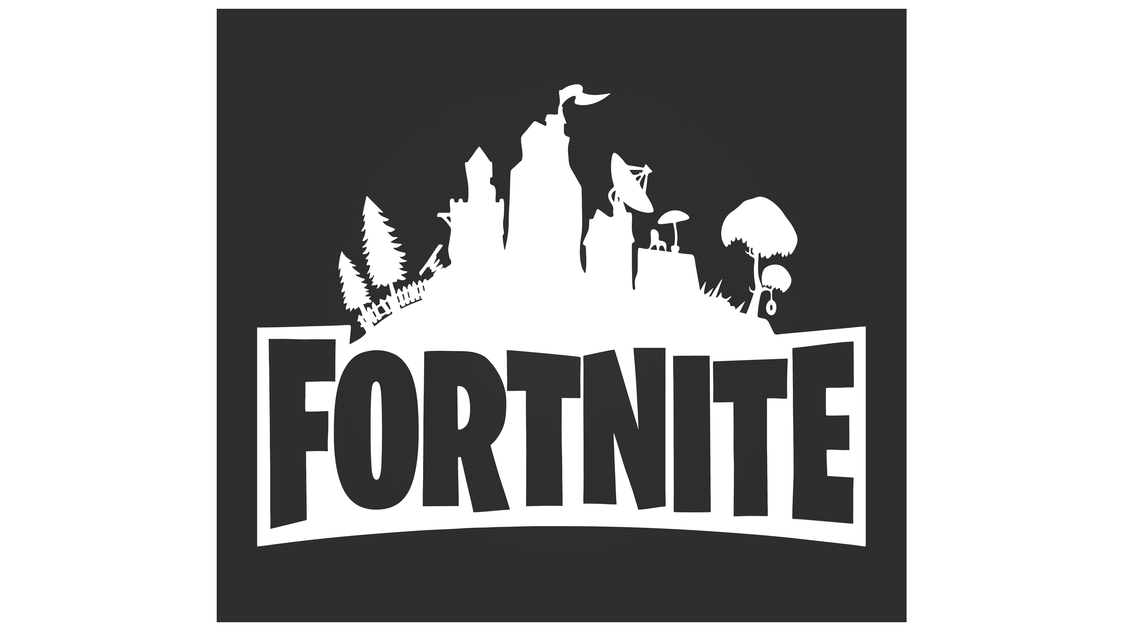
2014 – today
![]()
The new Fortnite multiplayer launched in the summer of 2017, but the familiar wordmark appeared much earlier, in 2014. Since then, the black FORTNITE lettering has remained an unchanged symbol of the Epic Games franchise. The game’s cartoon-like, vibrant style did not alter the emblem’s dark, heavy character.
The wordmark itself appears large and dense. It no longer includes debris elements, and the letters now resemble geometric forms in a grotesque typeface. The typeface is custom-made for Fortnite and is formally classified as a modified Burbank Condensed Black. Despite the density and mass, each letter is slightly distorted. Some letters tilt to the side, while others are subtly cut at the edges. The effect of “jumping” characters in varying sizes enhances the lively game atmosphere.
The color treatment is minimal. Pure black. The logo continues to convey the spirit of Fortnite, combining playful energy with an underlying darkness.
Font and Colors
As the game is a survival shooter with colorful, detailed graphics, the developers decided to introduce a contrasting logo: a concise, dark one. All letters in it are typed in uppercase letters of the Burbank Big Condensed Black font by Tal Leming. They have thick lines with serrations and sharp angles.
Despite the symbolism’s grimness, it carries a purely playful character, reflects a considerable sense of humor, and encourages experimentation. The “jumping” symbols create the impression of uneven distribution within the word “Fortnite”. The color palette is monochromatic.